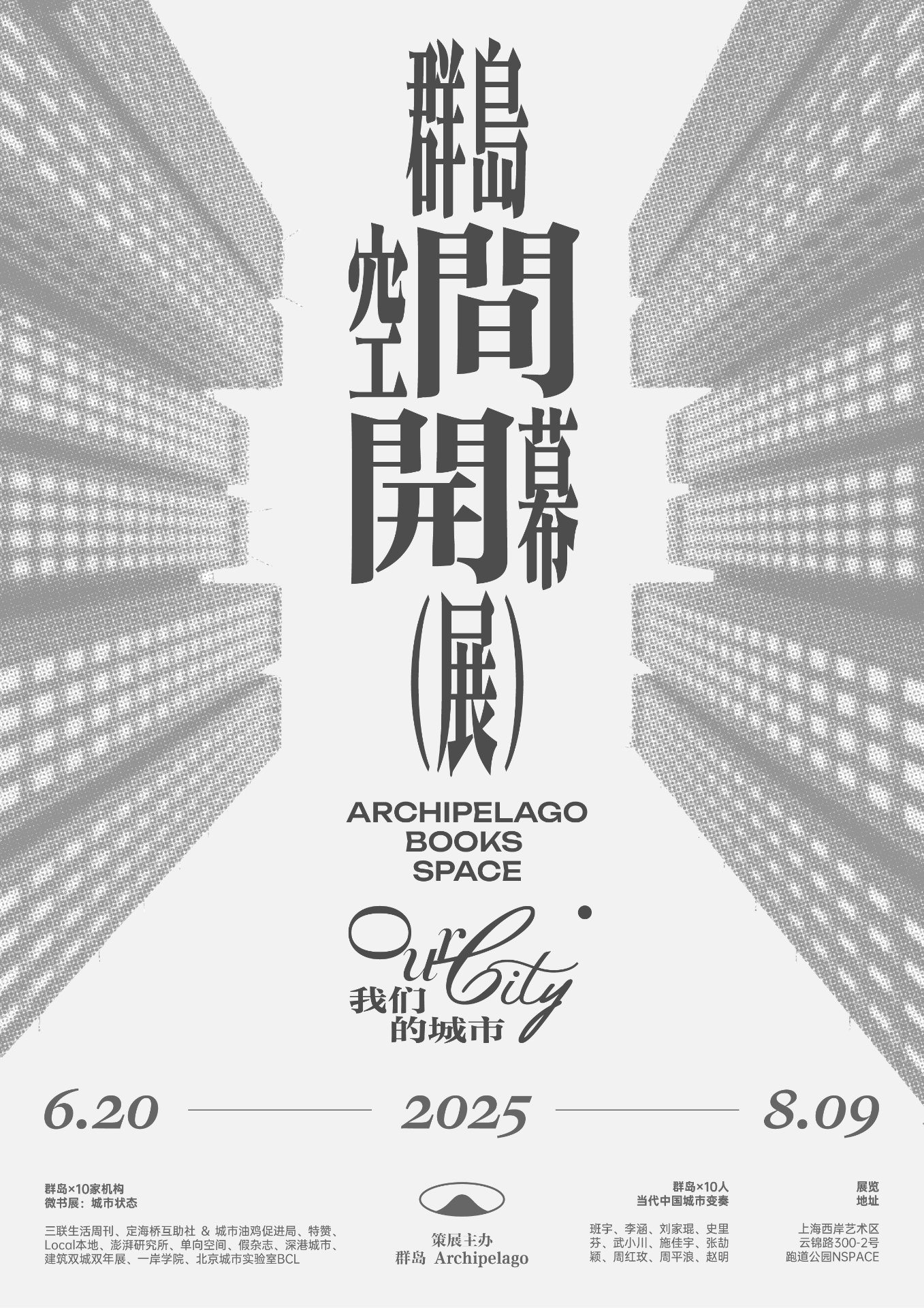
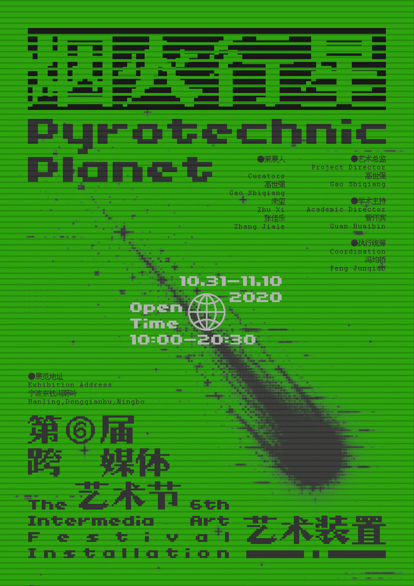
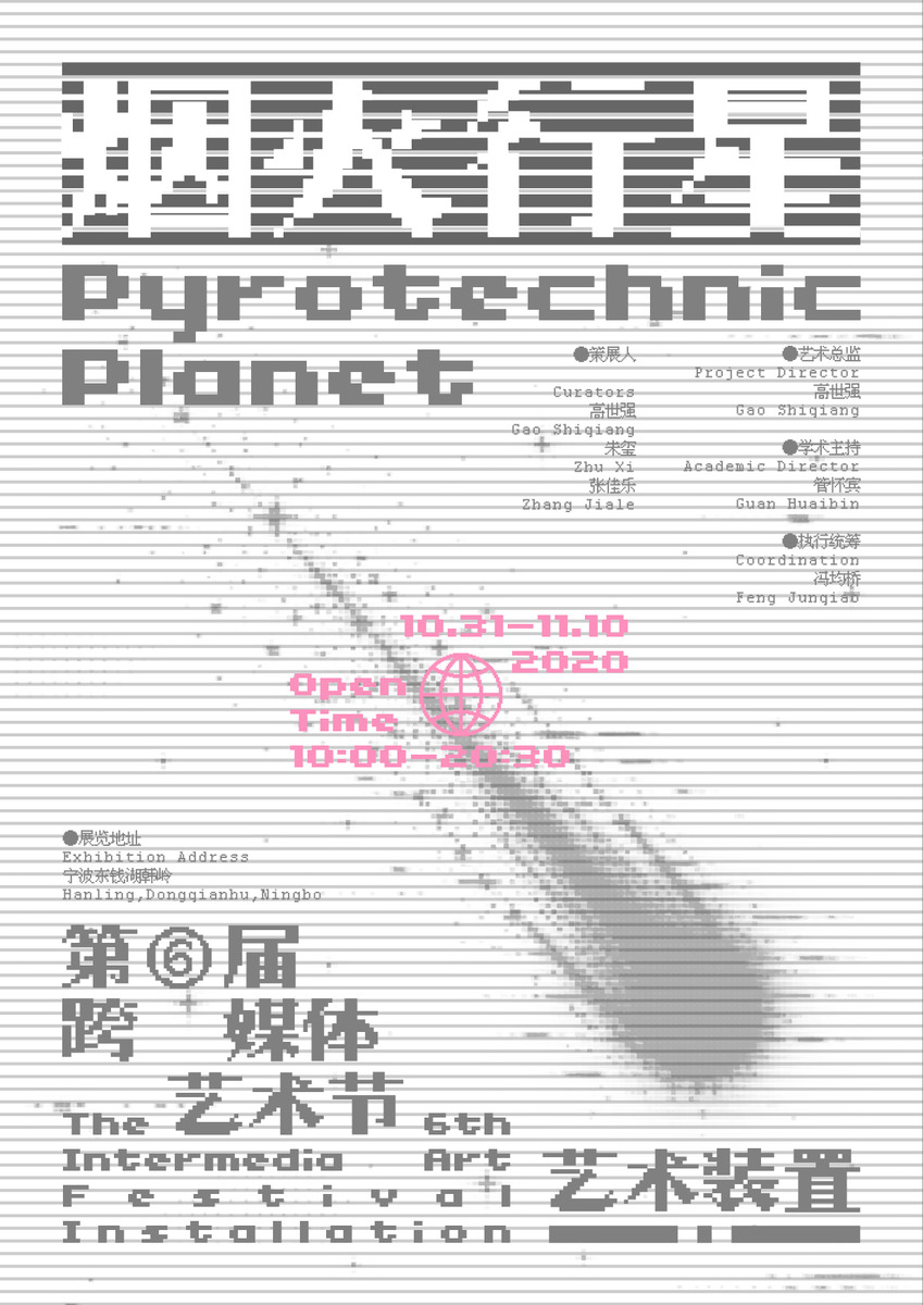
Past design works and behind the scenes of my creative process.
Brand / Poster / Font / Book
& So on...

易餐 Echomp
Brief
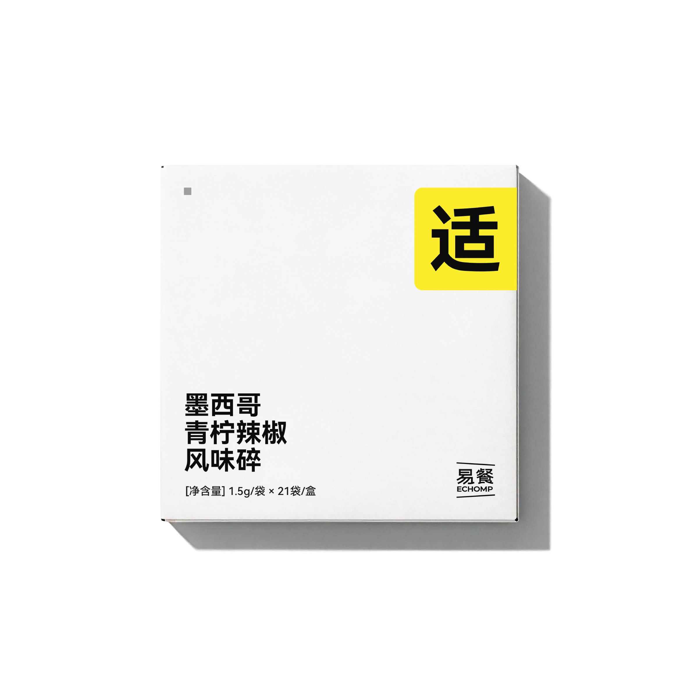
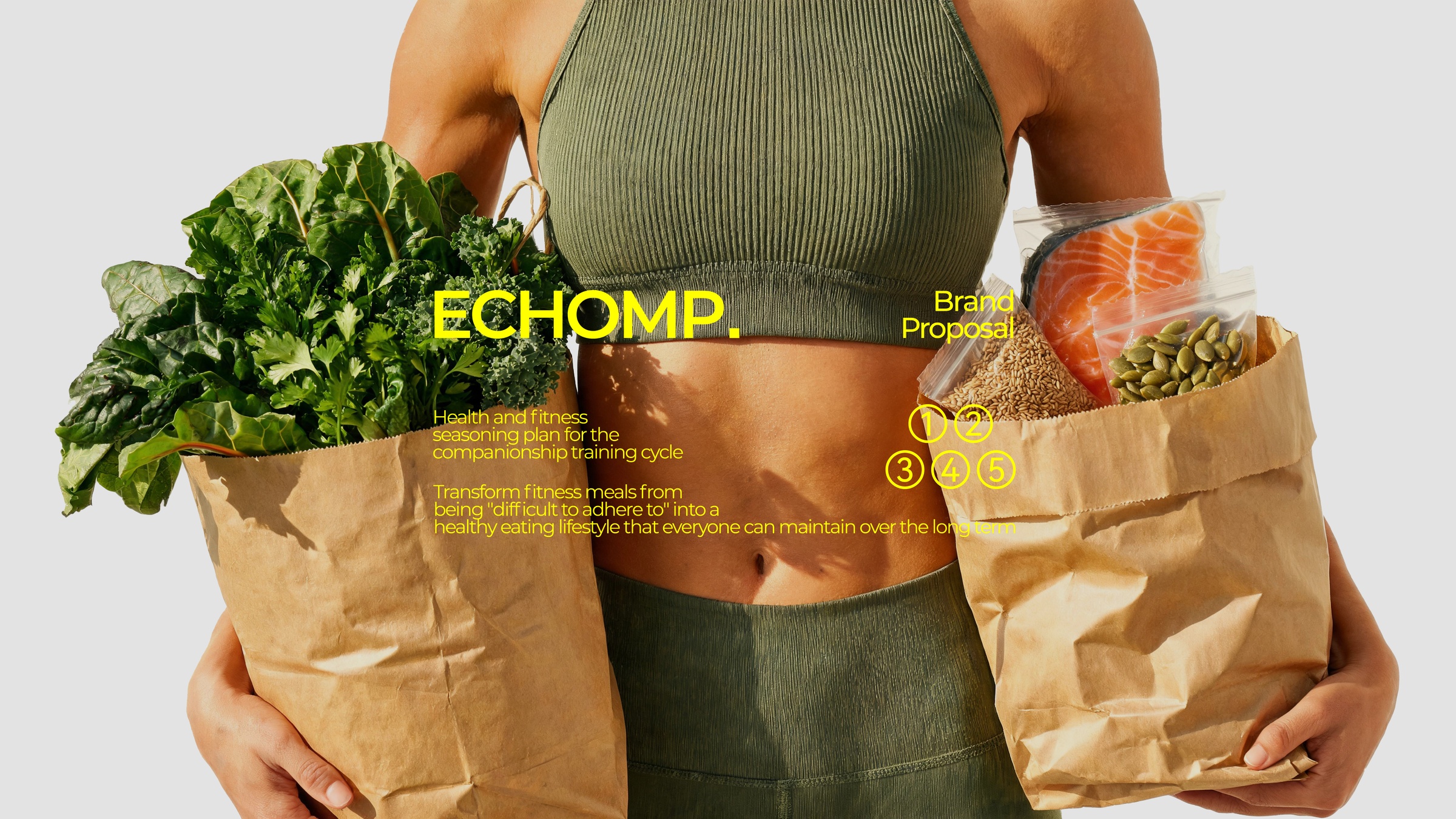
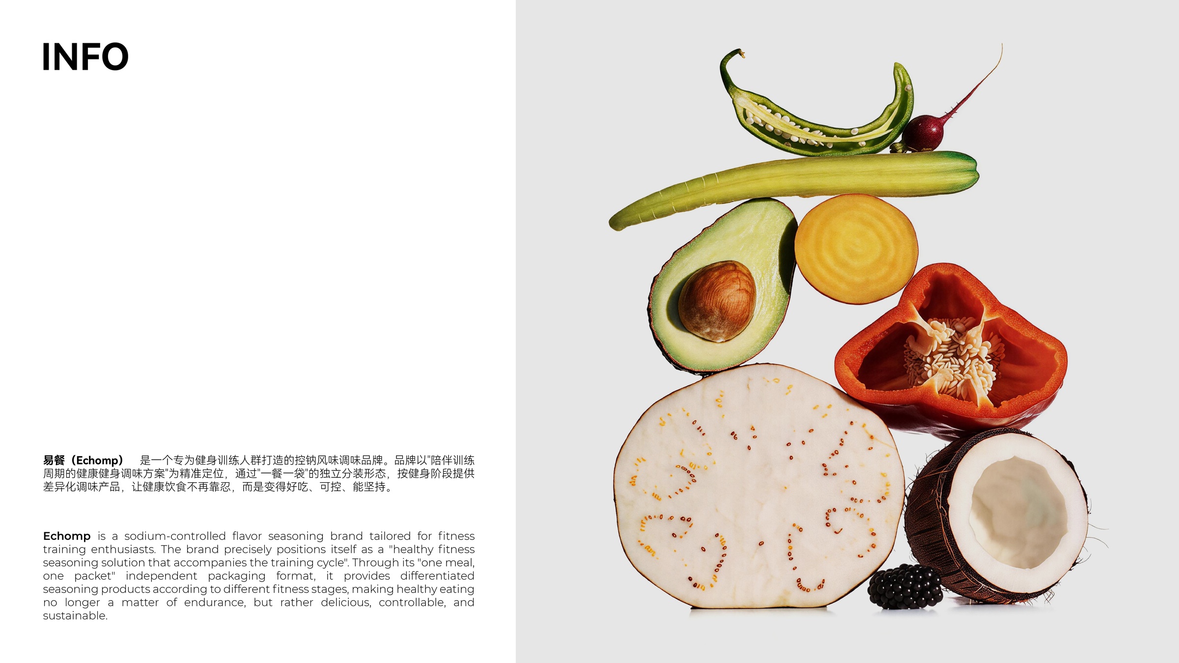
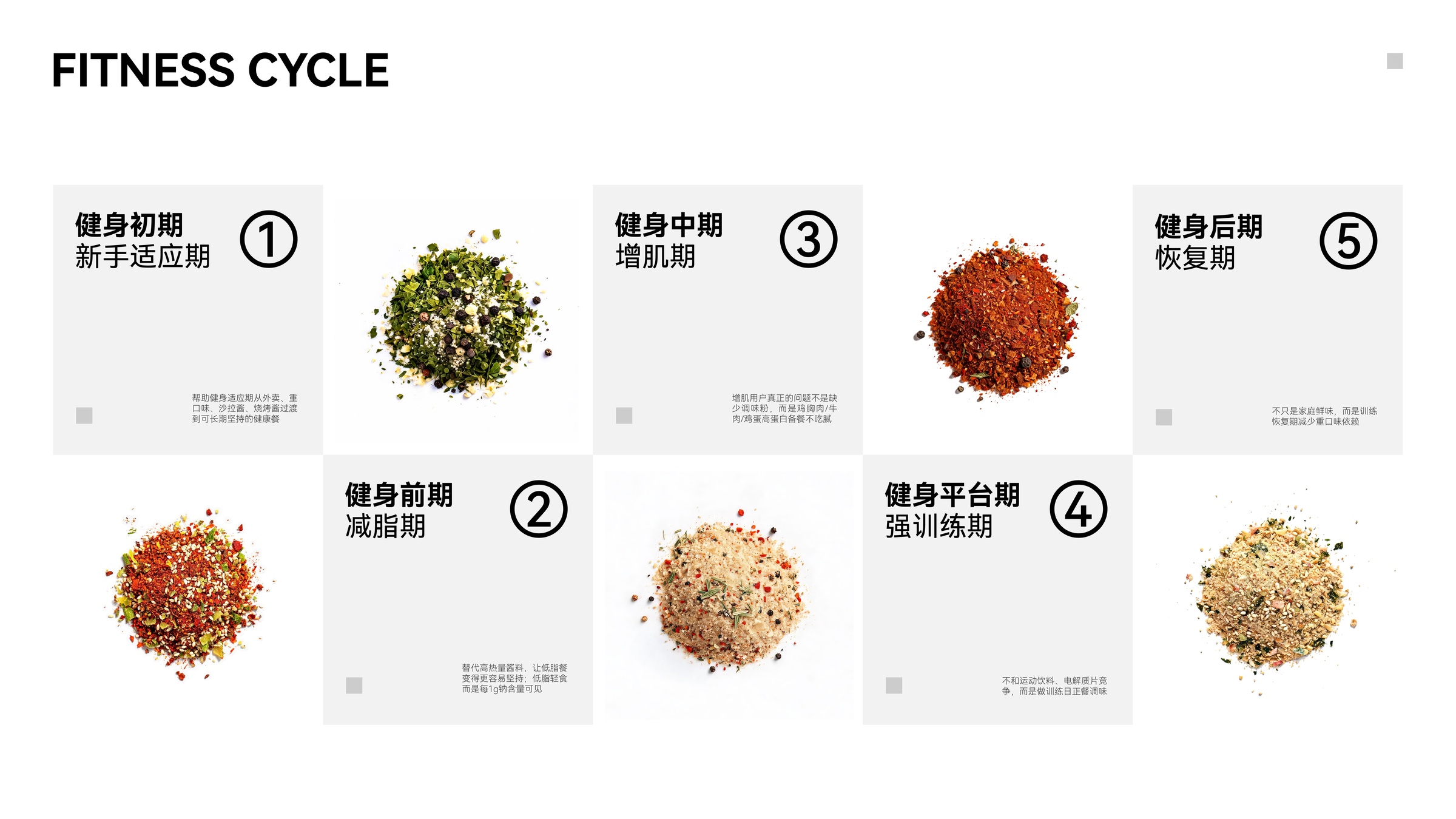
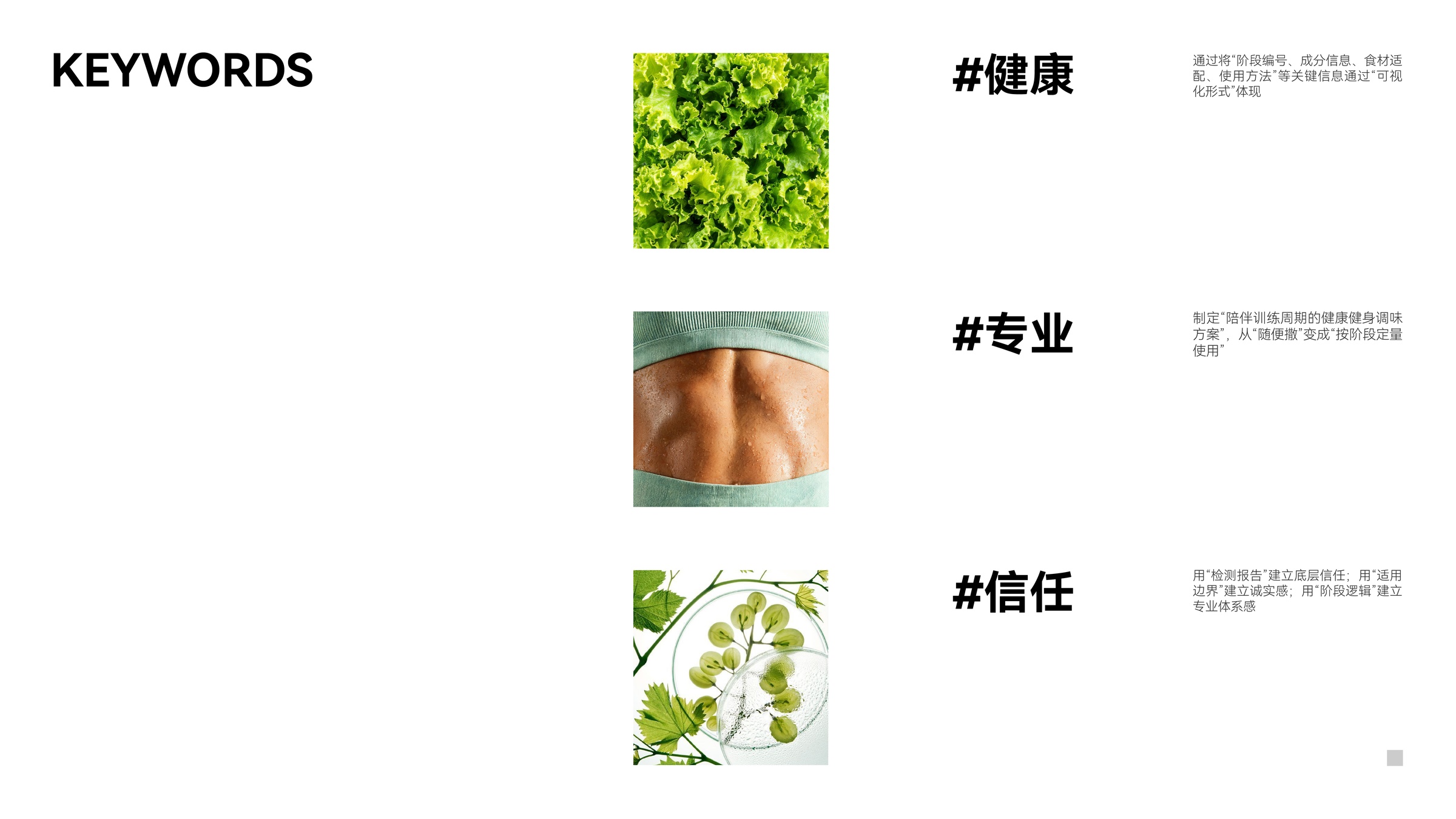
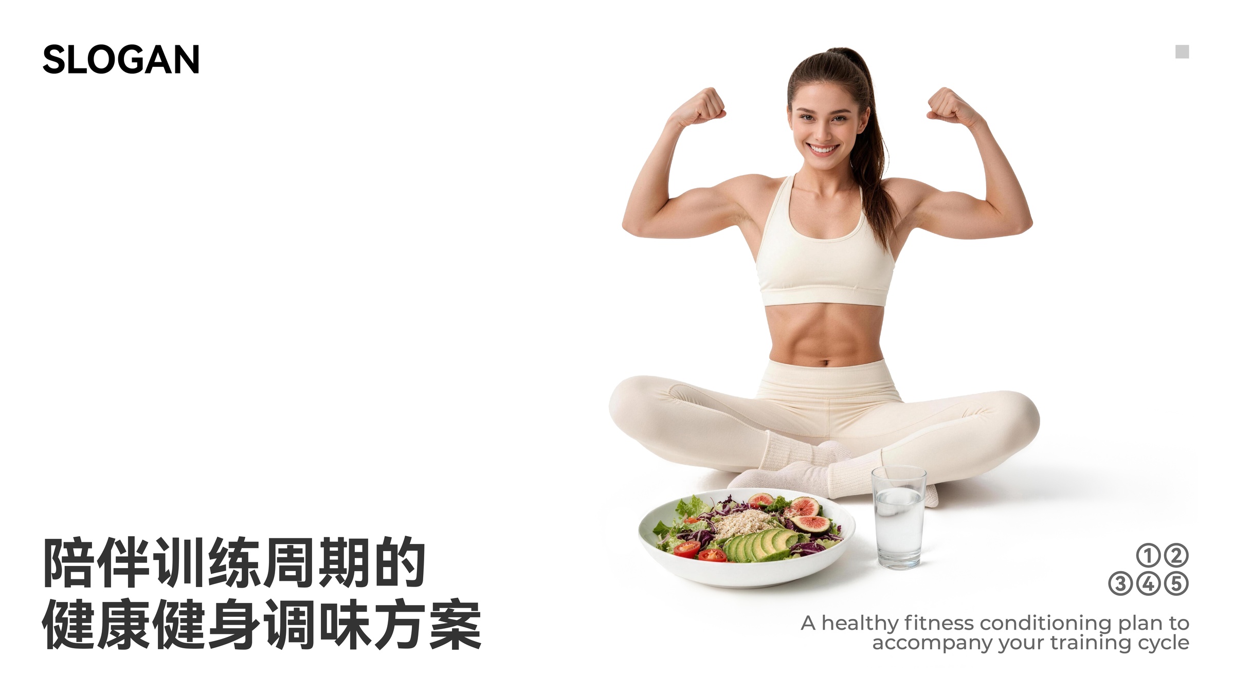
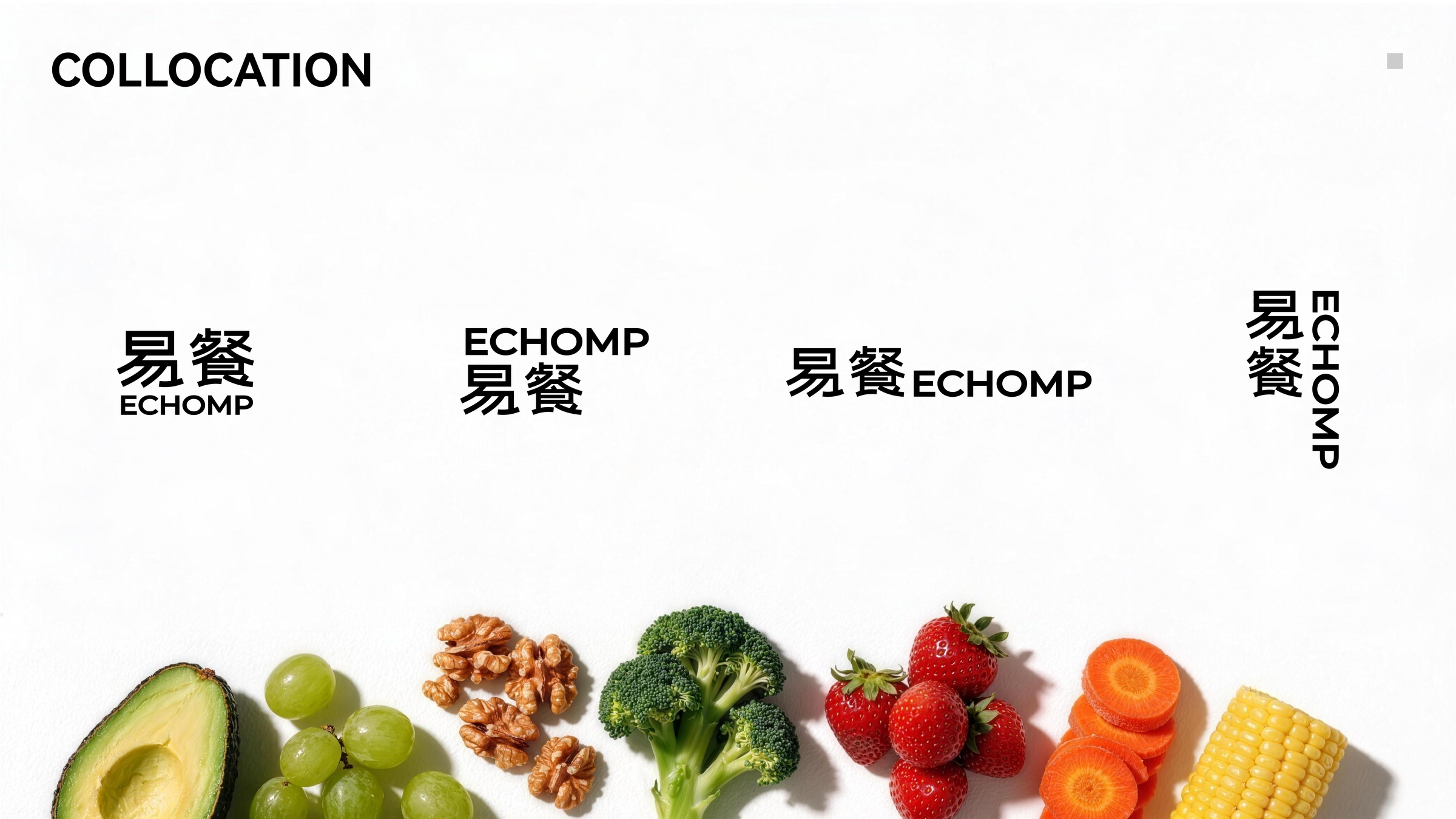
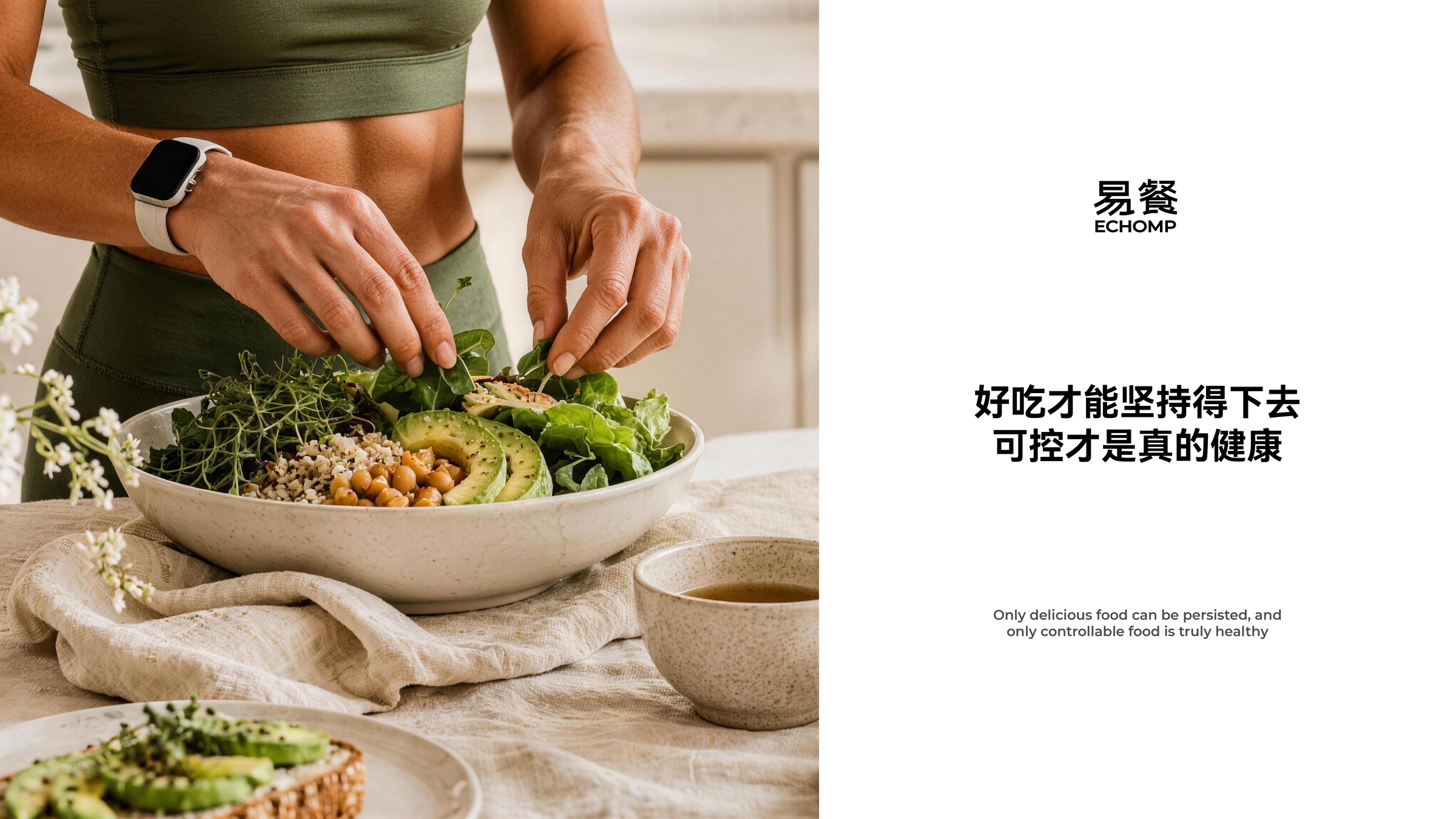
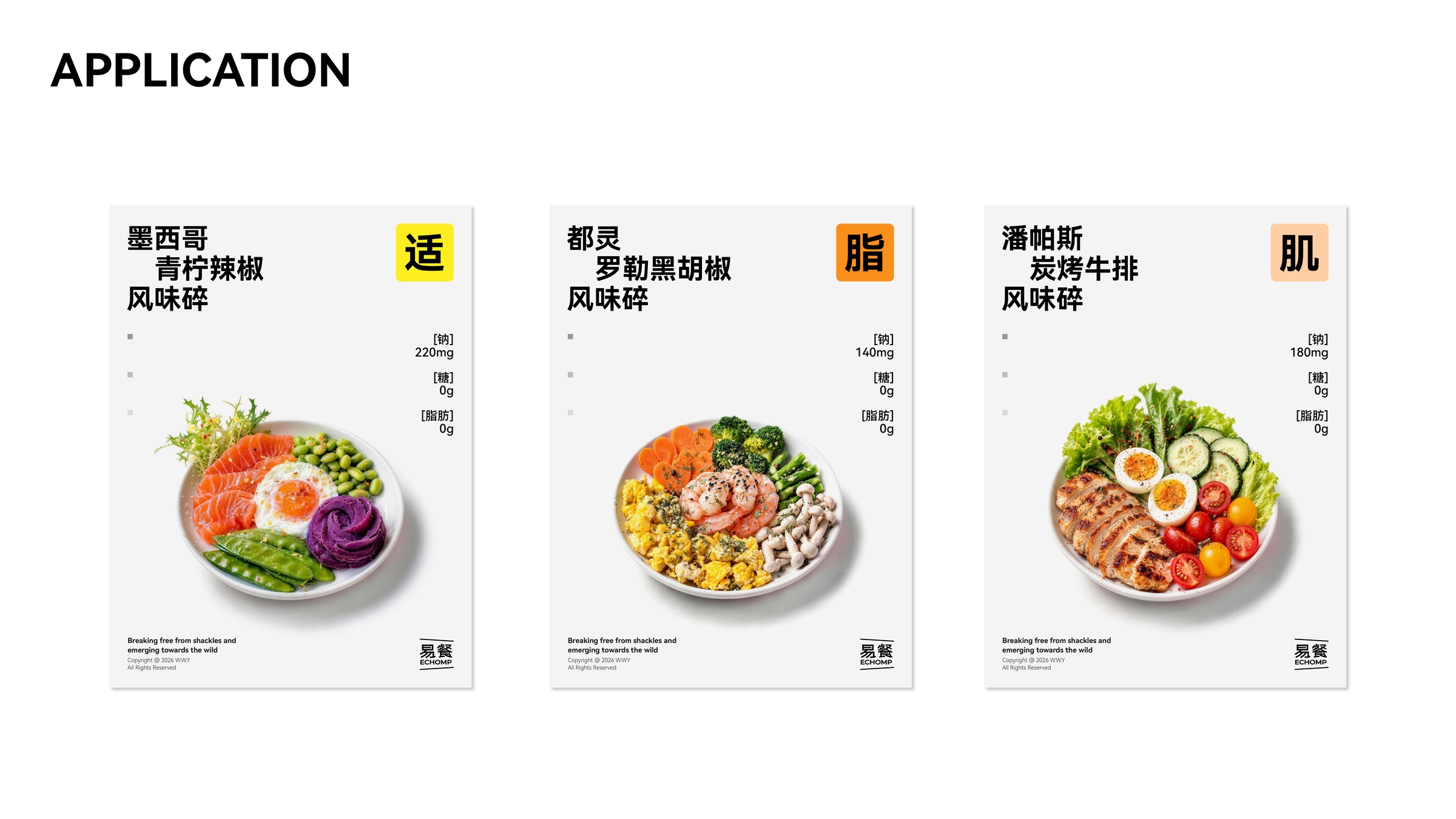
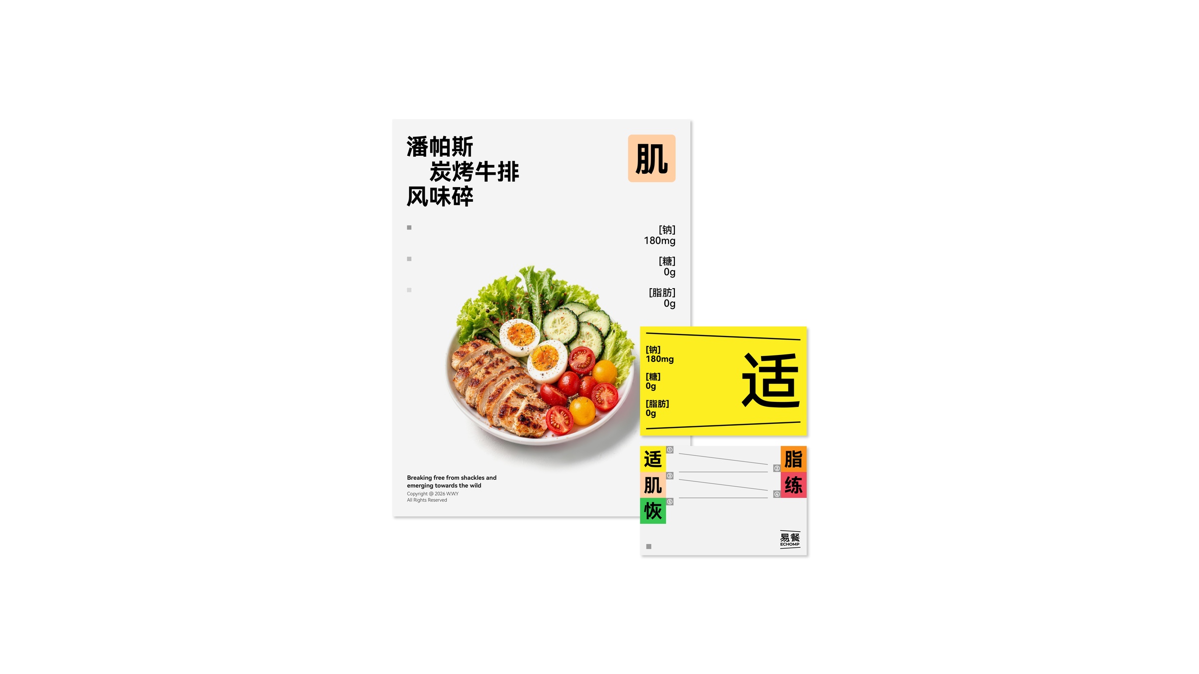
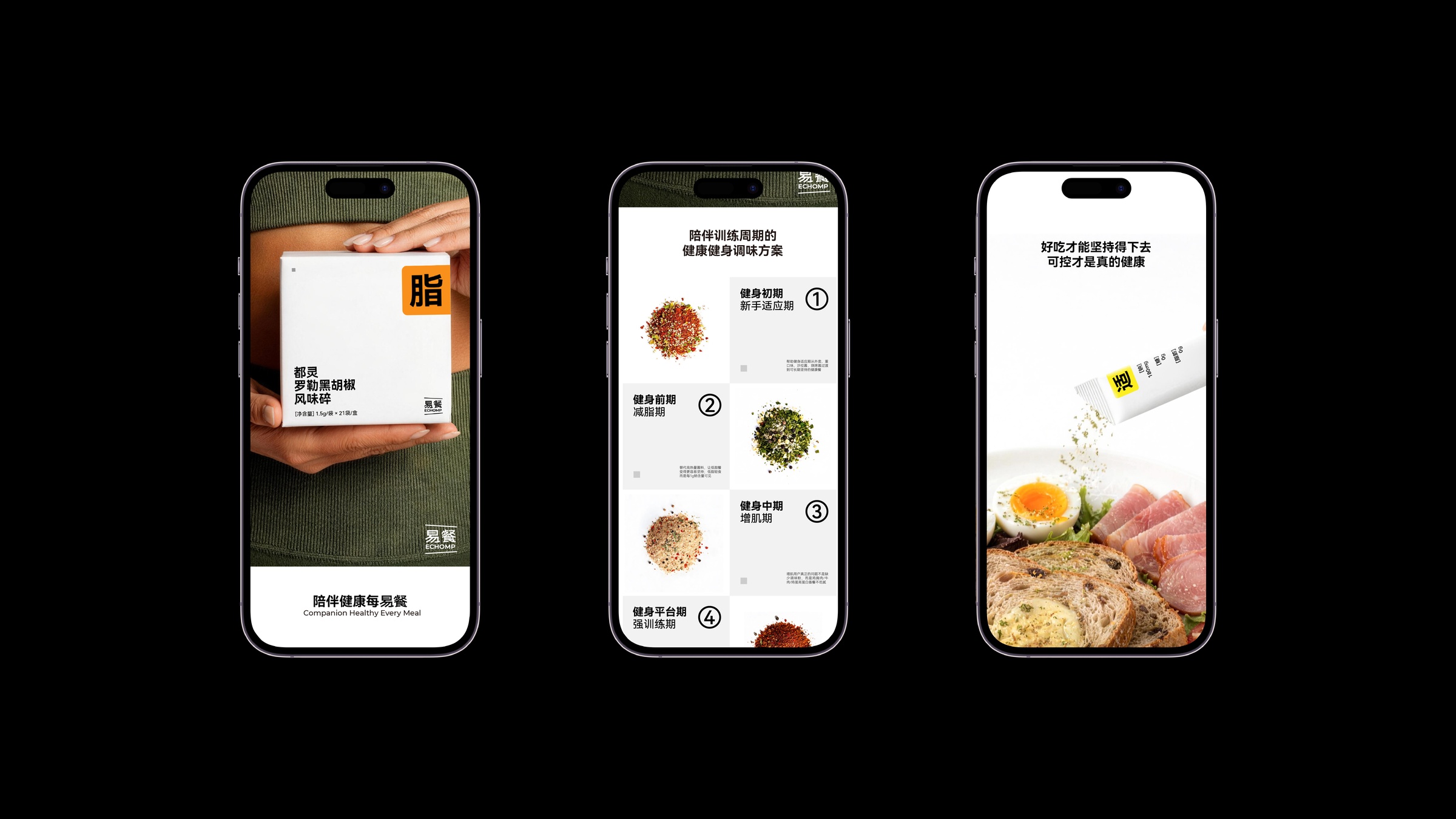
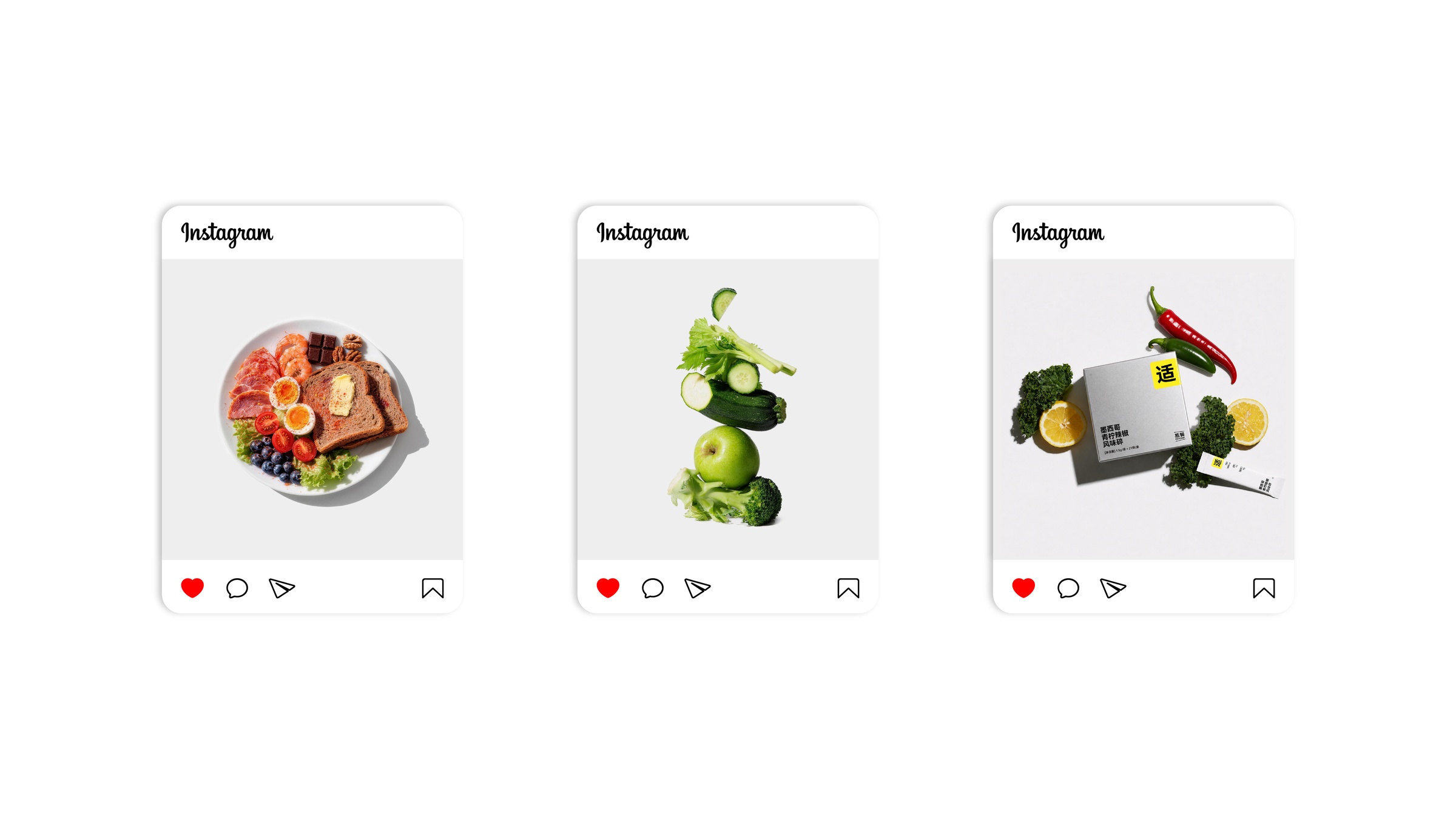
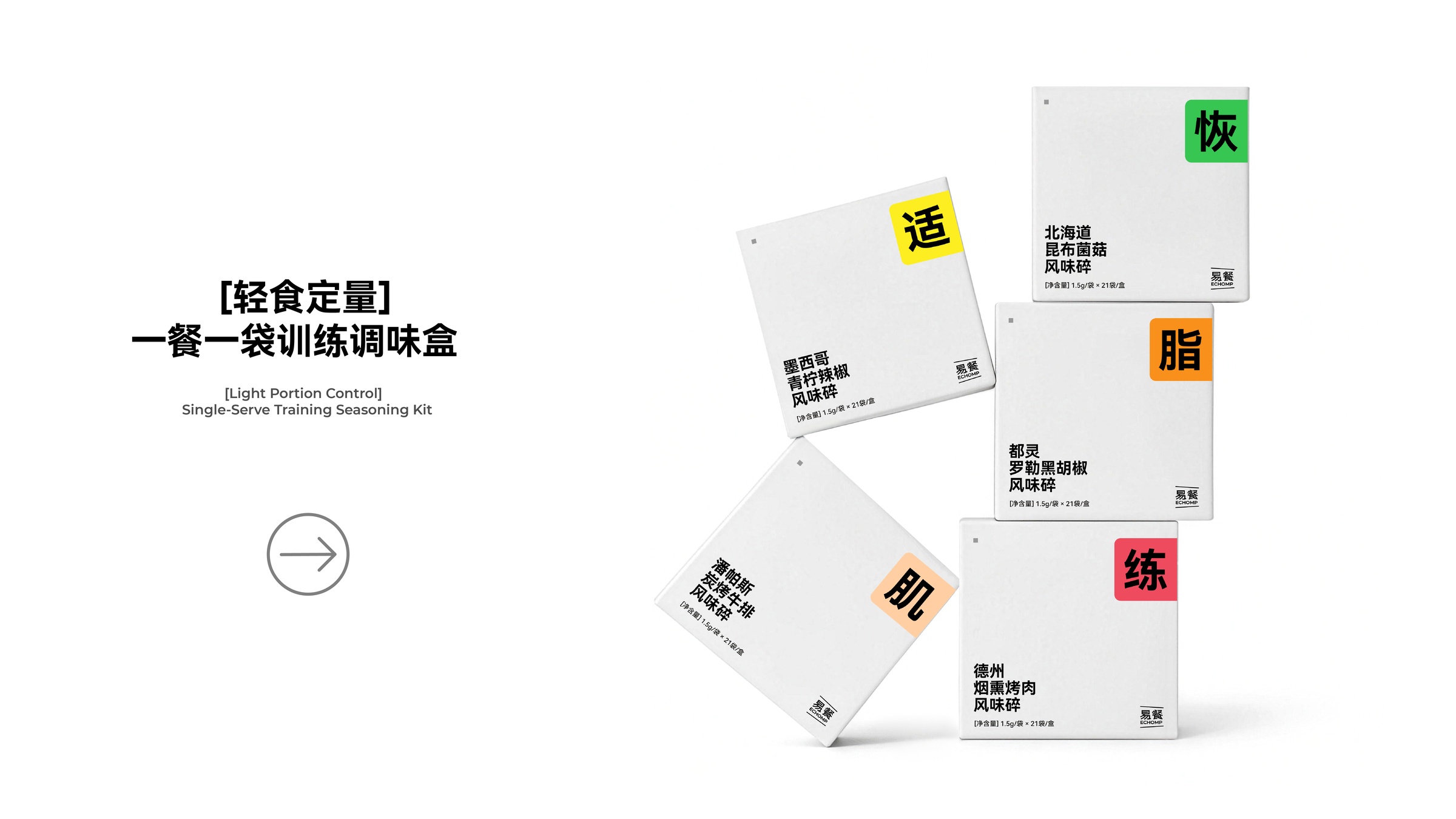
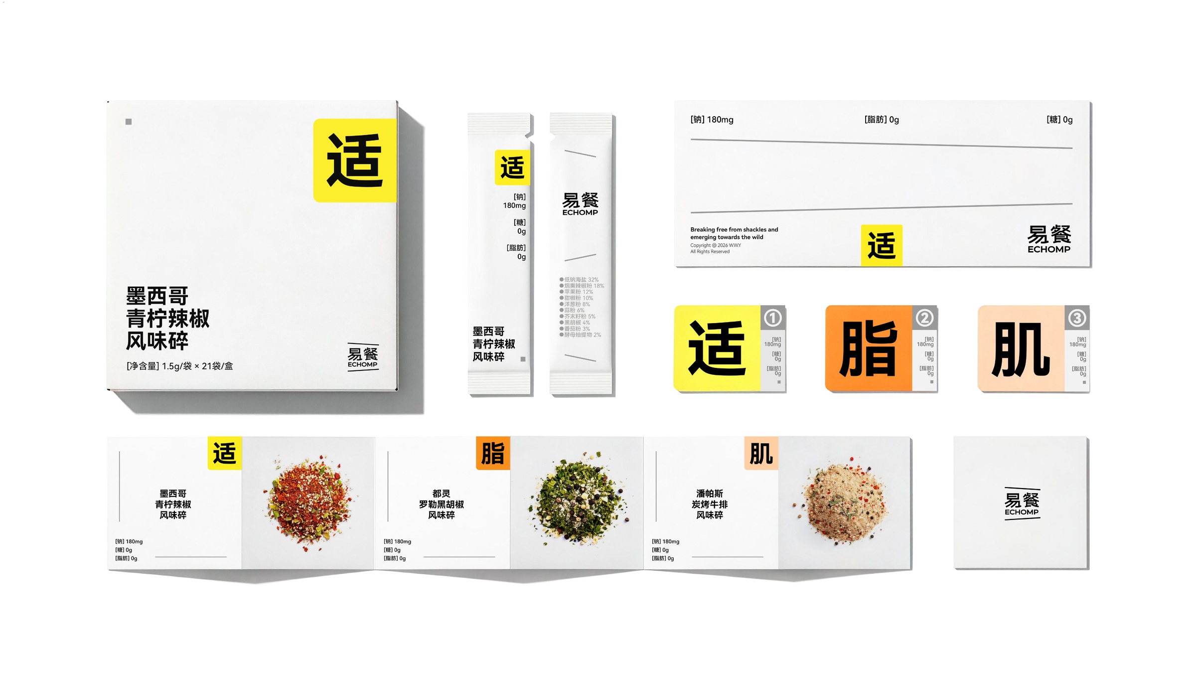
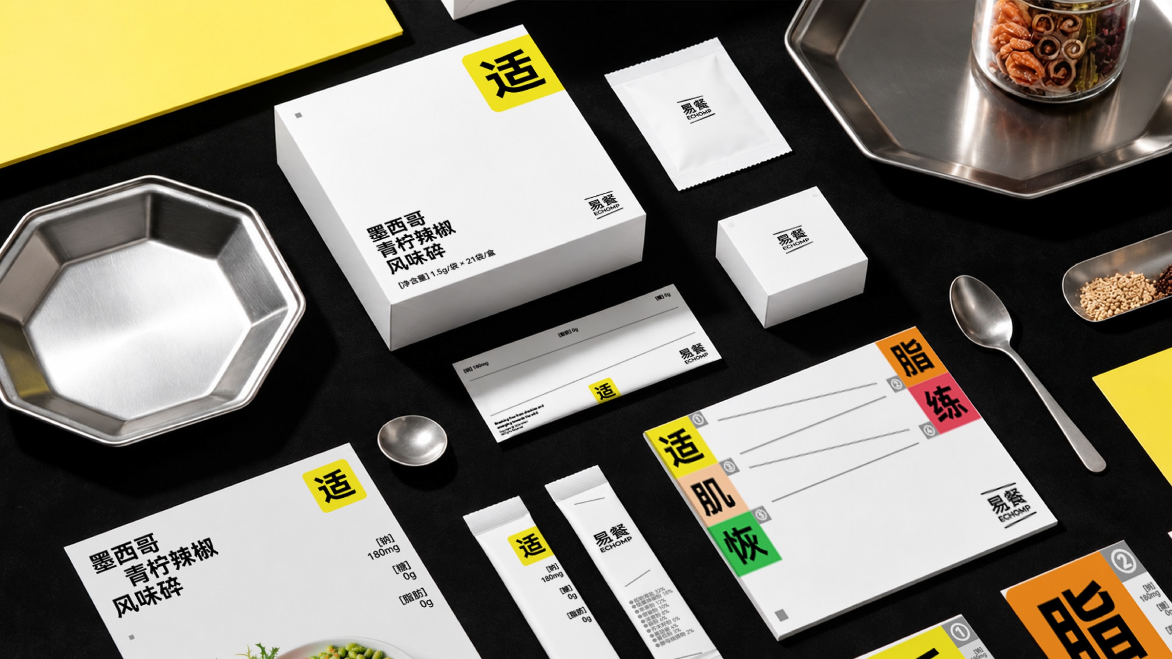
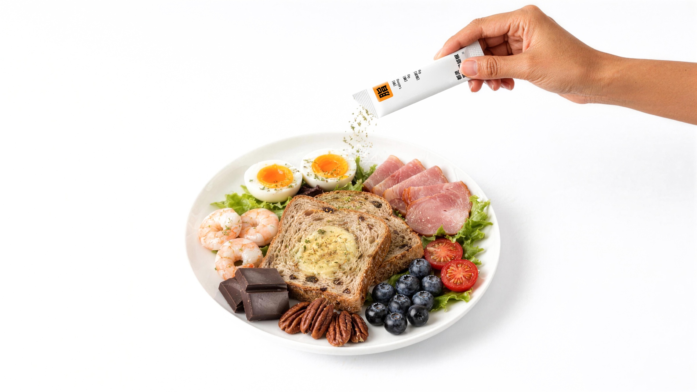
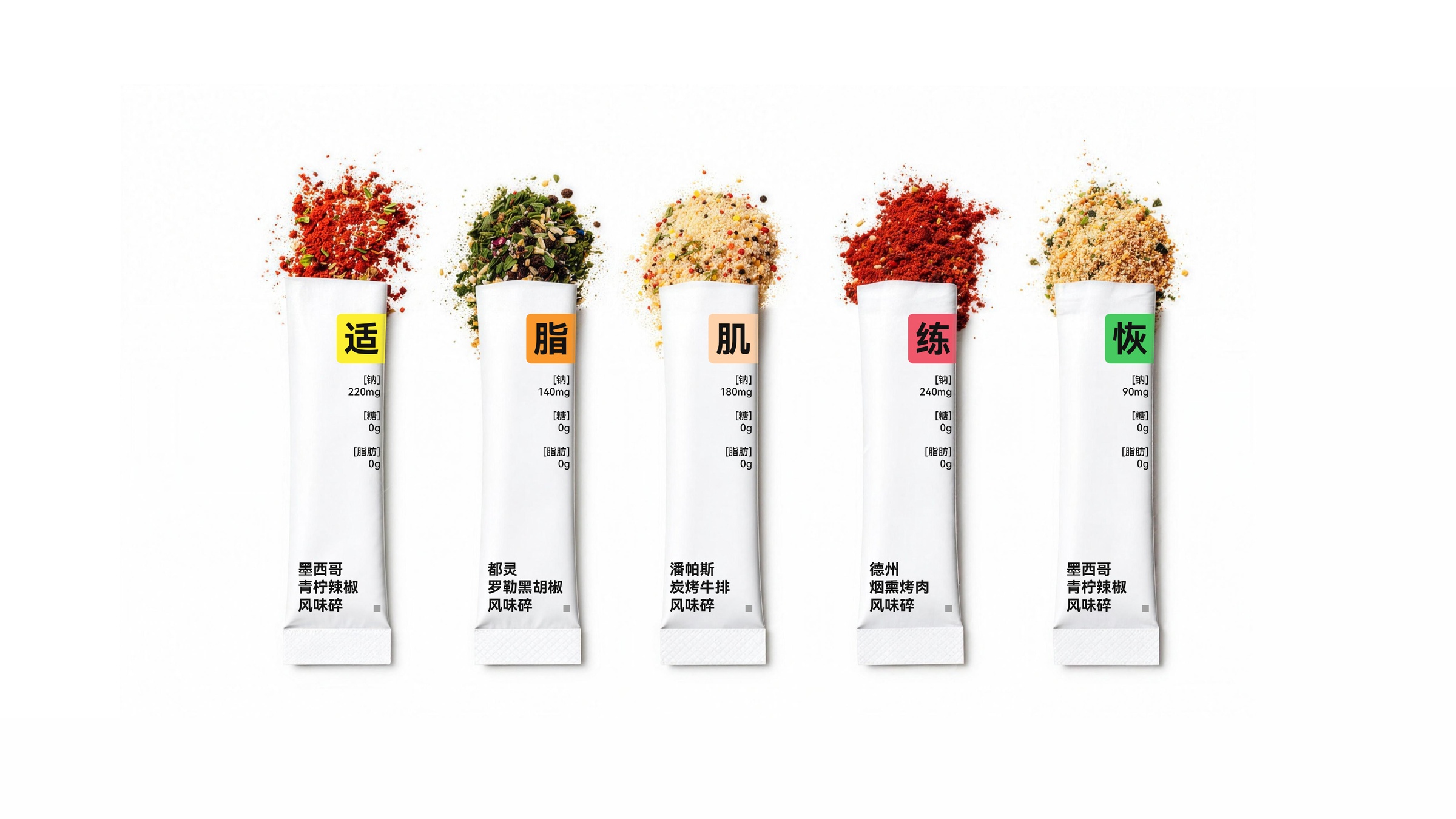
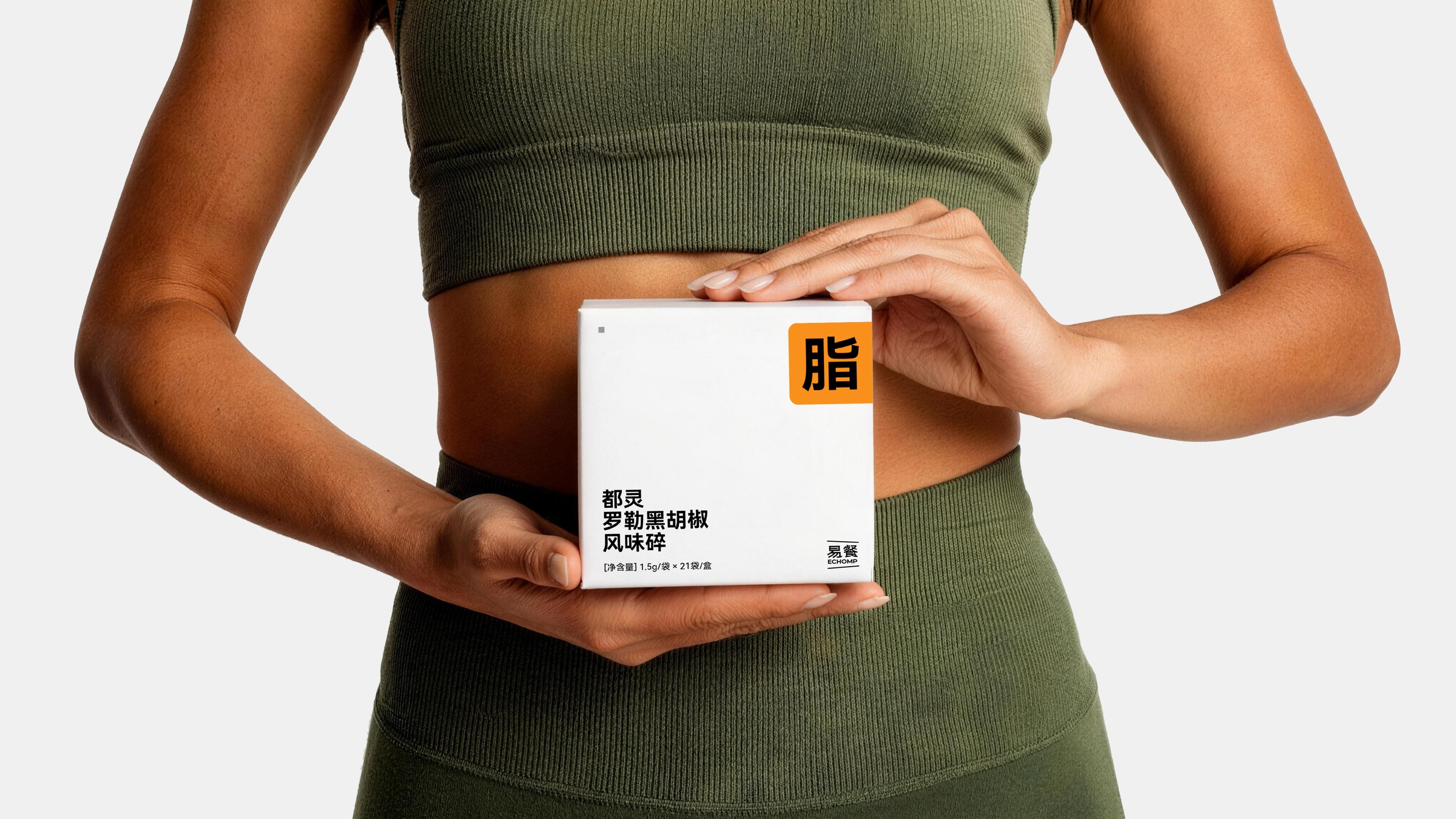
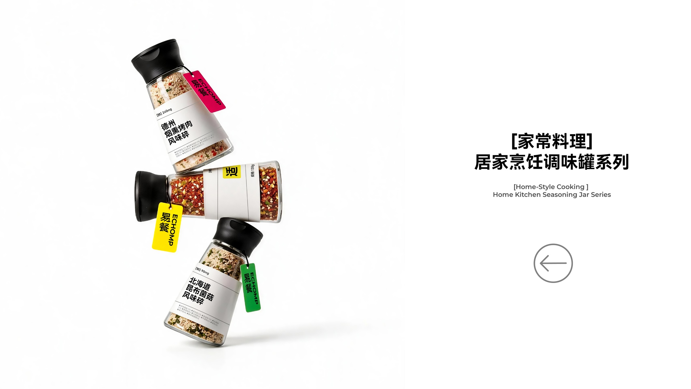
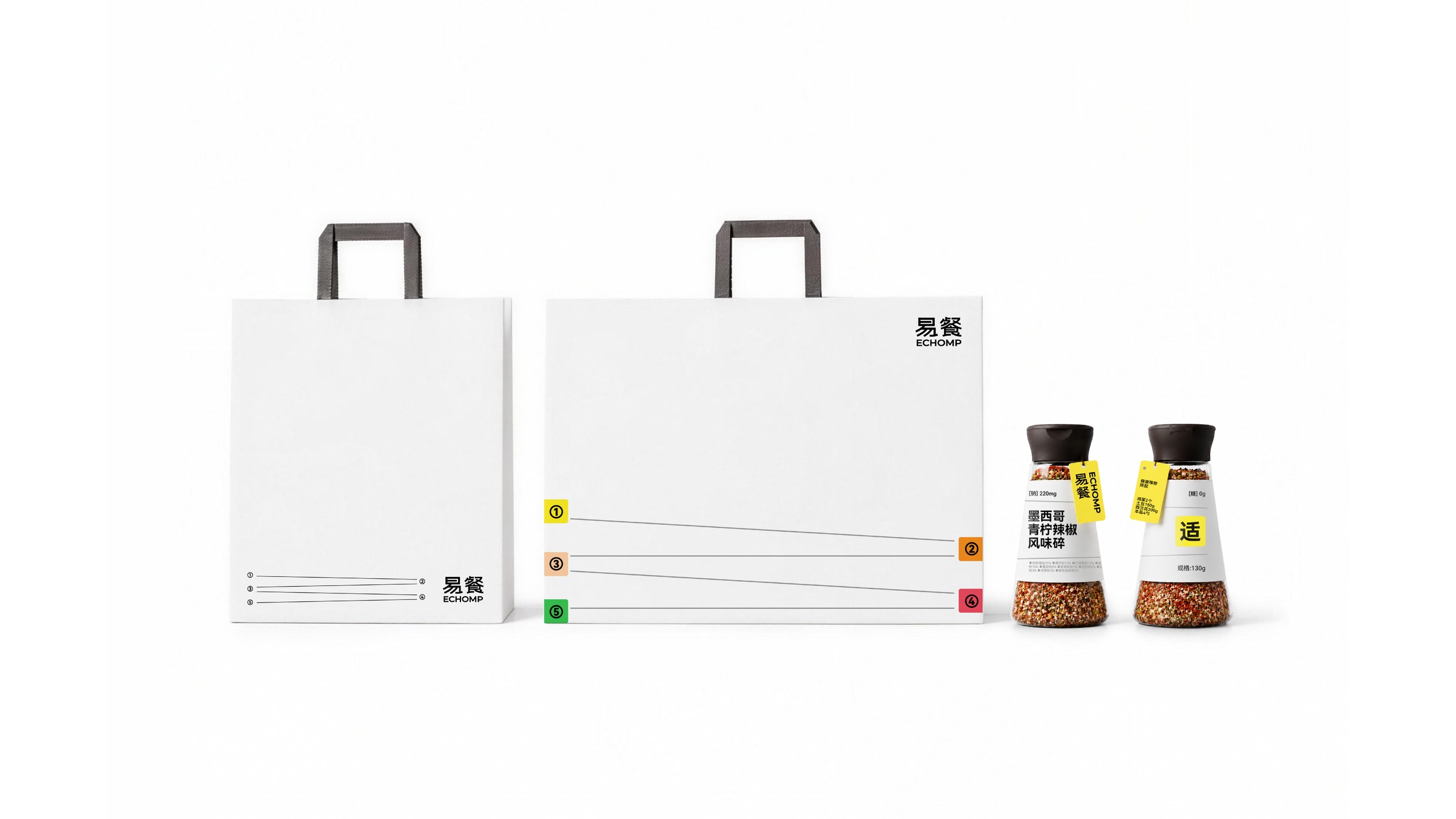
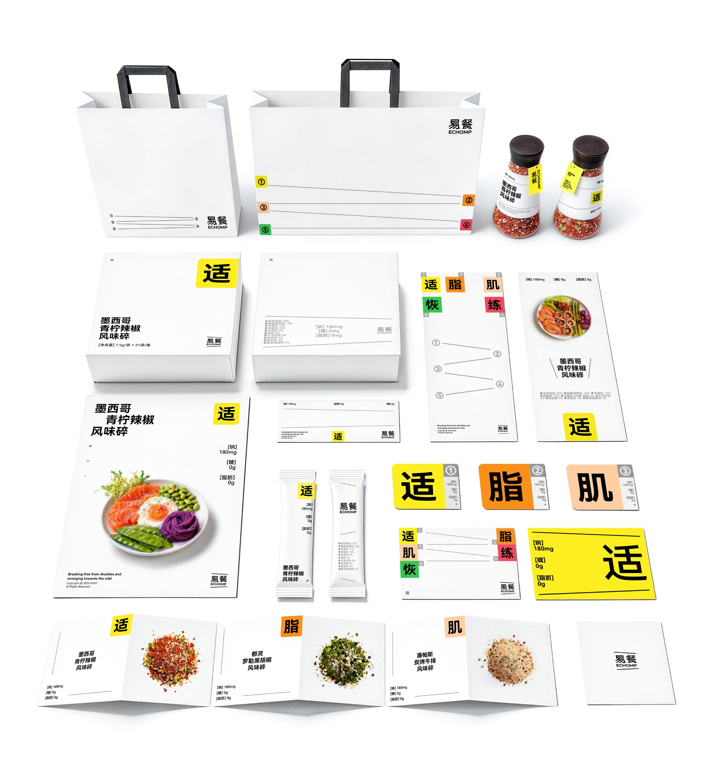
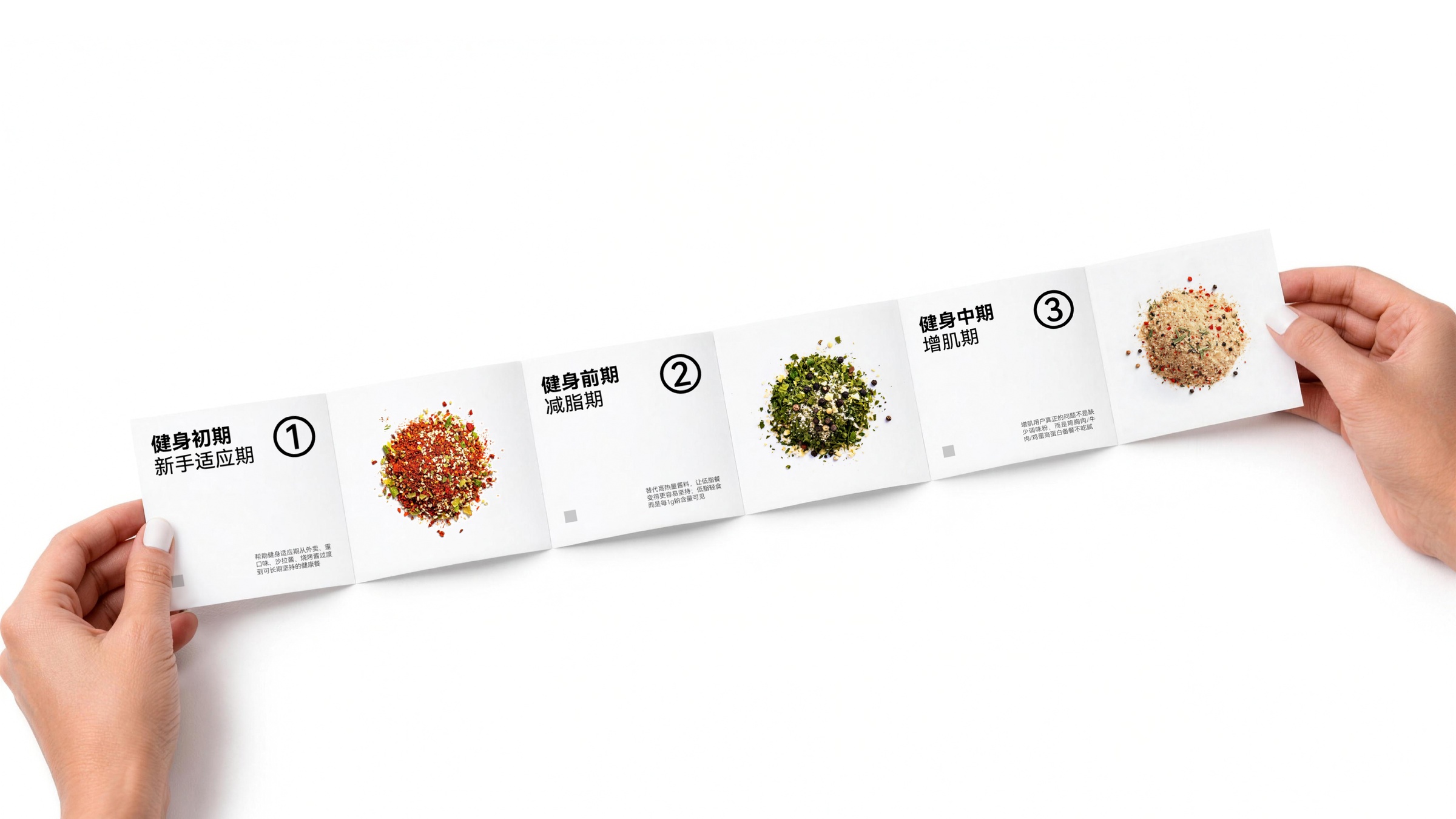
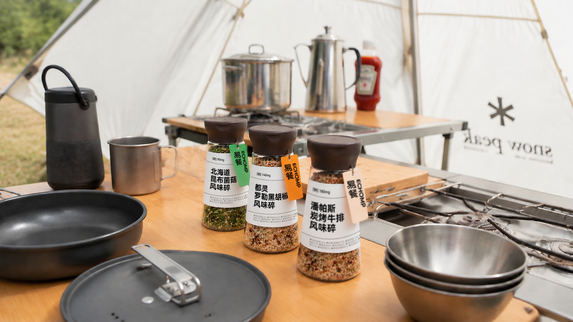
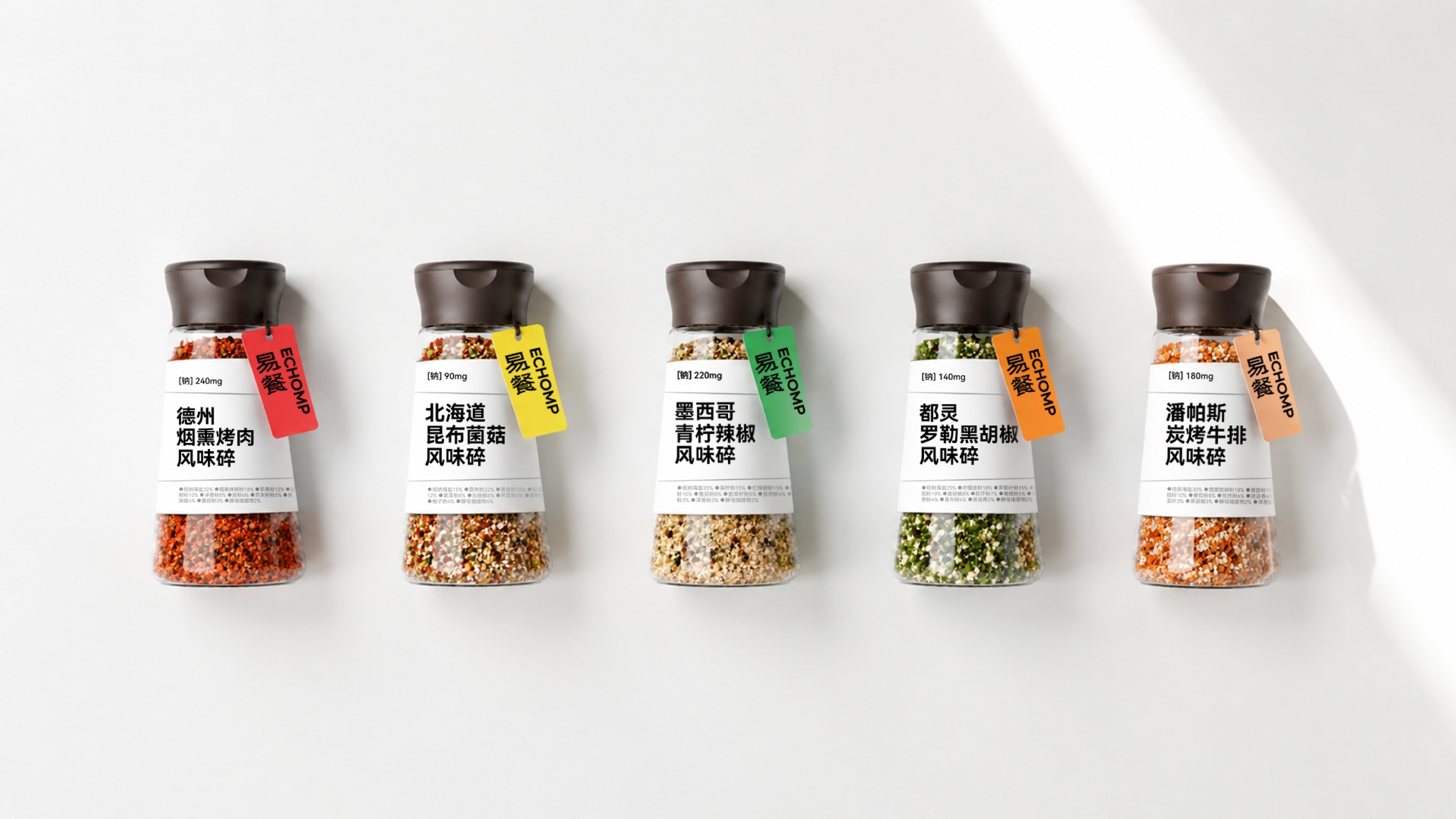
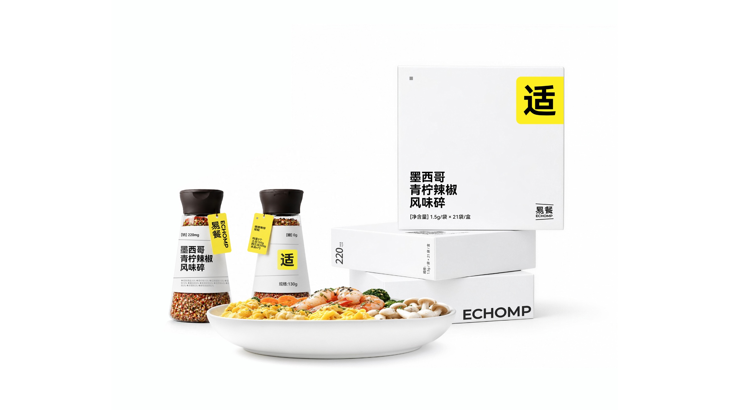
易餐(Echomp) 是一个专为健身训练人群打造的控钠风味调味品牌。品牌以“陪伴训练周期的健康健身调味方案”为精准定位,通过“一餐一袋”的独立分装形态,按健身阶段提供差异化调味产品,让健康饮食不再靠忍,而是变得好吃、可控、能坚持。
Echomp is a sodium-controlled flavor seasoning brand tailored for fitness training enthusiasts. The brand precisely positions itself as a “healthy fitness seasoning solution that accompanies the training cycle”. Through its “one meal, one packet” independent packaging format, it provides differentiated seasoning products according to different fitness stages, making healthy eating no longer a matter of endurance, but rather delicious, controllable, and sustainable.

乐 LE CAFE&BAKERY
Brief
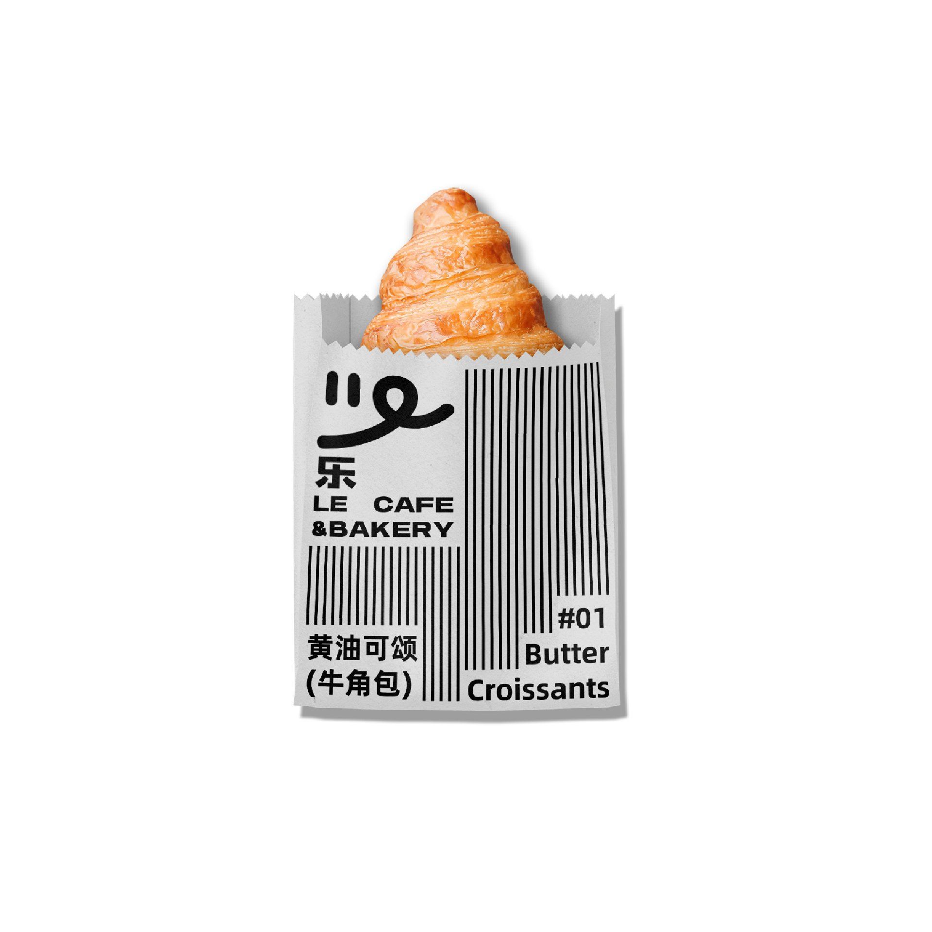
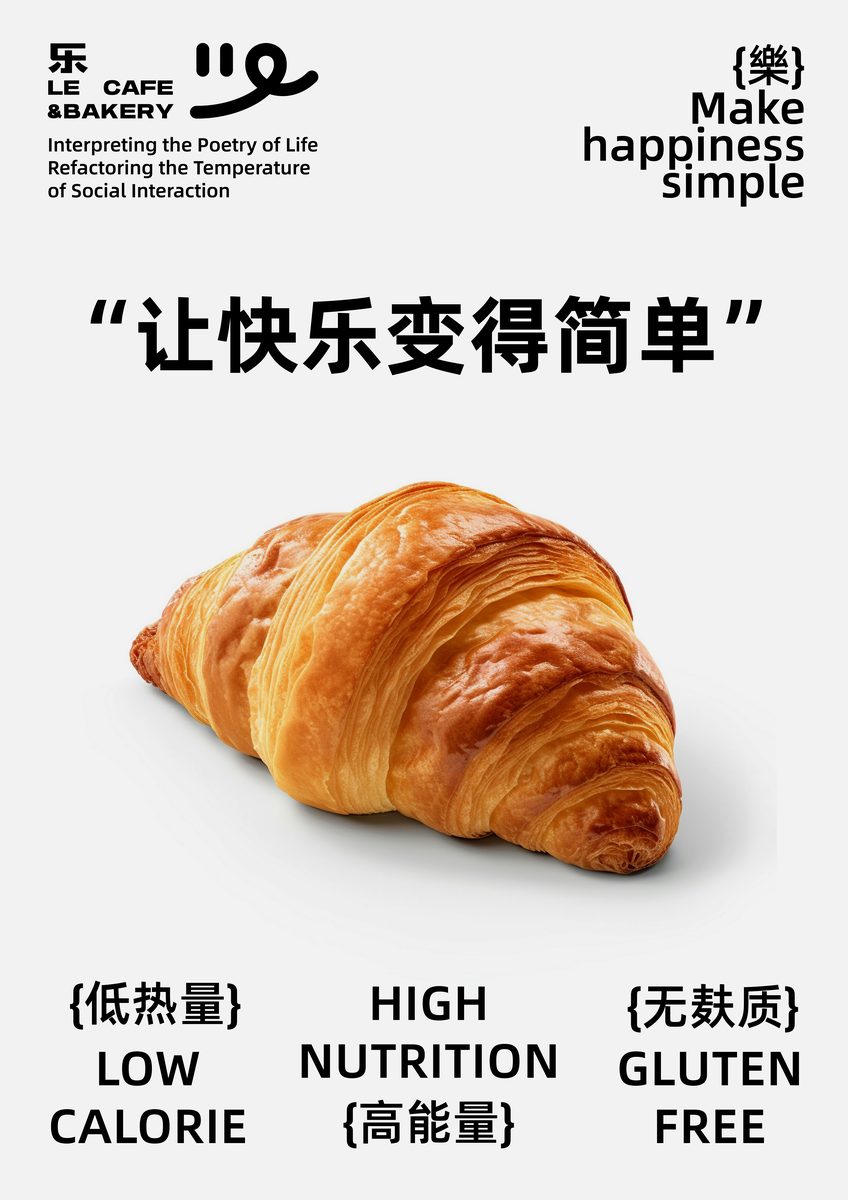
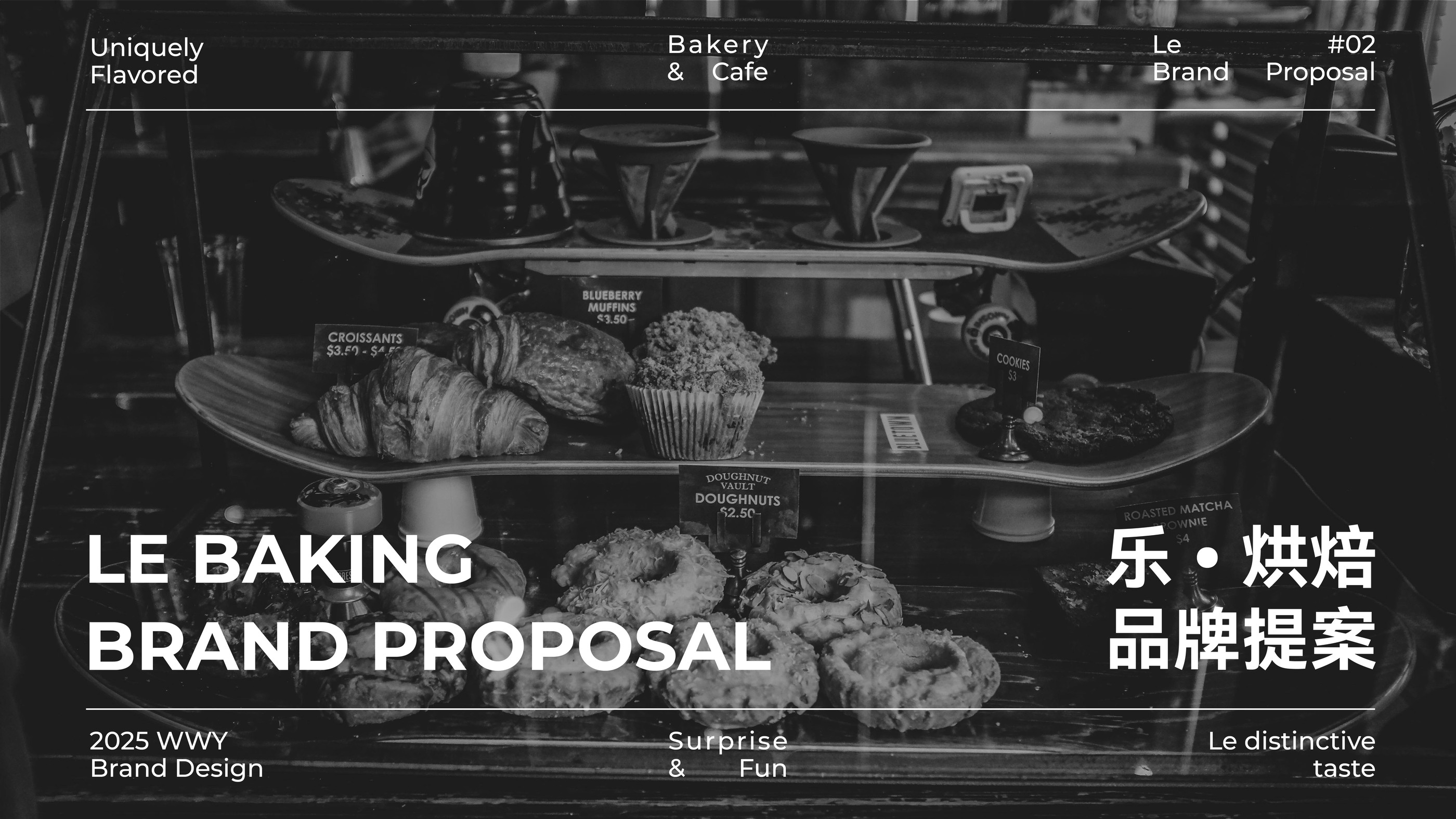
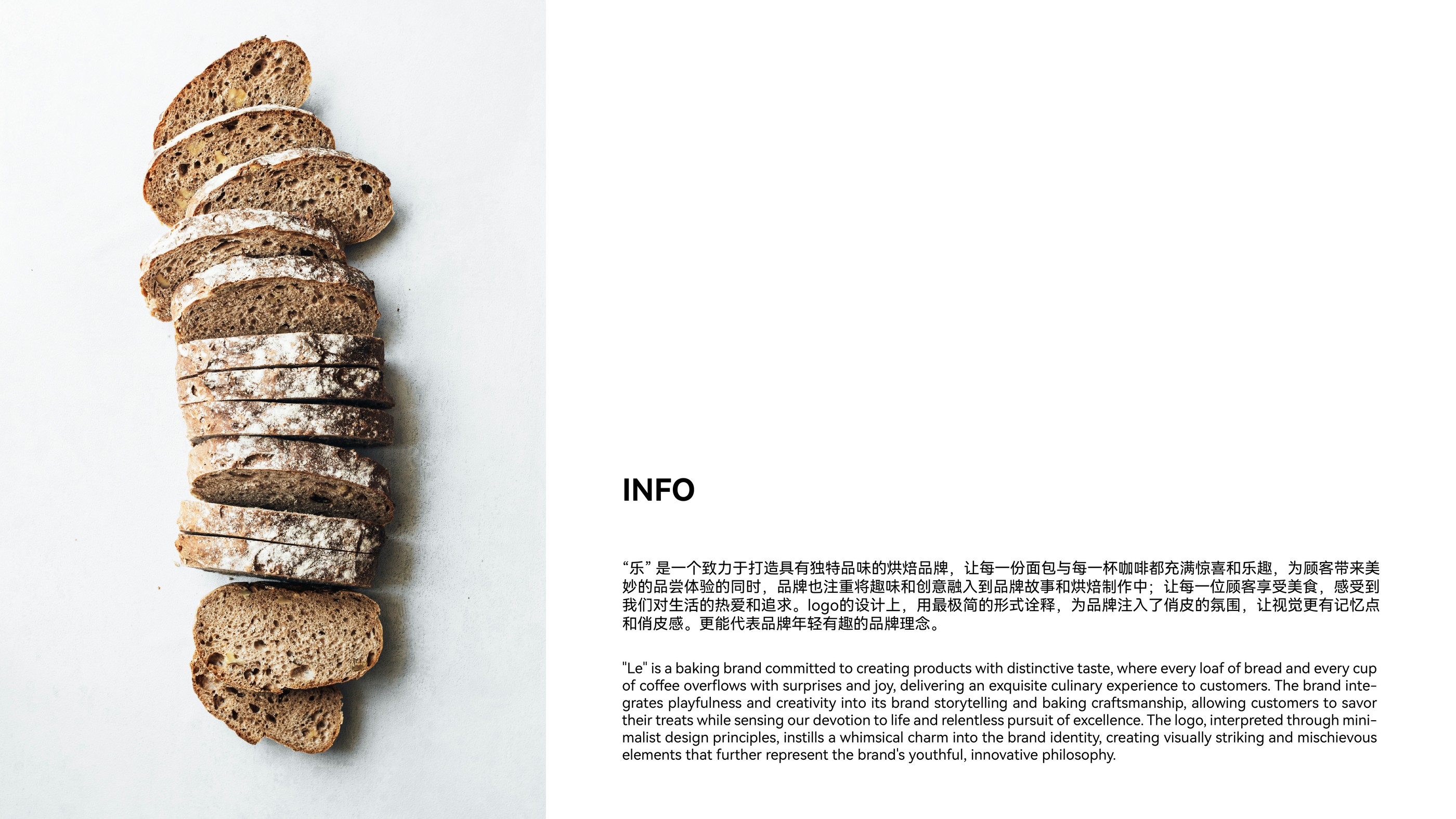
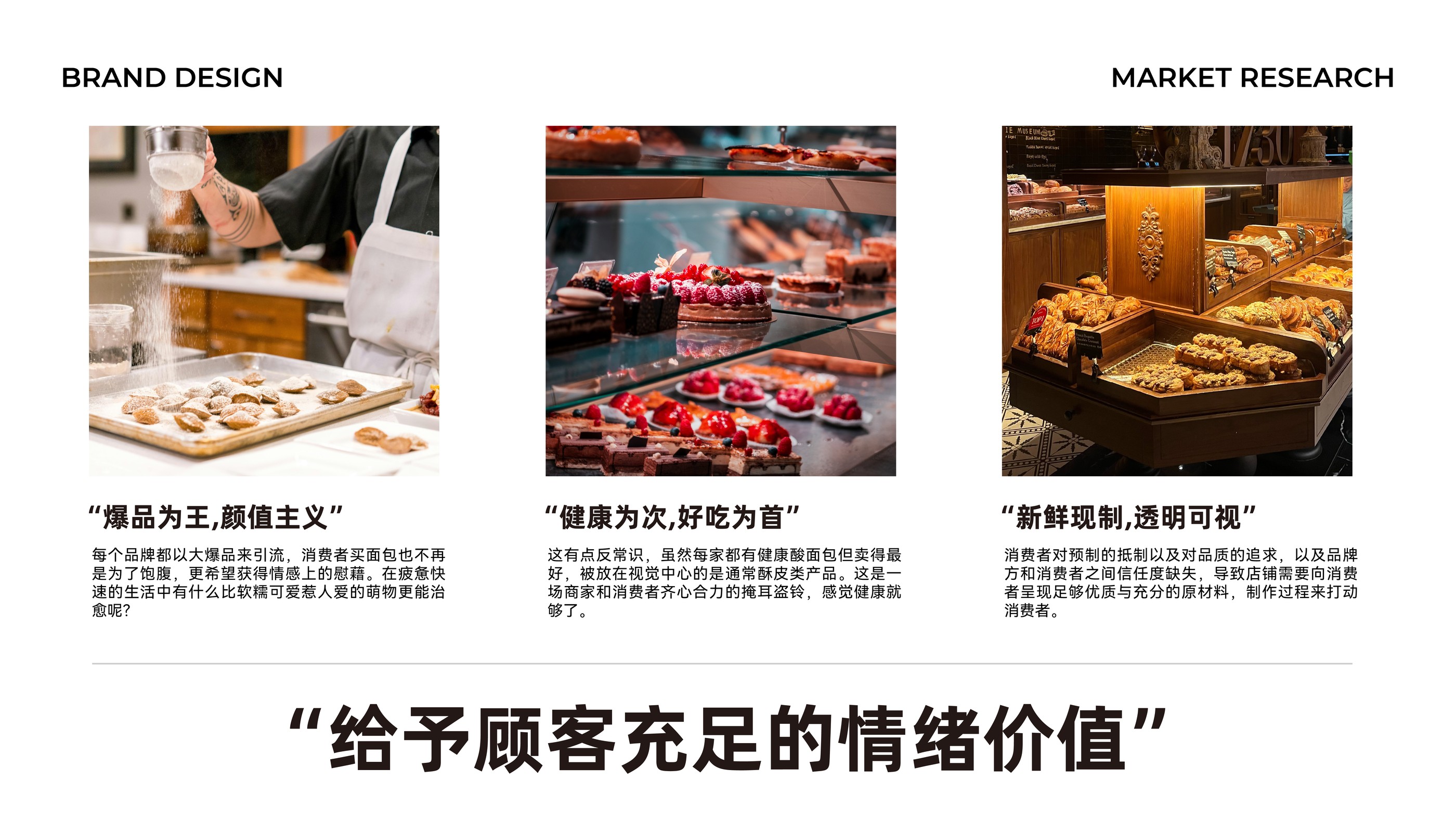
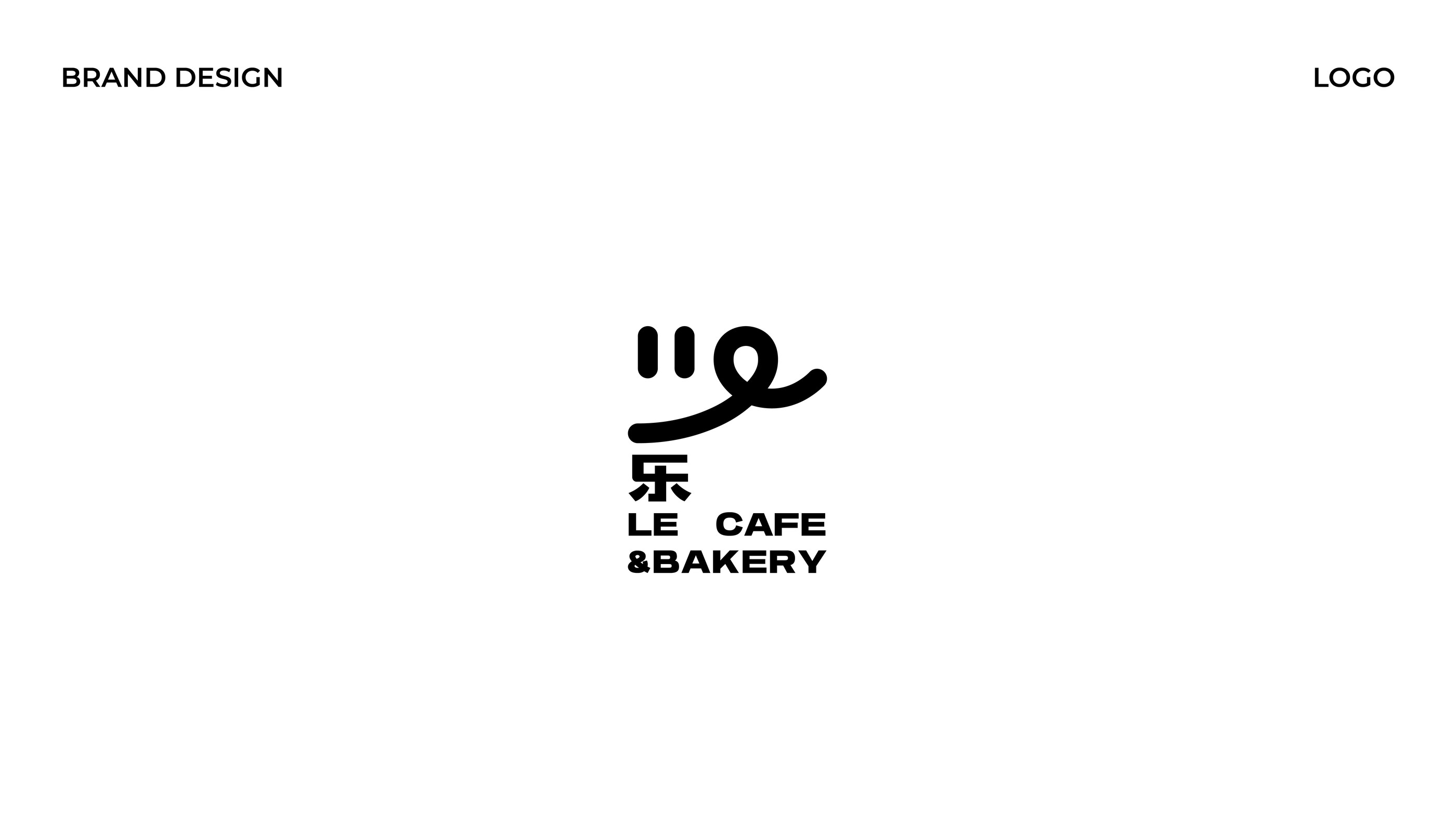
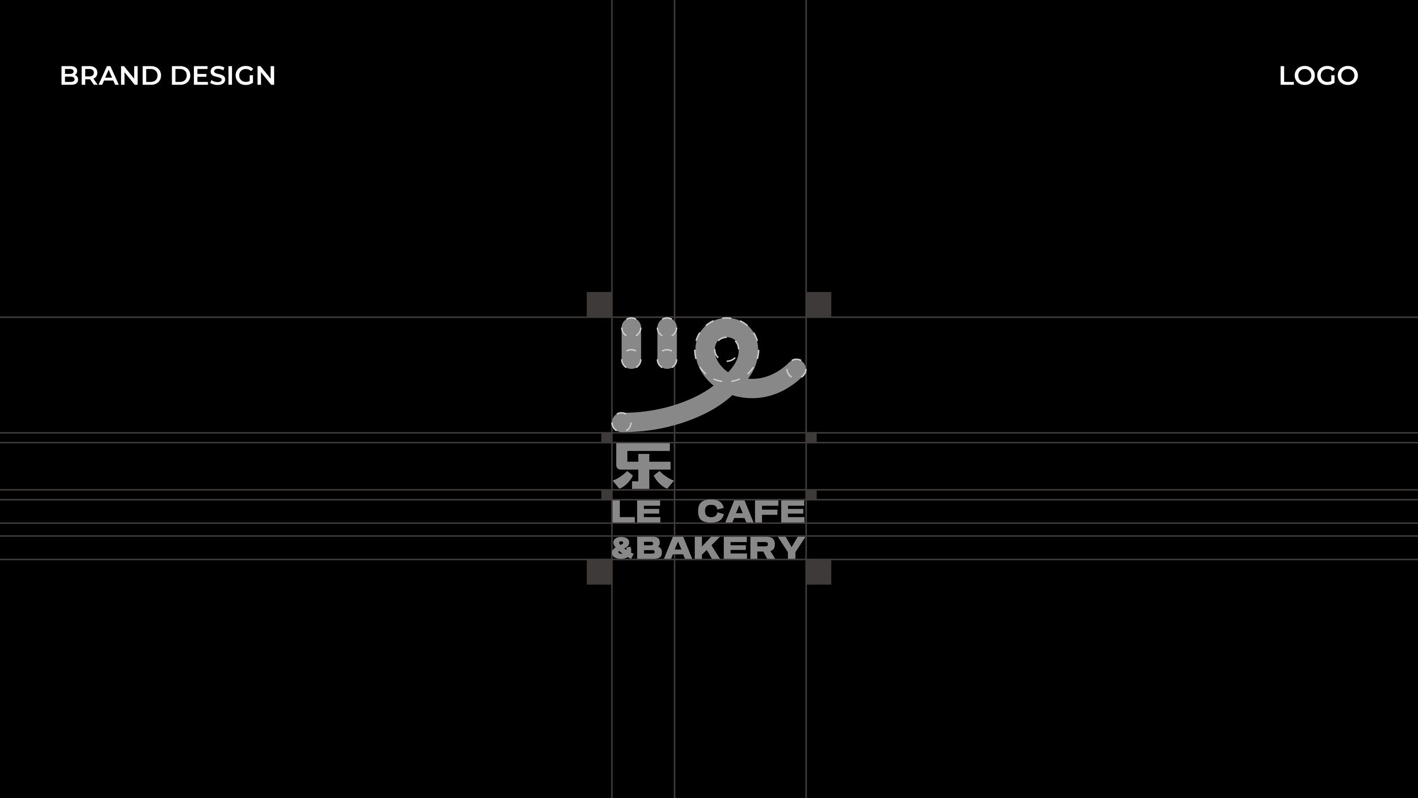
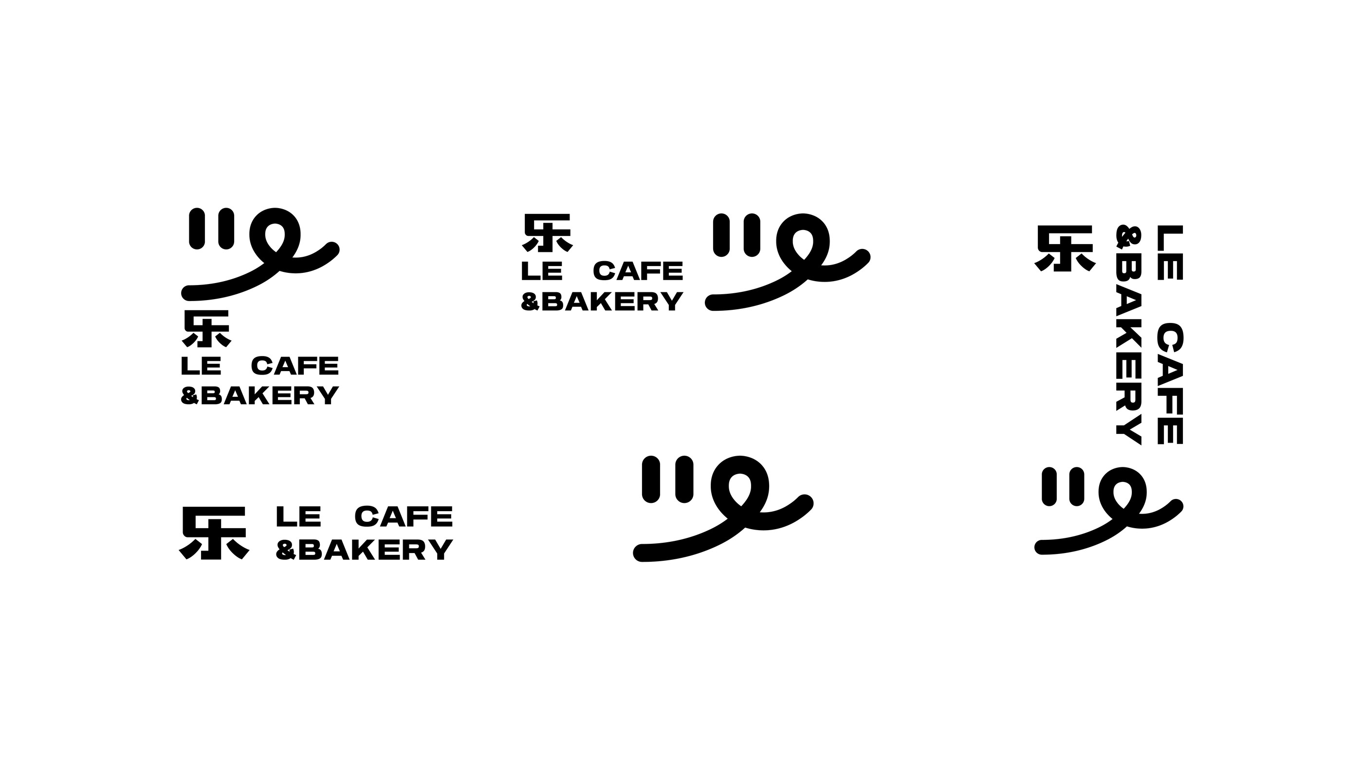
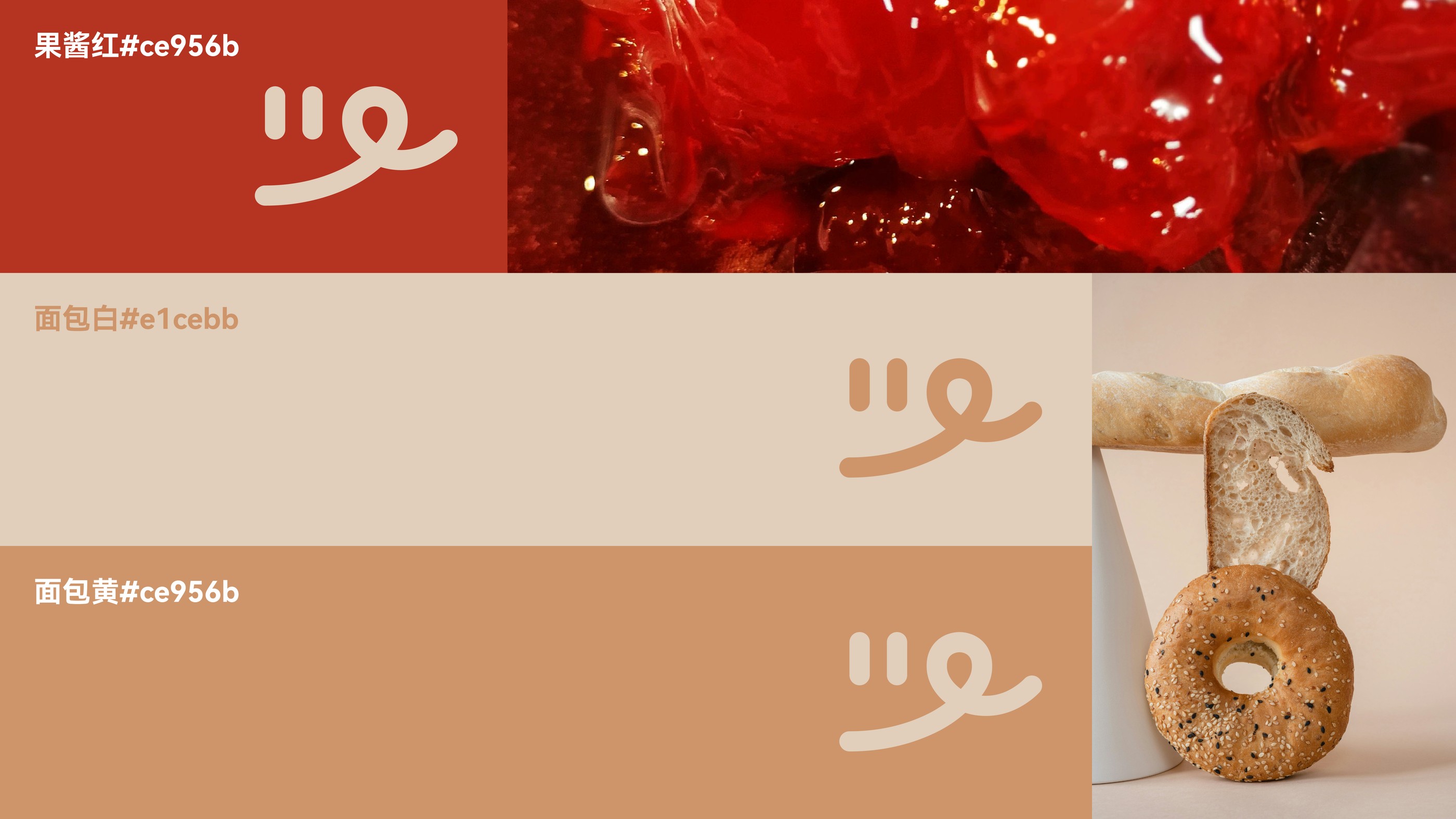
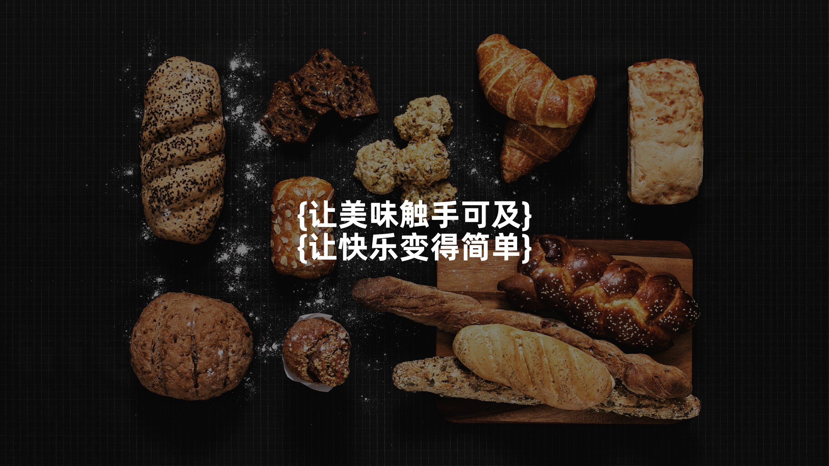
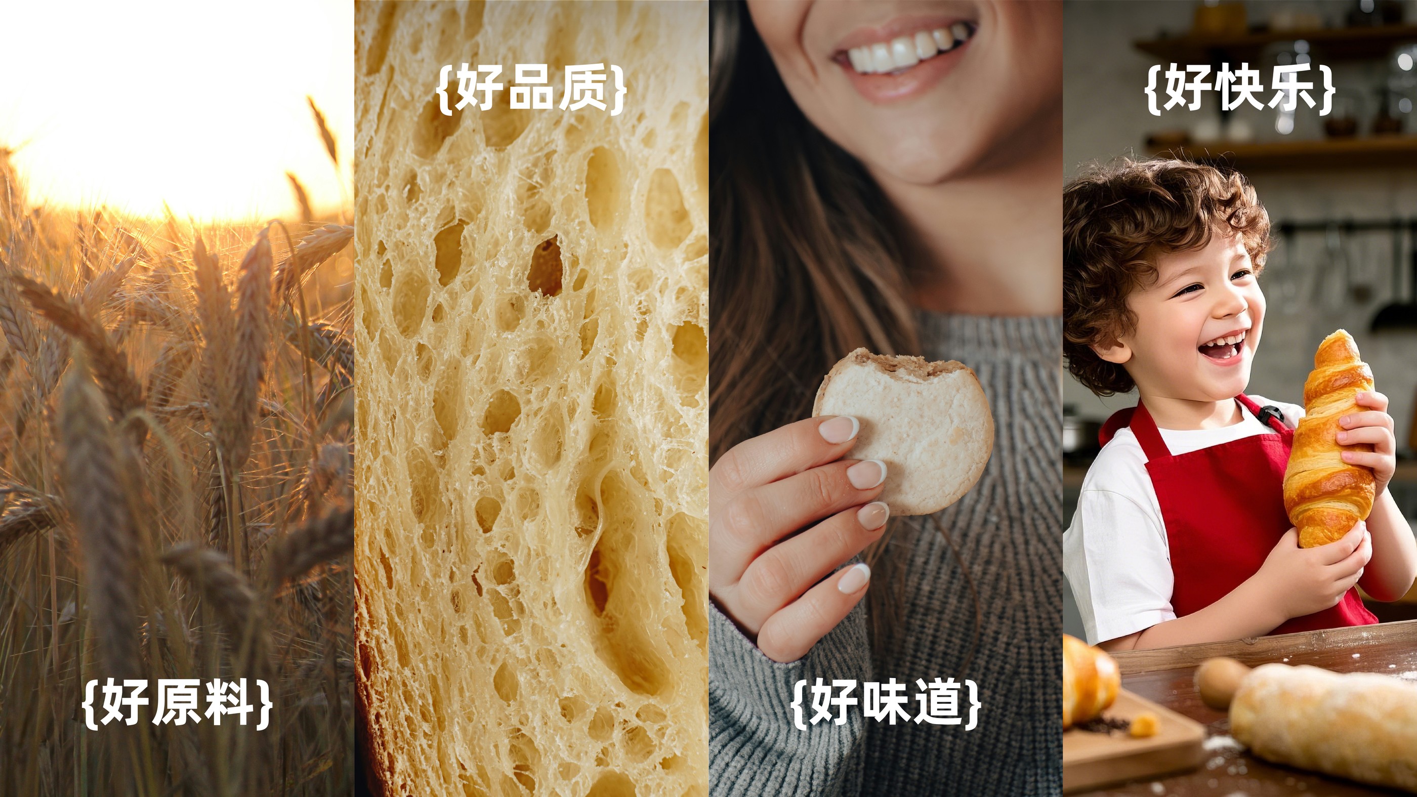
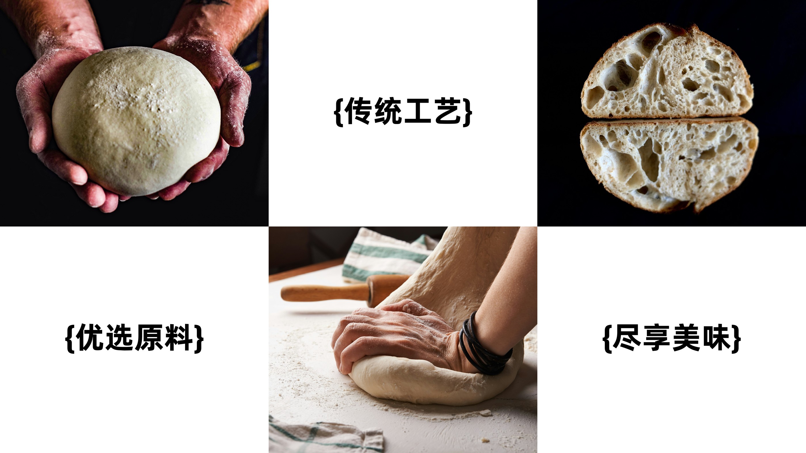
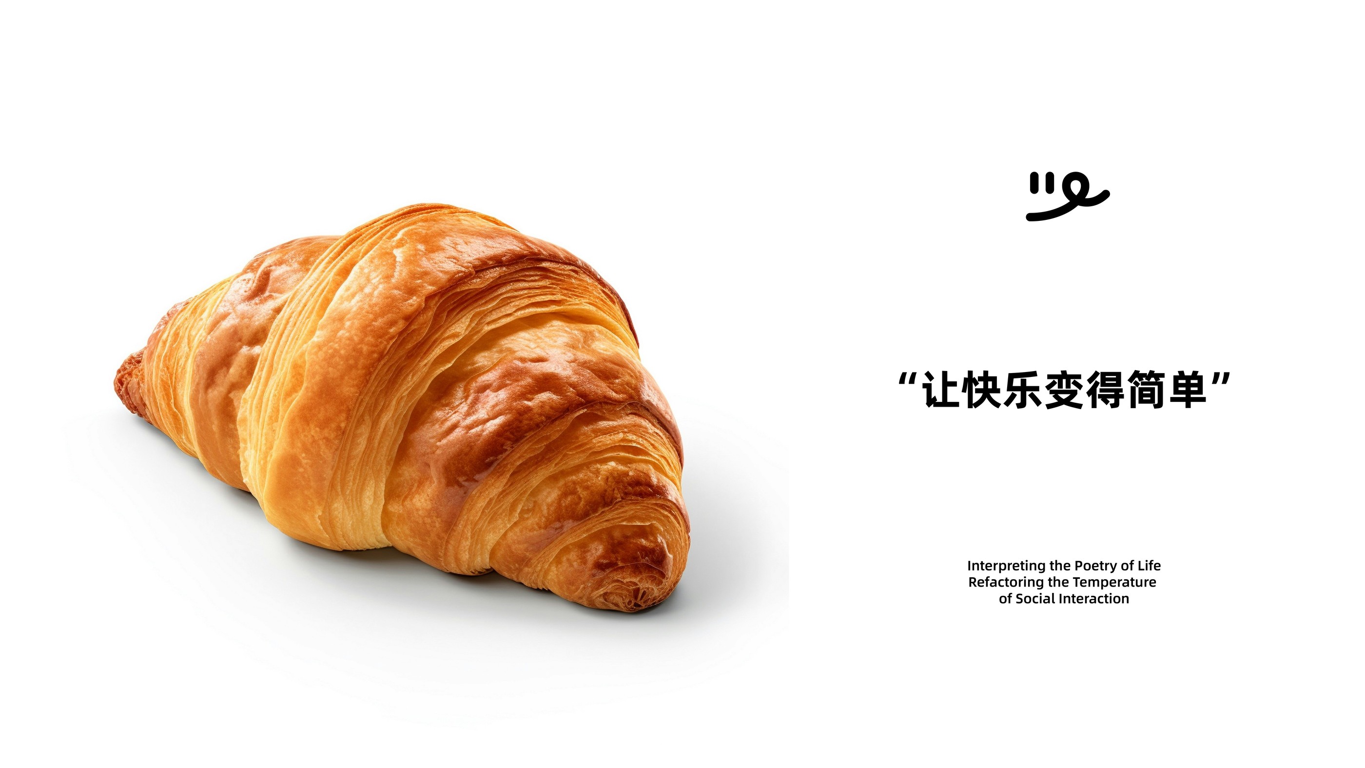
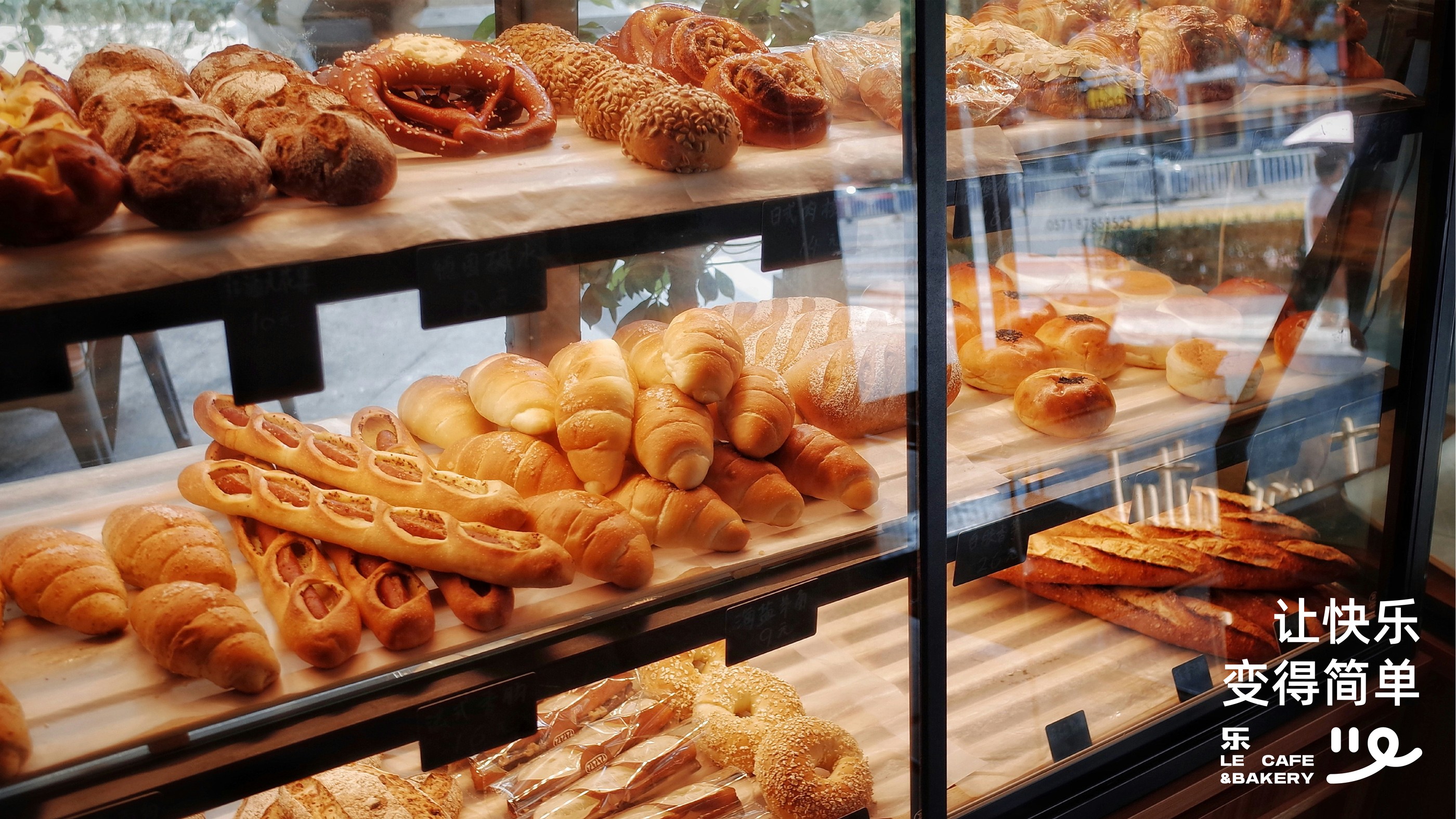
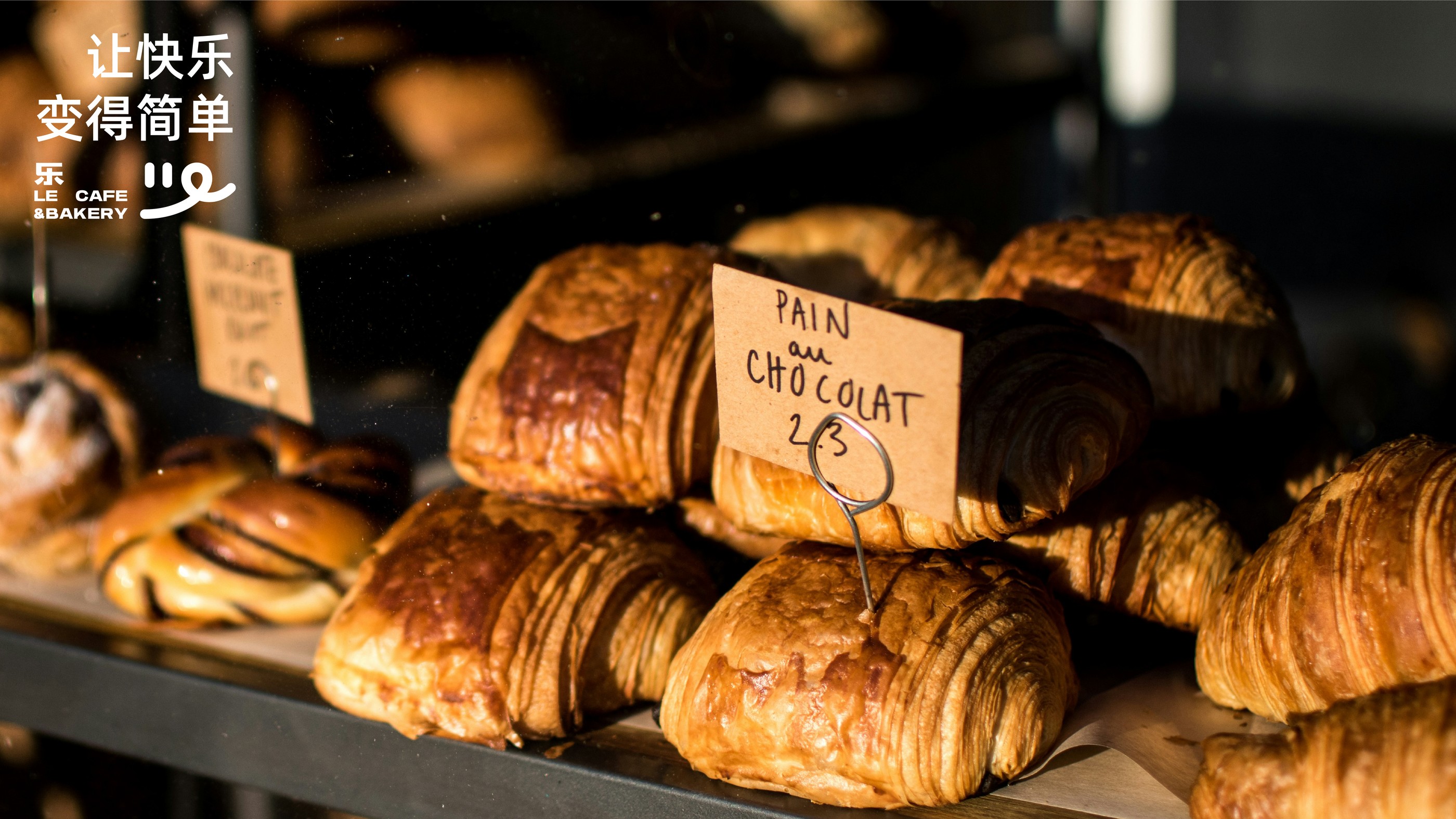
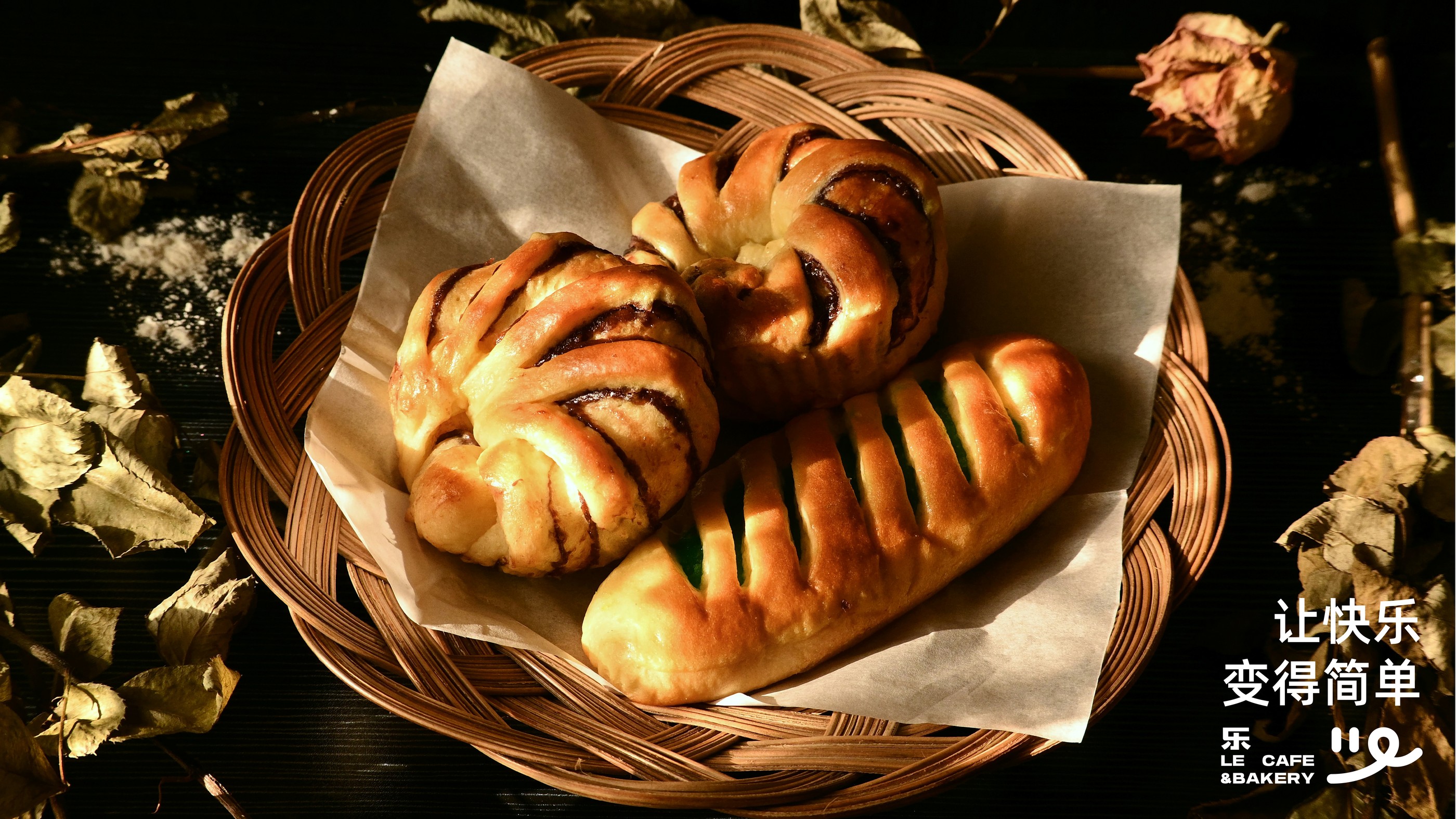
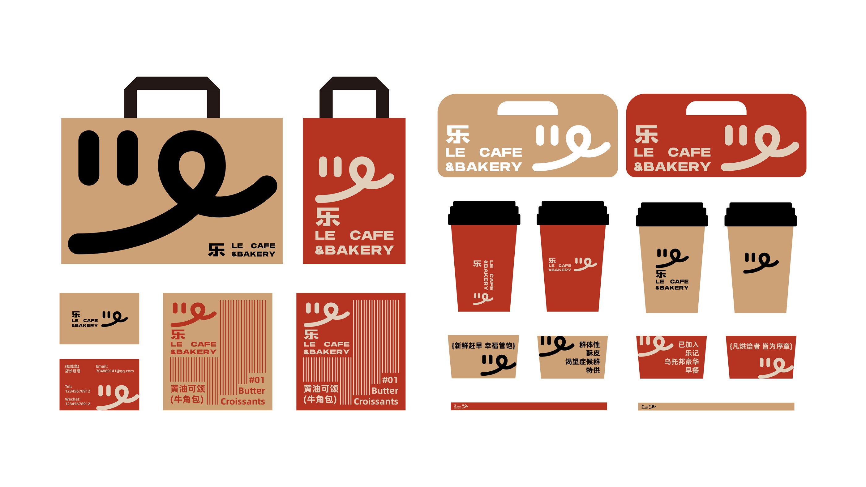
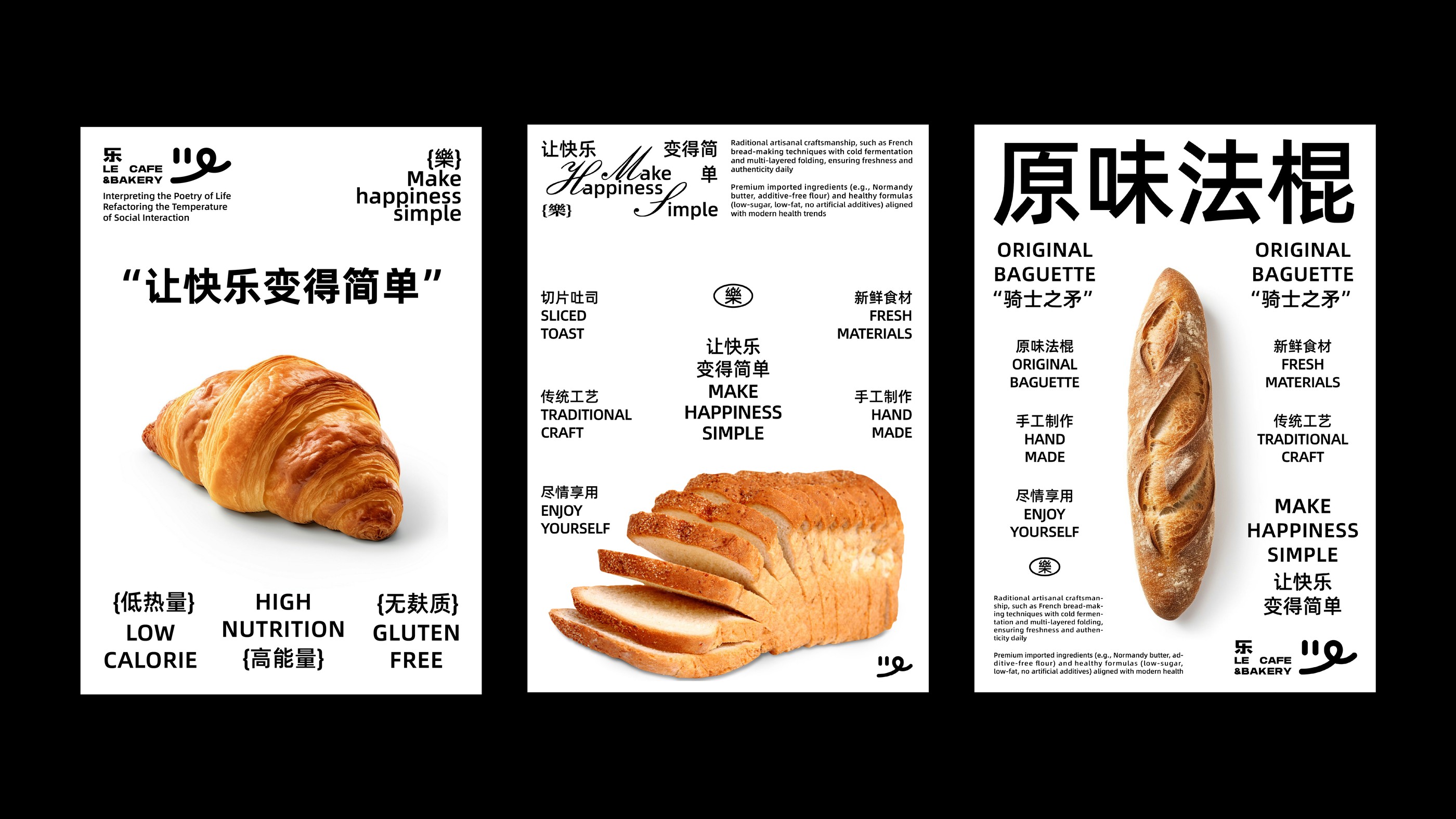
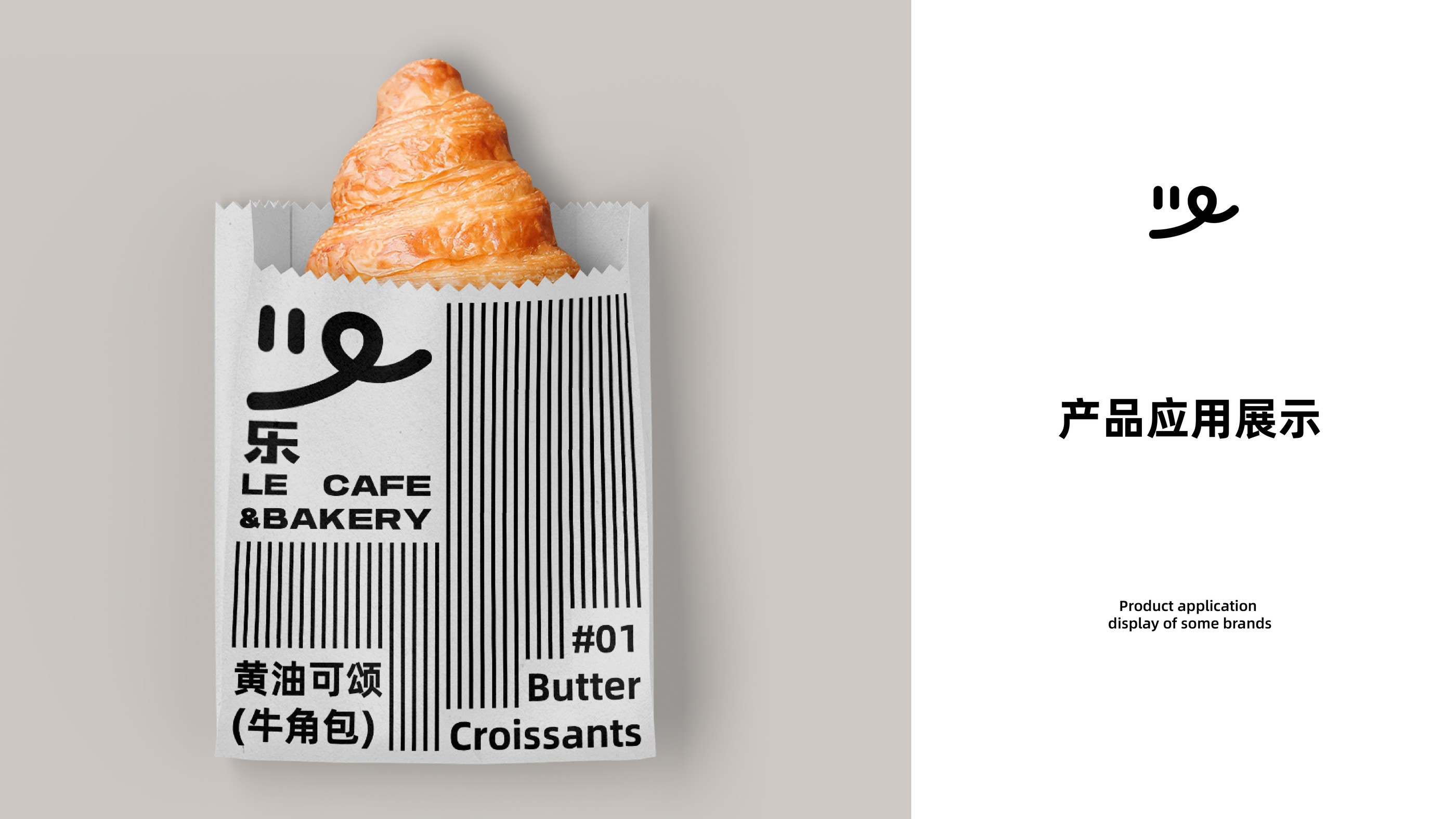
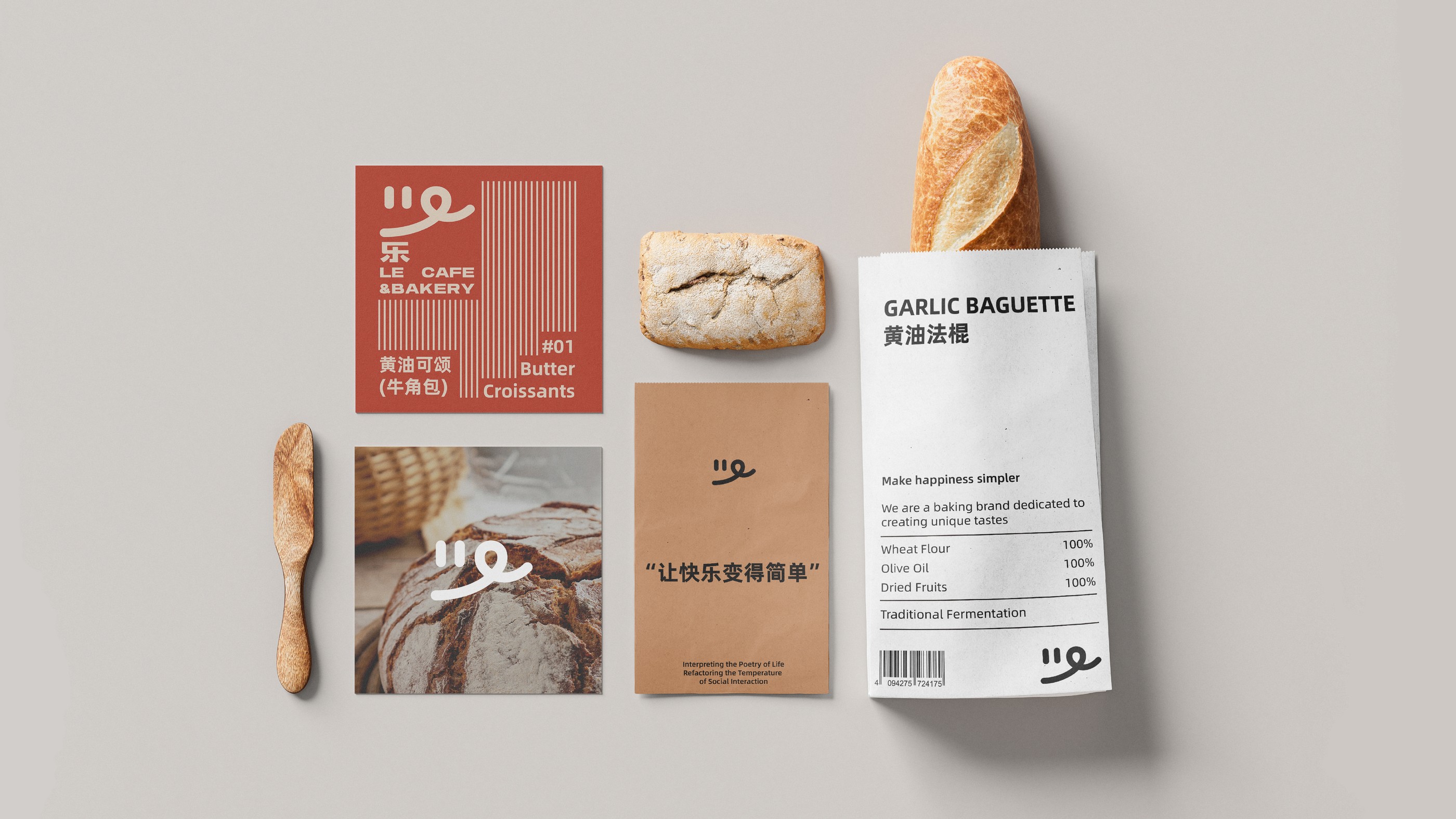
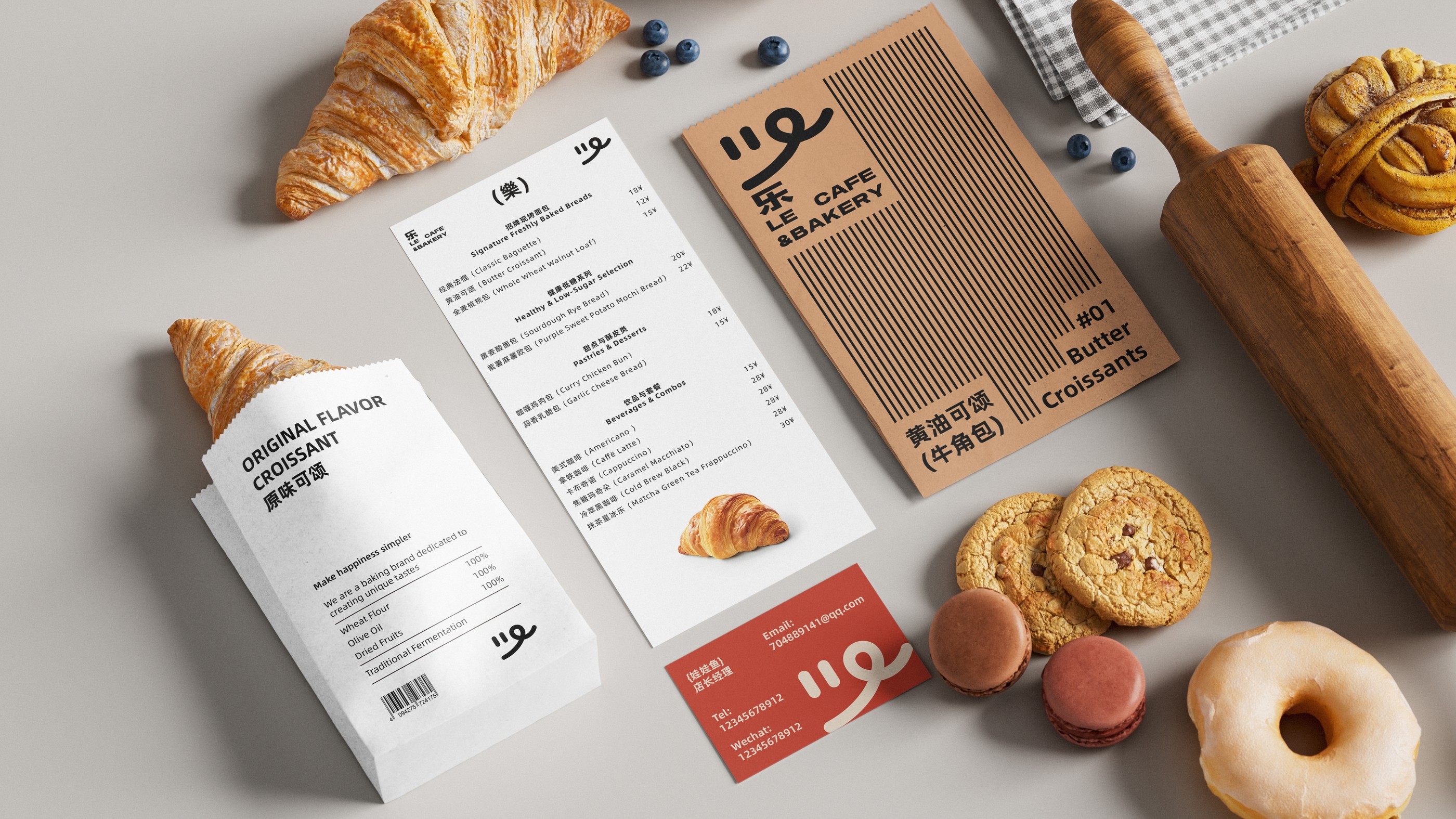
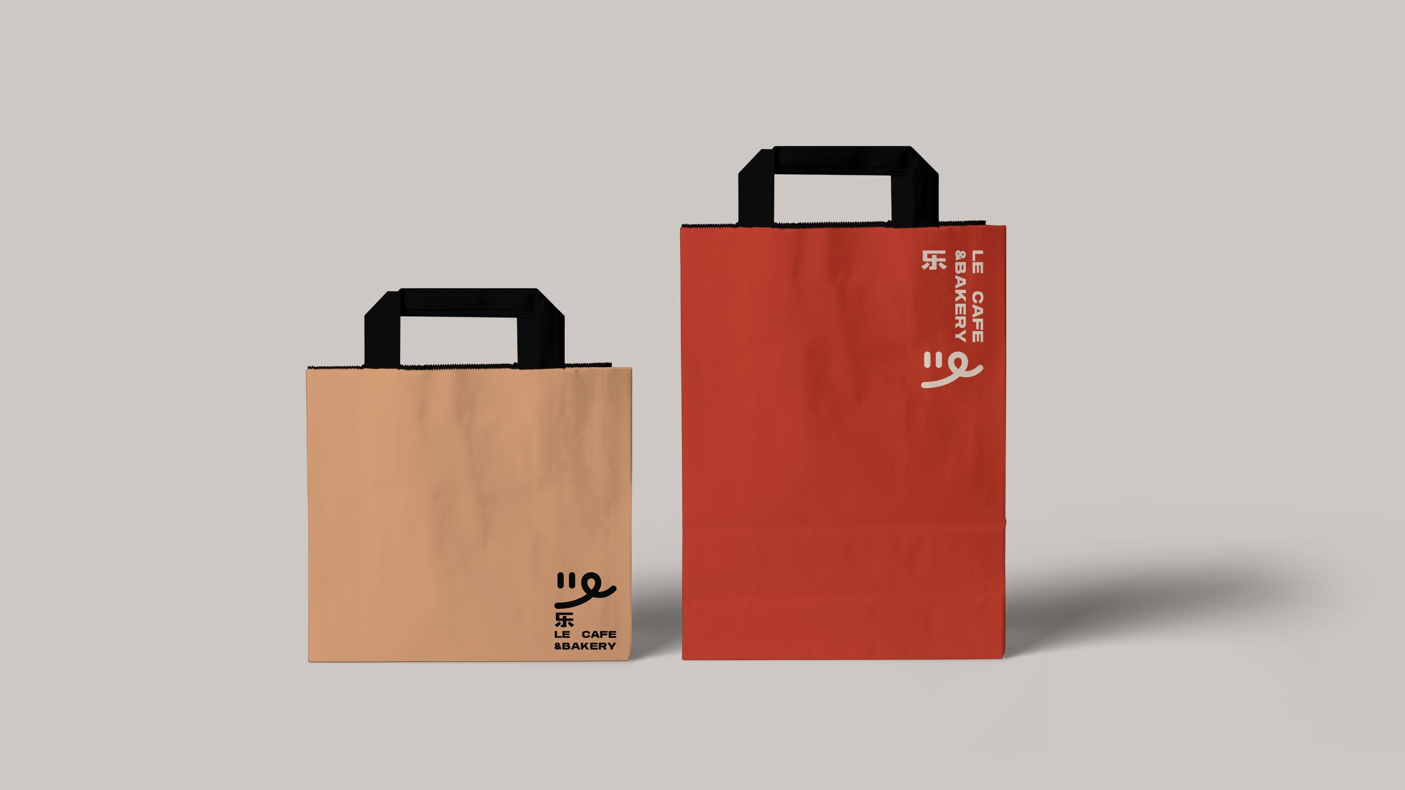
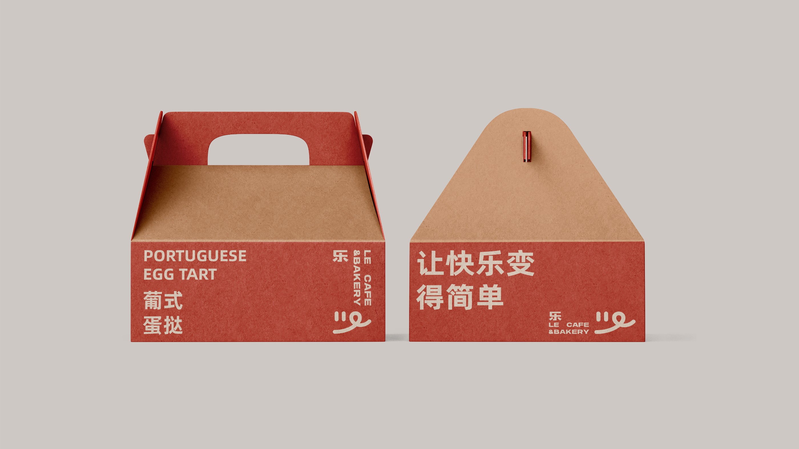
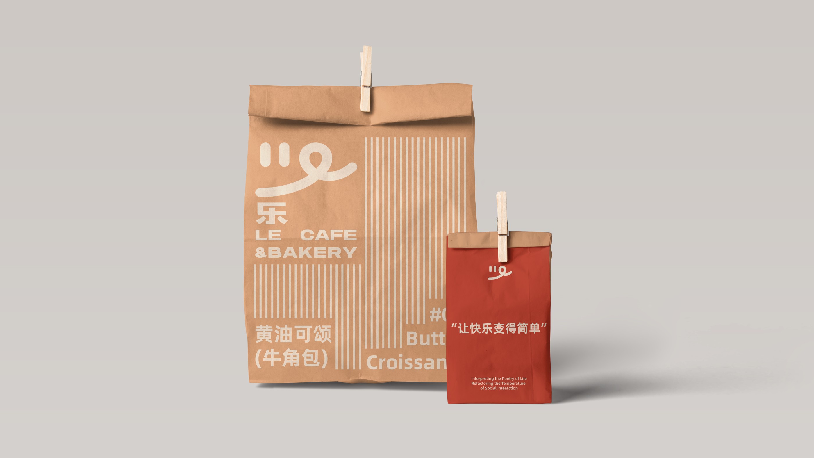
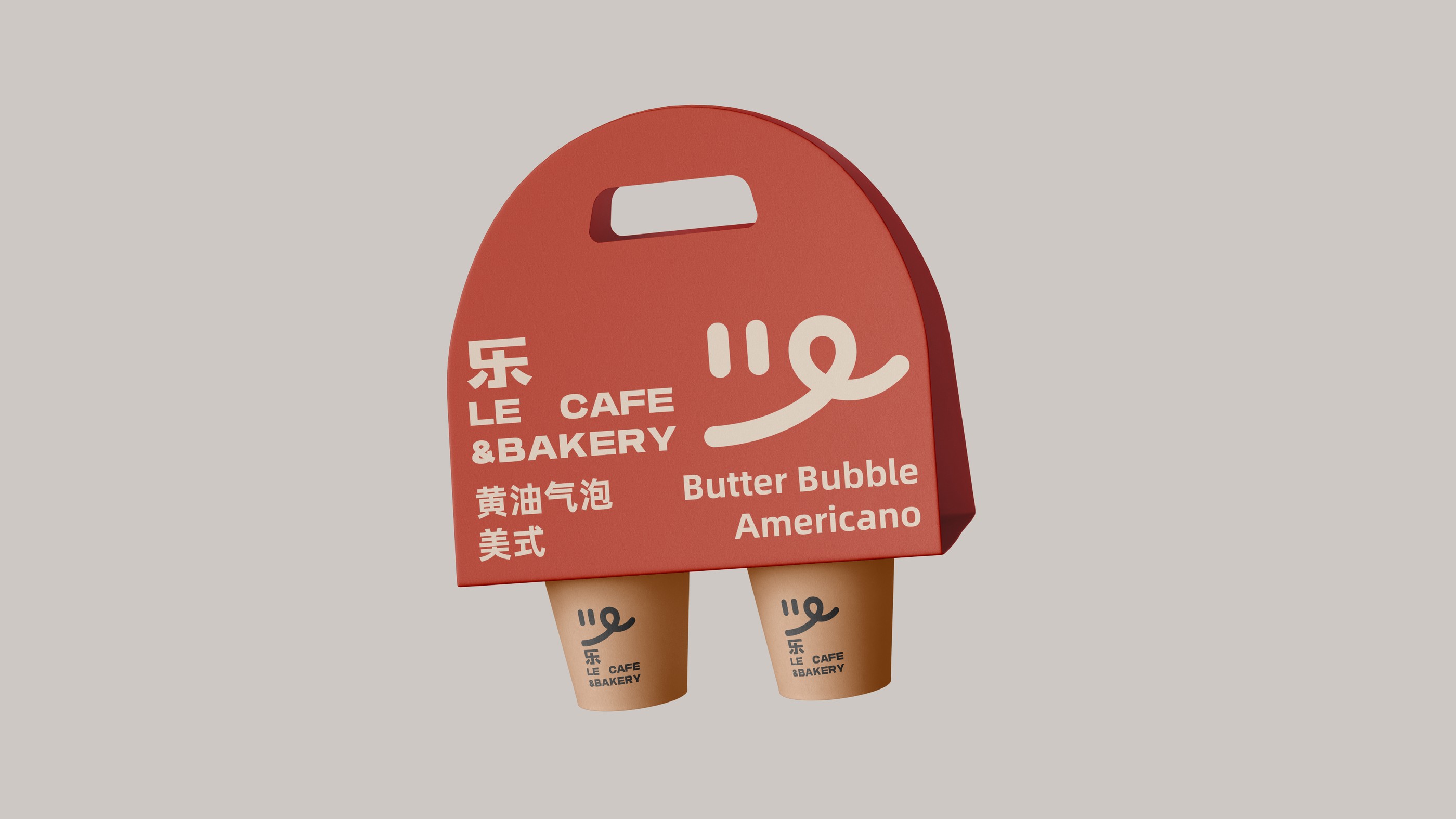
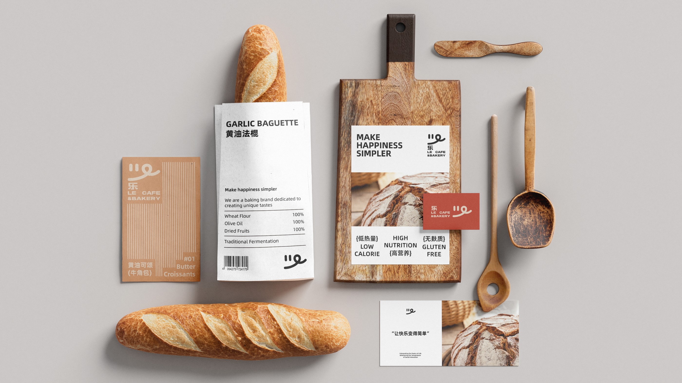
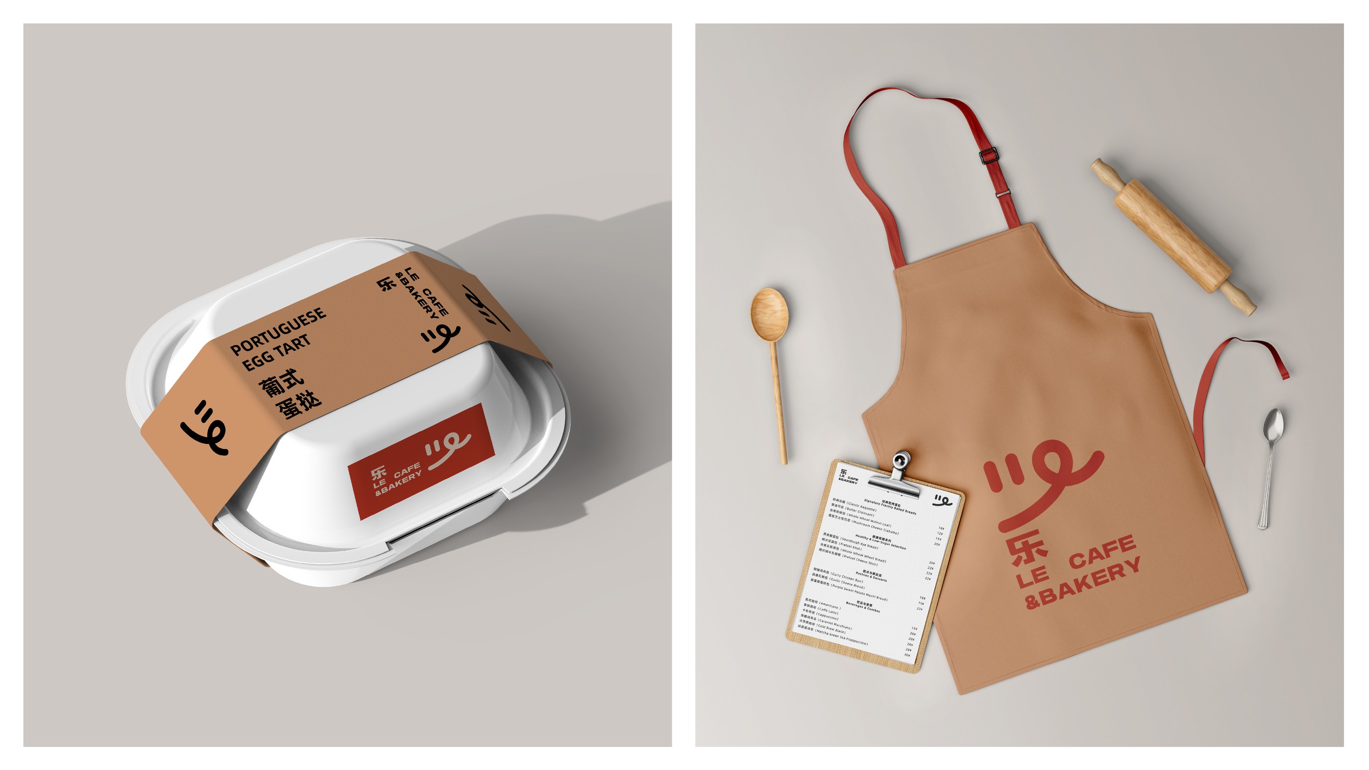
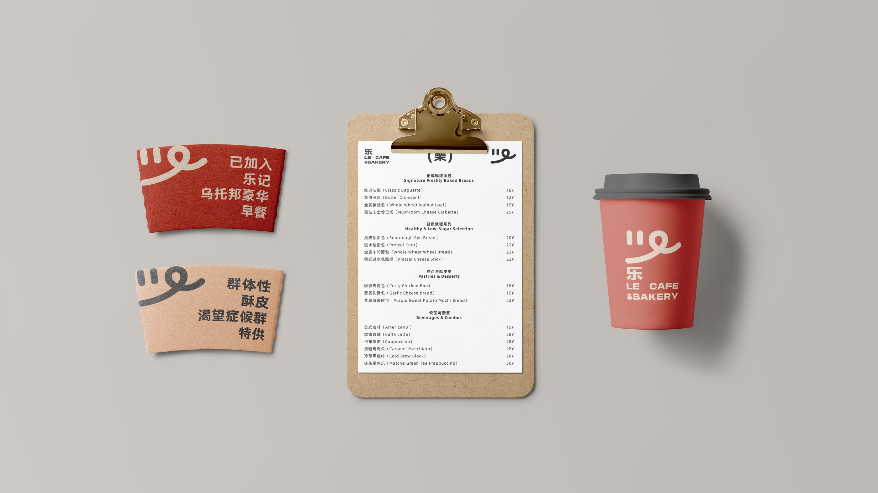
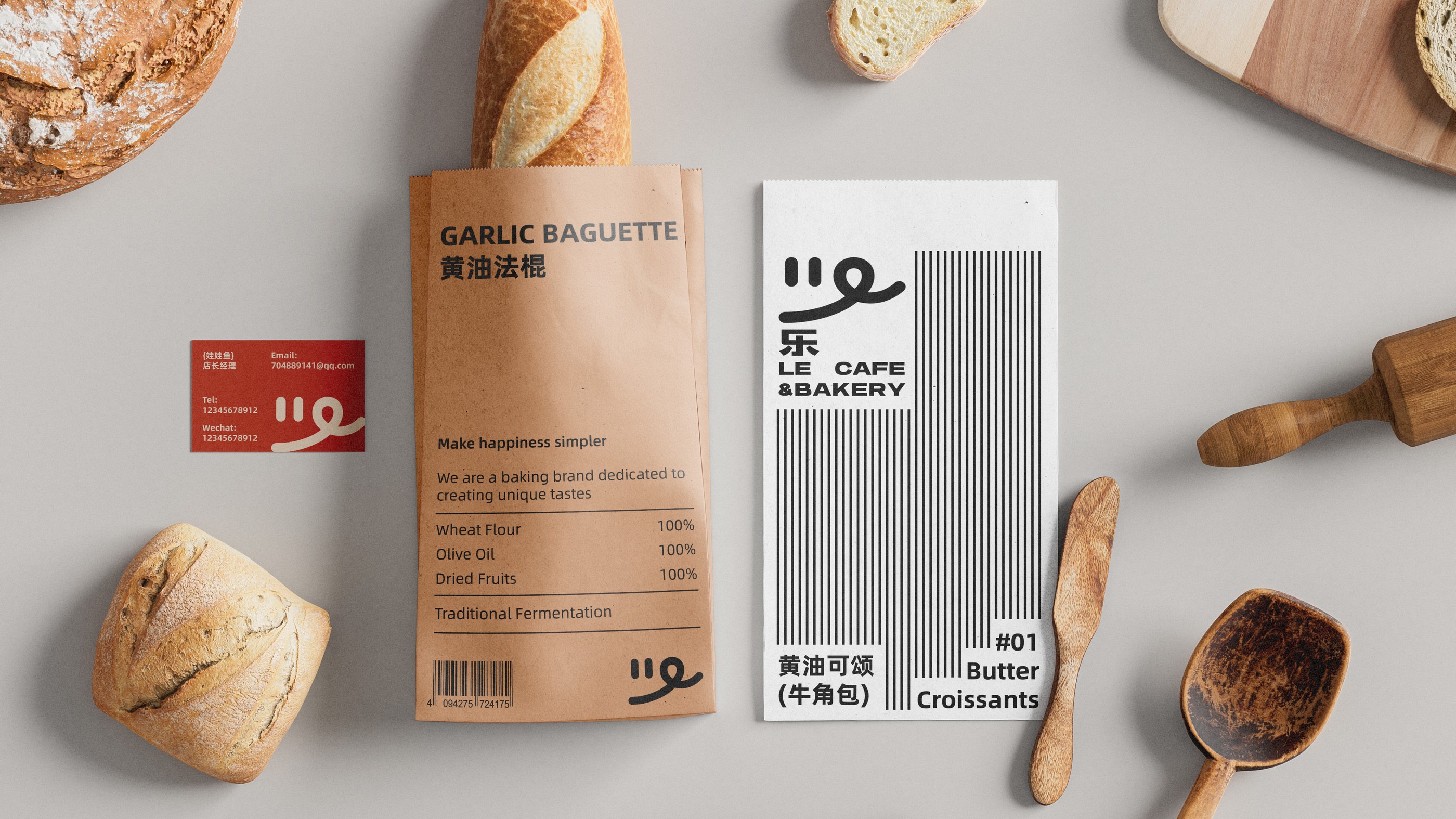
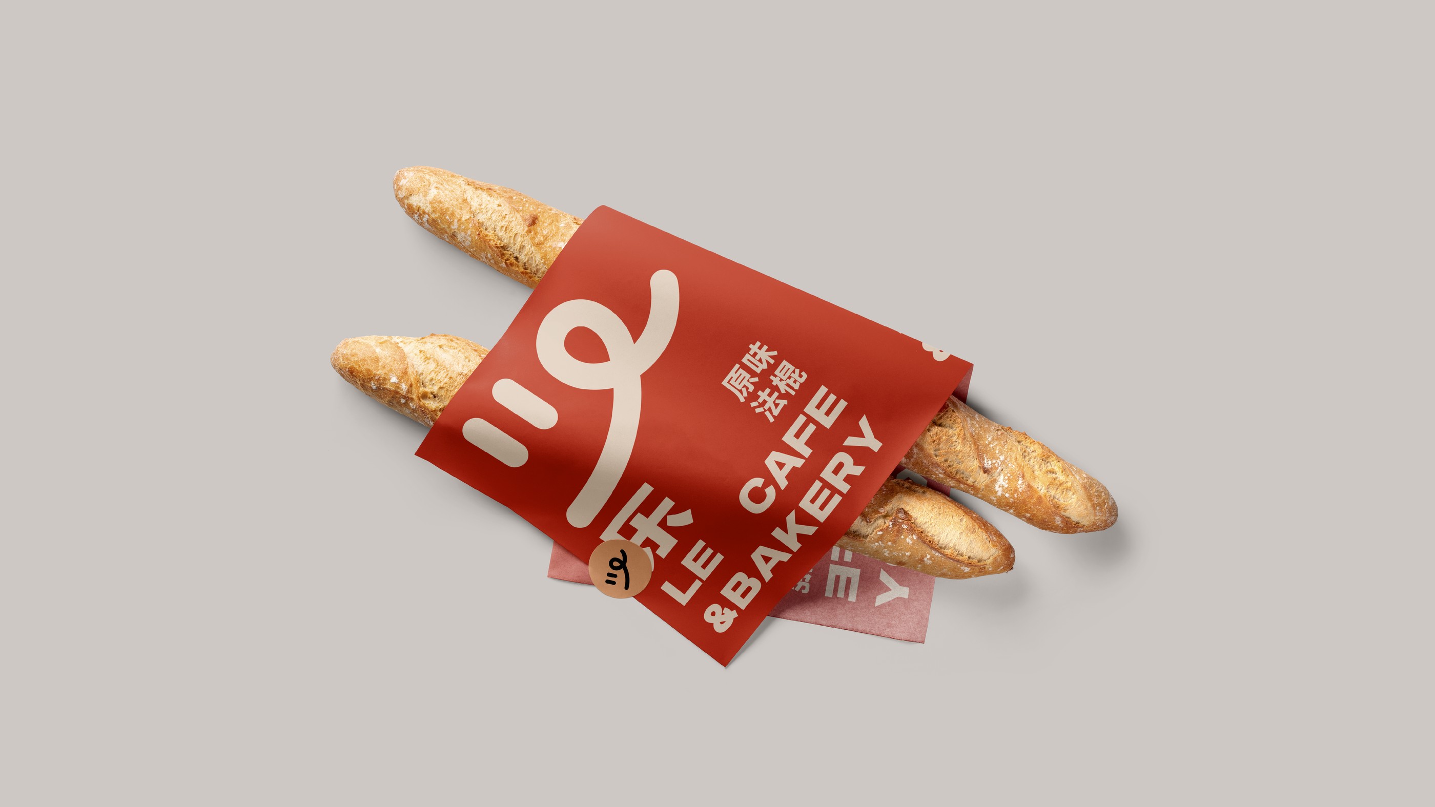
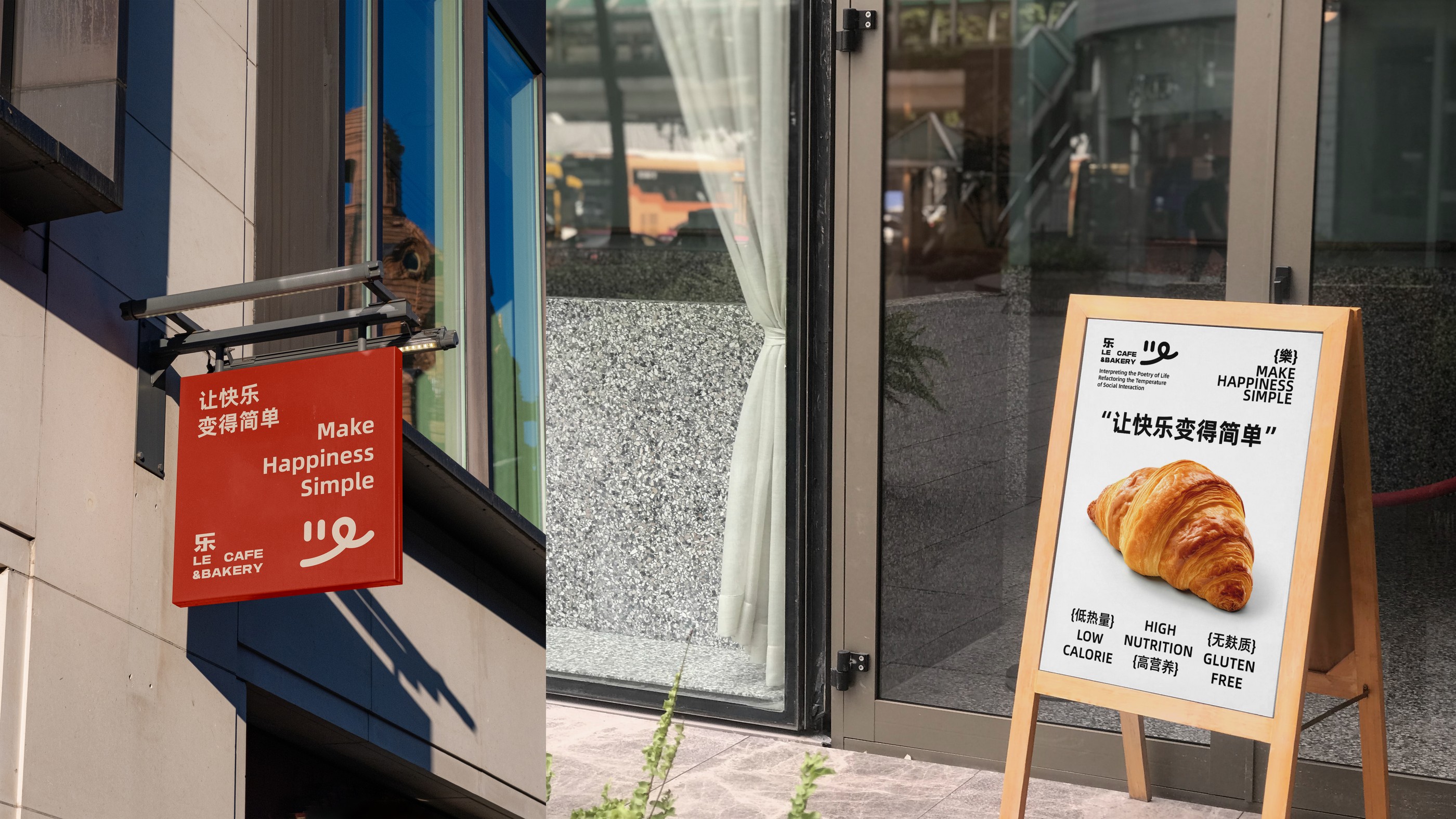
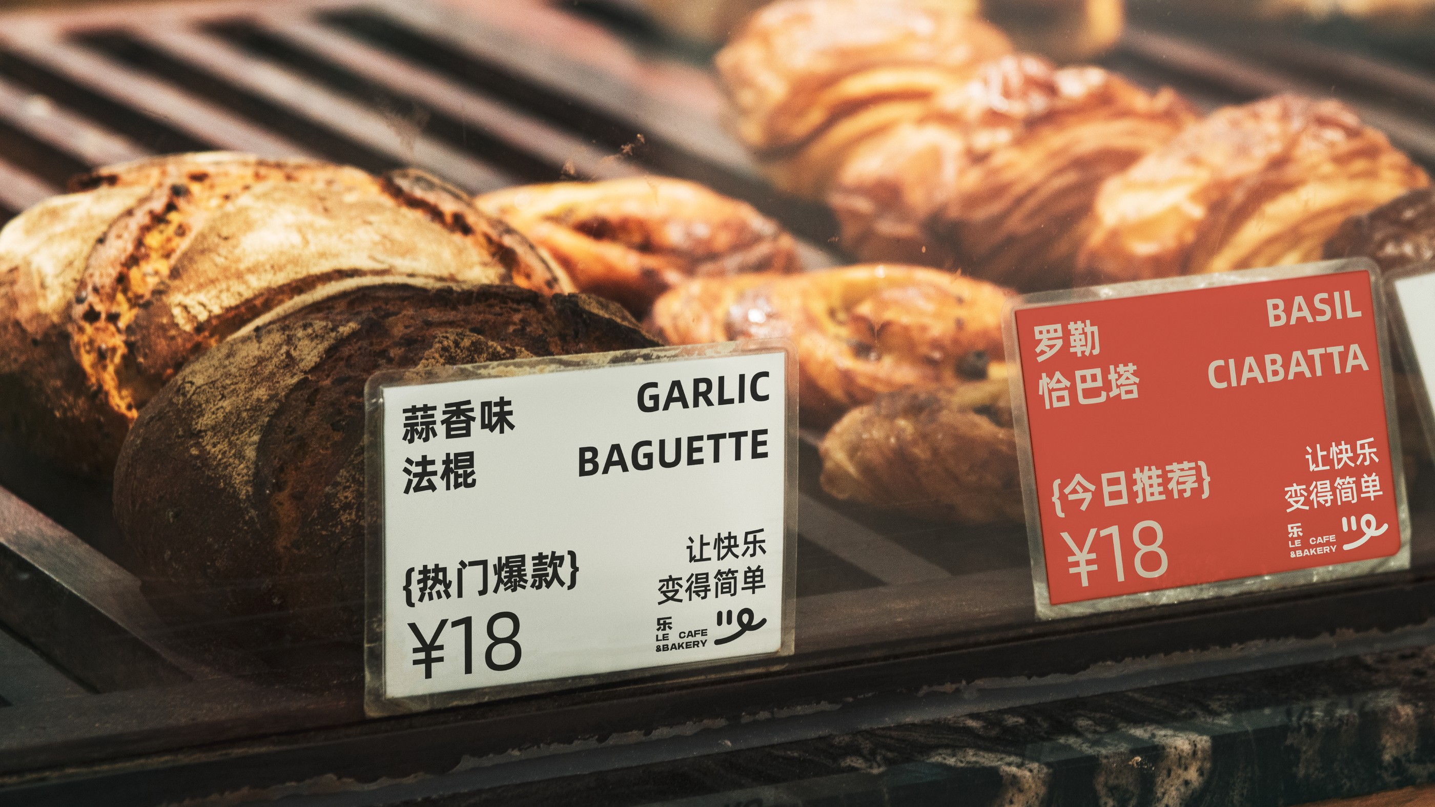
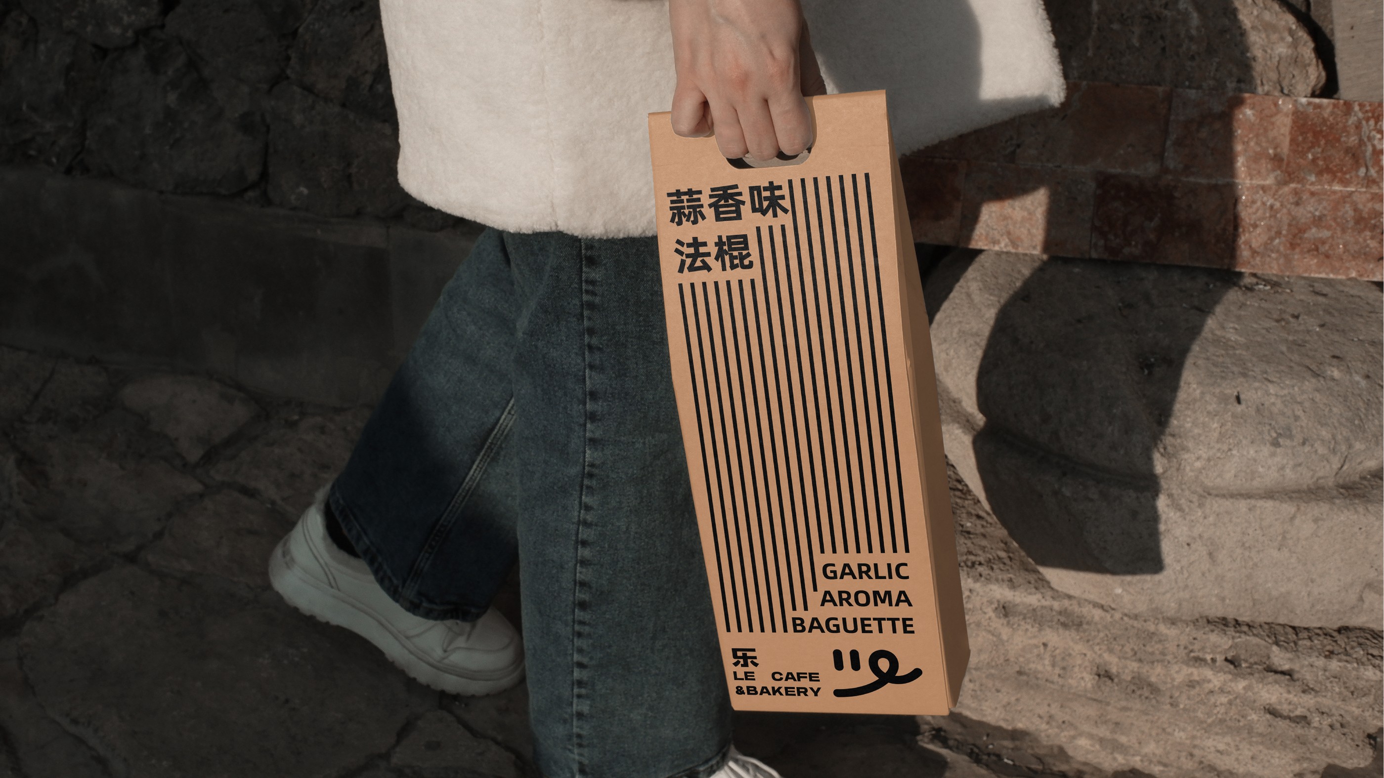
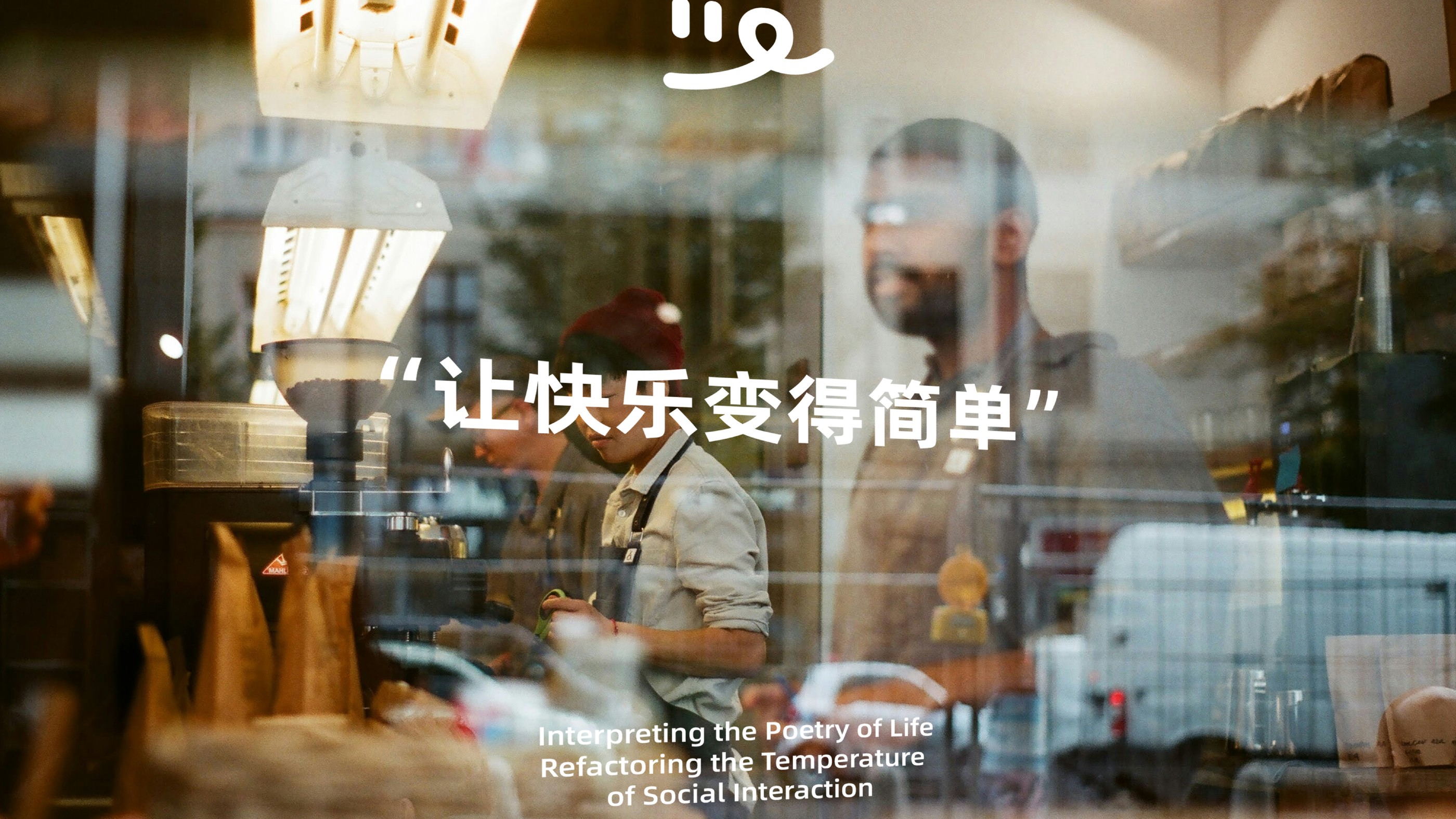
“乐”是一个致力于打造具有独特品味的烘焙品牌,让每一份面包与每一杯咖啡都充满惊喜和乐趣,为顾客带来美妙的品尝体验的同时,品牌也注重将趣味和创意融入到品牌故事和烘焙制作中;让每一位顾客享受美食,感受到我们对生活的热爱和追求。logo的设计上,用最极简的形式诠释,为品牌注入了俏皮的氛围,让视觉更有记忆点和俏皮感。更能代表品牌年轻有趣的品牌理念。
"Le" is a baking brand committed to creating products with distinctive taste, where every loaf of bread and every cup of coffee overflows with surprises and joy, delivering an exquisite culinary experience to customers. The brand inte-grates playfulness and creativity into its brand storytelling and baking craftsmanship, allowing customers to savortheir treats while sensing our devotion to life and relentless pursuit of excellence. The logo, interpreted through mini-malist design principles, instills a whimsical charm into the brand identity, creating visually striking and mischievouselements that further represent the brand's youthful, innovative philosophy.
Empty Set
Brief
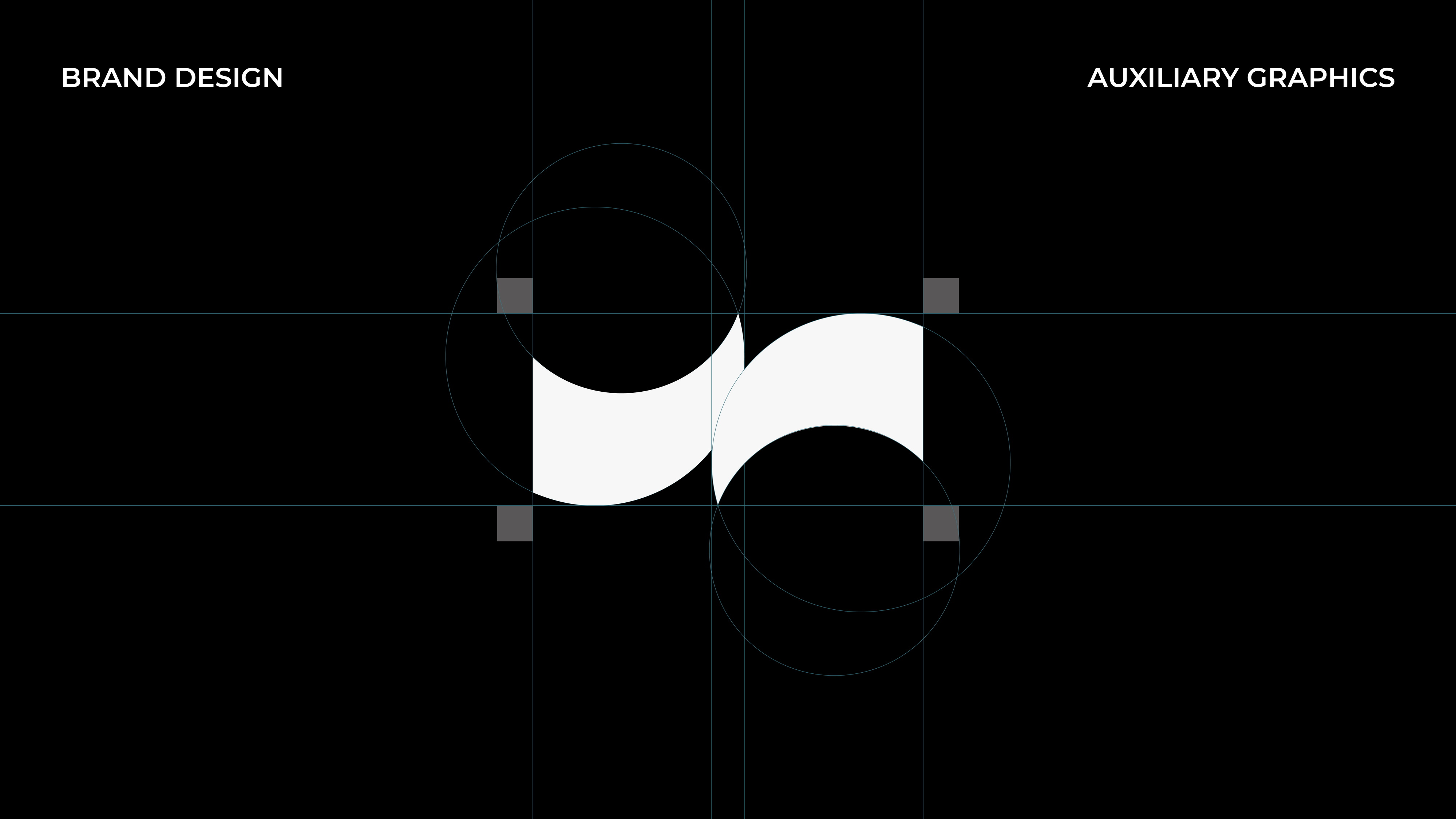
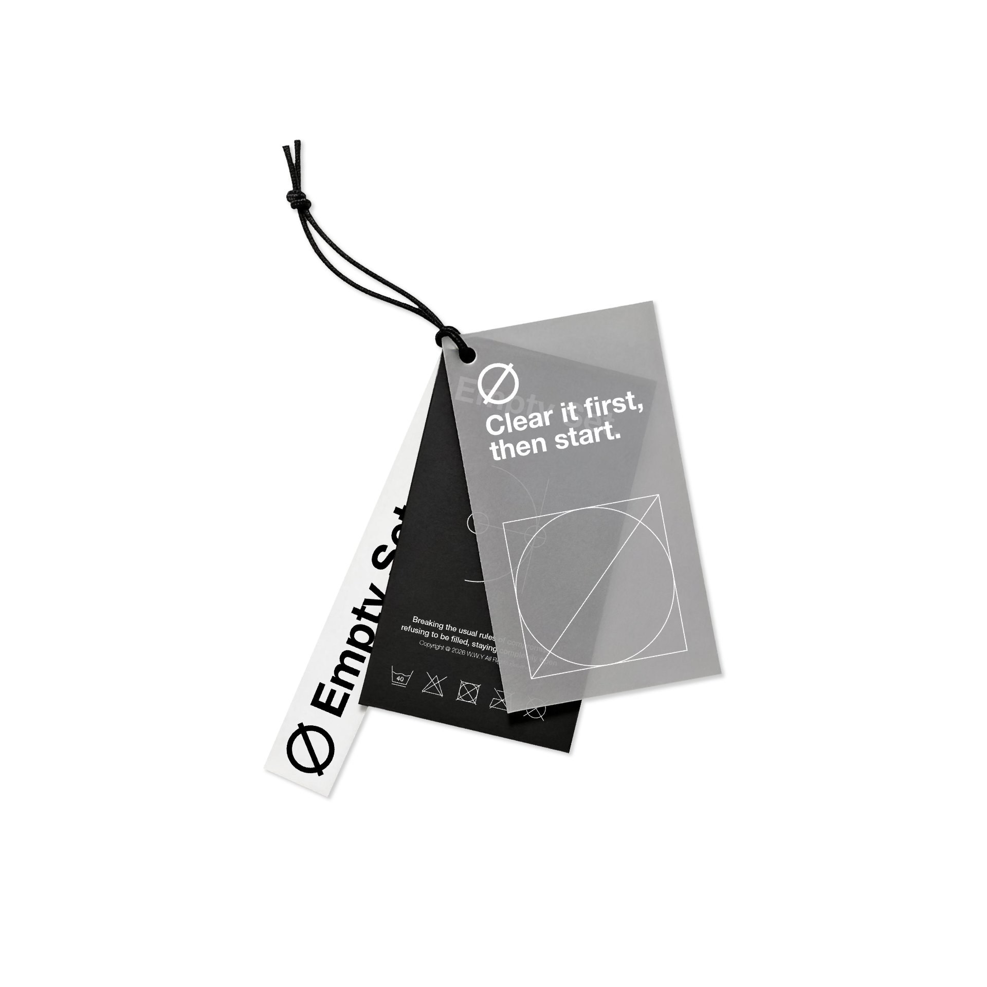
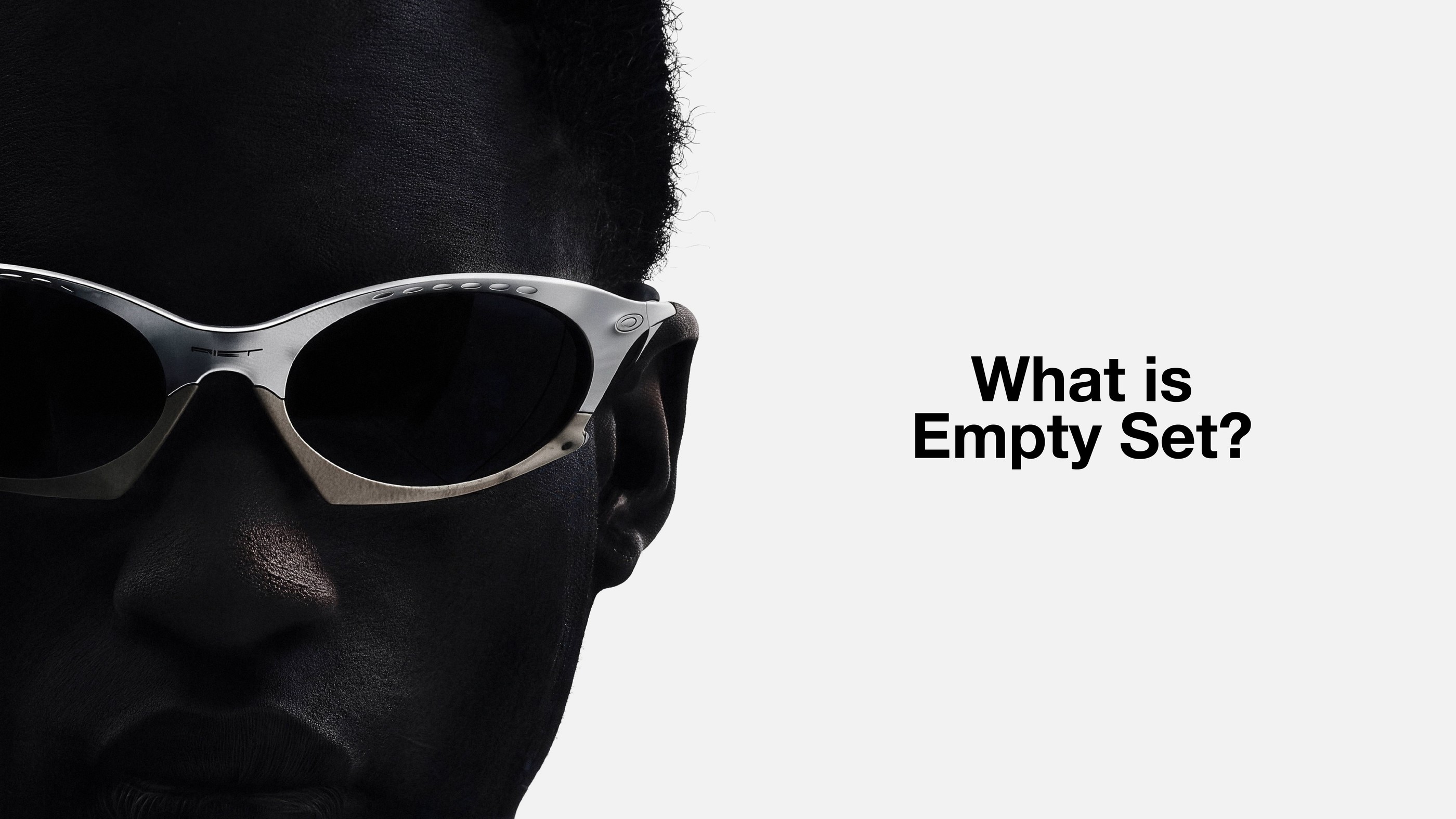
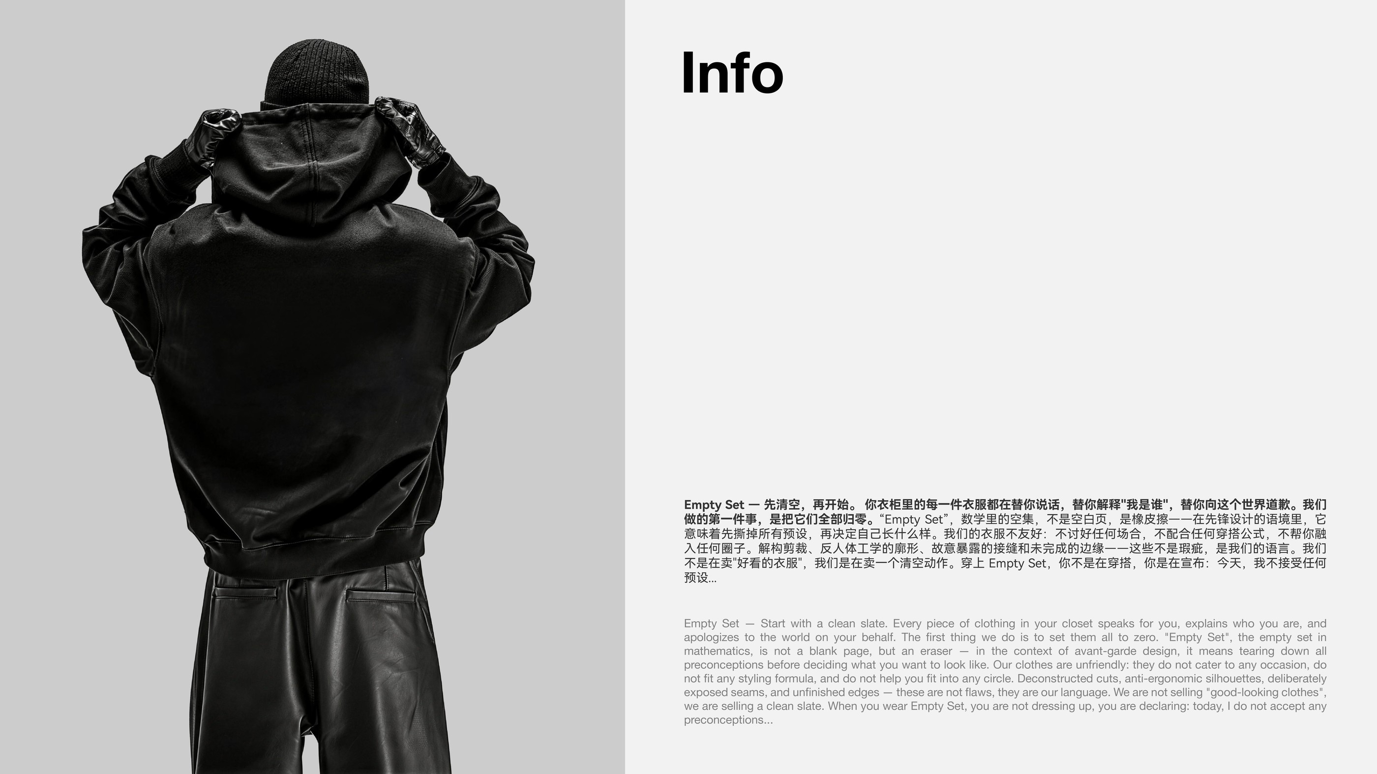
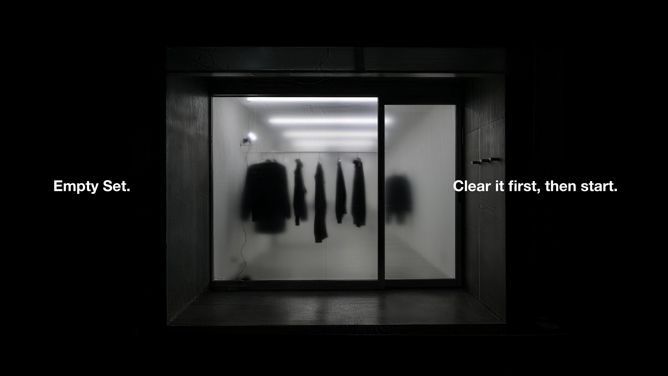
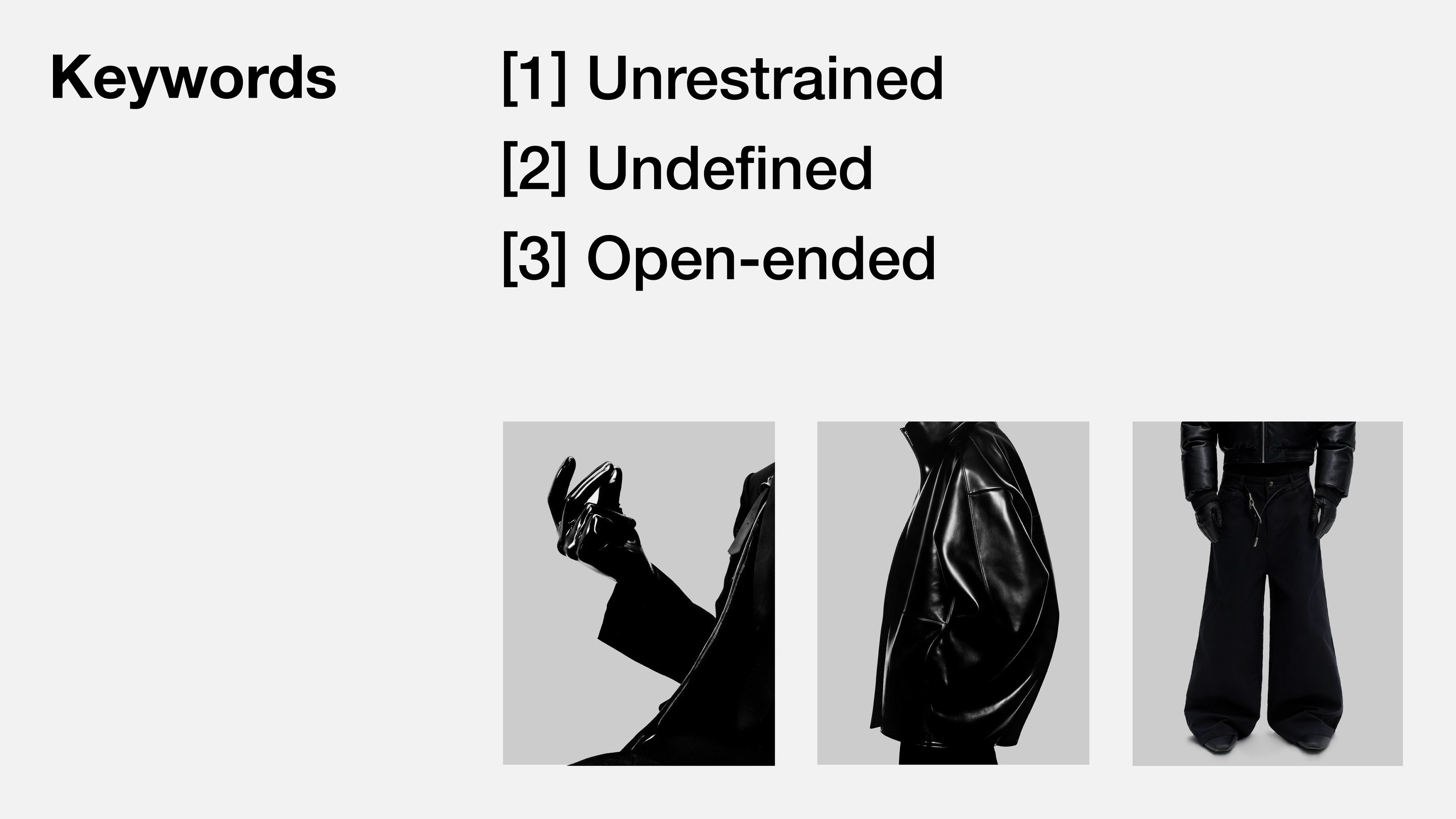
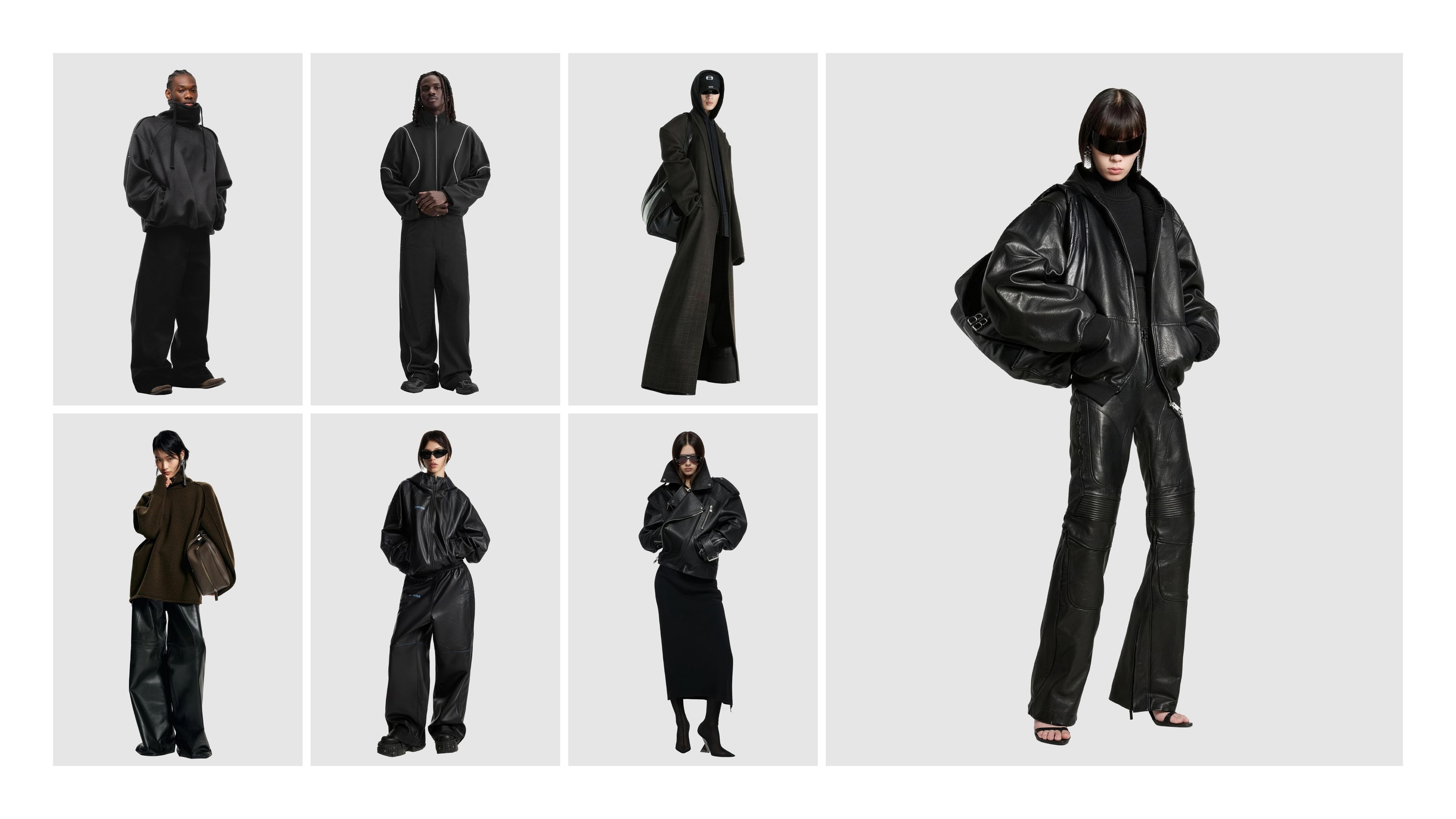
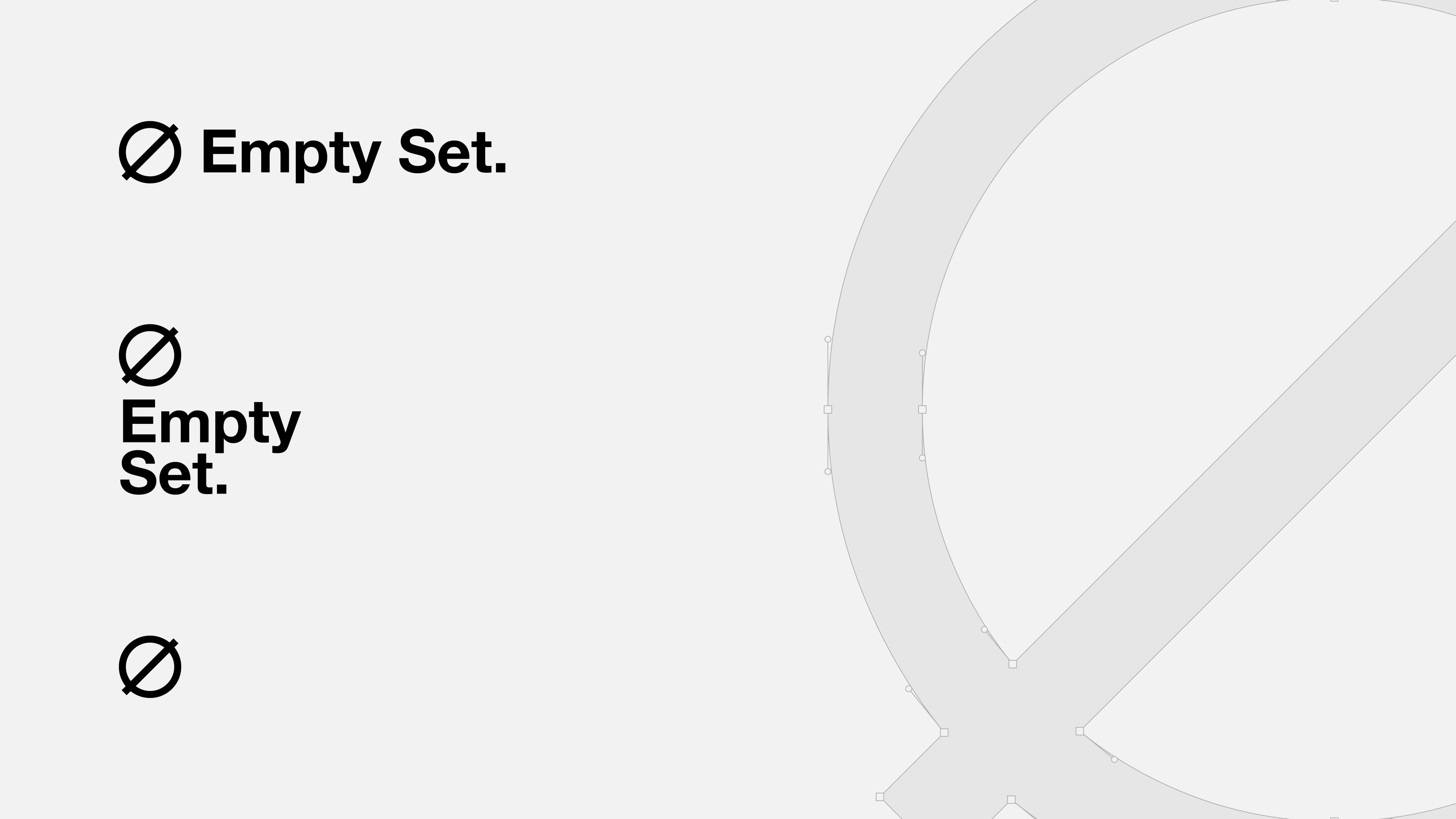
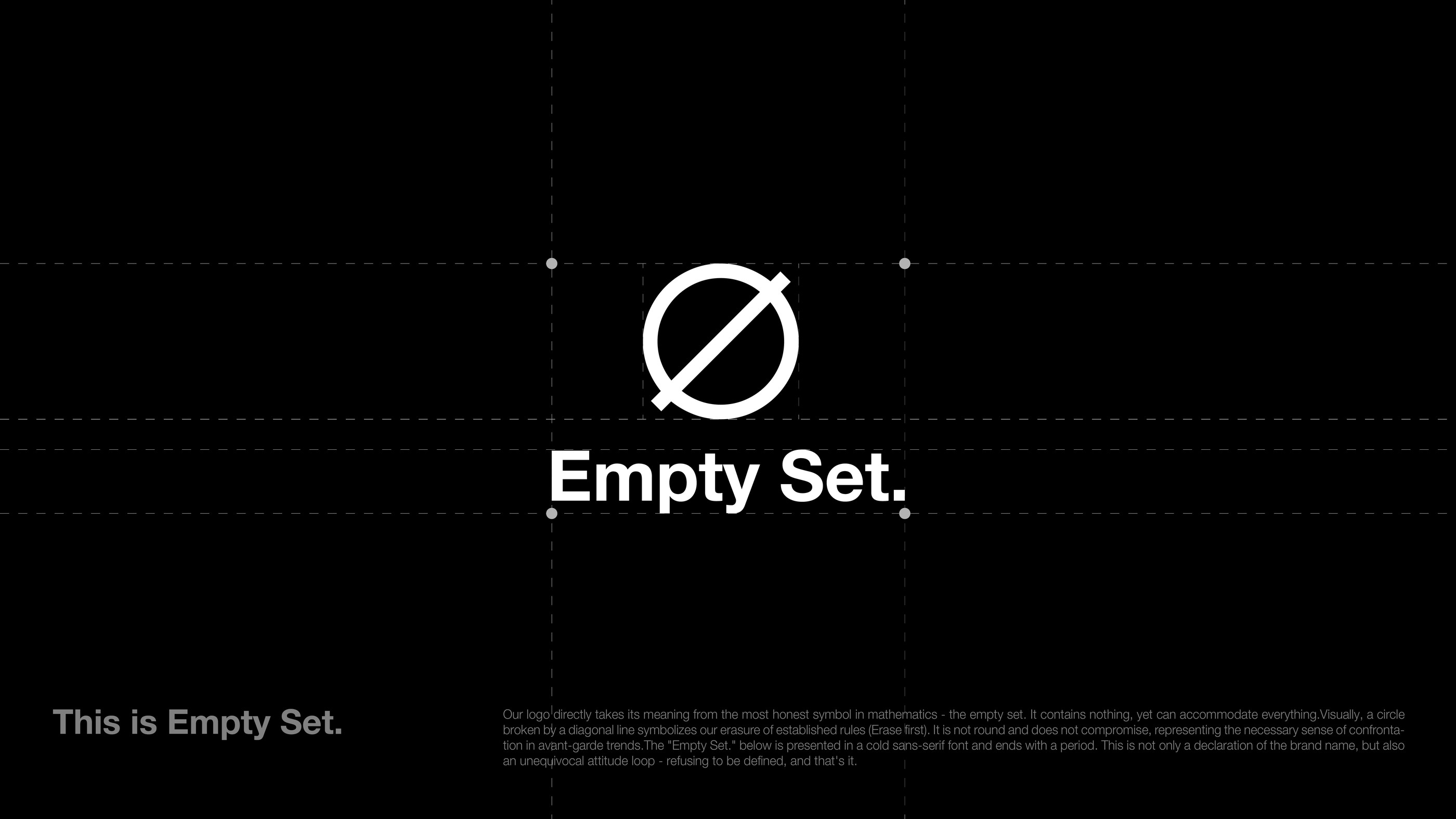
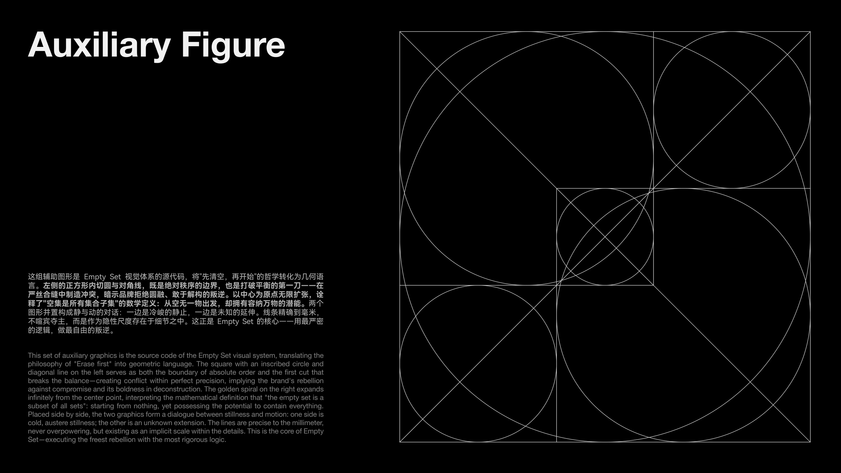
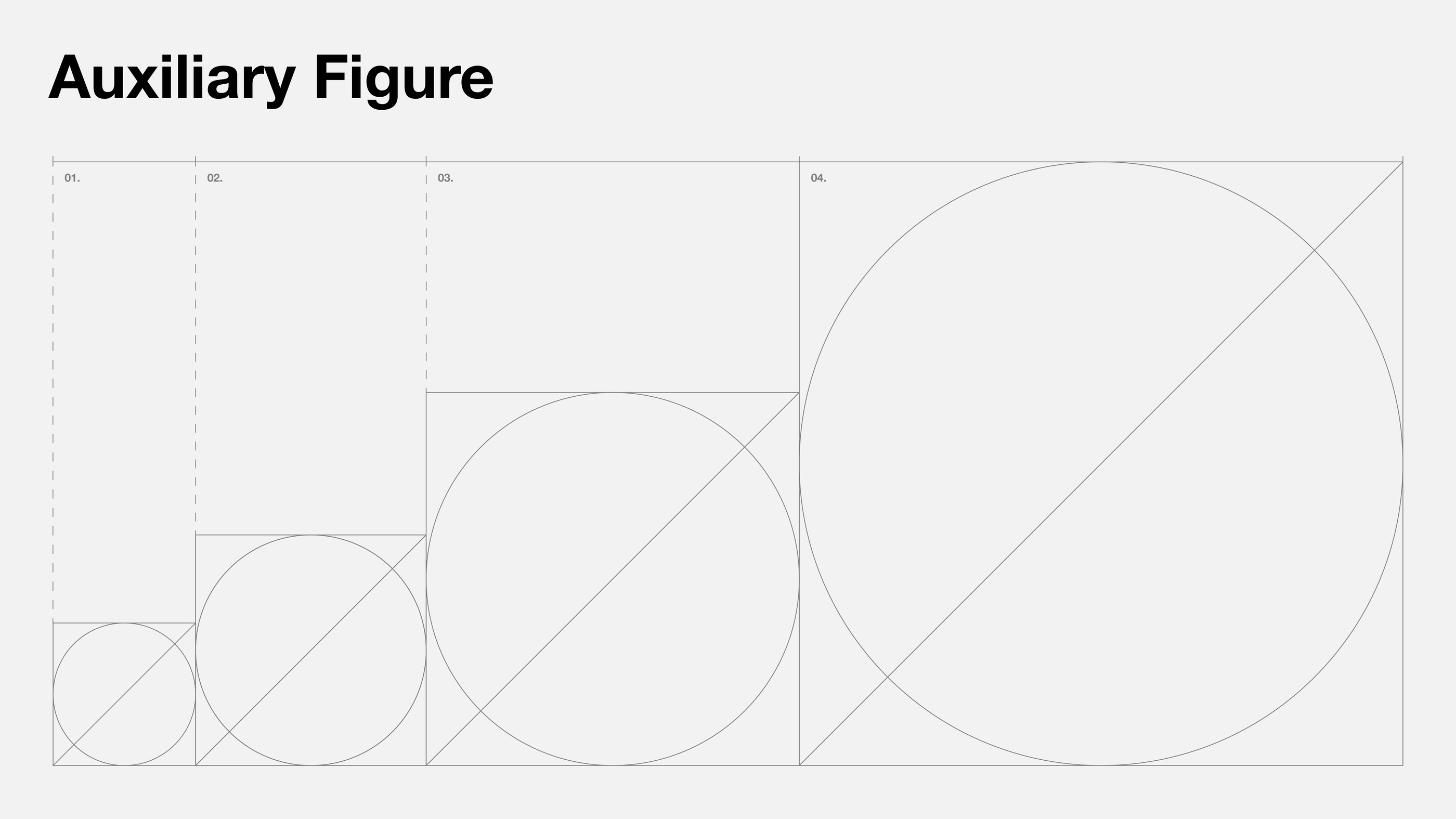
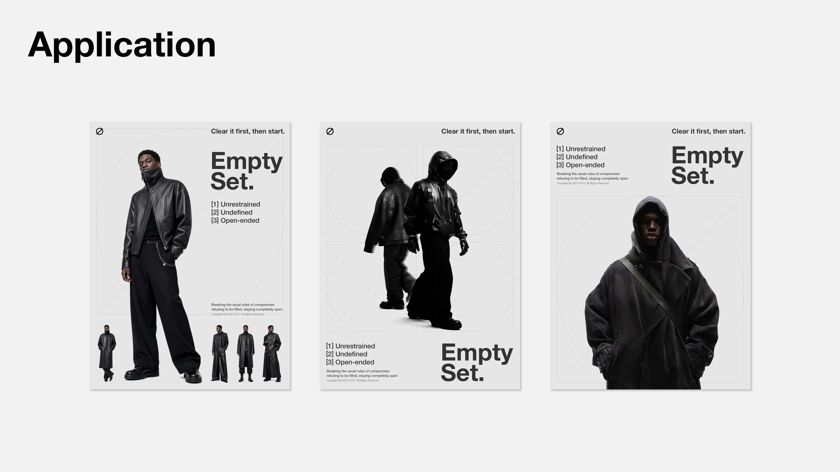
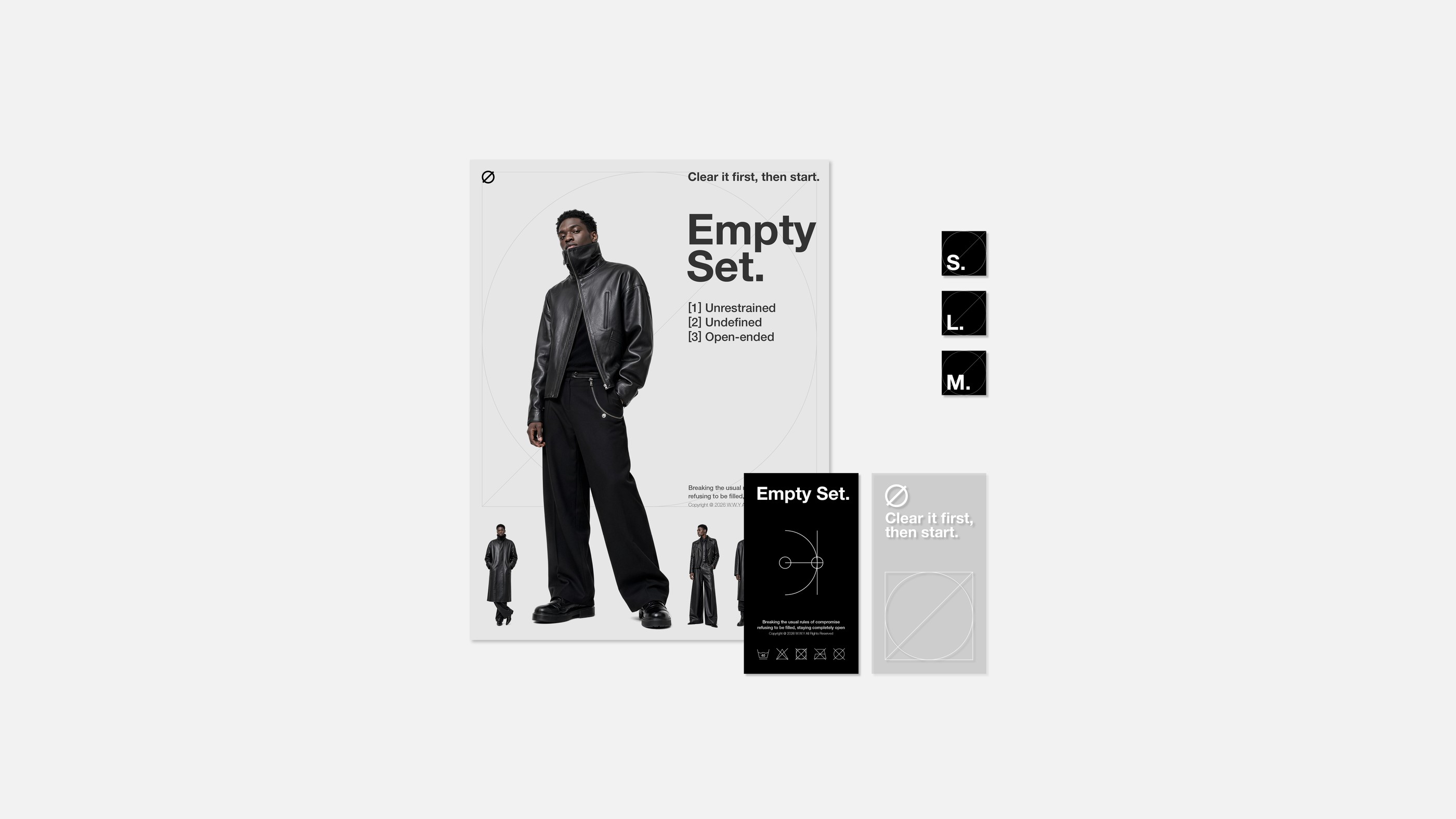
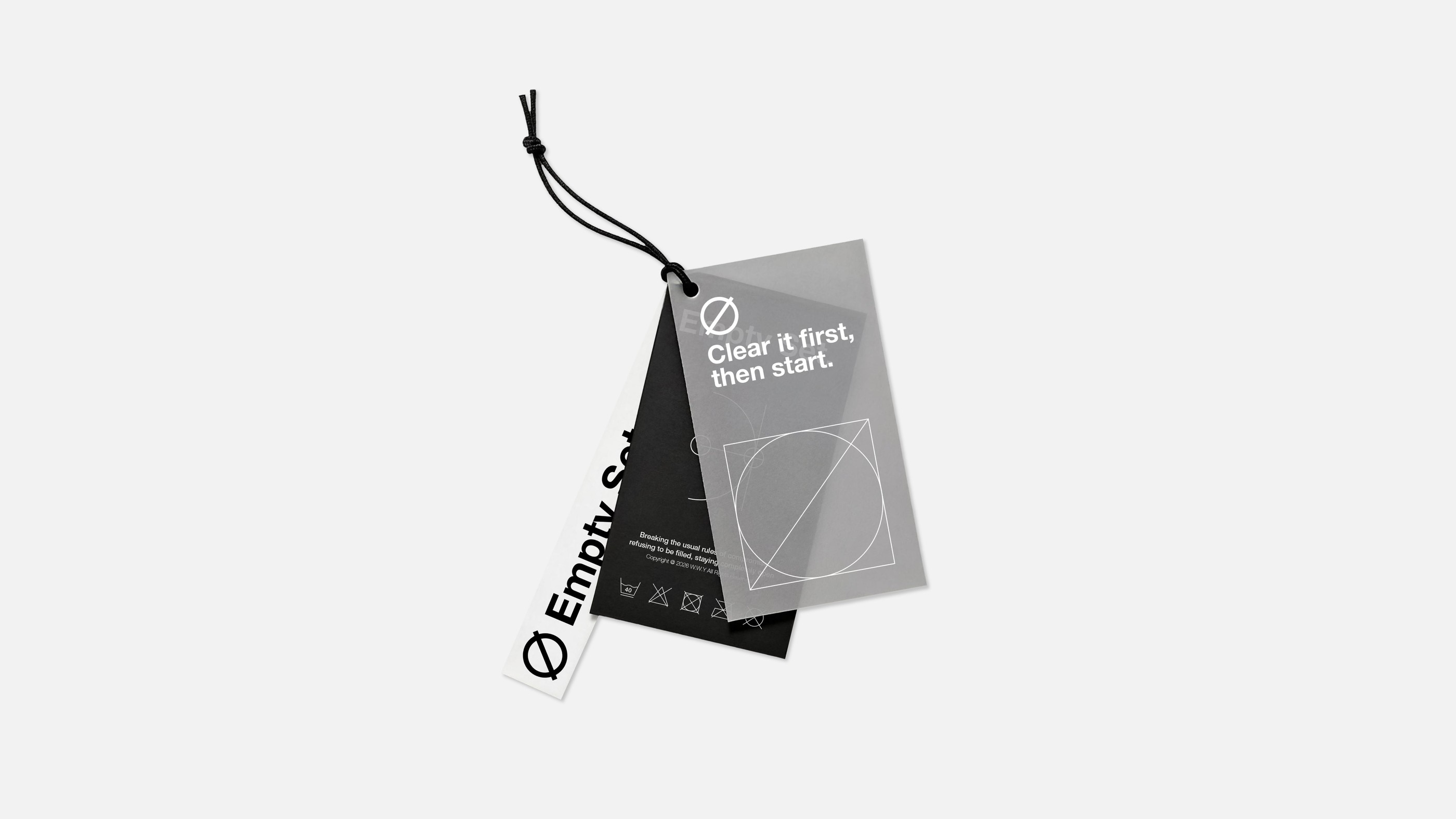
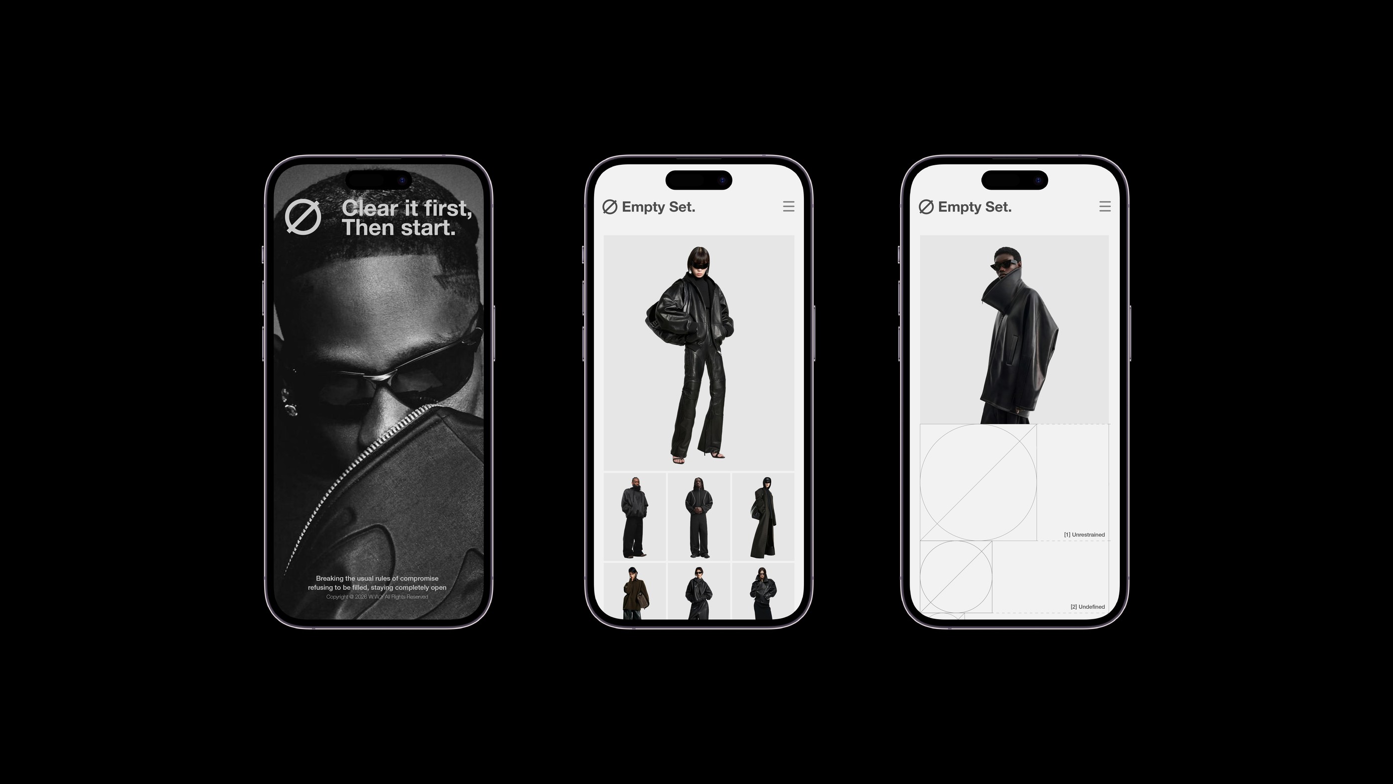
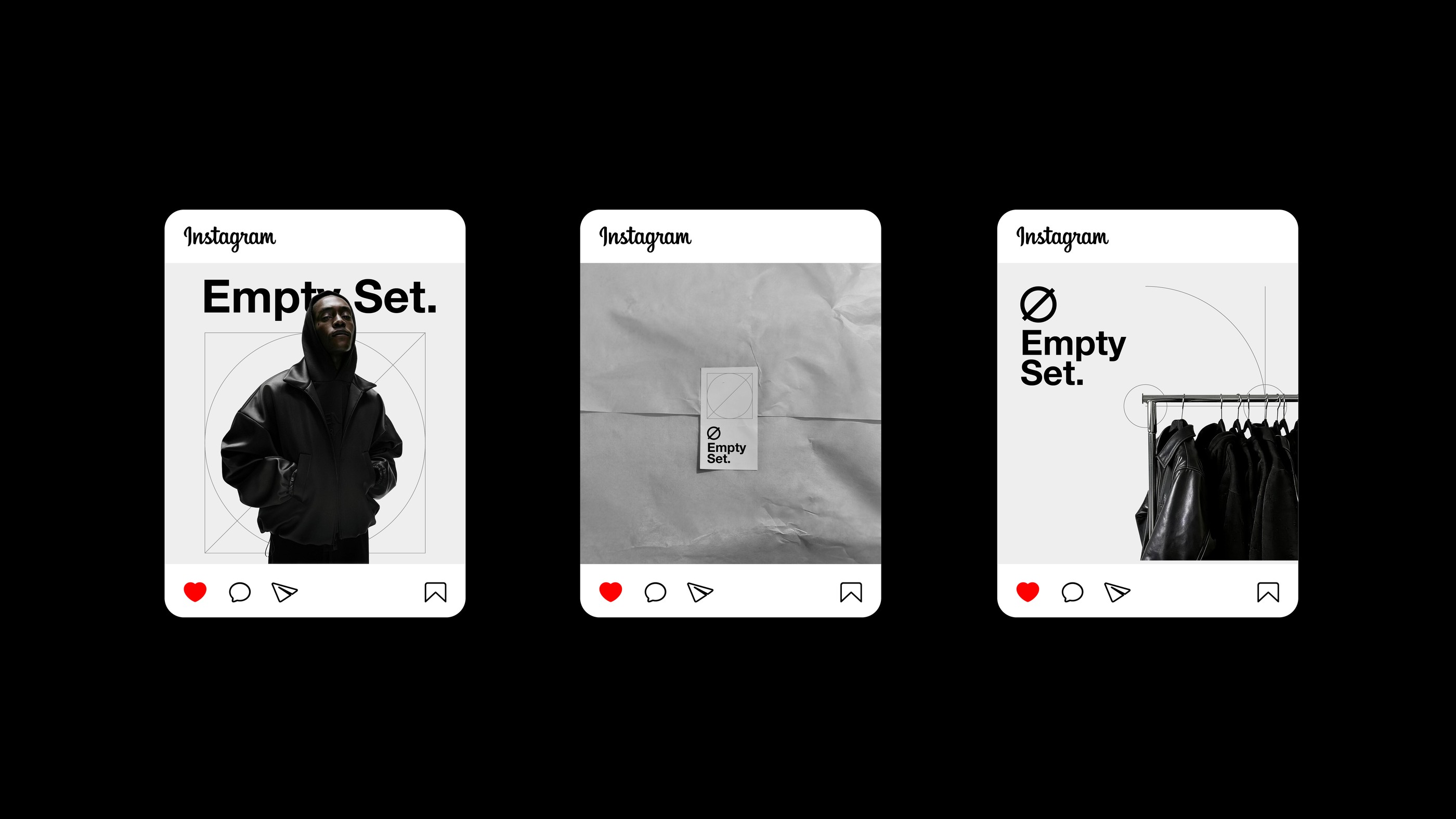
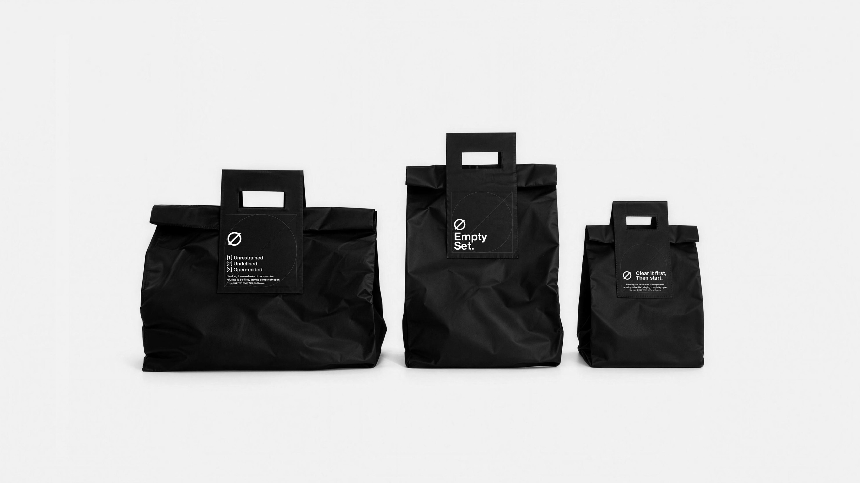
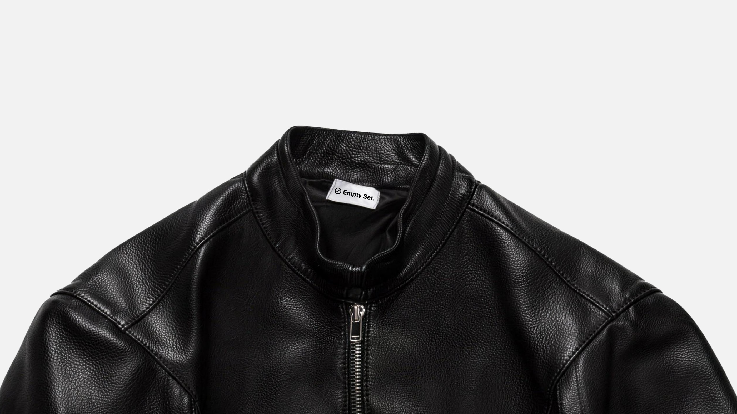
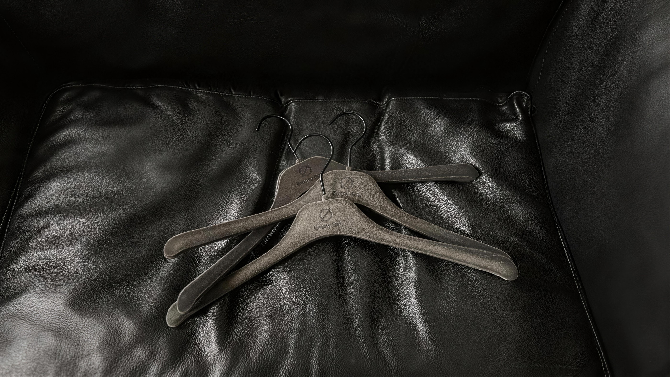
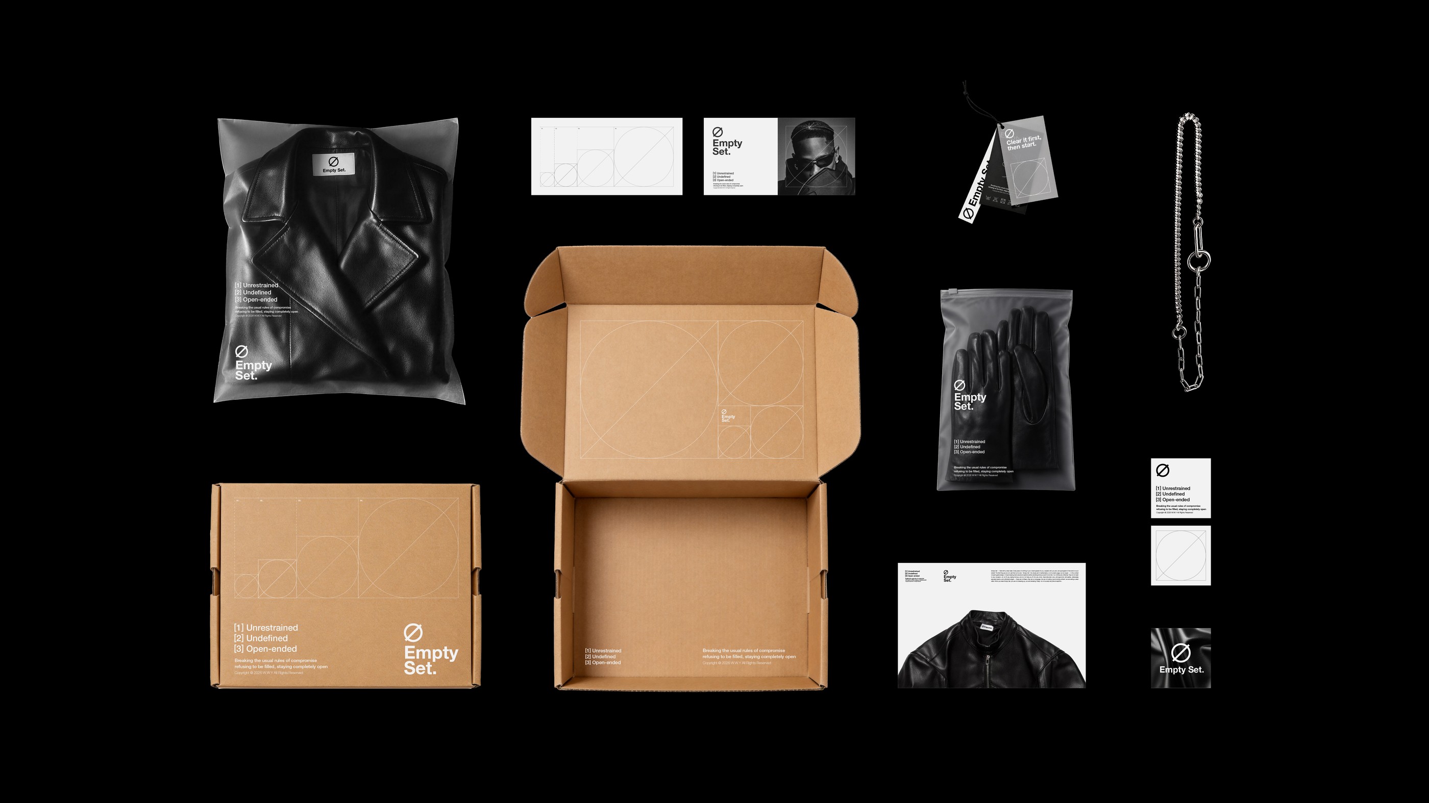
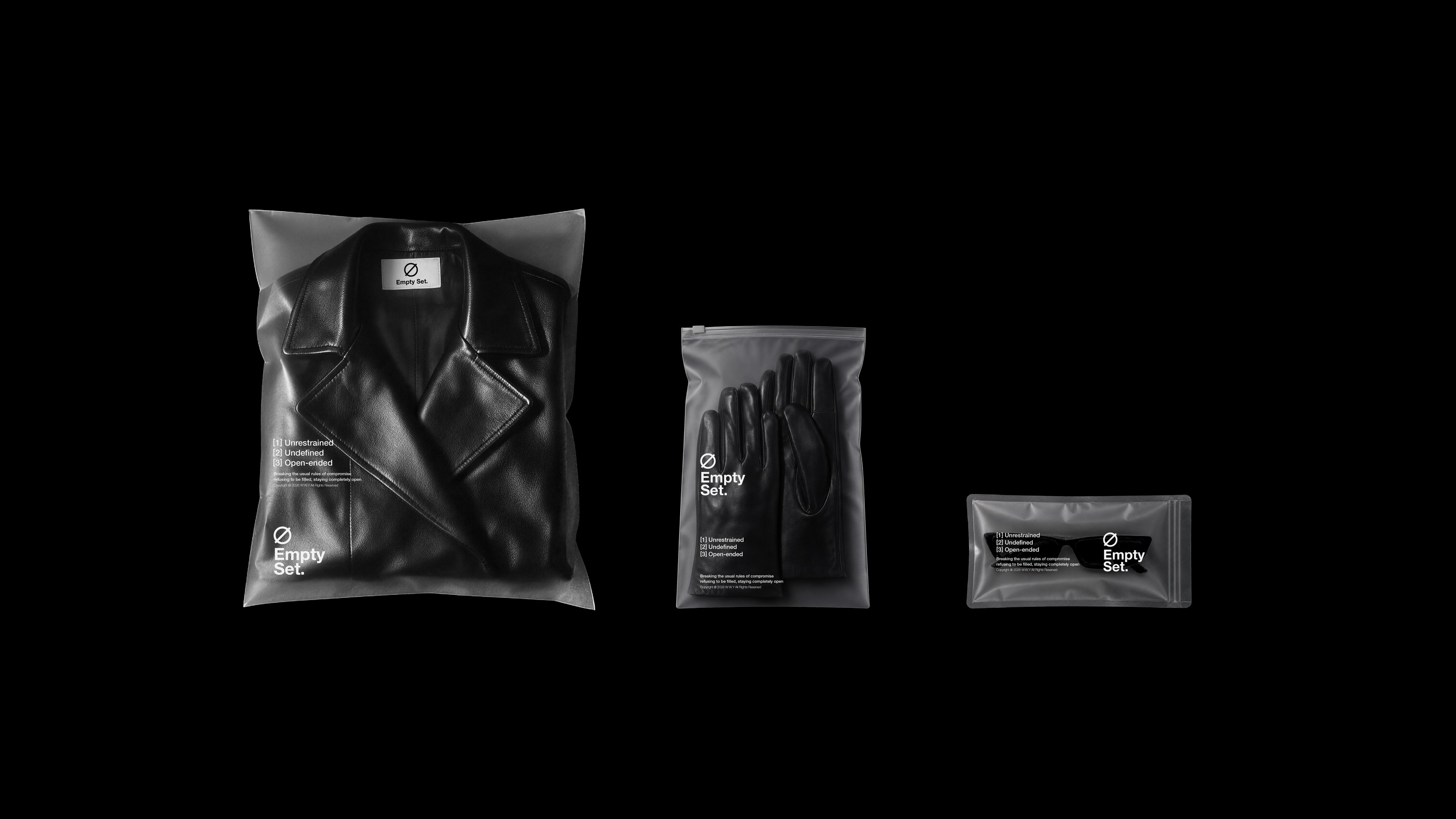
这组辅助图形是 Empty Set 视觉体系的源代码,将"先清空,再开始"的哲学转化为几何语言。左侧的正方形内切圆与对角线,既是绝对秩序的边界,也是打破平衡的第一刀——在严丝合缝中制造冲突,暗示品牌拒绝圆融、敢于解构的叛逆。以中心为原点无限扩张,诠释了"空集是所有集合子集"的数学定义:从空无一物出发,却拥有容纳万物的潜能。两个图形并置构成静与动的对话:一边是冷峻的静止,一边是未知的延伸。线条精确到毫米,不喧宾夺主,而是作为隐性尺度存在于细节之中。这正是 Empty Set 的核心——用最严密的逻辑,做最自由的叛逆。
This set of auxiliary graphics is the source code of the Empty Set visual system, translating the philosophy of "Erase first" into geometric language. The square with an inscribed circle and diagonal line on the left serves as both the boundary of absolute order and the first cut that breaks the balance—creating conflict within perfect precision, implying the brand's rebellion against compromise and its boldness in deconstruction. The golden spiral on the right expands infinitely from the center point, interpreting the mathematical definition that "the empty set is a subset of all sets": starting from nothing, yet possessing the potential to contain everything. Placed side by side, the two graphics form a dialogue between stillness and motion: one side is cold, austere stillness; the other is an unknown extension. The lines are precise to the millimeter, never overpowering, but existing as an implicit scale within the details. This is the core of Empty Set—executing the freest rebellion with the most rigorous logic.
VIGO
Brief
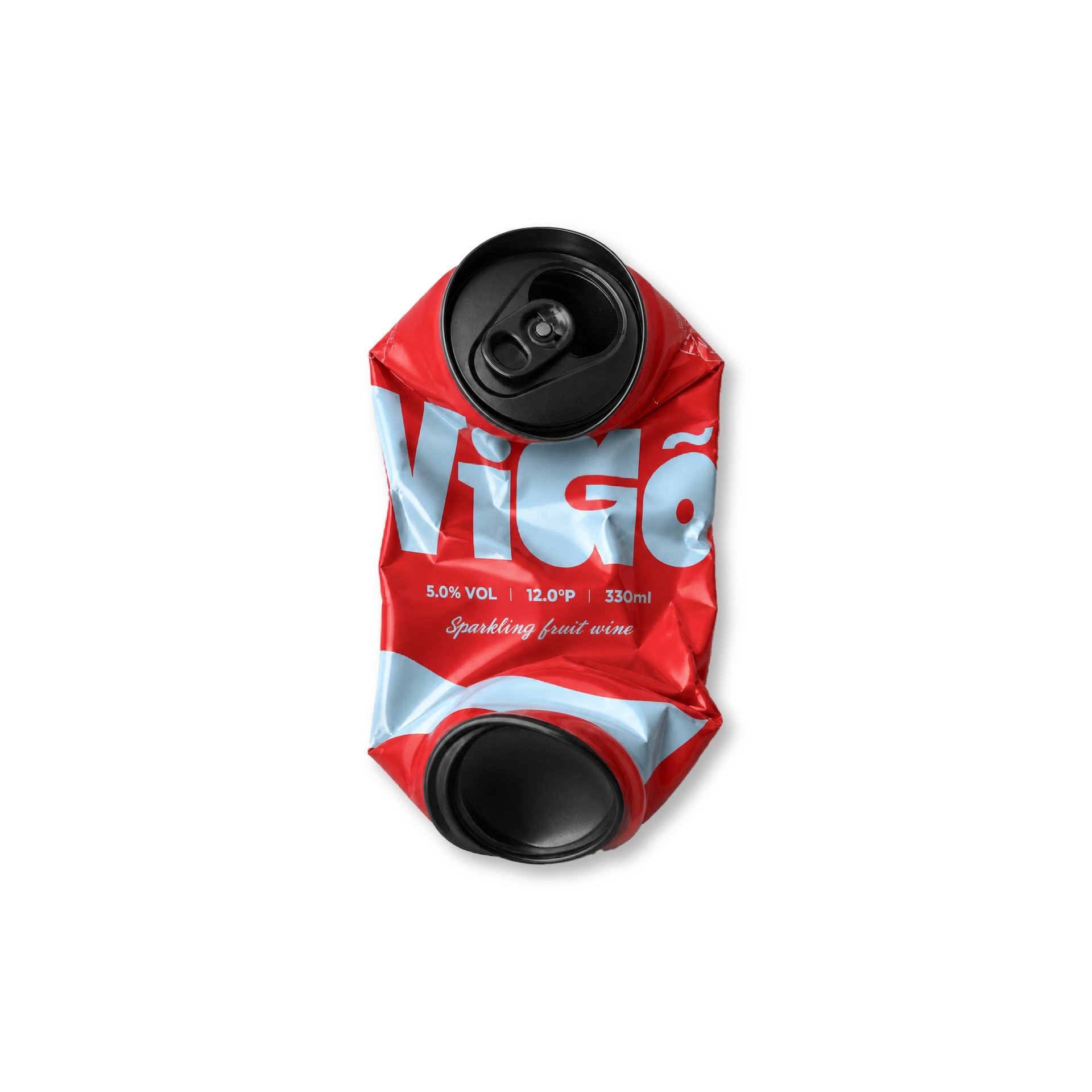
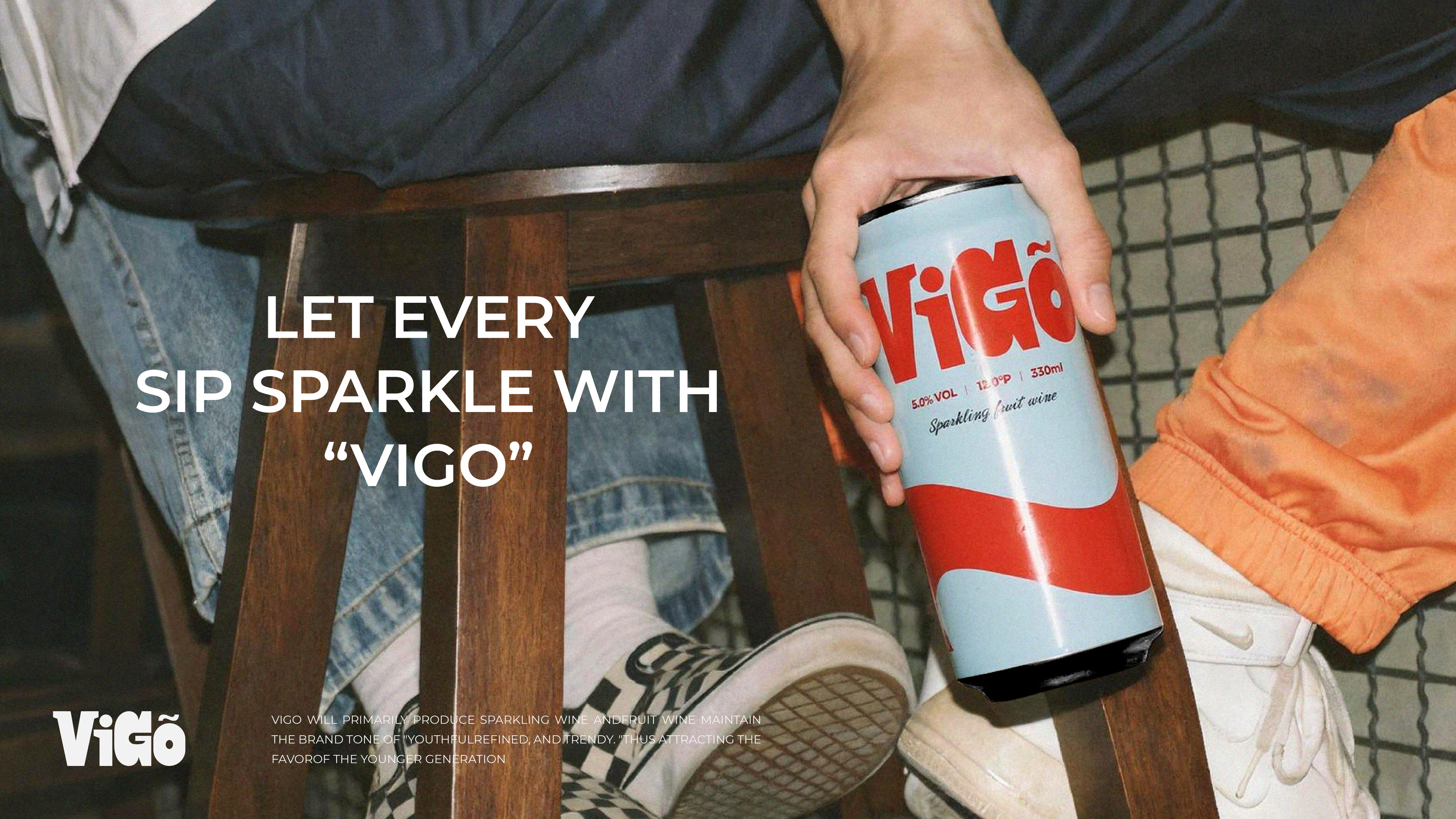
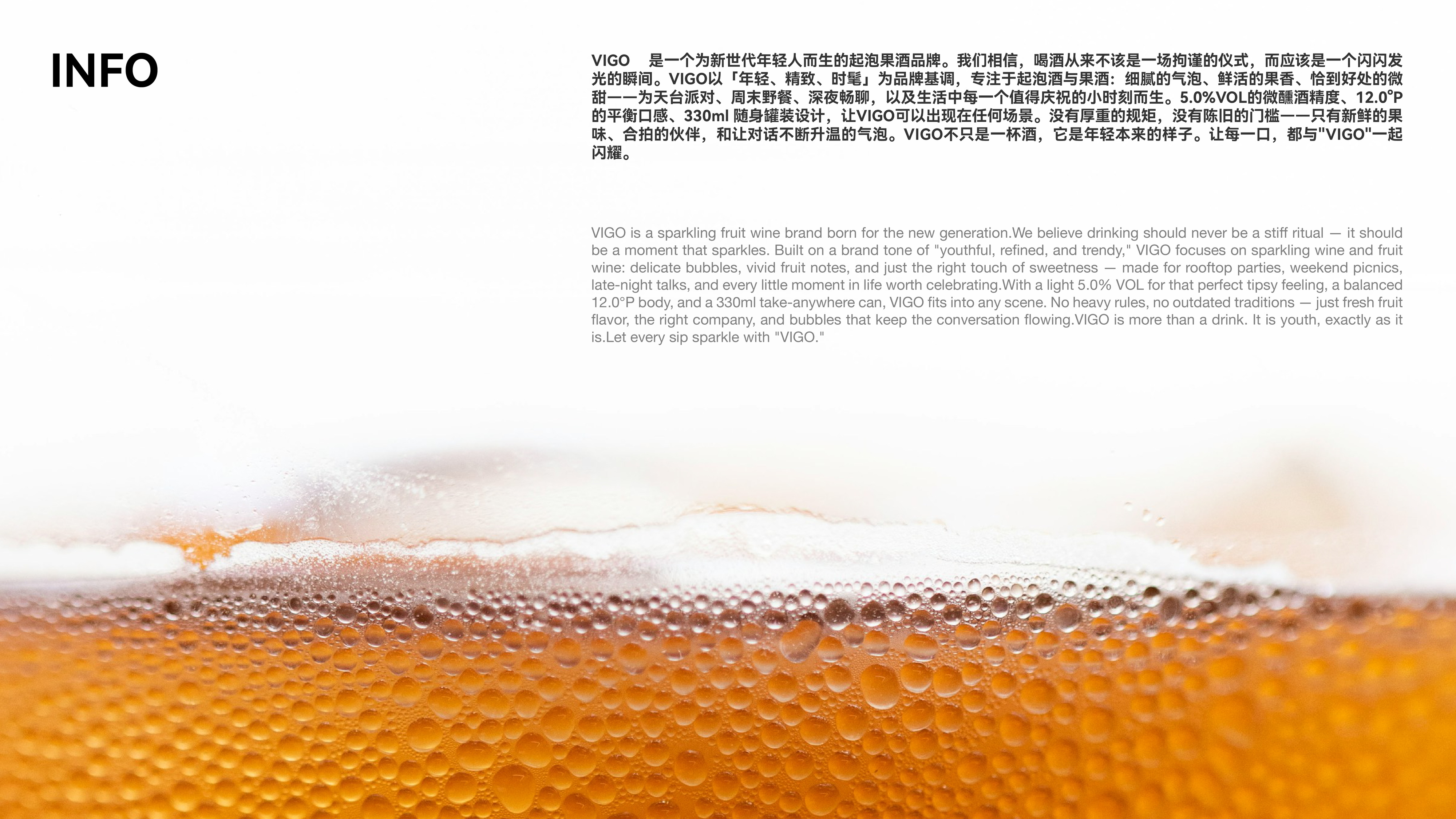
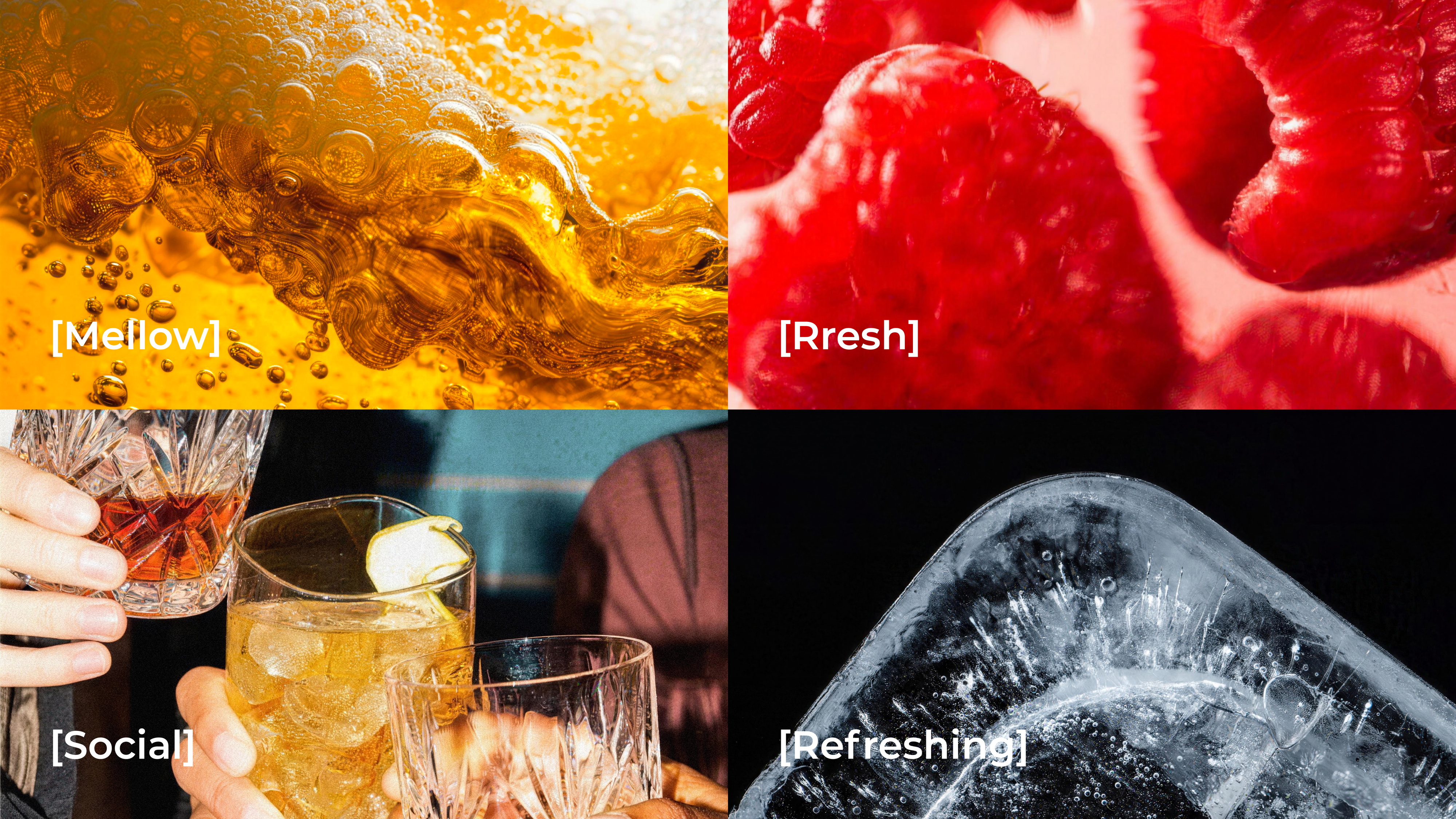
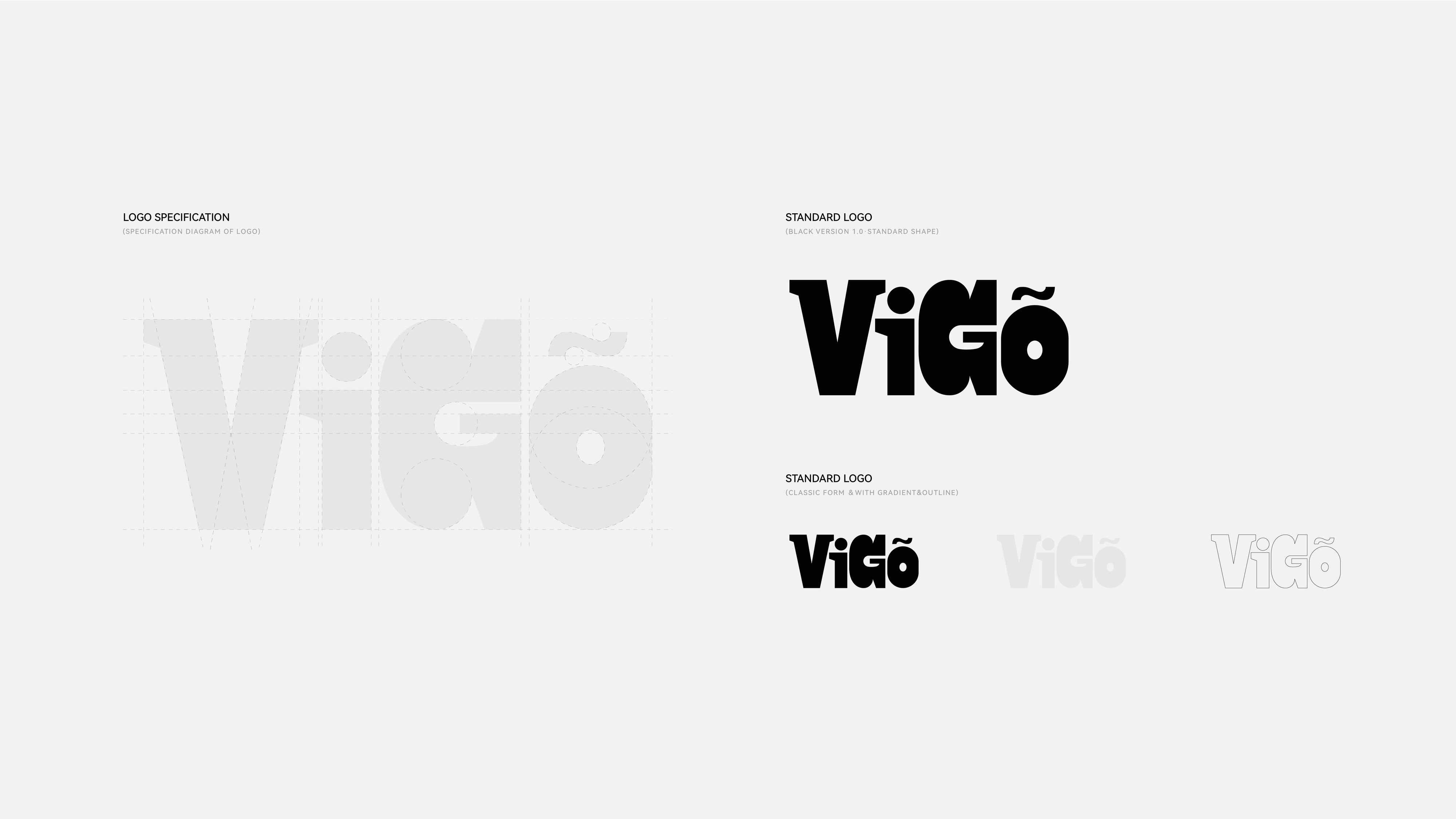
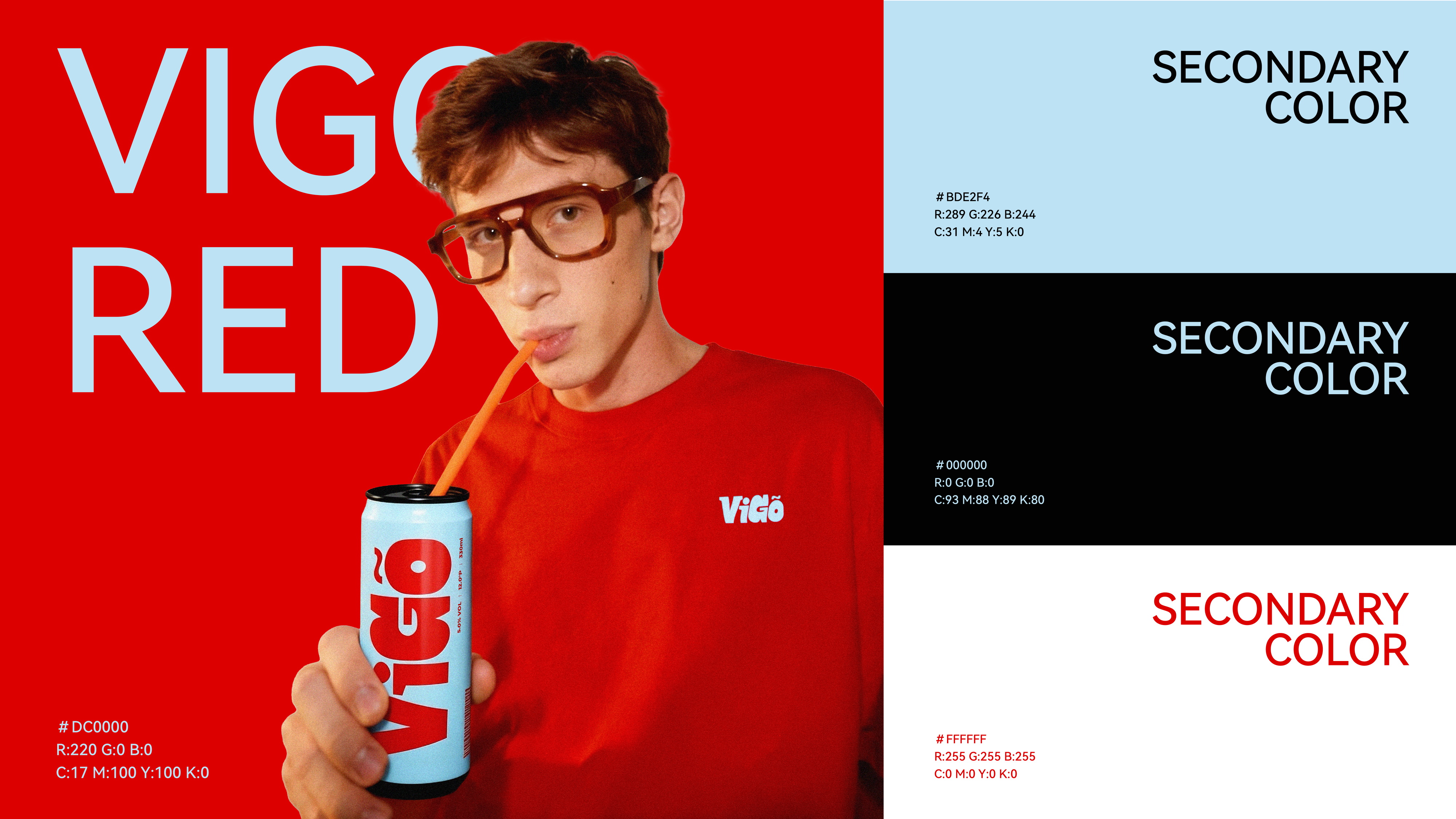
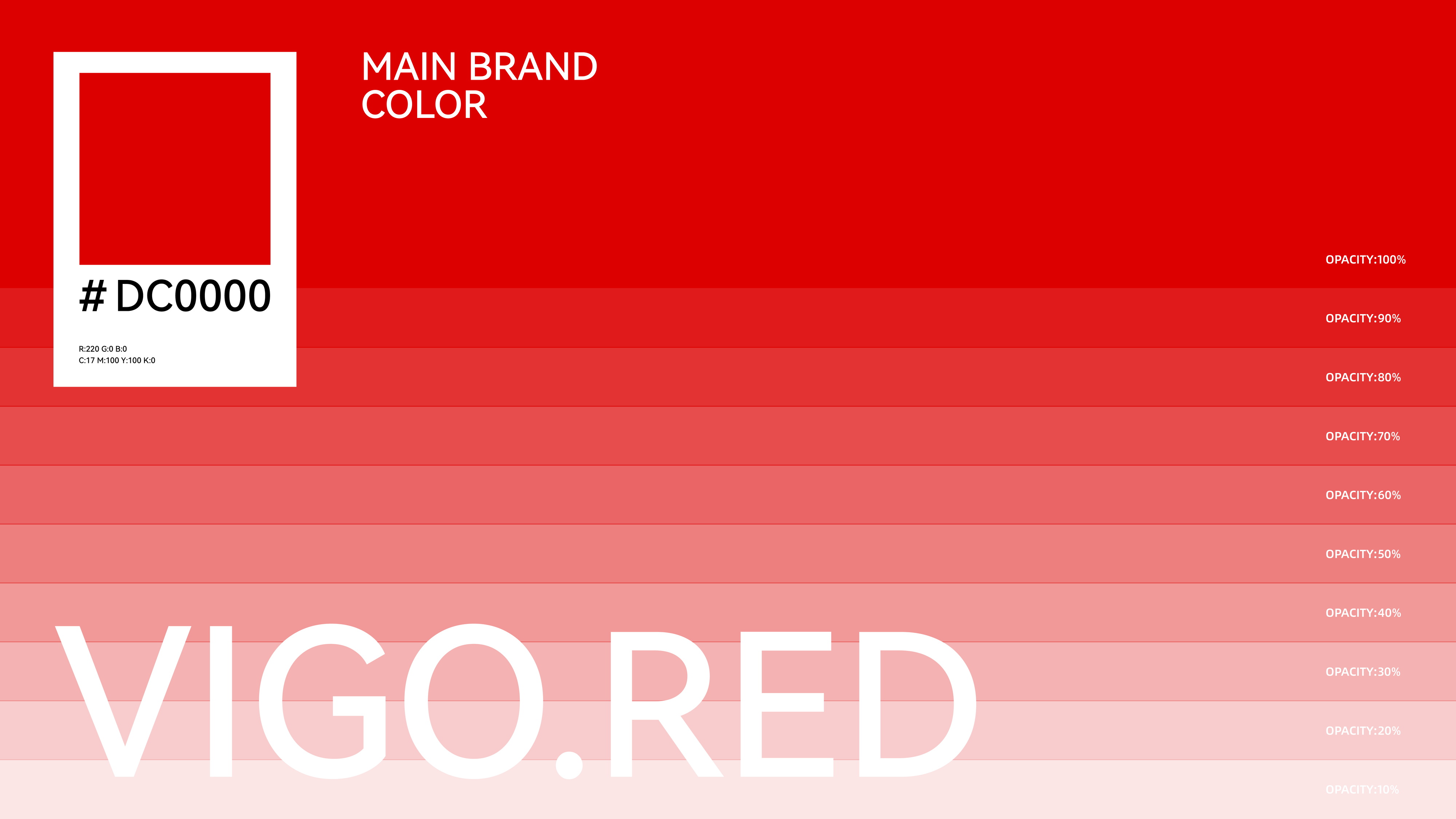
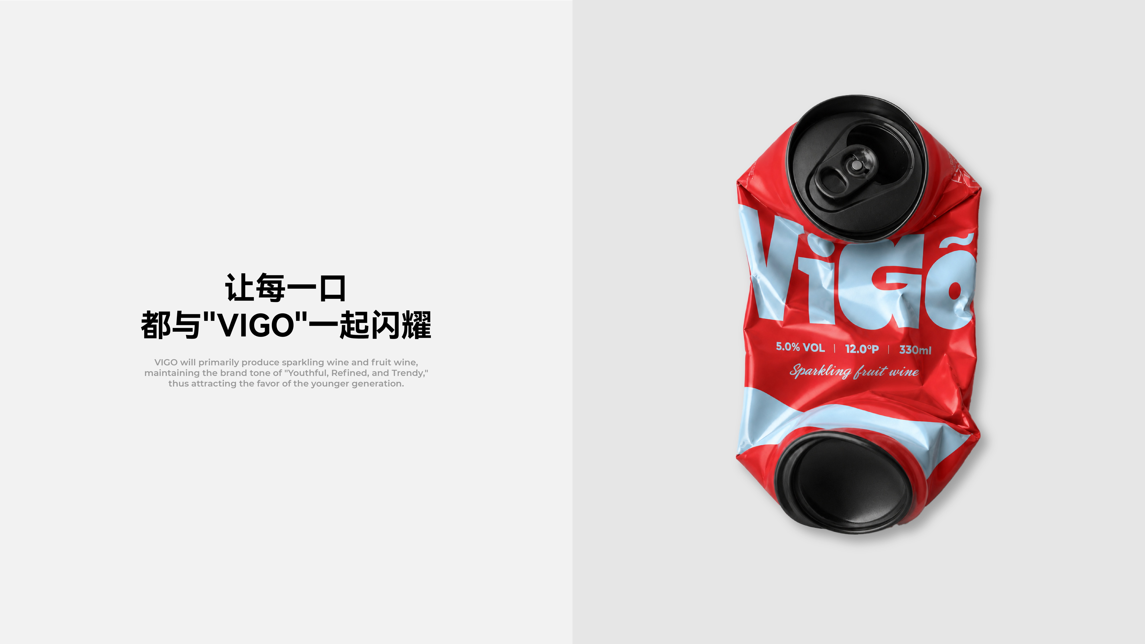
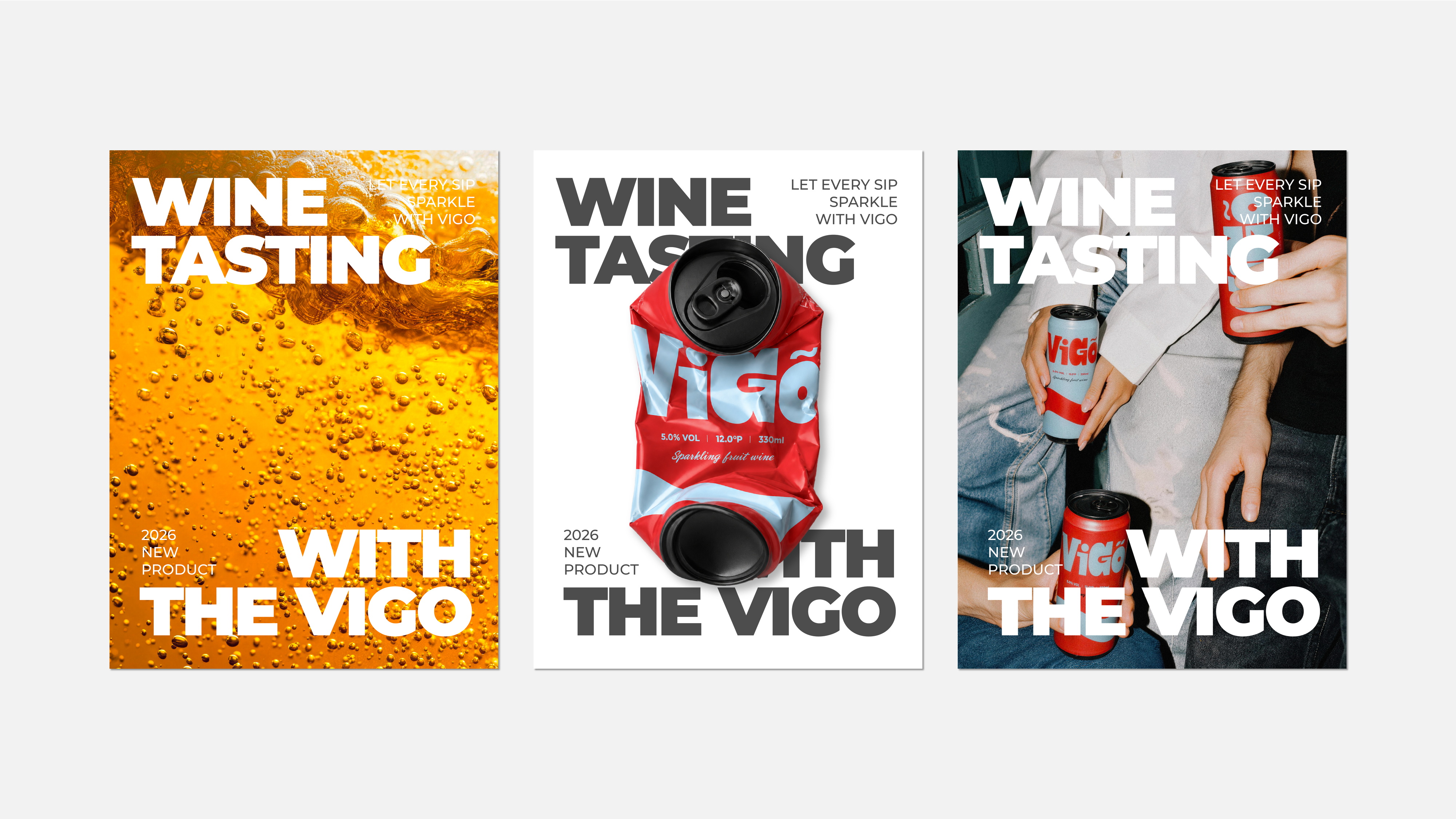
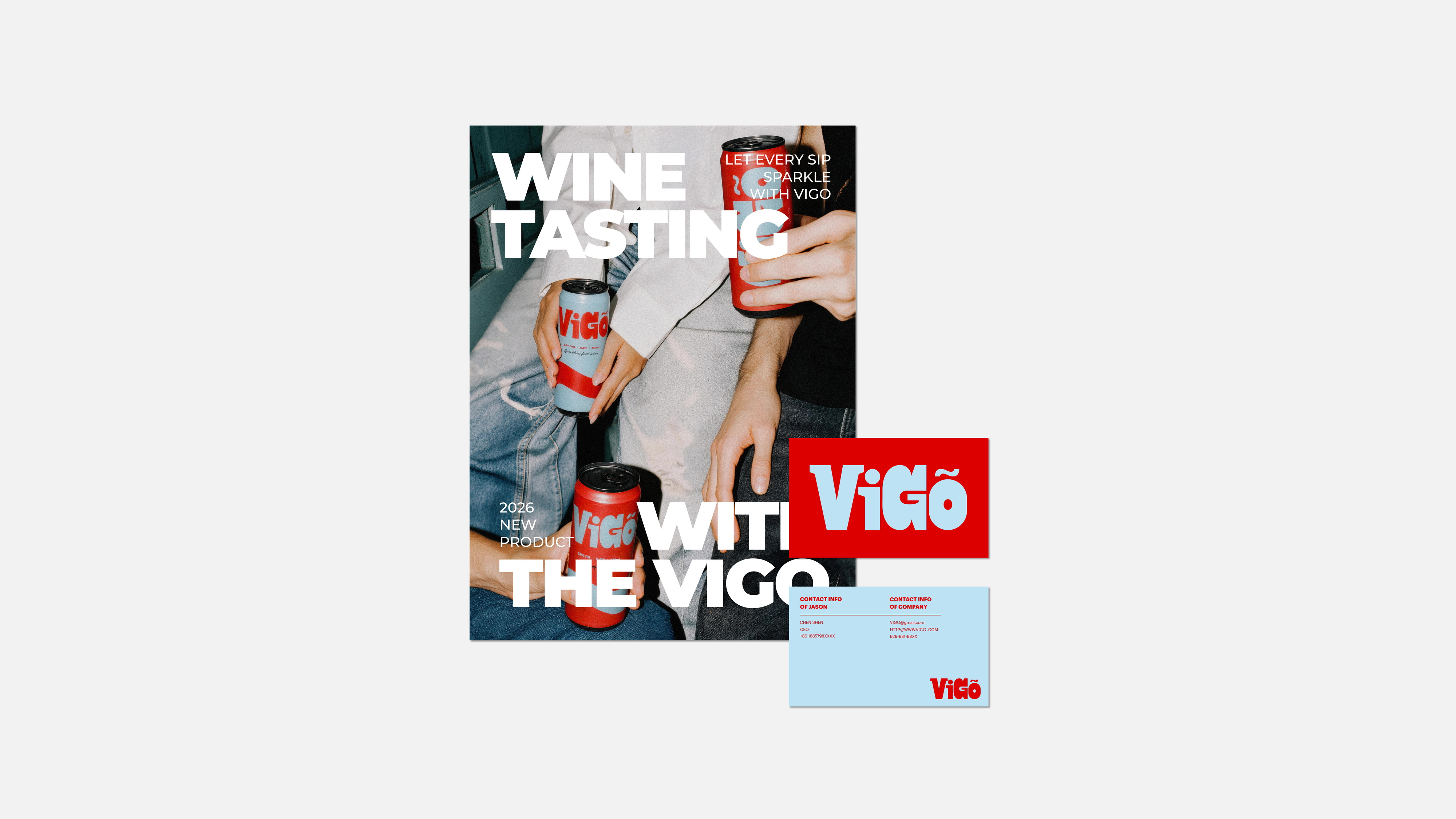
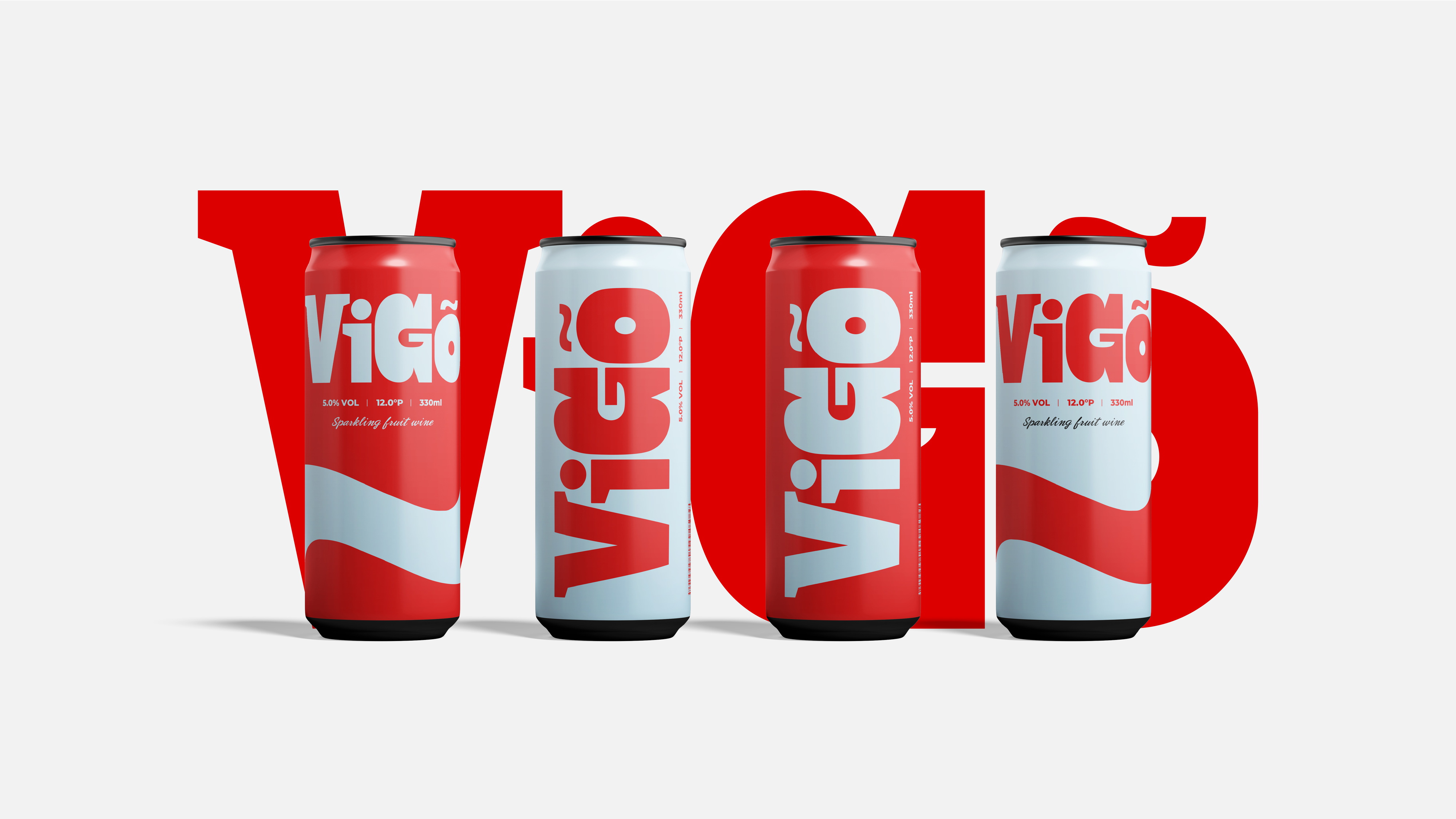
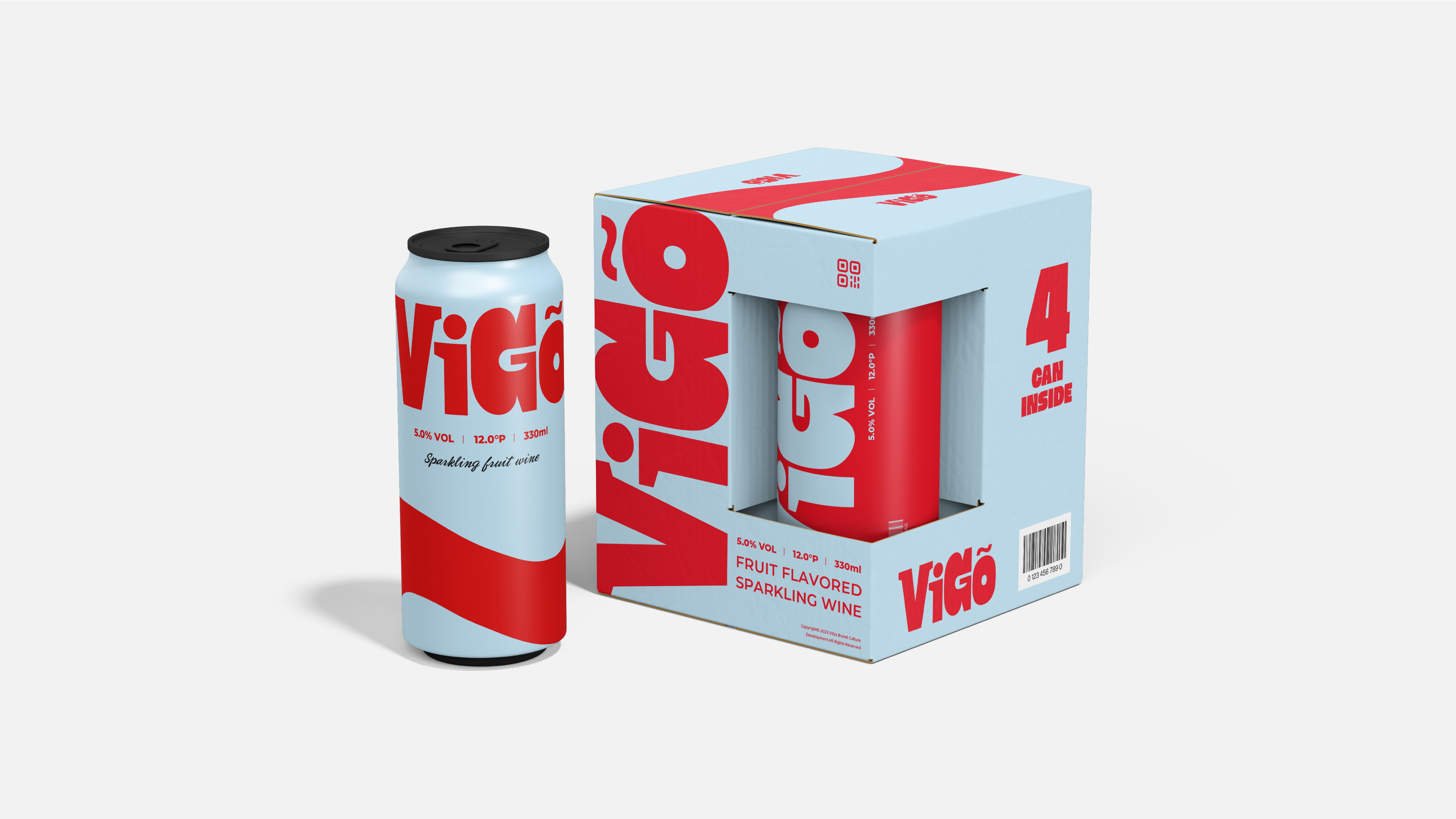
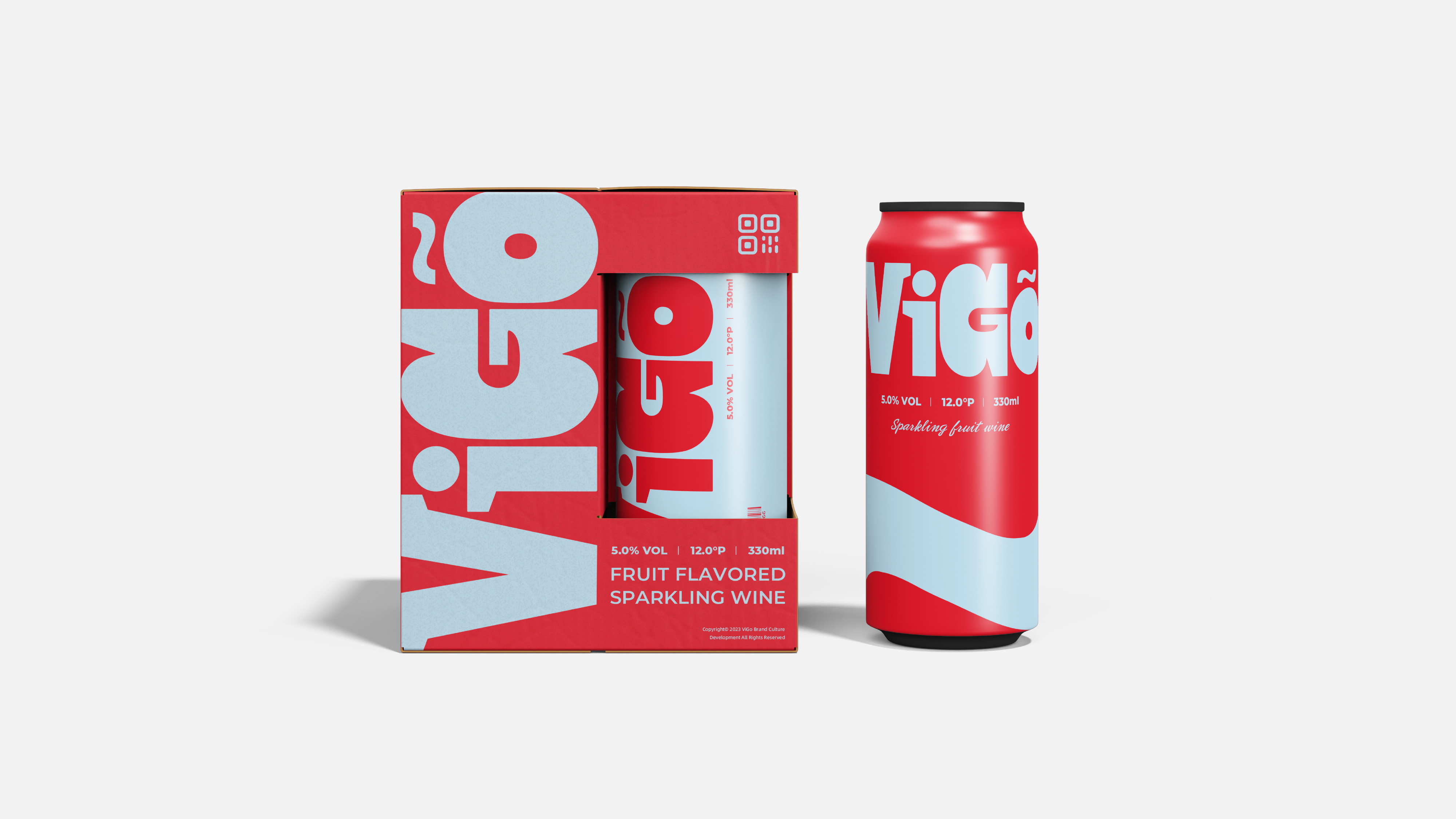
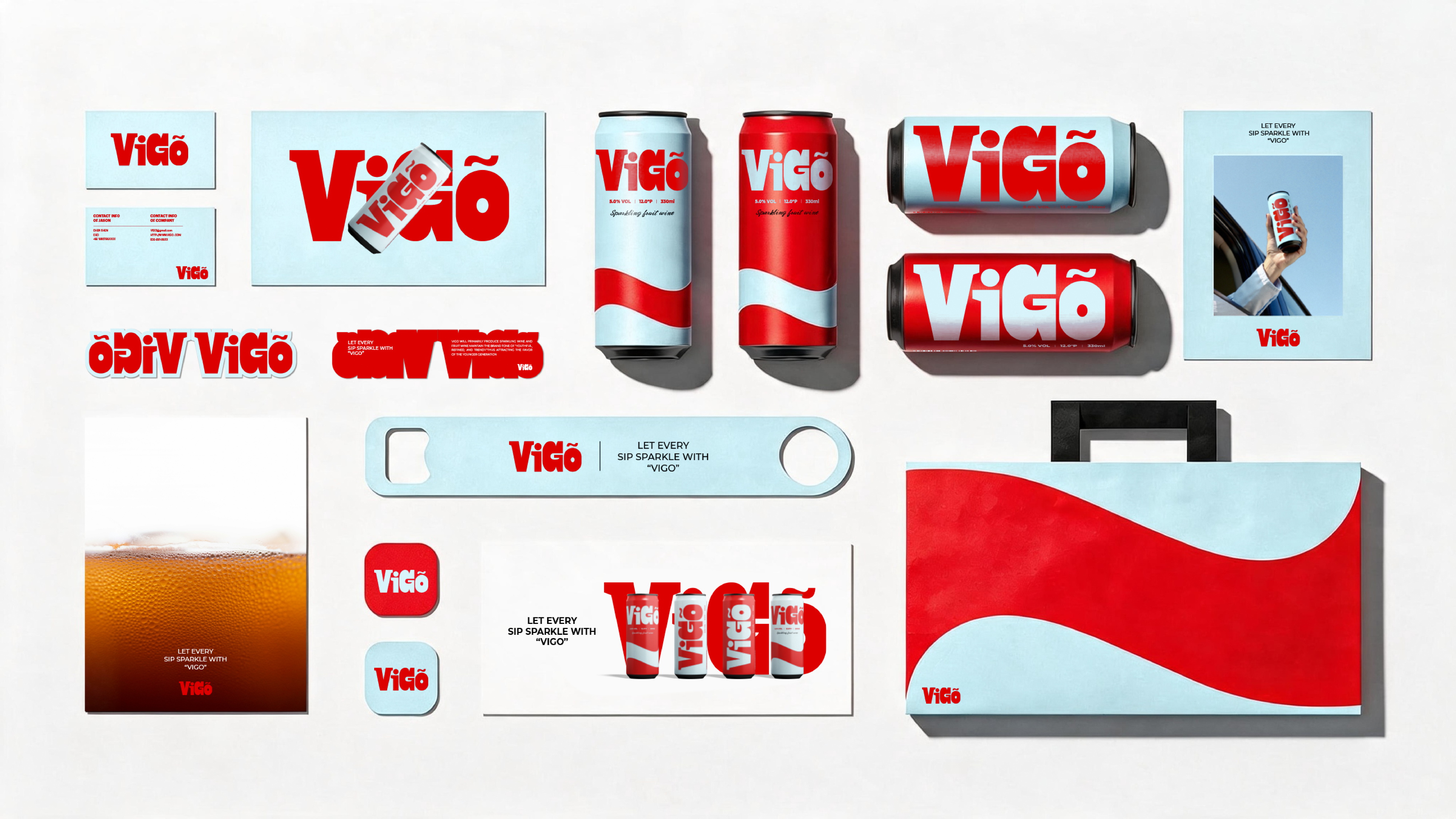
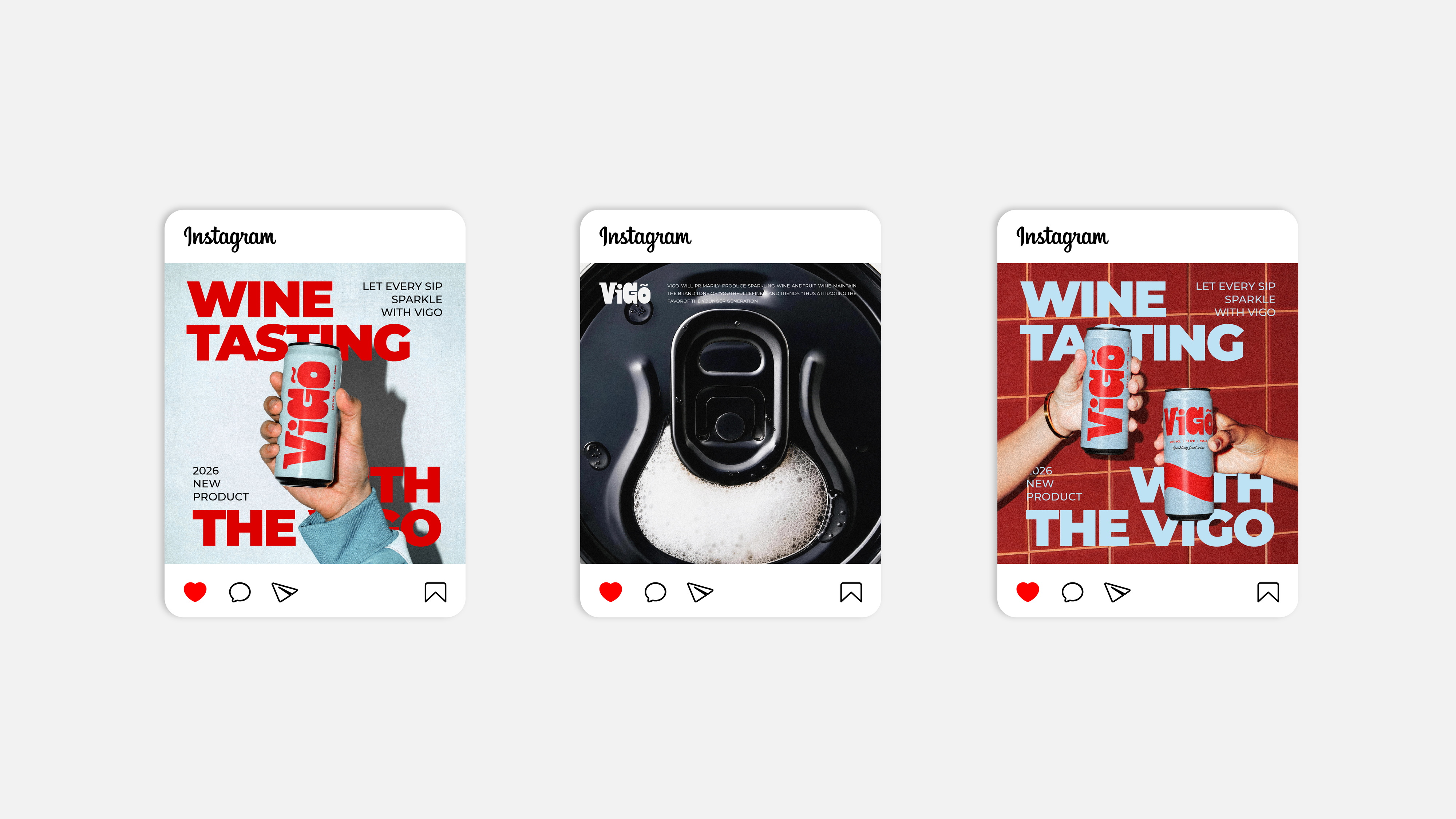
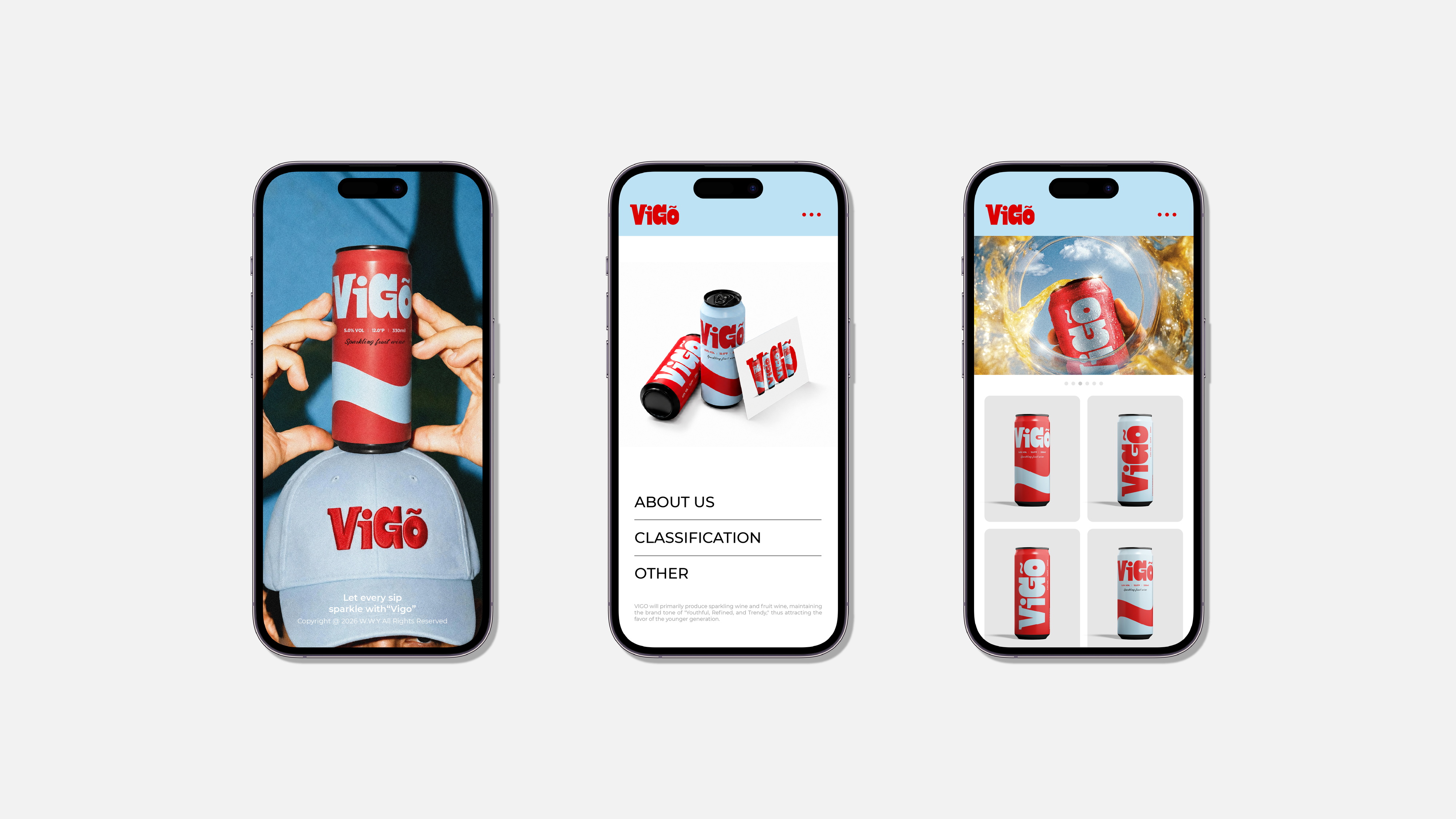
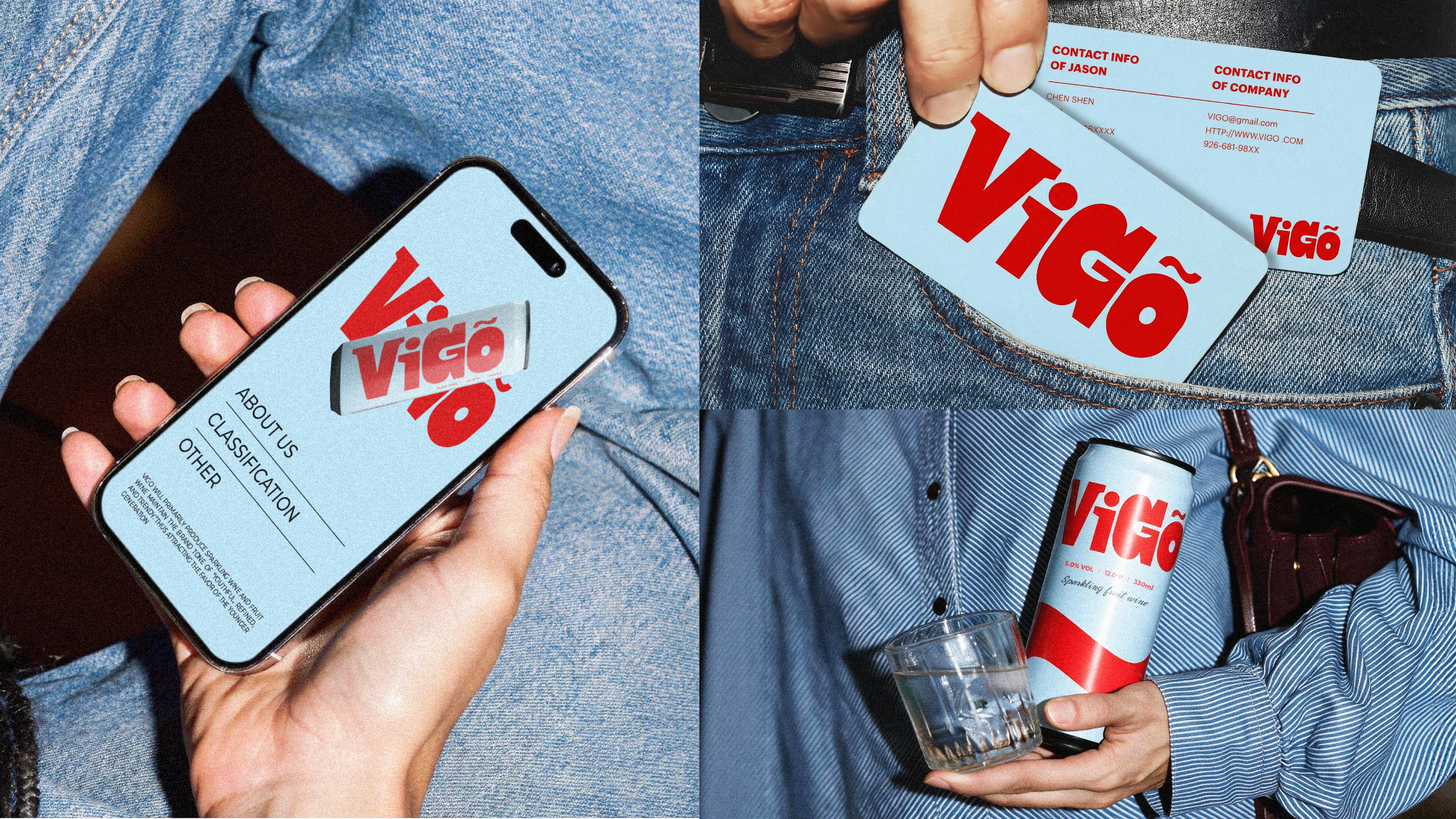
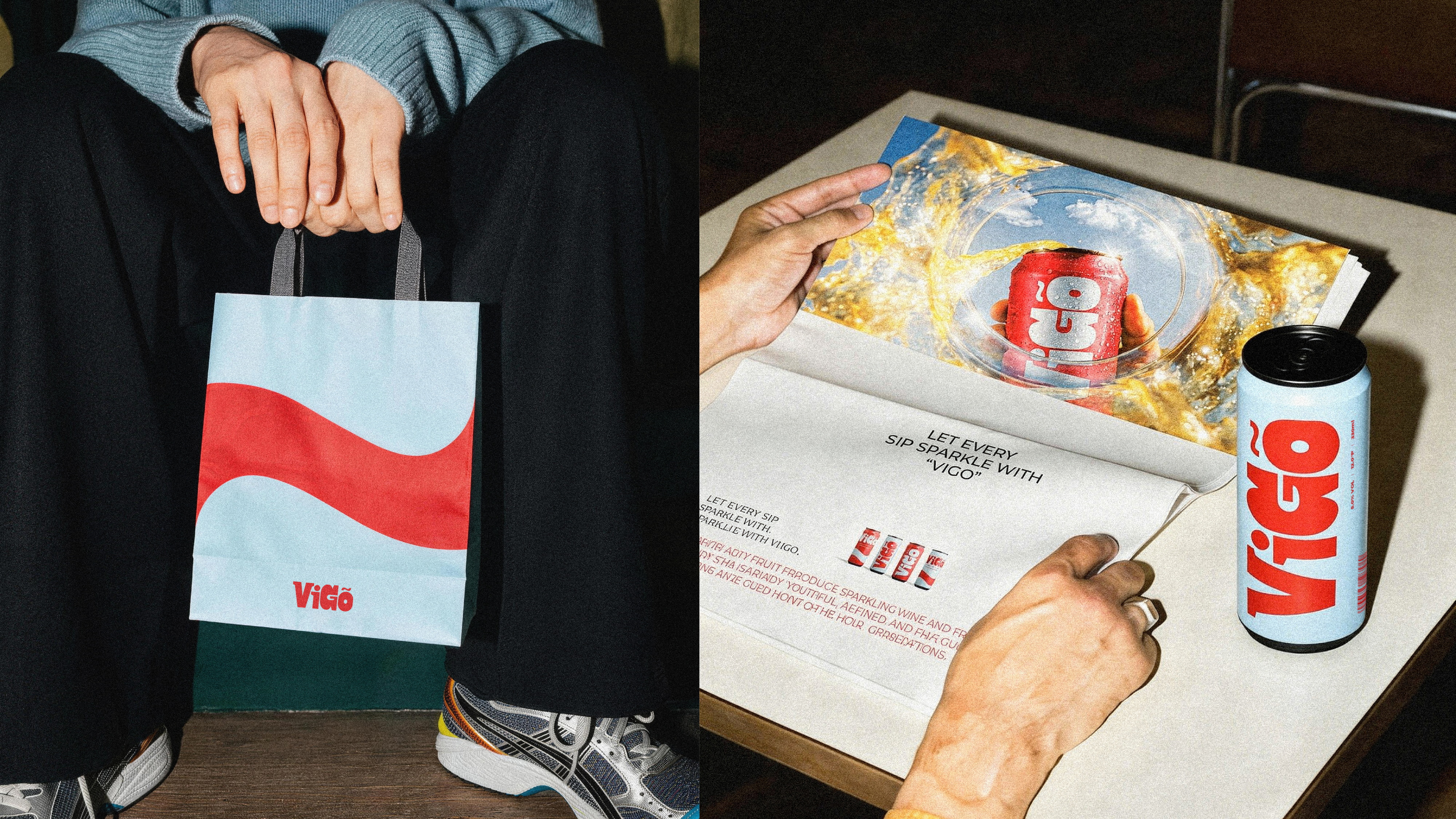
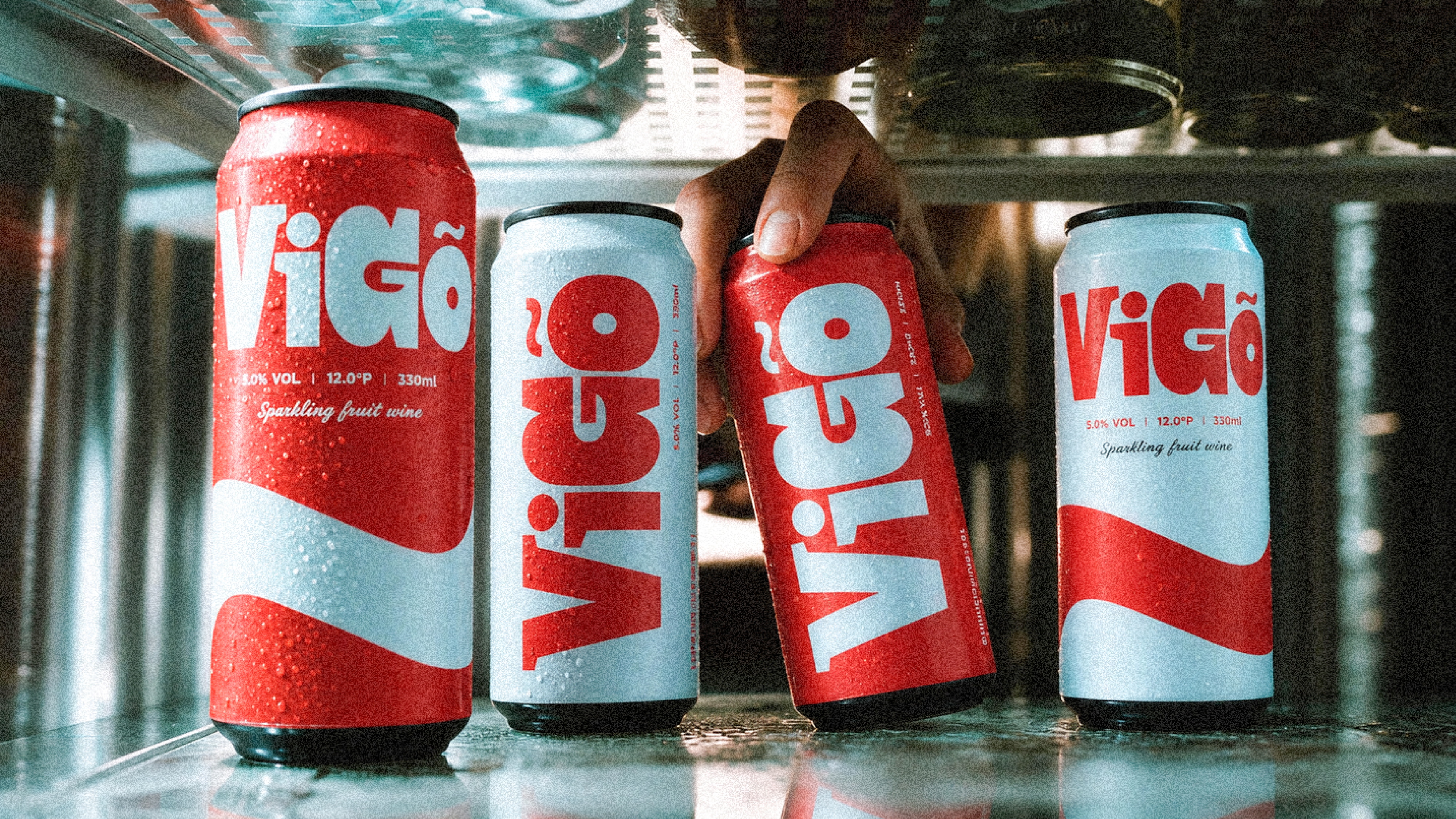
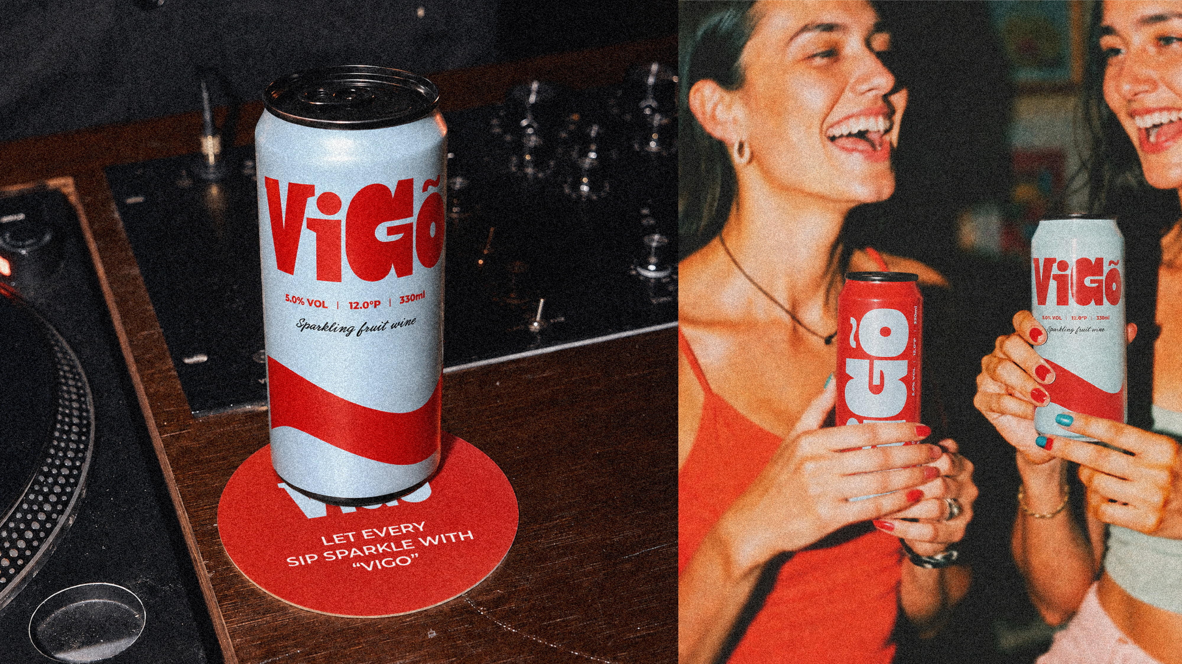
VIGO 是一个为新世代年轻人而生的起泡果酒品牌。我们相信,喝酒从来不该是一场拘谨的仪式,而应该是一个闪闪发光的瞬间。VIGO以「年轻、精致、时髦」为品牌基调,专注于起泡酒与果酒:细腻的气泡、鲜活的果香、恰到好处的微甜——为天台派对、周末野餐、深夜畅聊,以及生活中每一个值得庆祝的小时刻而生。5.0%VOL的微醺酒精度、12.0°P 的平衡口感、330ml 随身罐装设计,让VIGO可以出现在任何场景。没有厚重的规矩,没有陈旧的门槛——只有新鲜的果味、合拍的伙伴,和让对话不断升温的气泡。VIGO不只是一杯酒,它是年轻本来的样子。让每一口,都与"VIGO"一起闪耀。
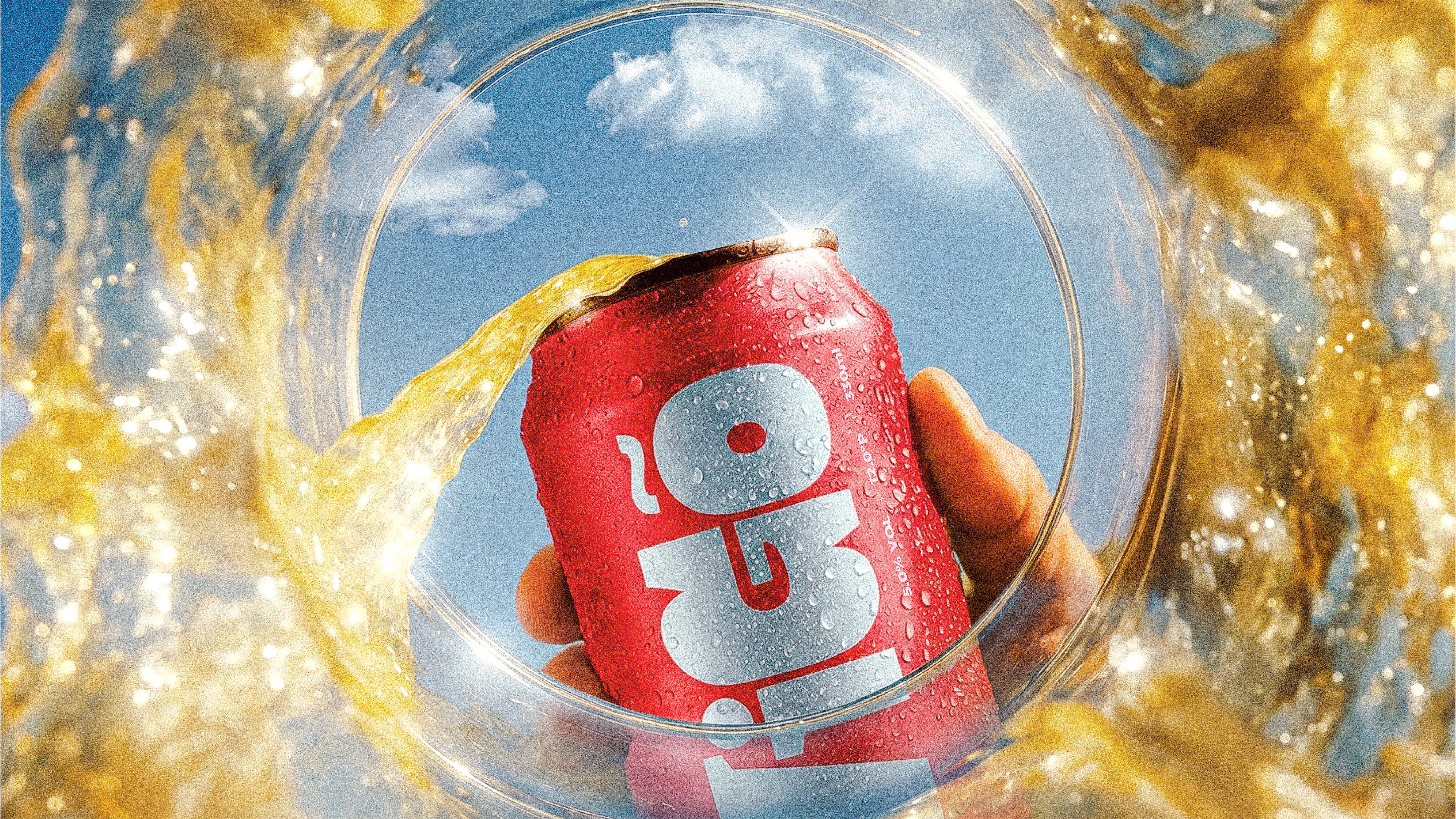
VIGO is a sparkling fruit wine brand born for the new generation. We believe drinking should never be a stiff ritual — it should be a moment that sparkles. Built on a brand tone of "youthful, refined, and trendy," VIGO focuses on sparkling wine and fruit wine: delicate bubbles, vivid fruit notes, and just the right touch of sweetness — made for rooftop parties, weekend picnics, late-night talks, and every little moment in life worth celebrating. With a light 5.0% VOL for that perfect tipsy feeling, a balanced 12.0°P body, and a 330ml take-anywhere can, VIGO fits into any scene. No heavy rules, no outdated traditions — just fresh fruit flavor, the right company, and bubbles that keep the conversation flowing. VIGO is more than a drink. It is youth, exactly as it is. Let every sip sparkle with "VIGO."

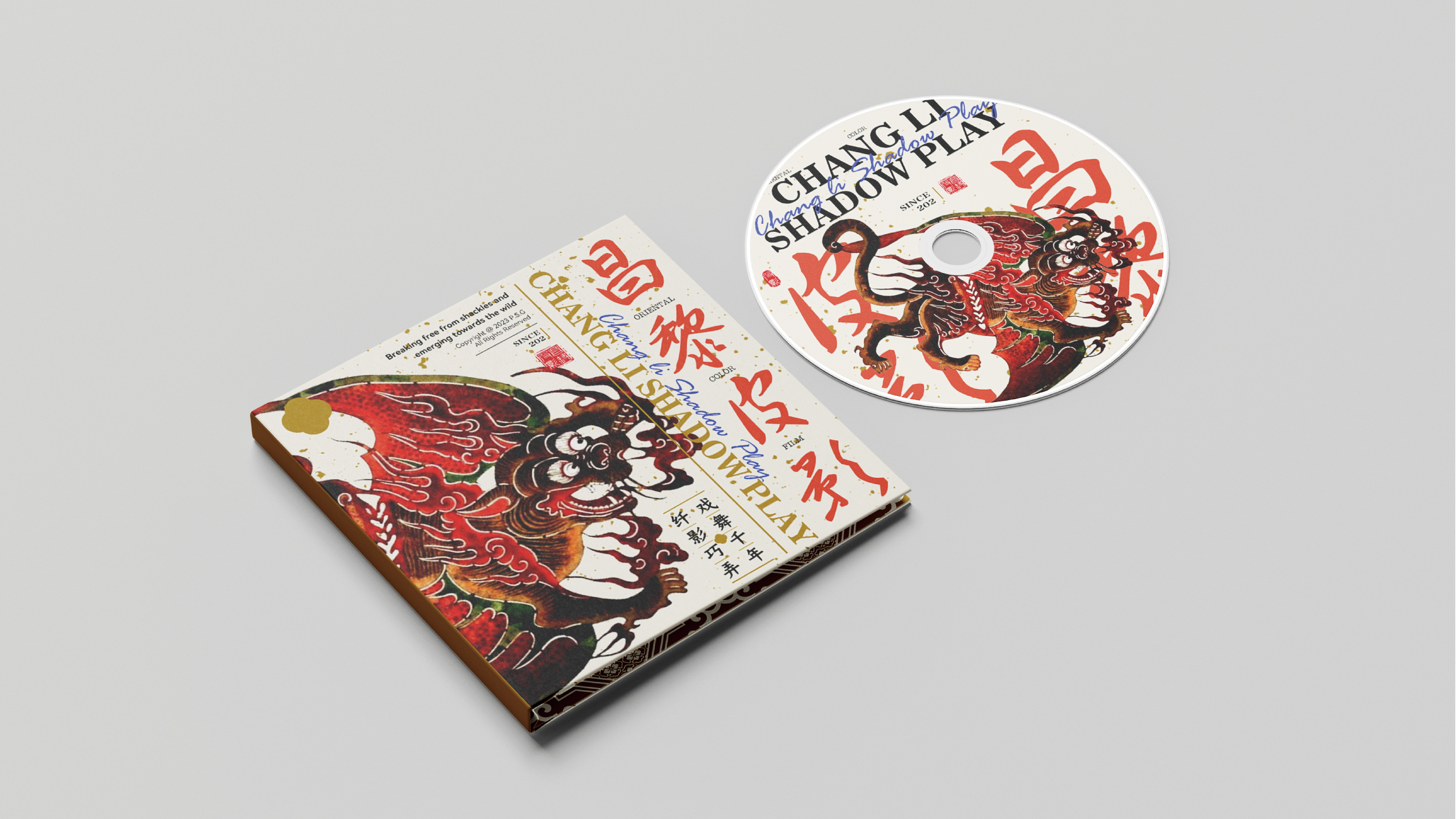
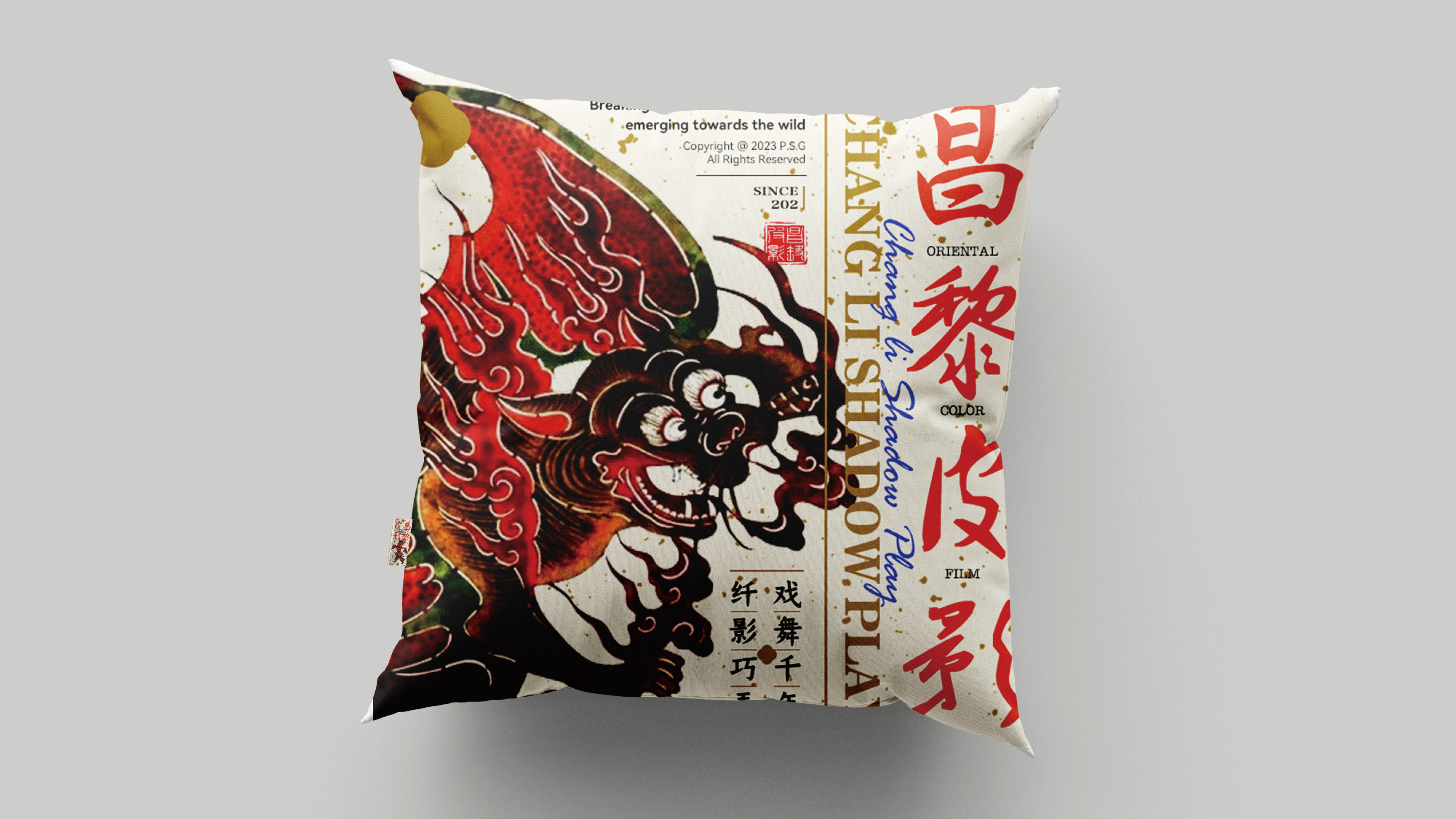
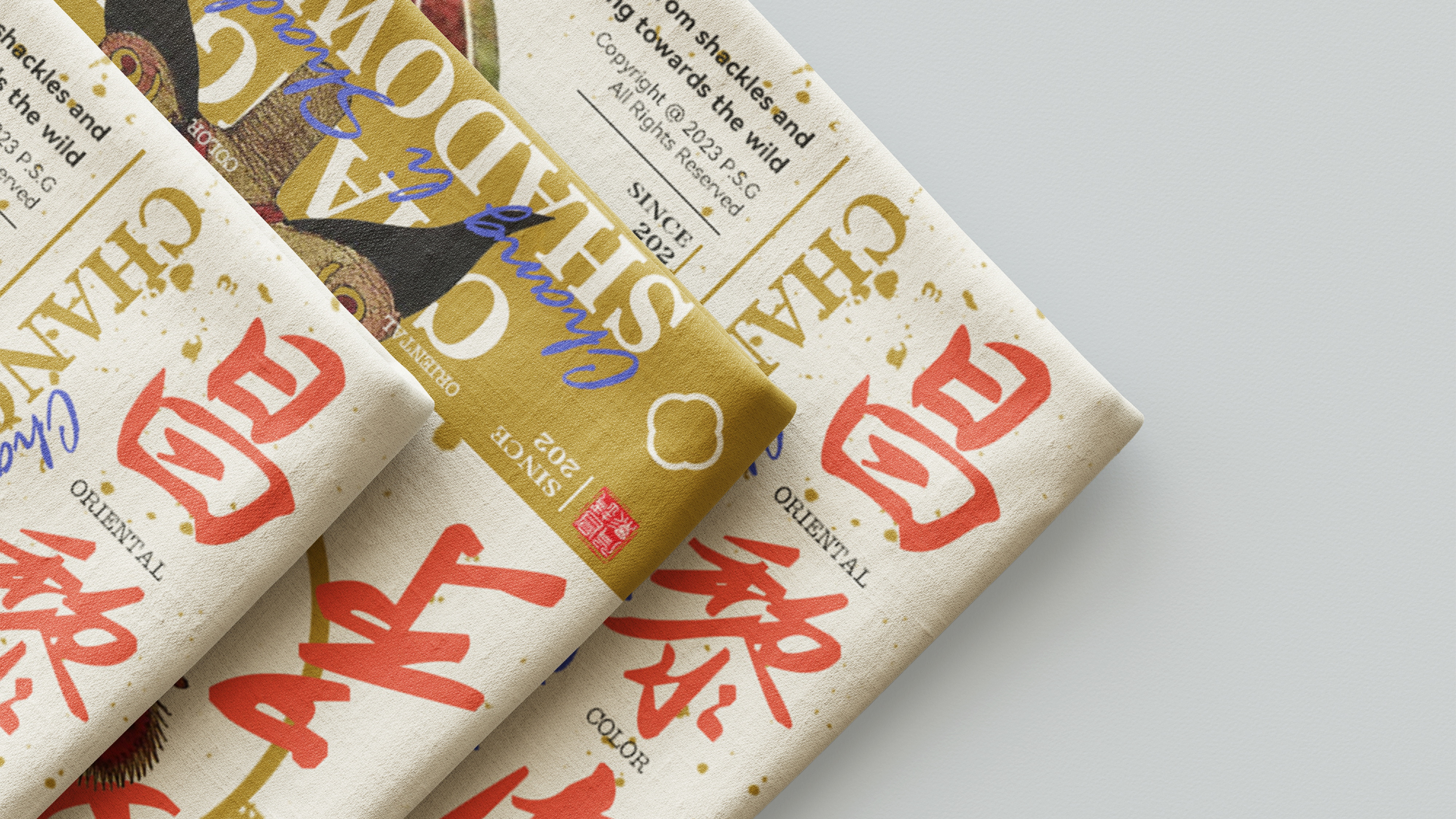
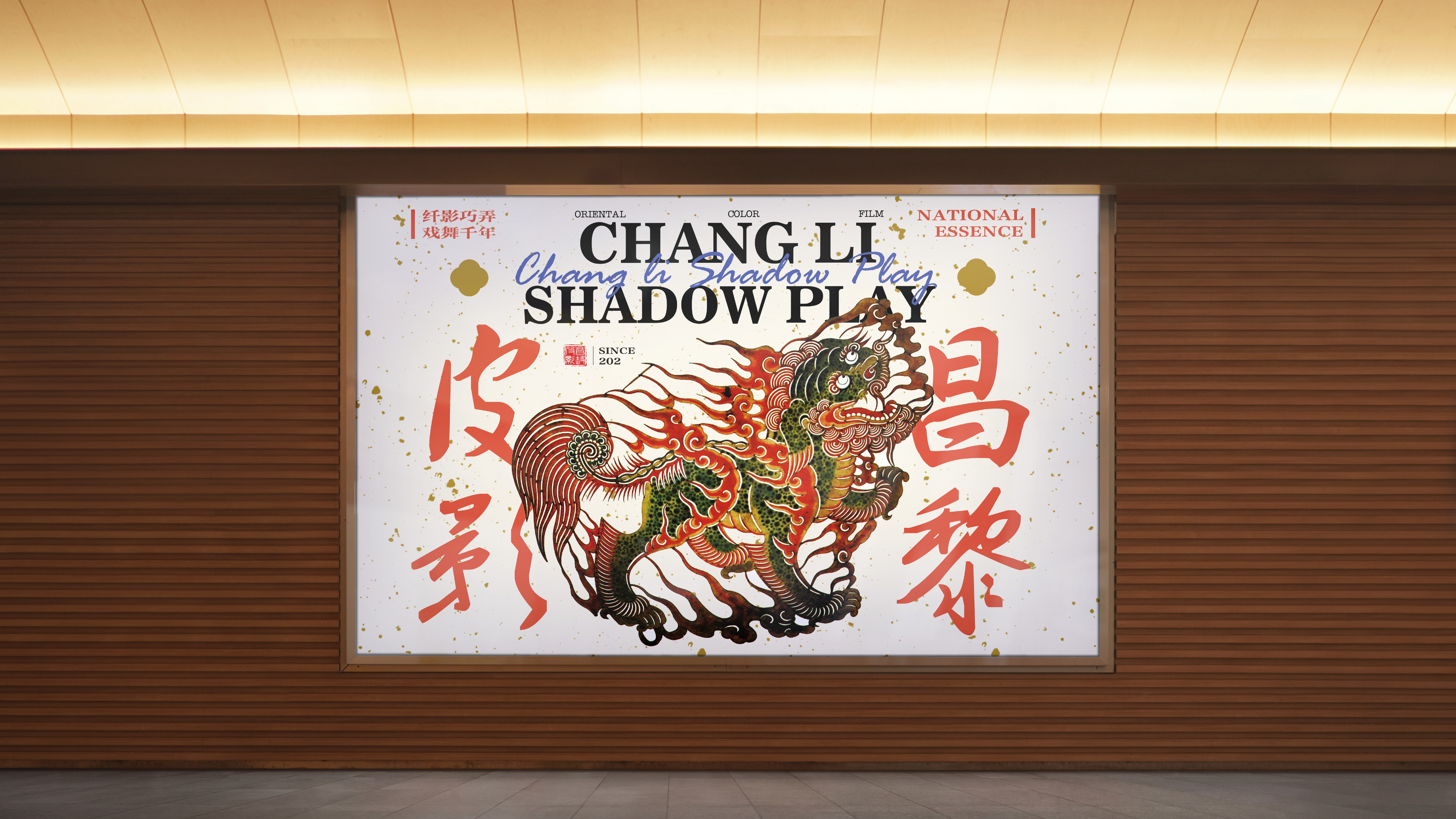
昌黎皮影品牌再设计
Brief
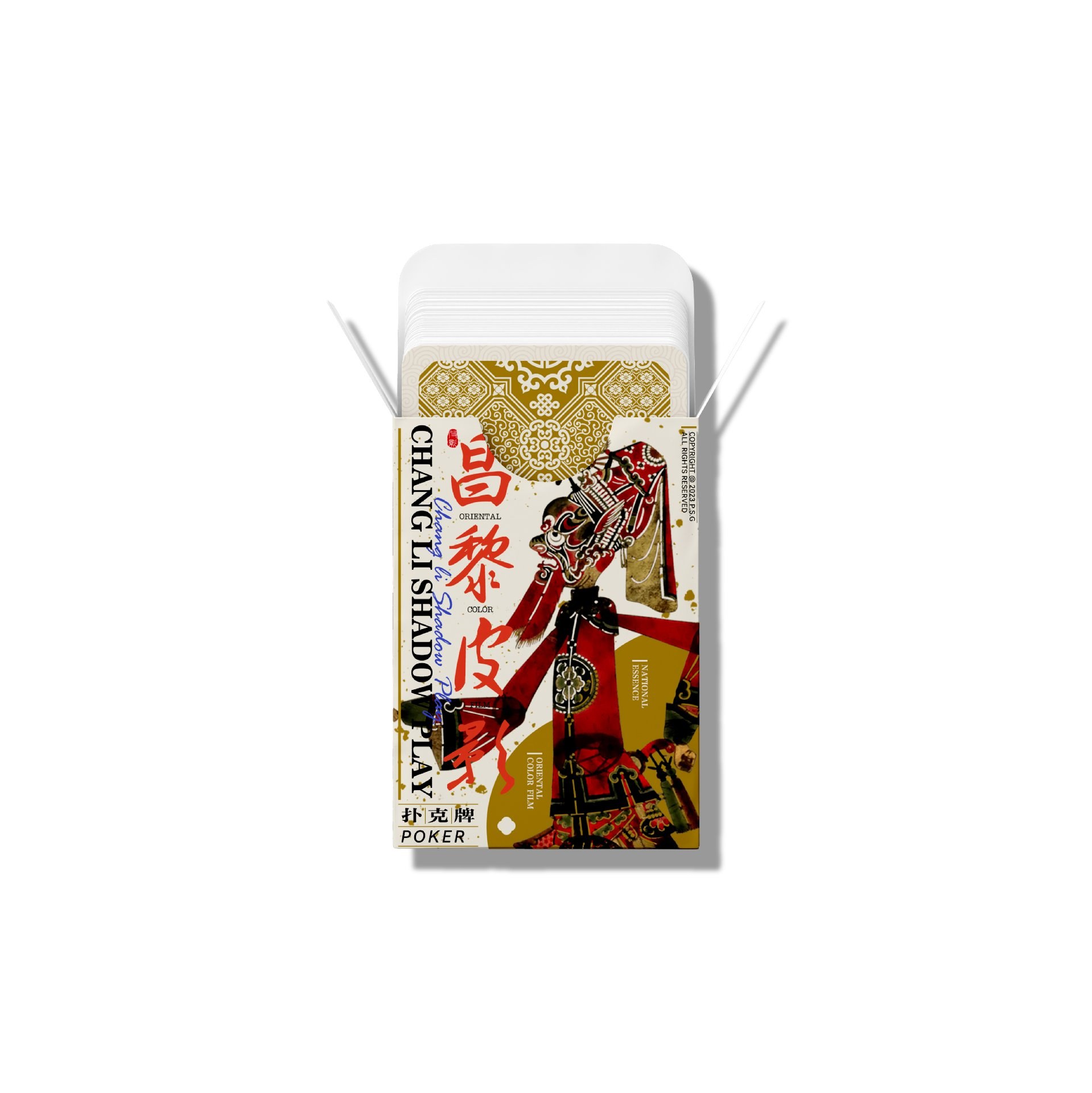
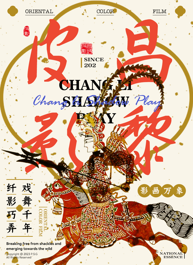
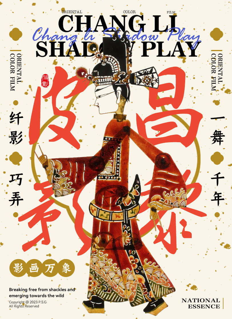
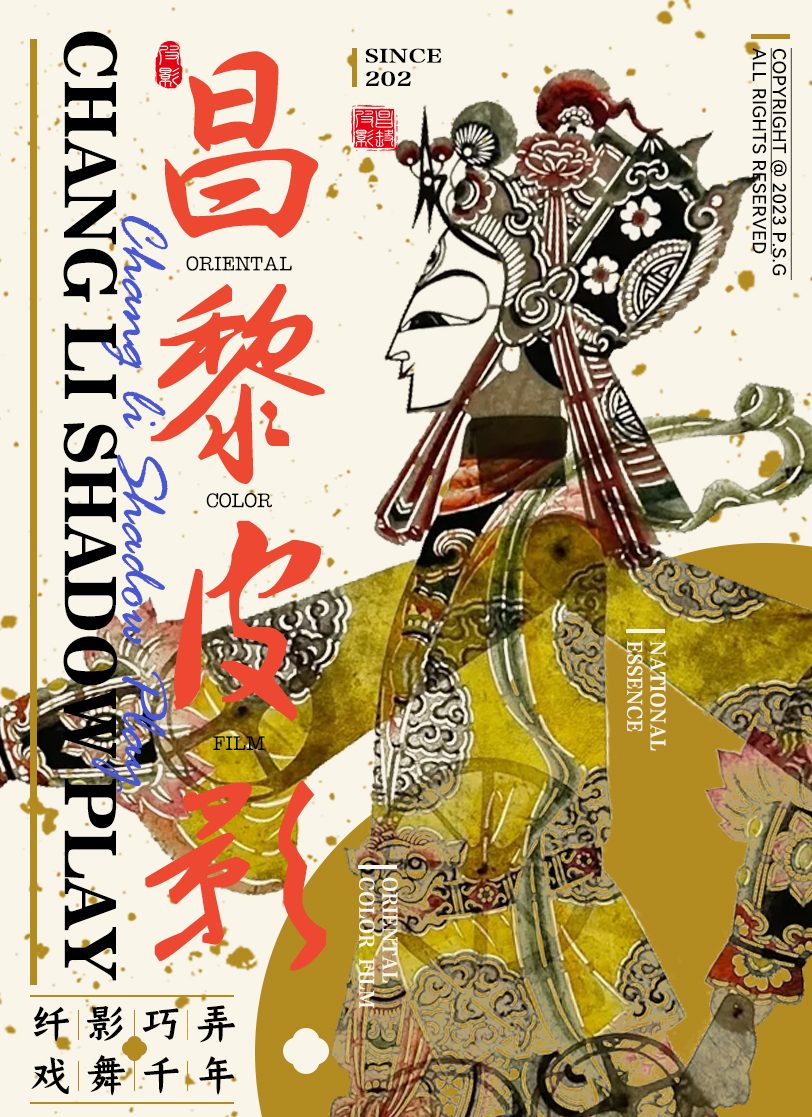
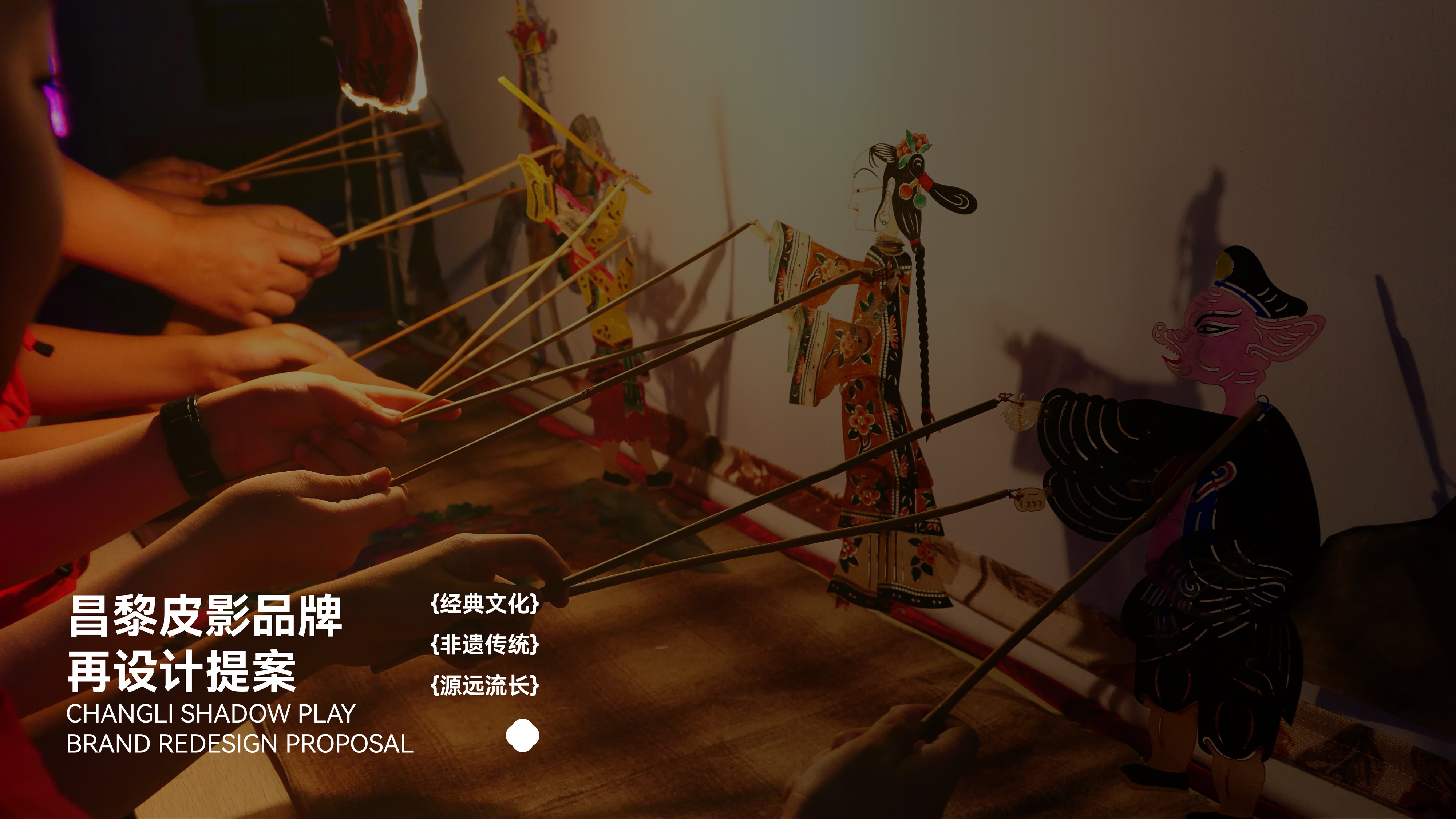
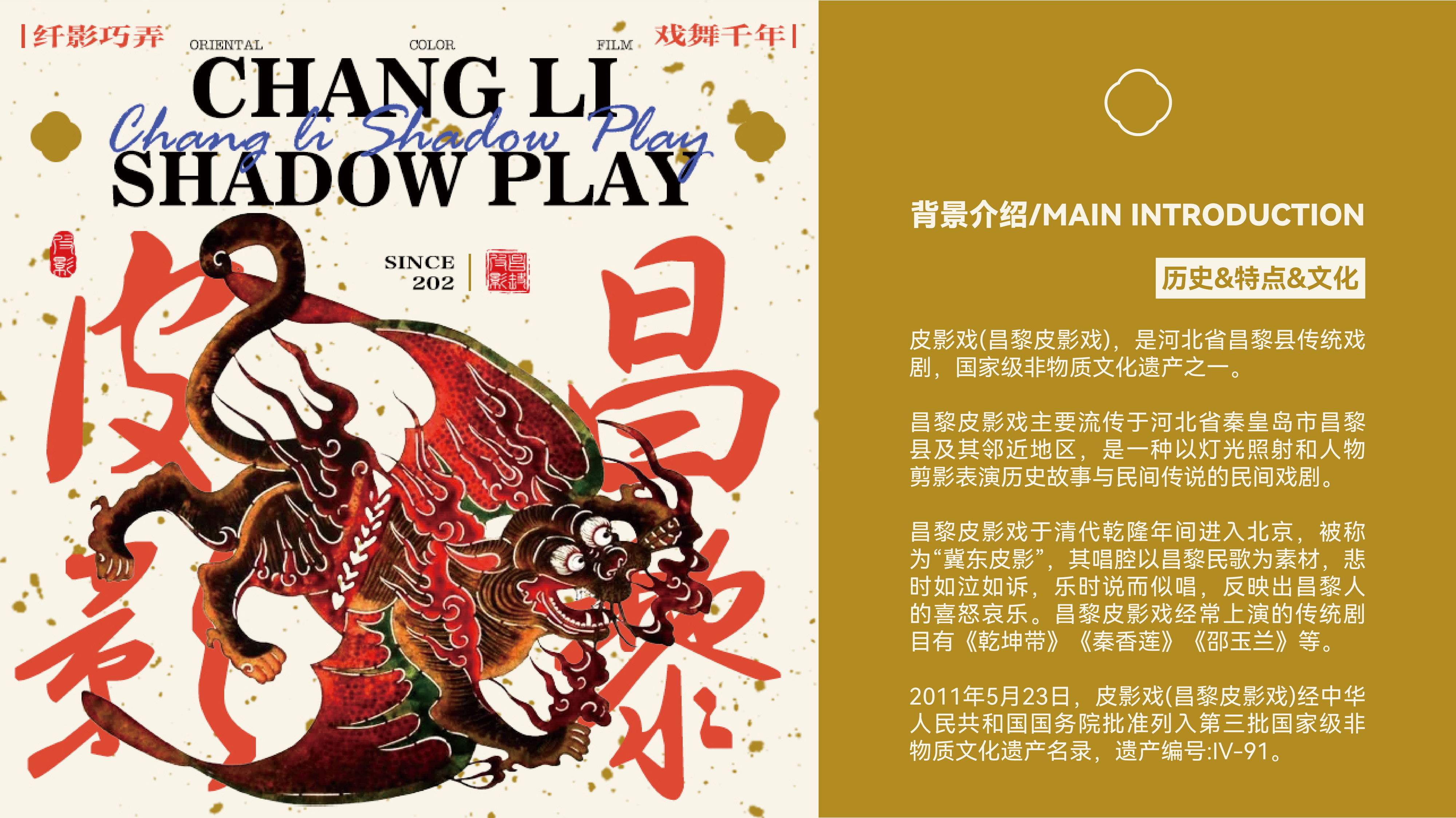
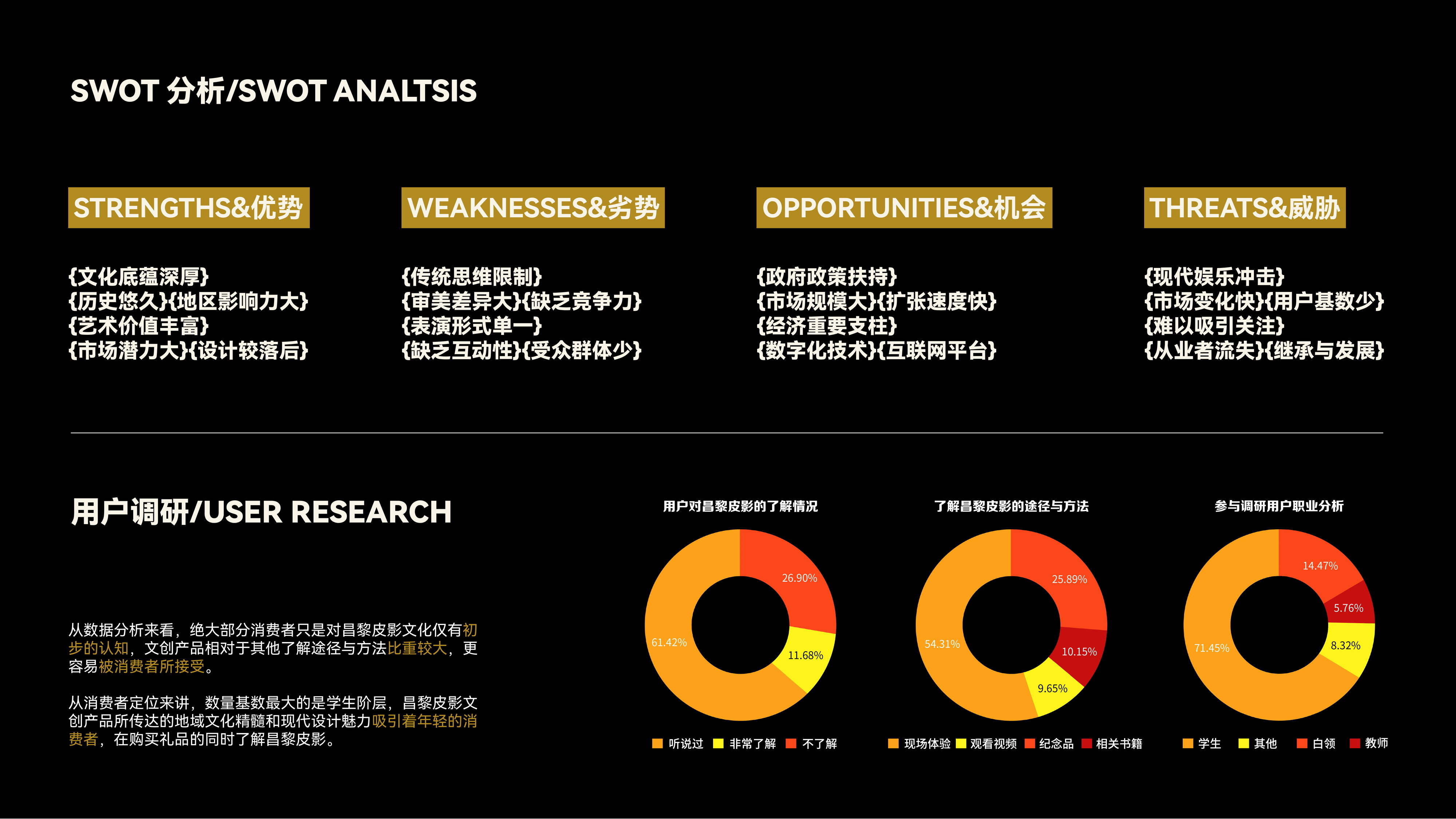
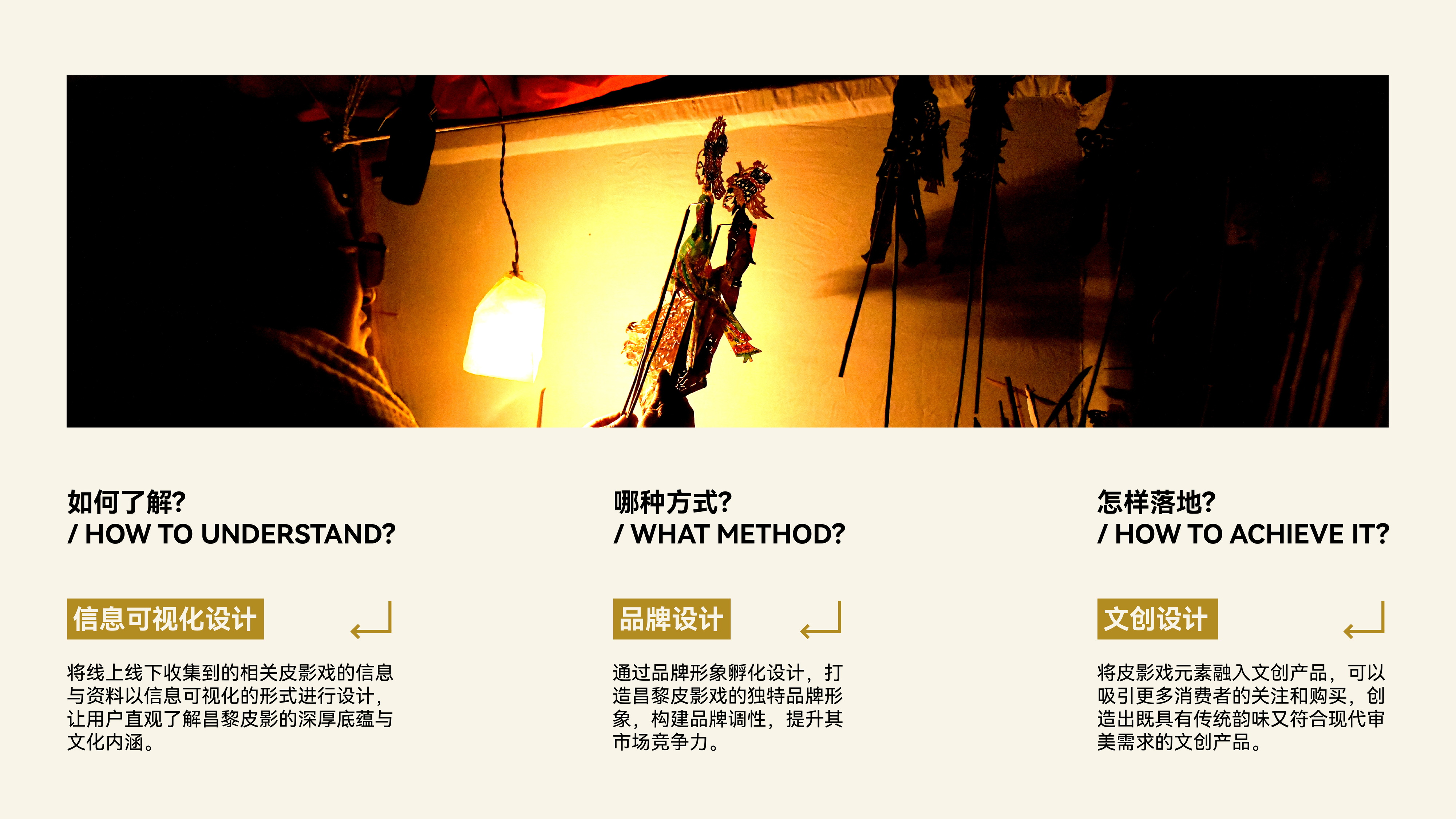
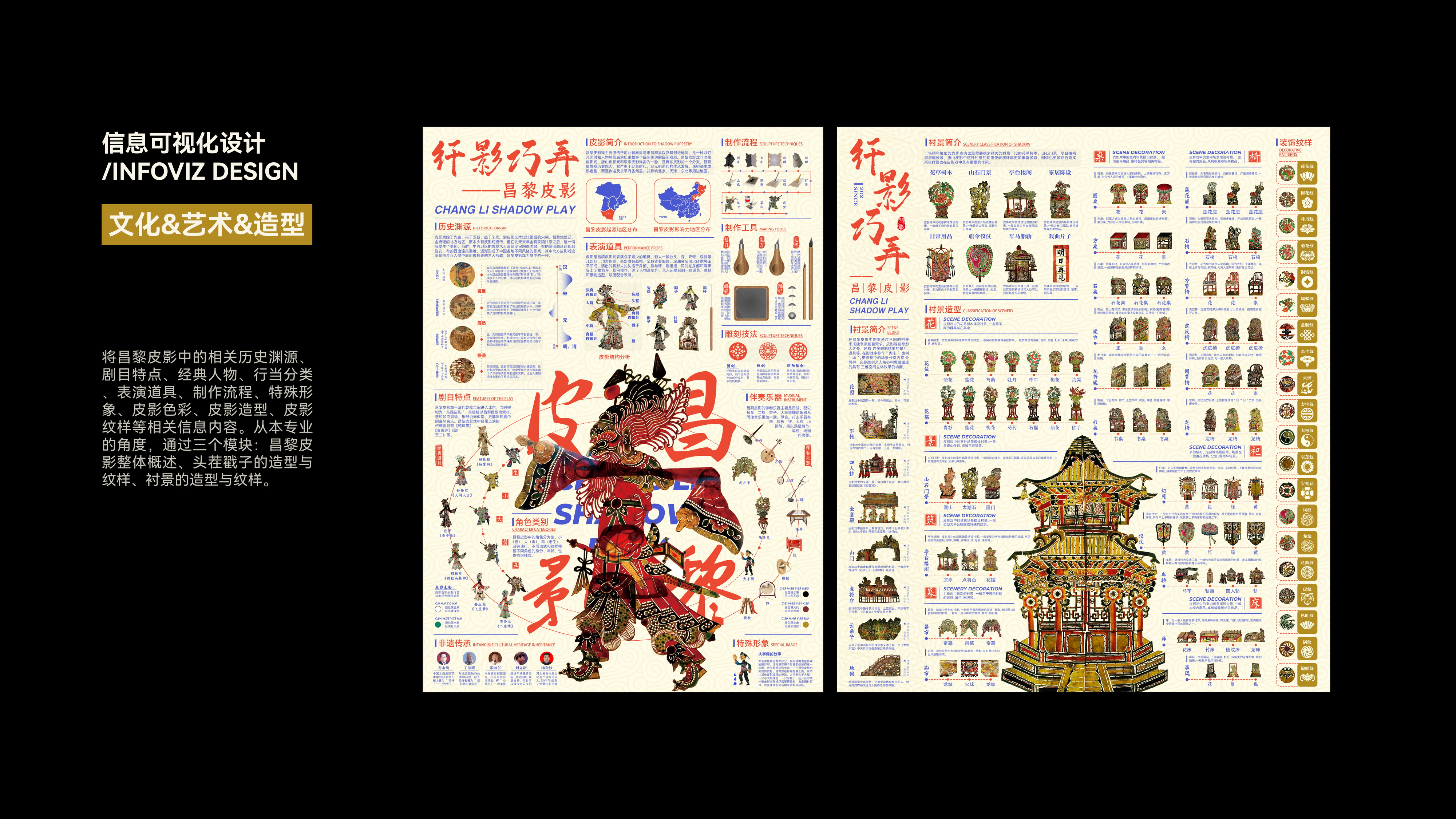
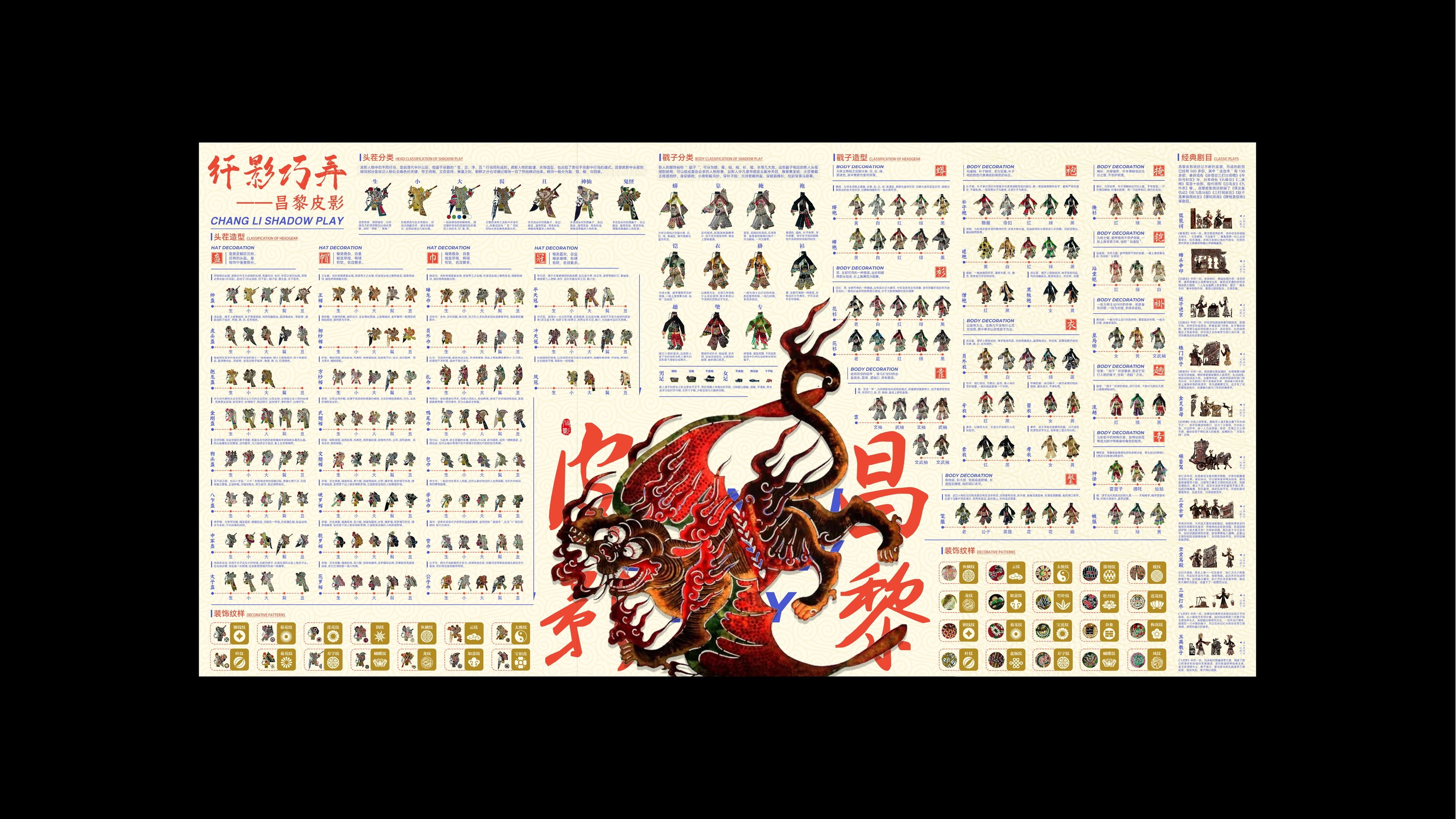
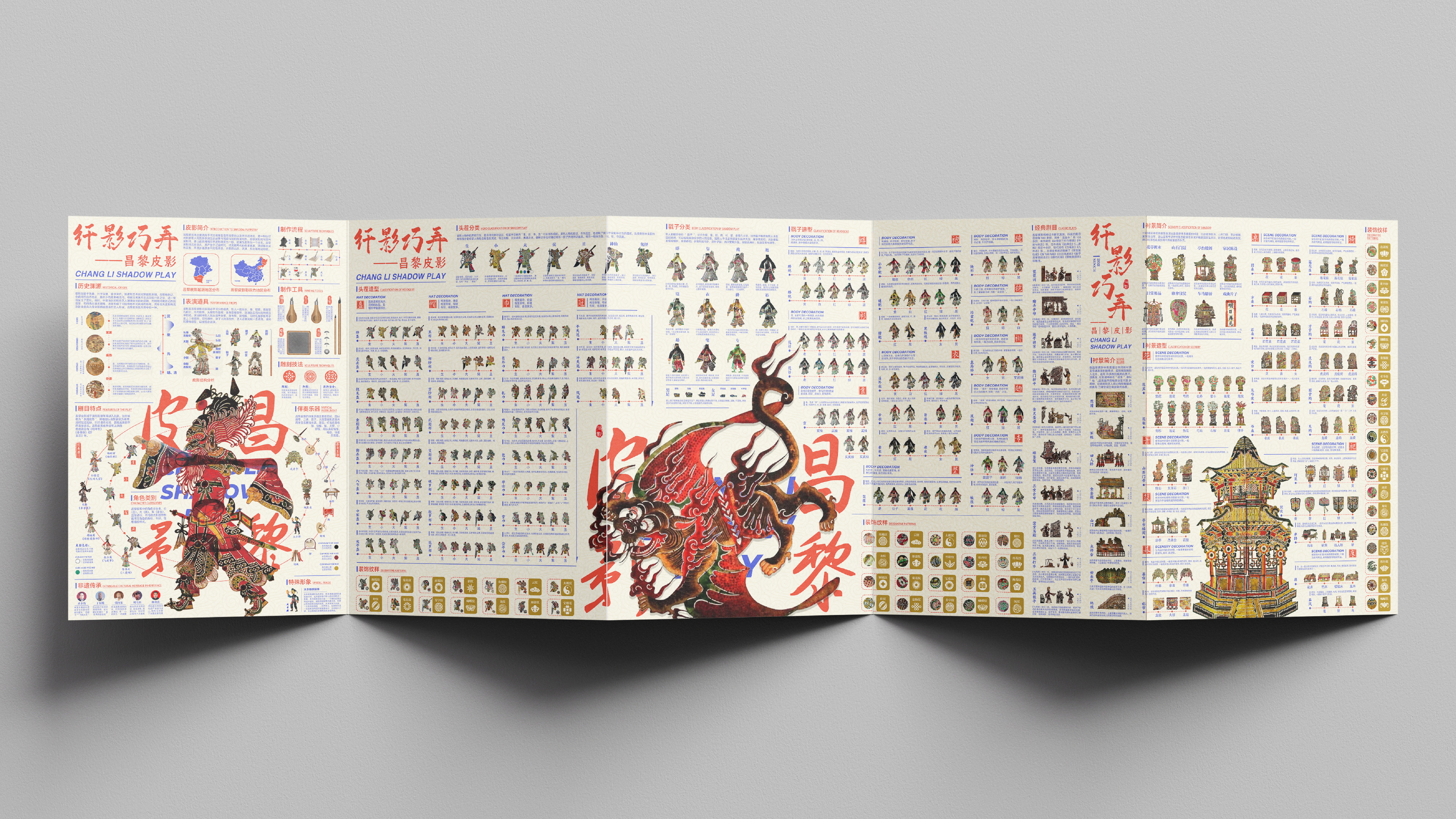
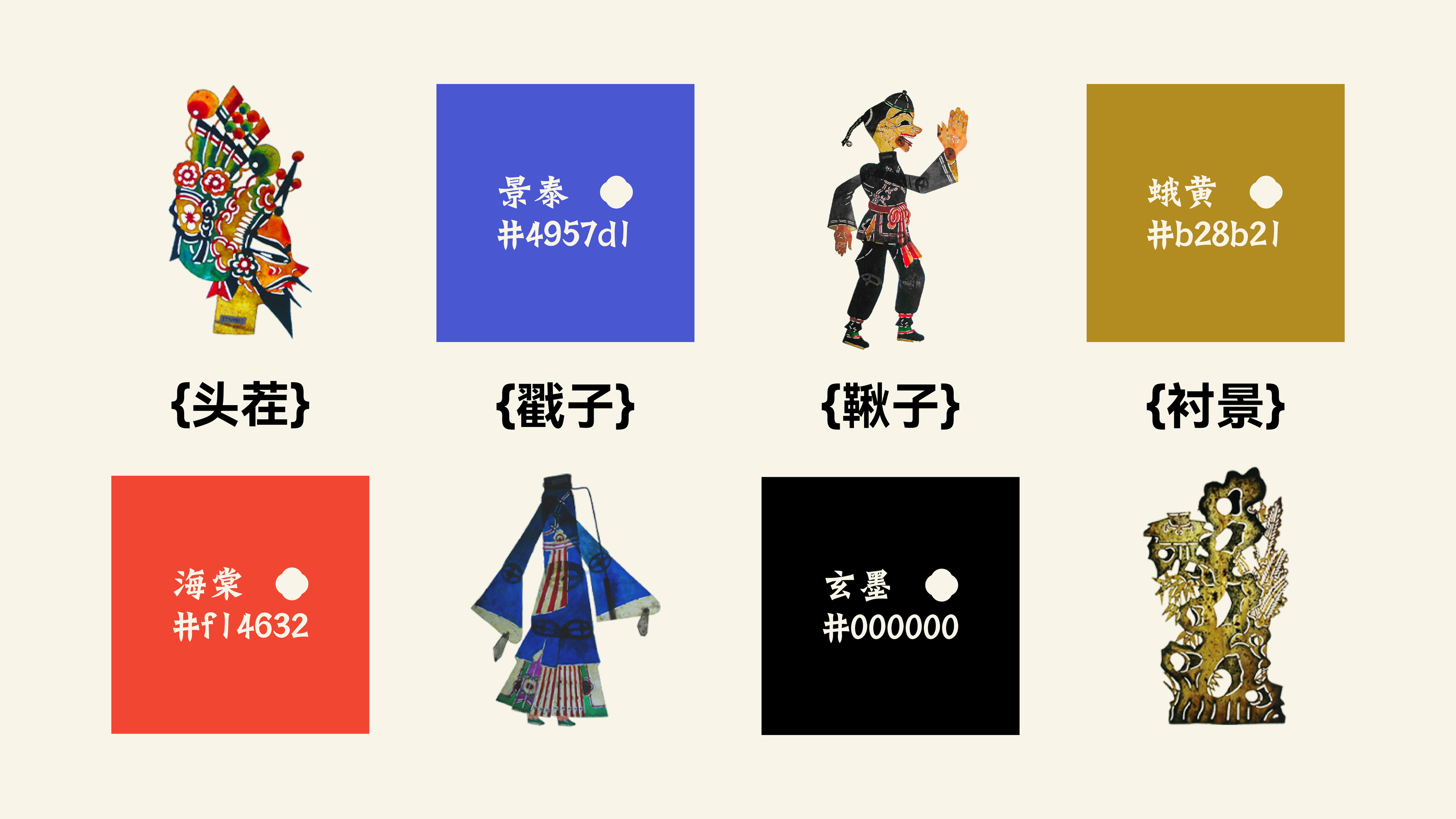
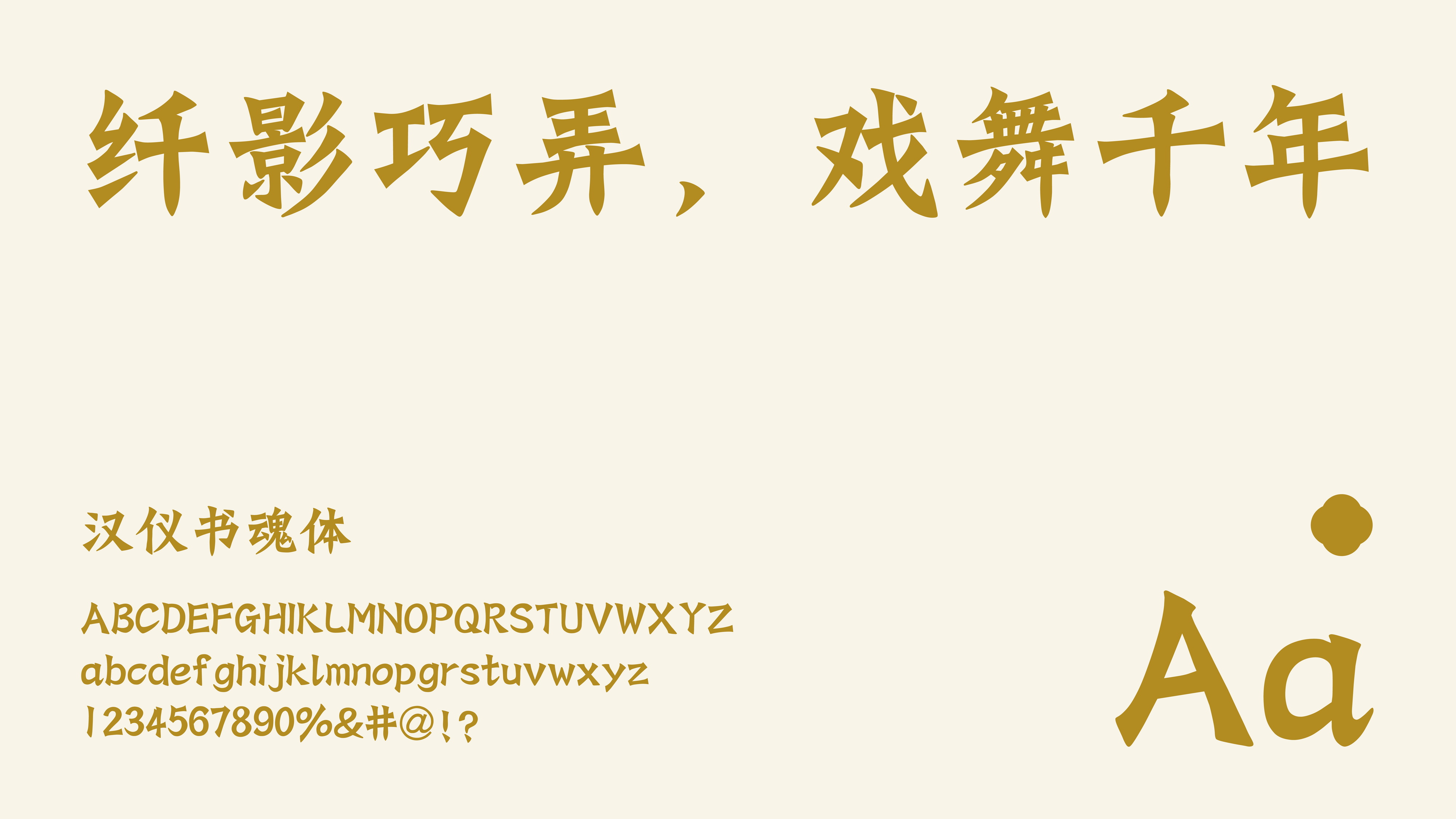
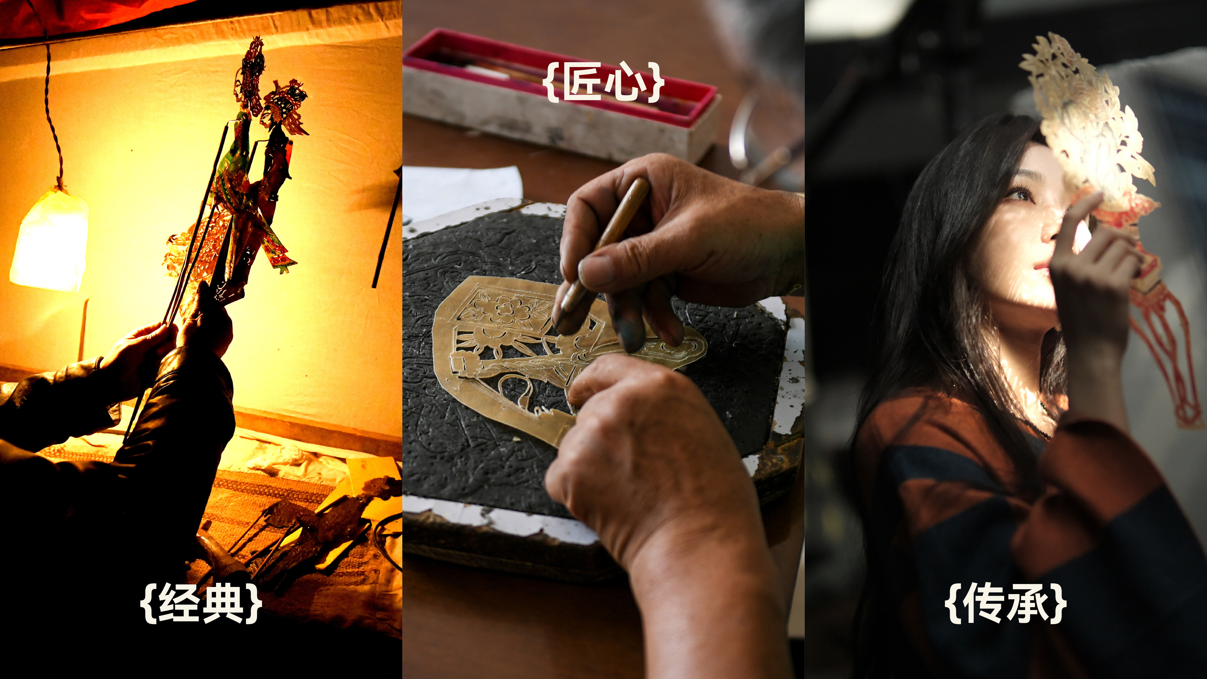
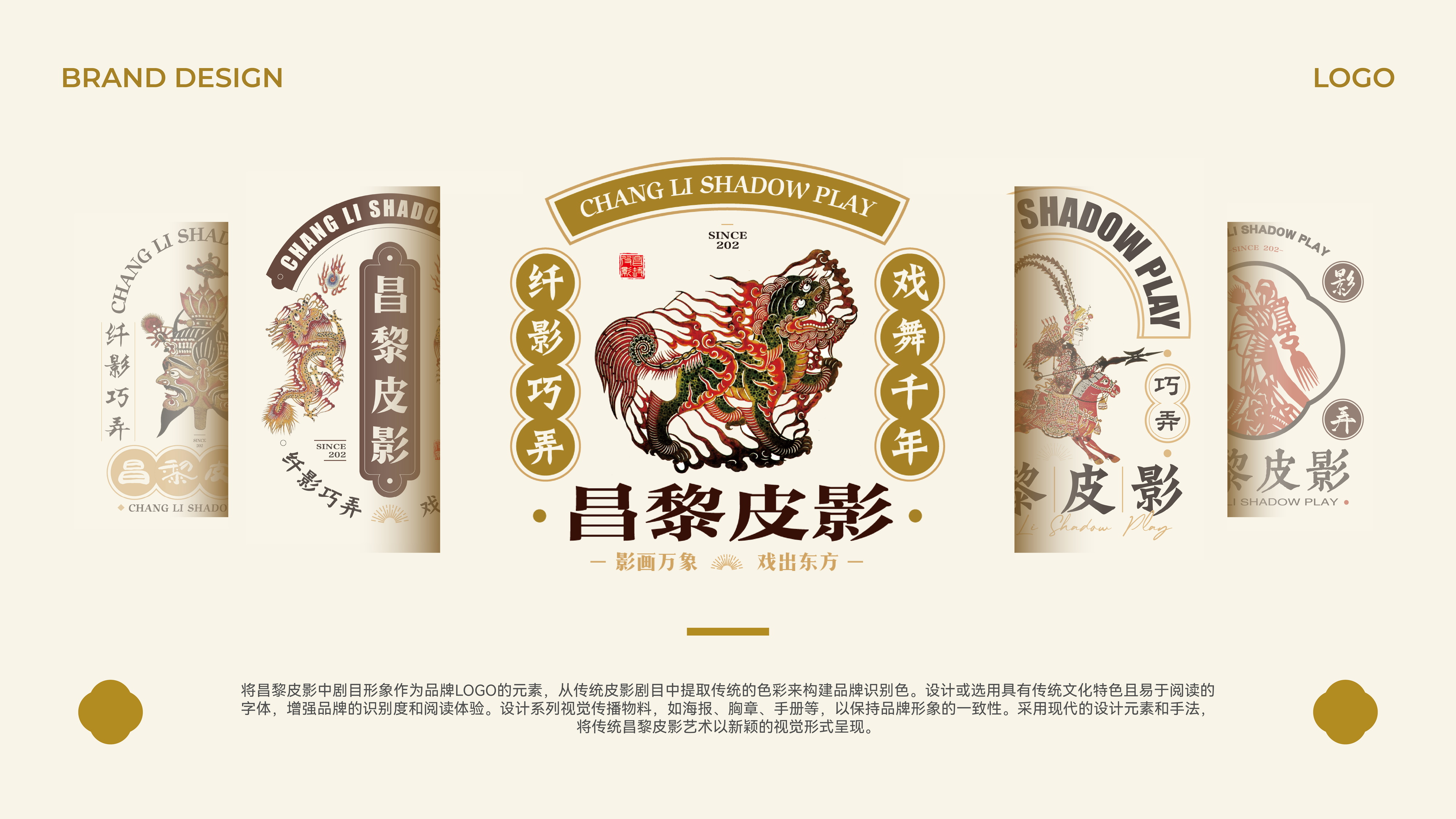
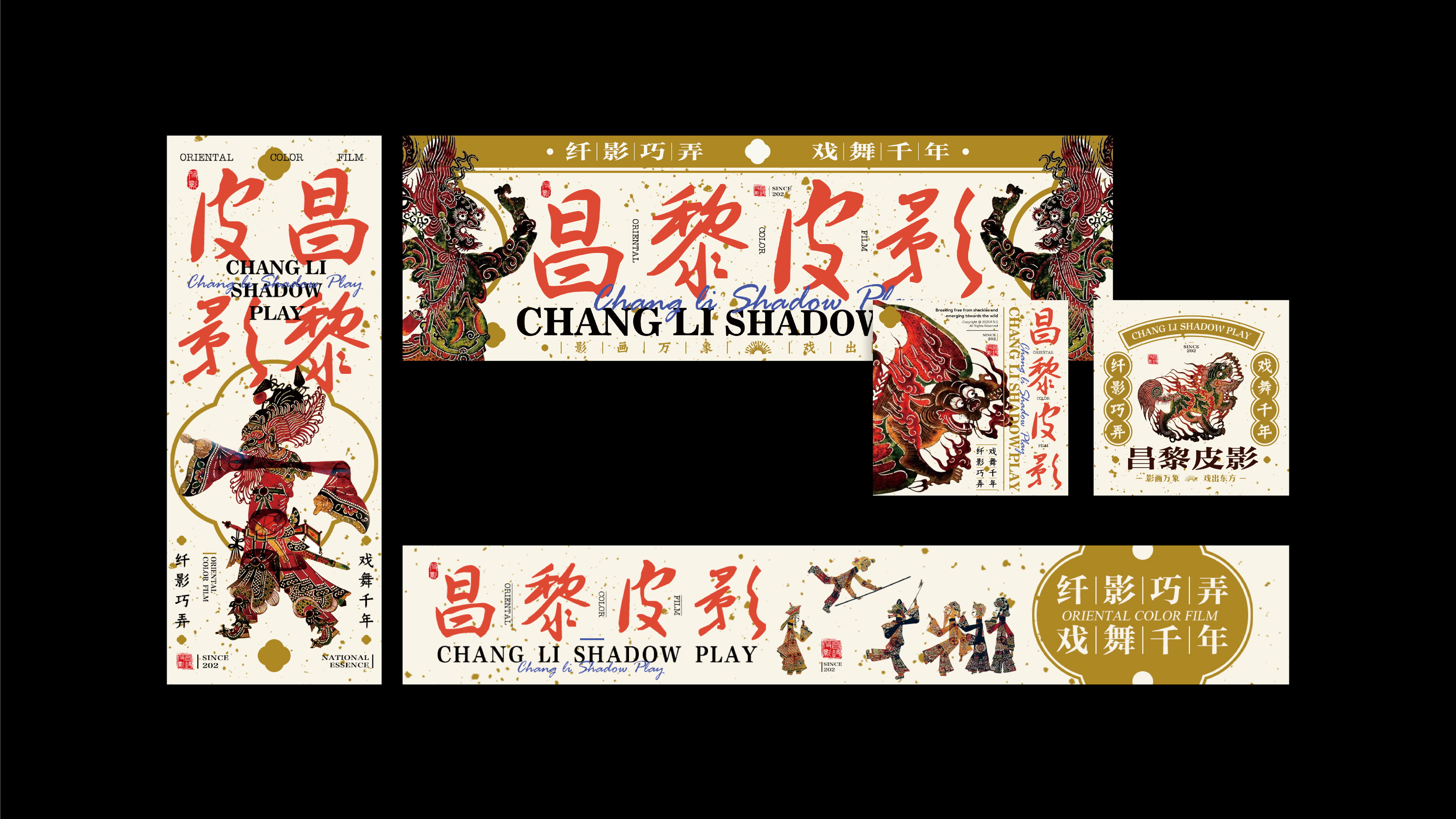
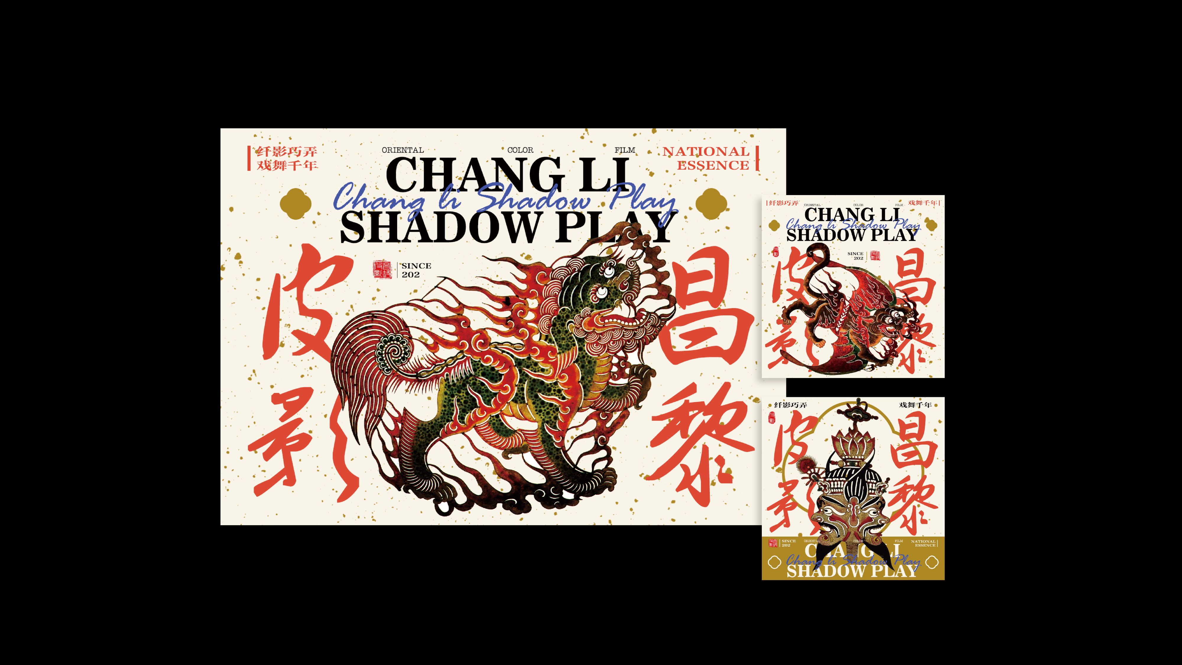
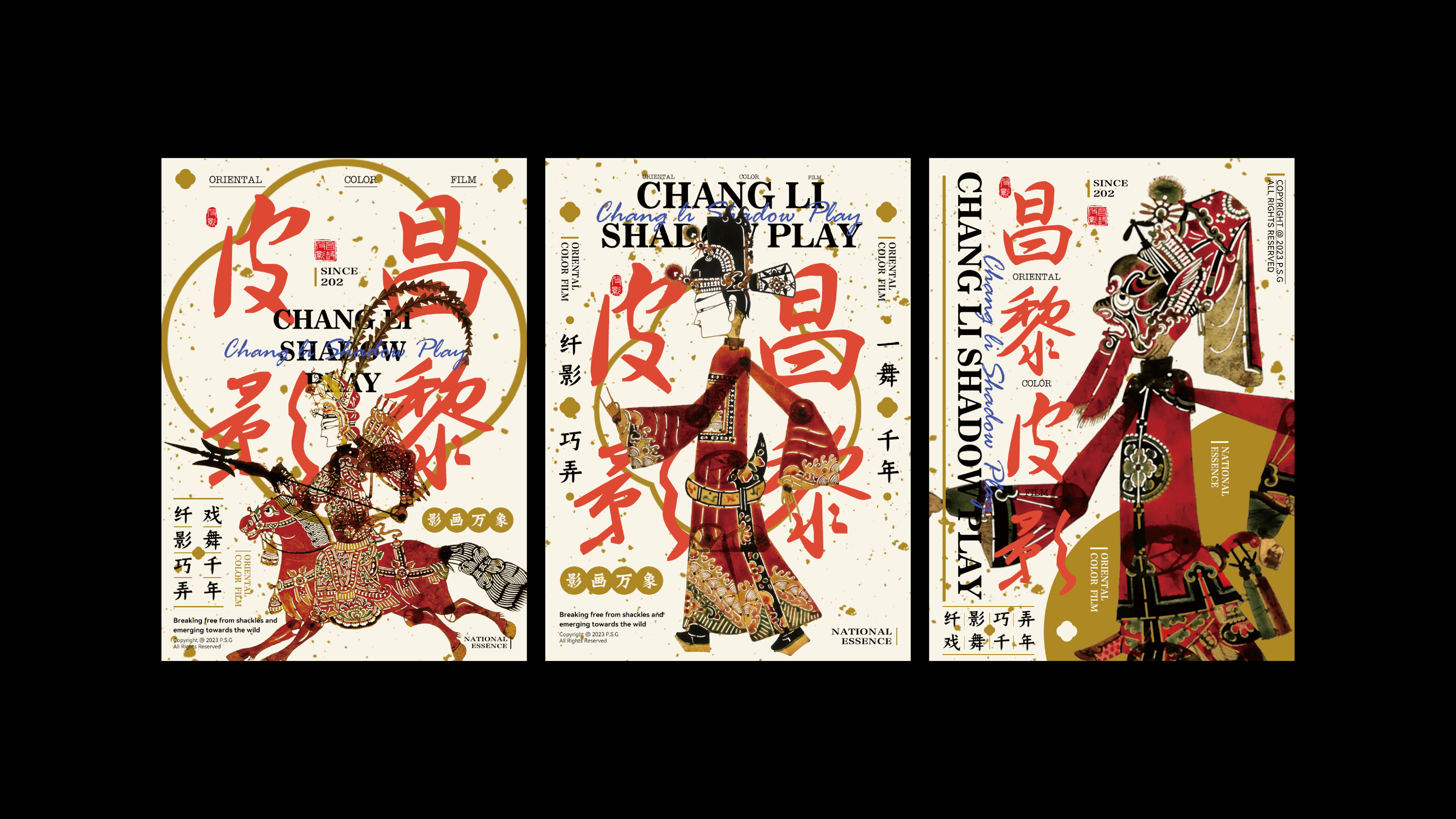
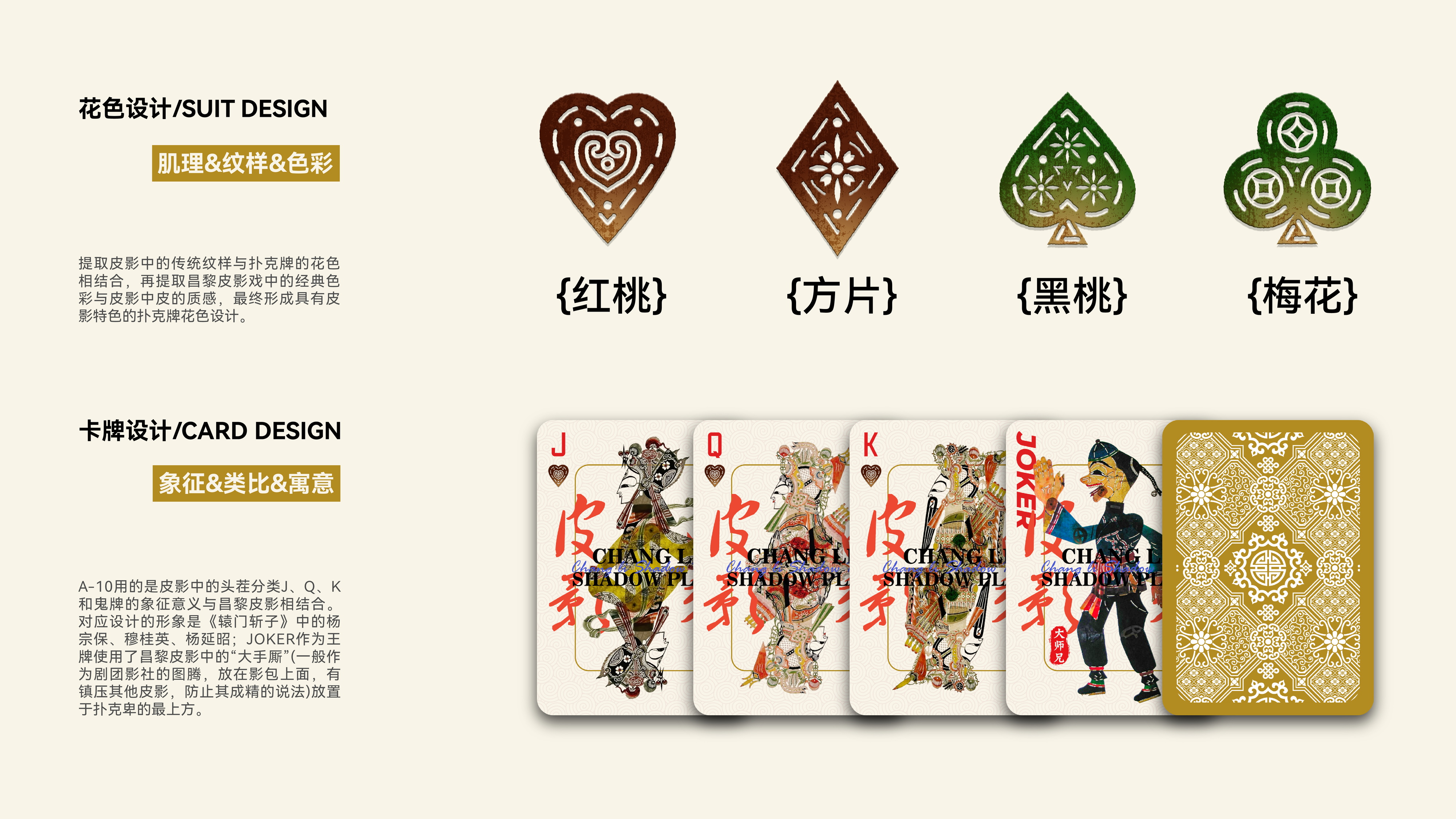
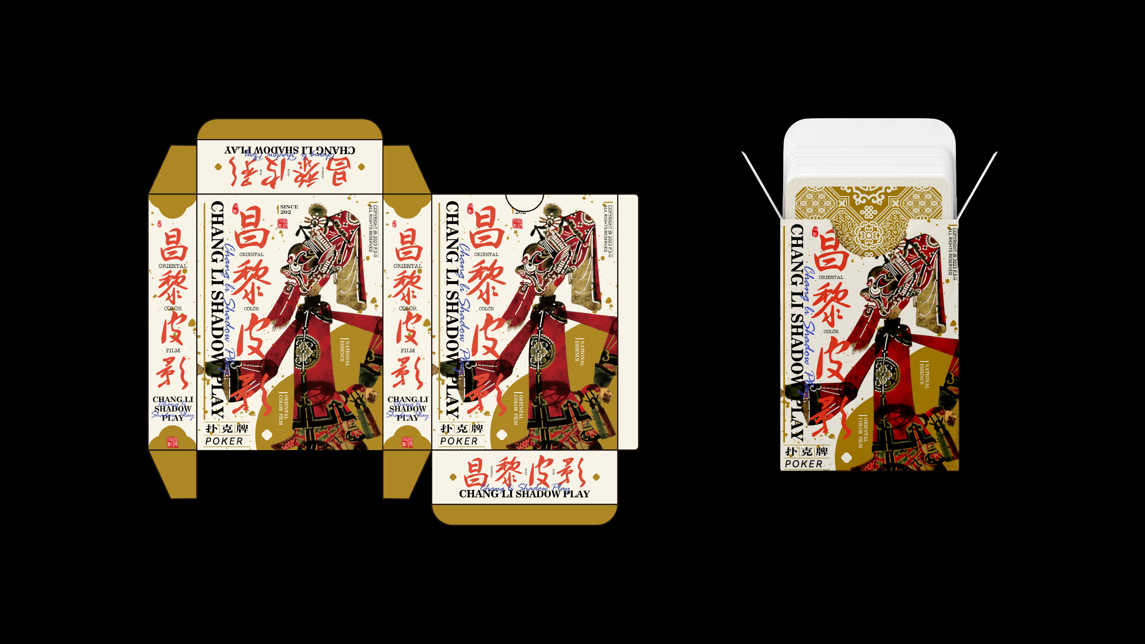
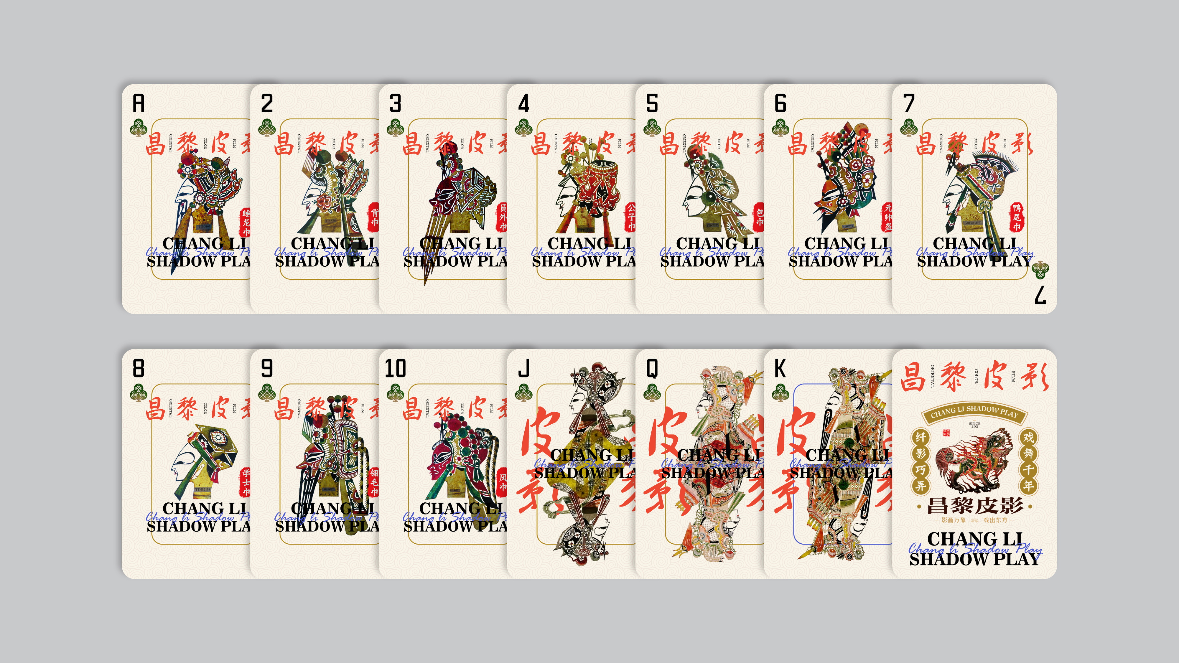
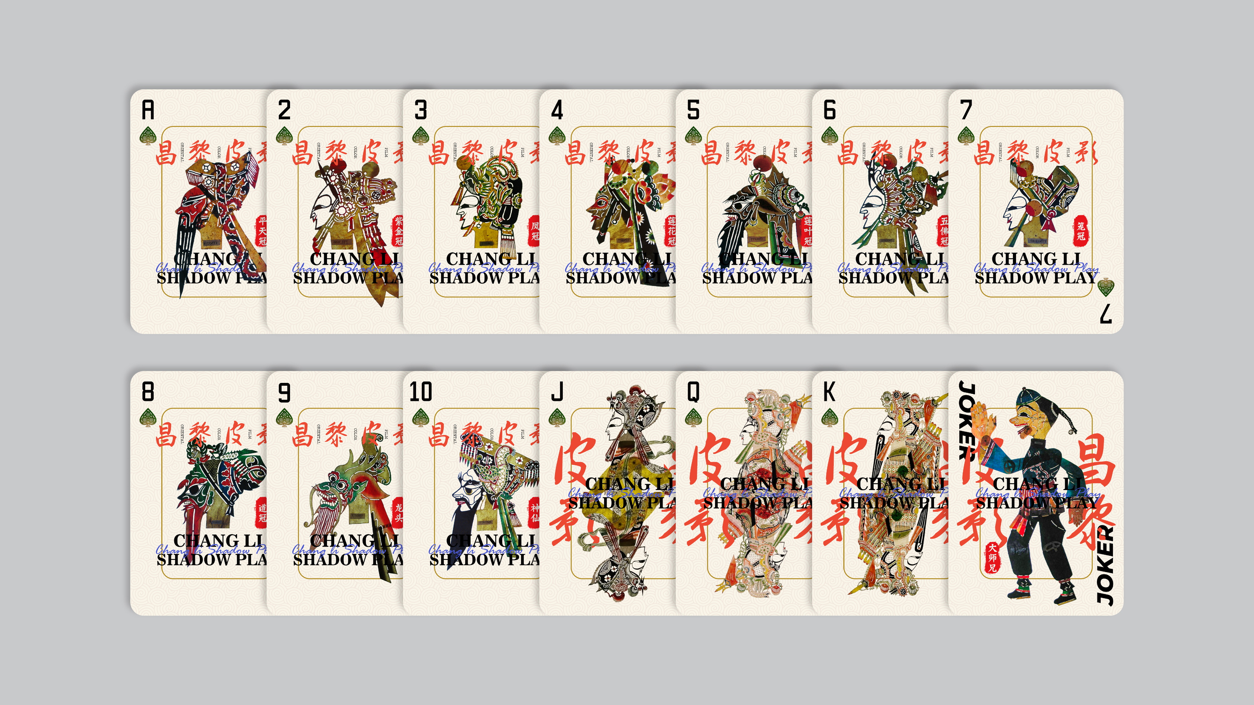
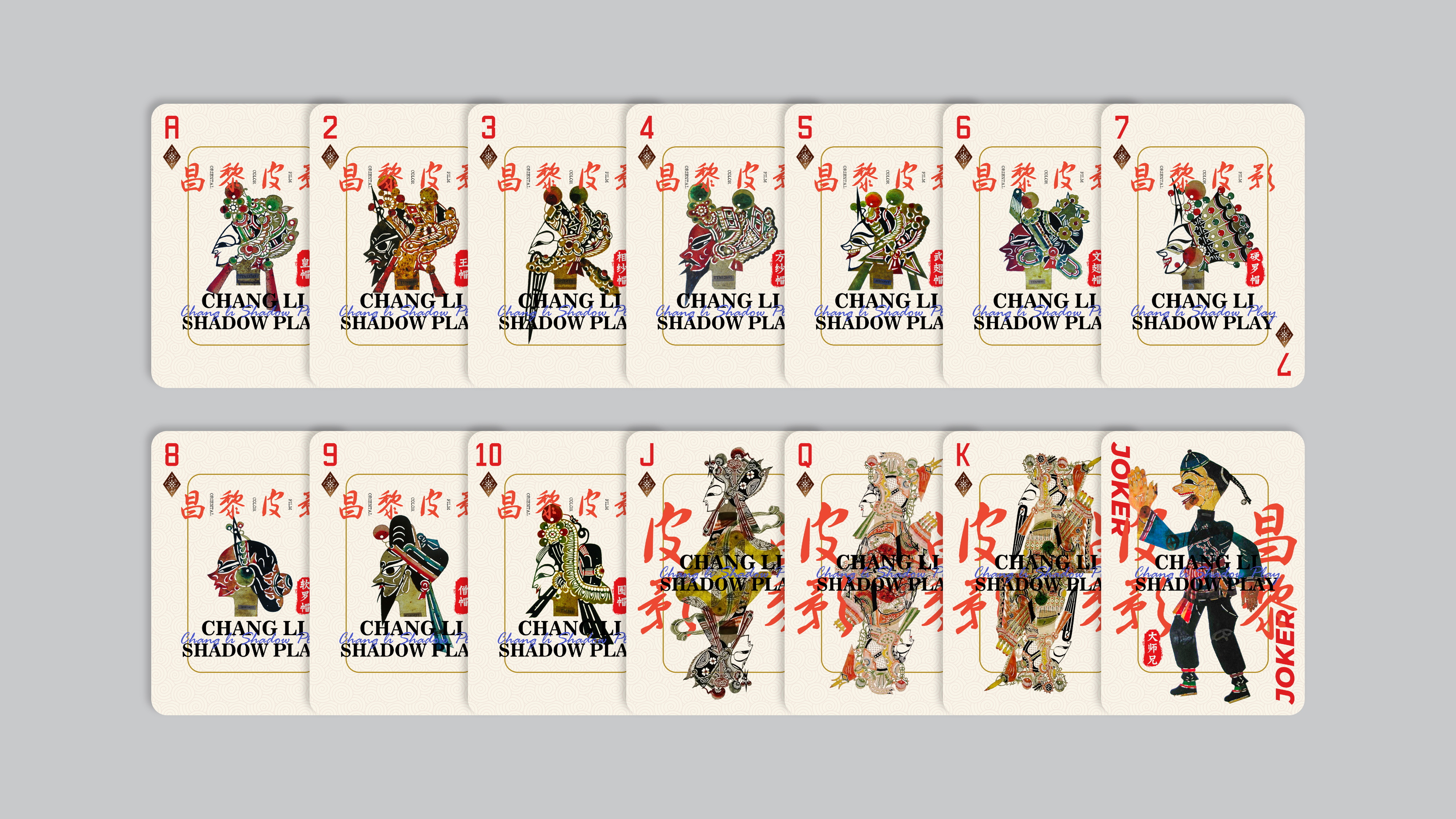
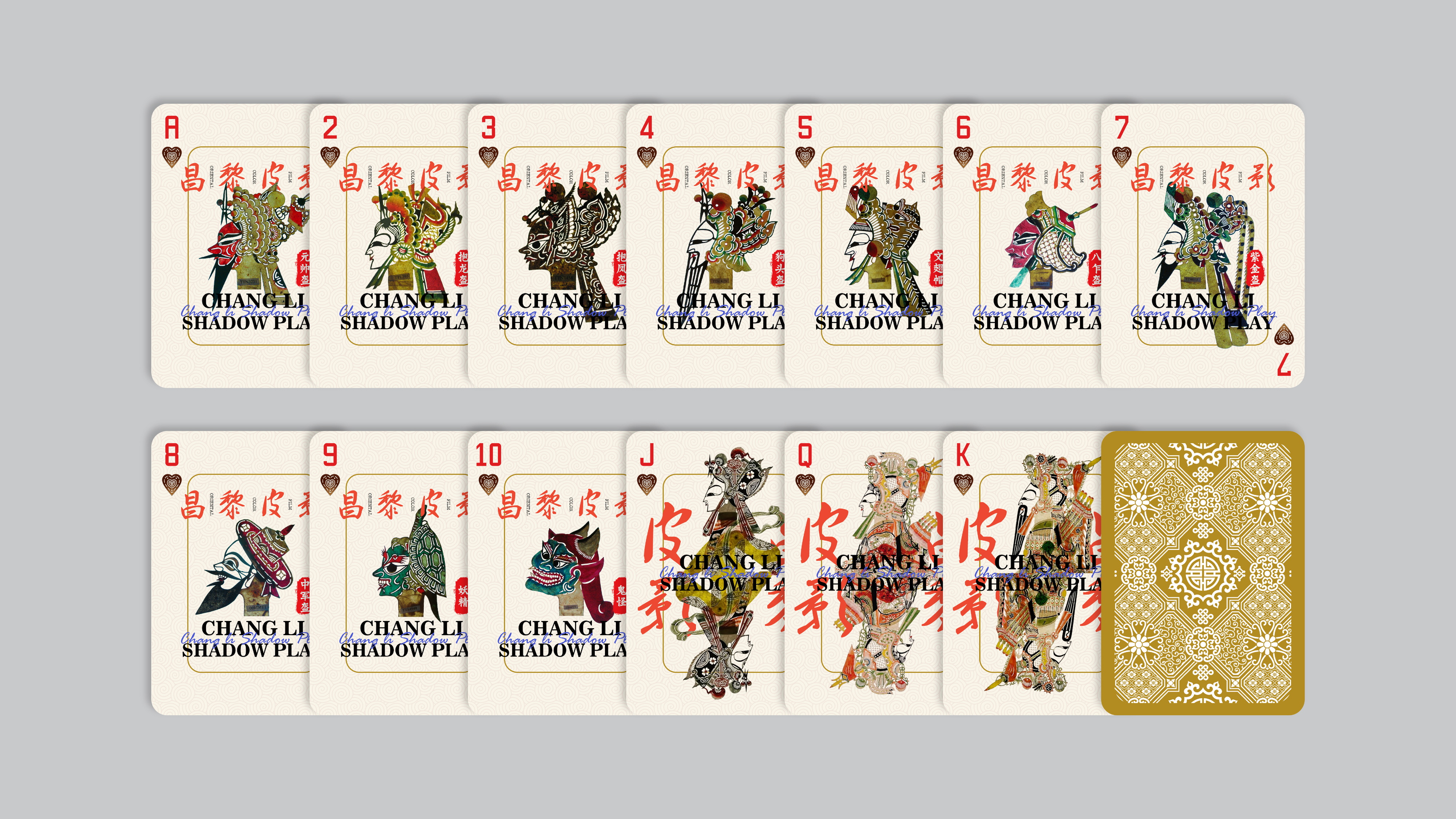
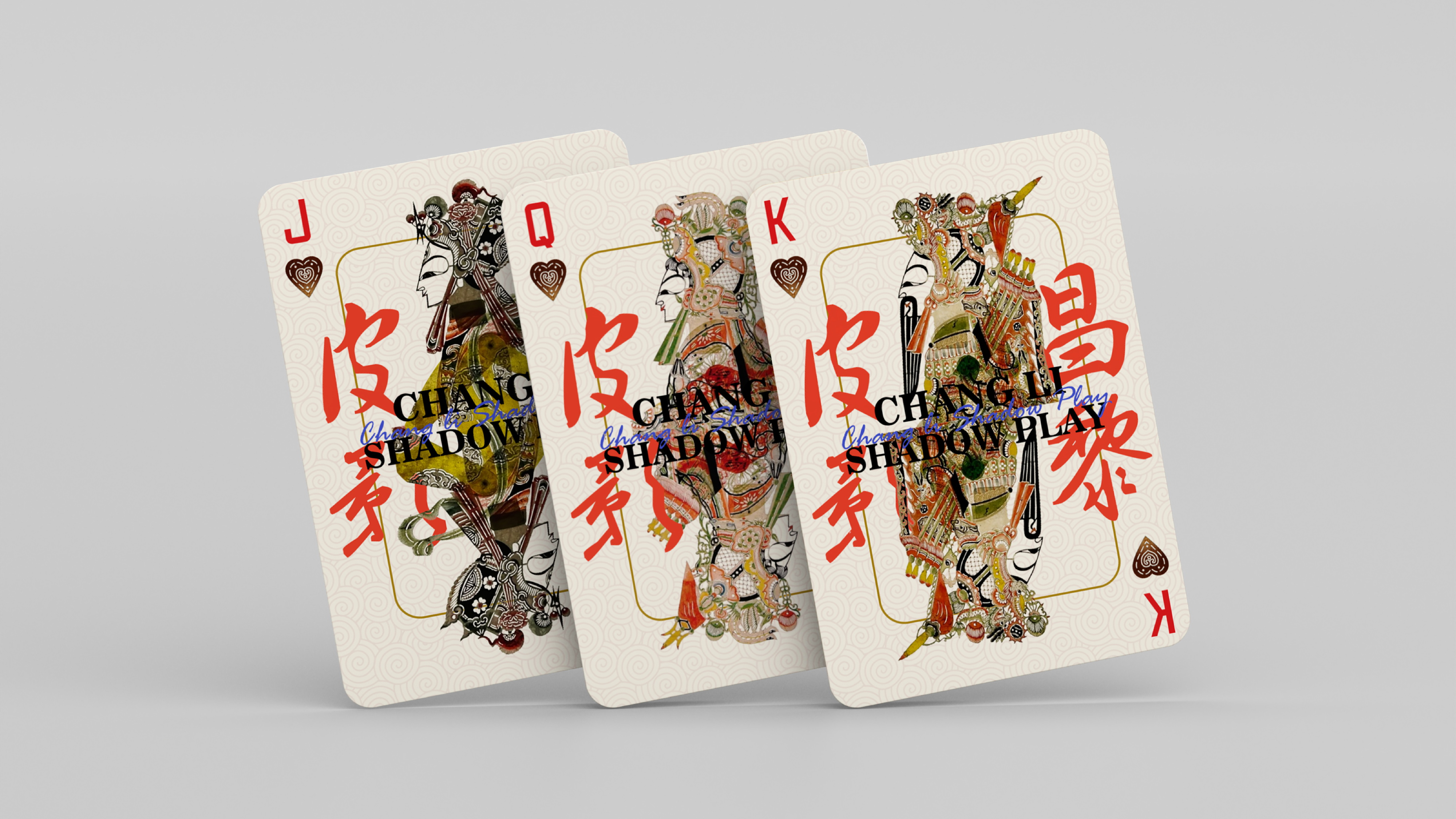
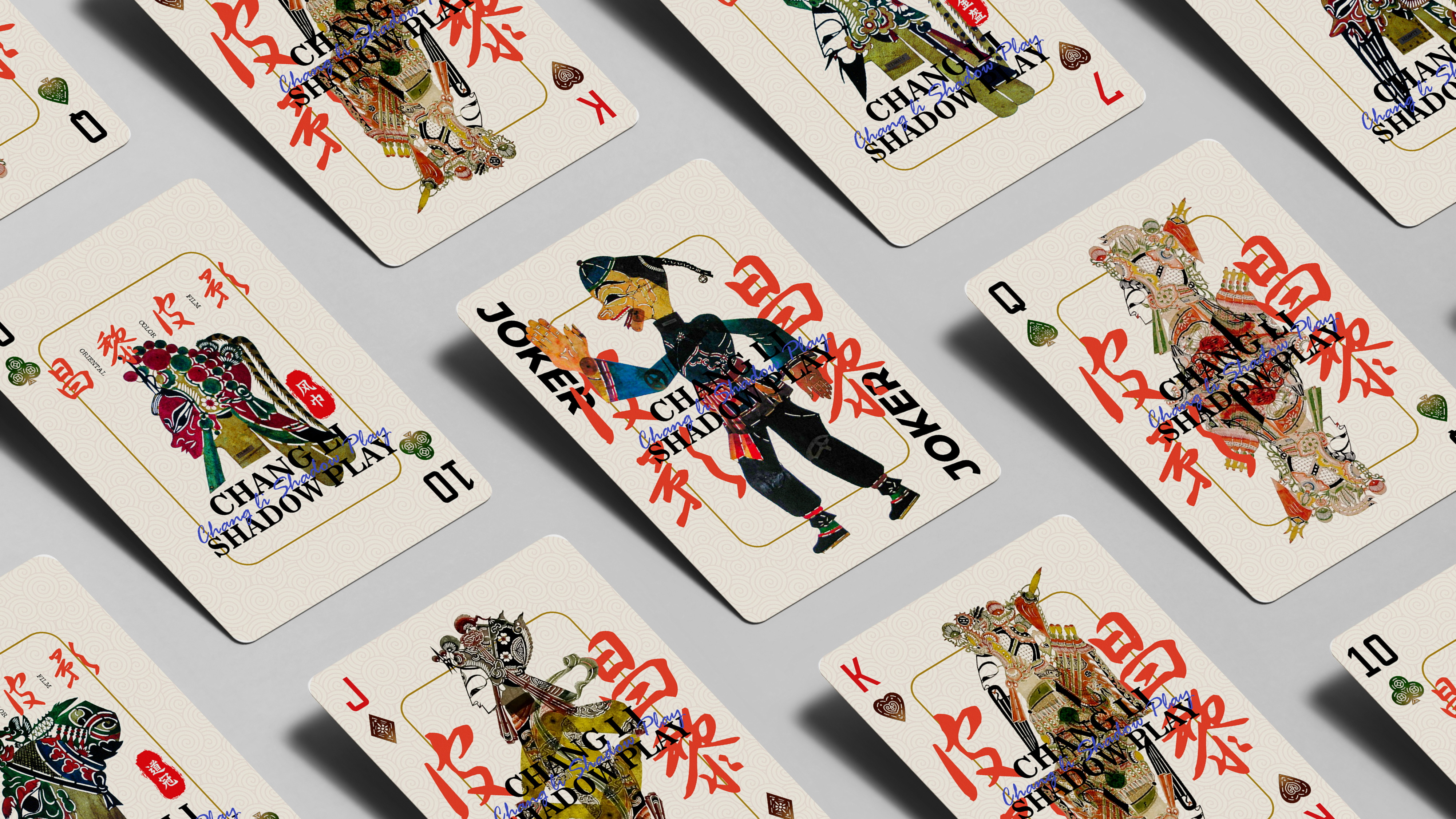
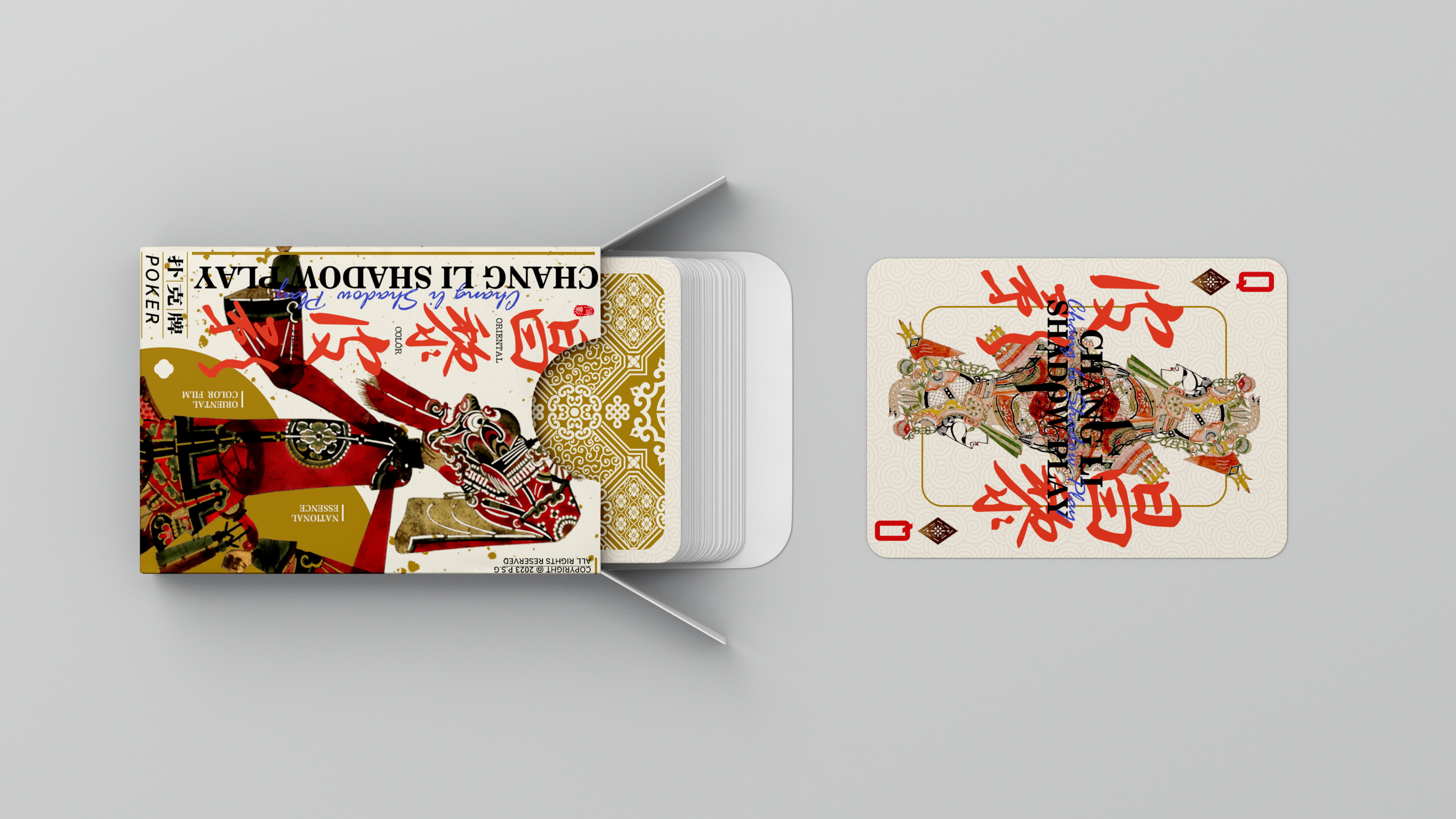
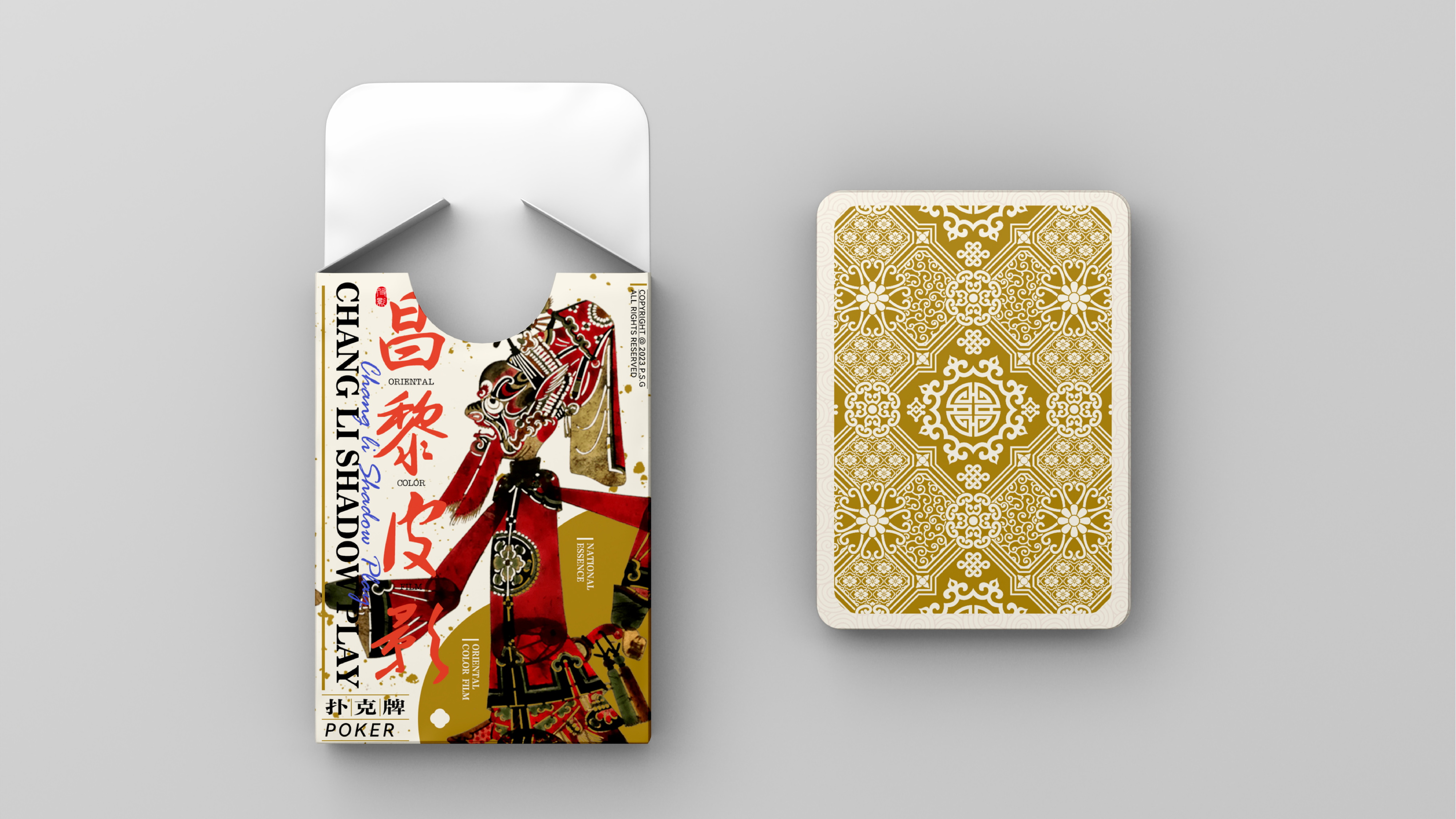
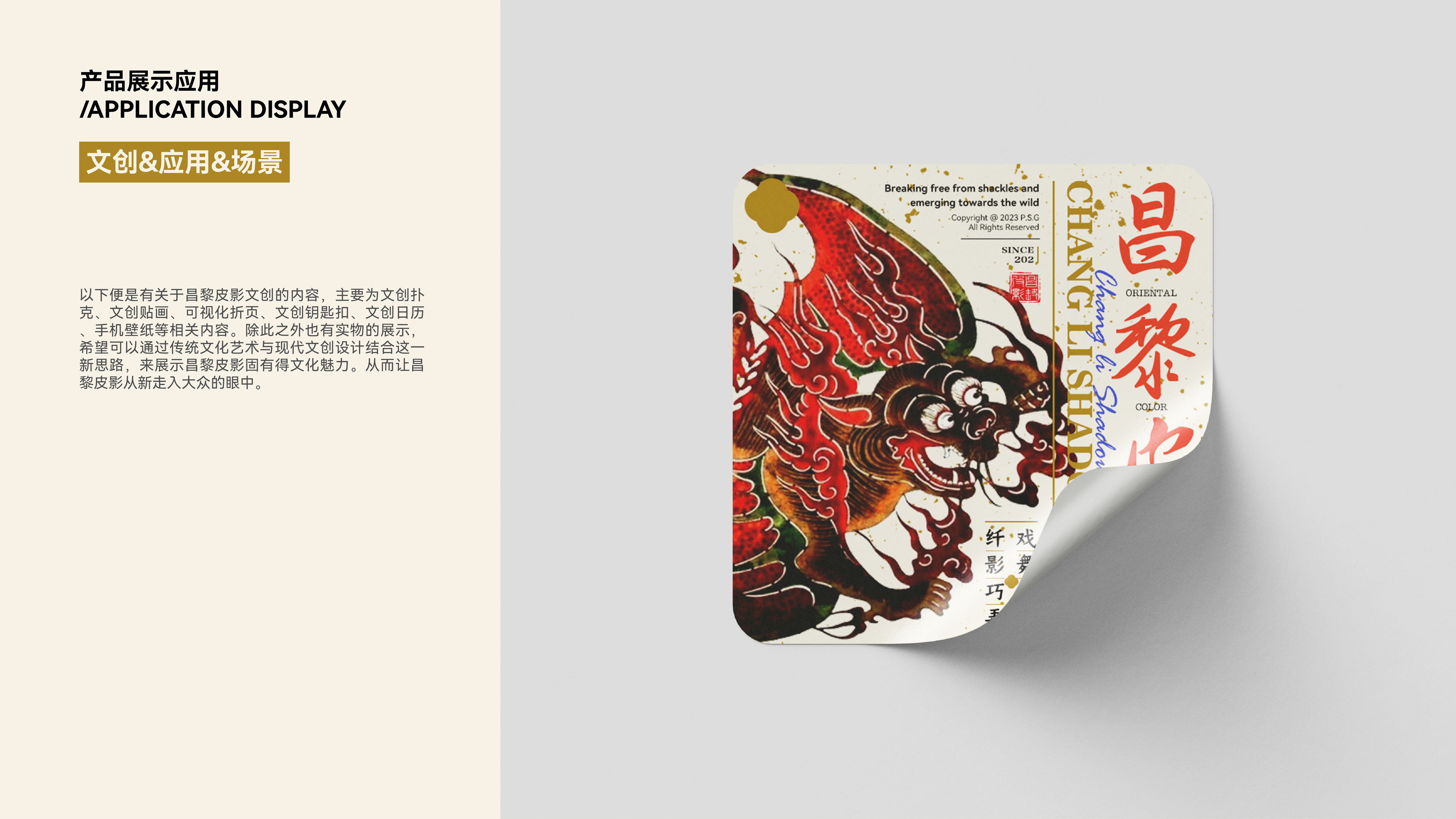
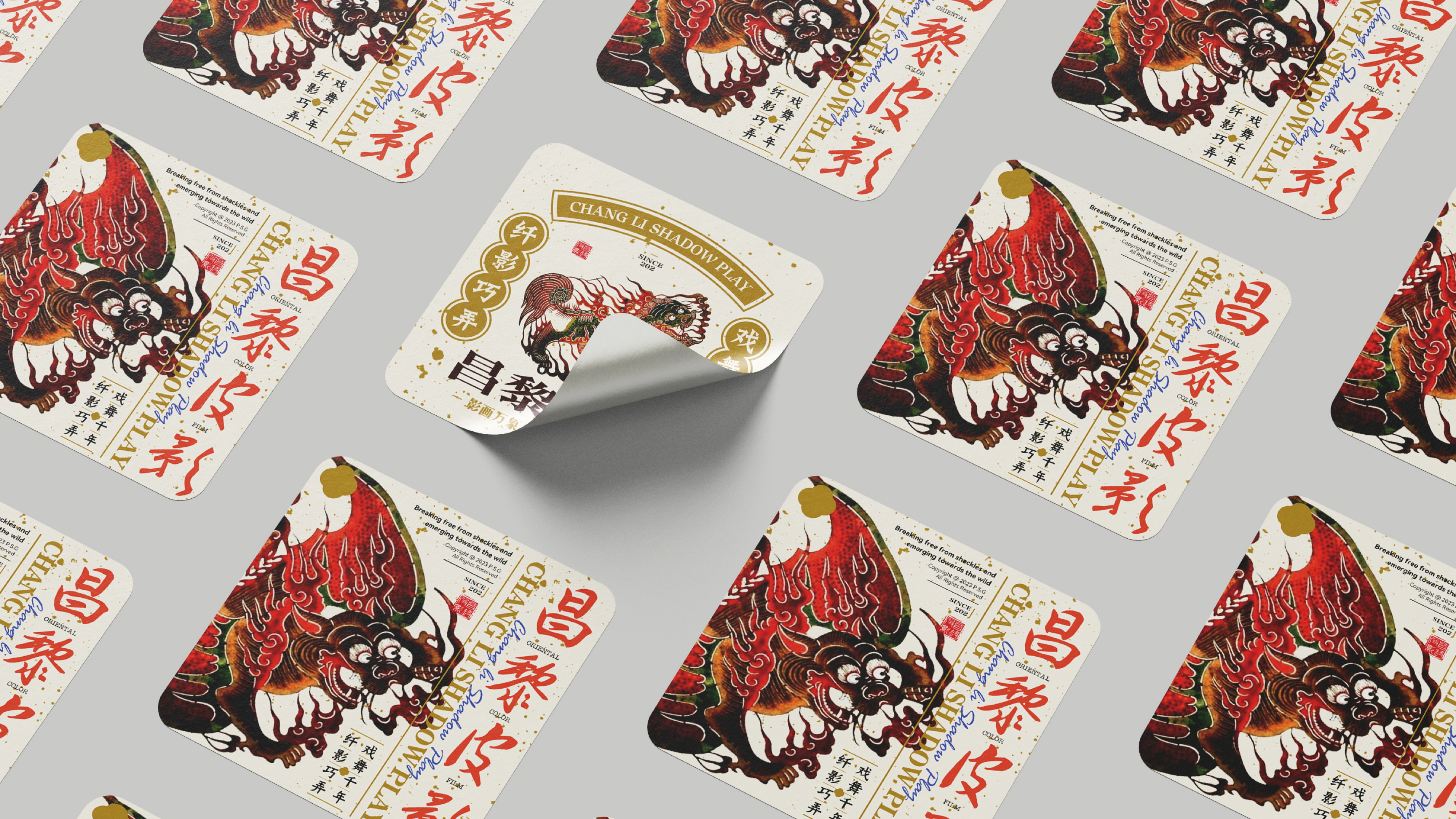
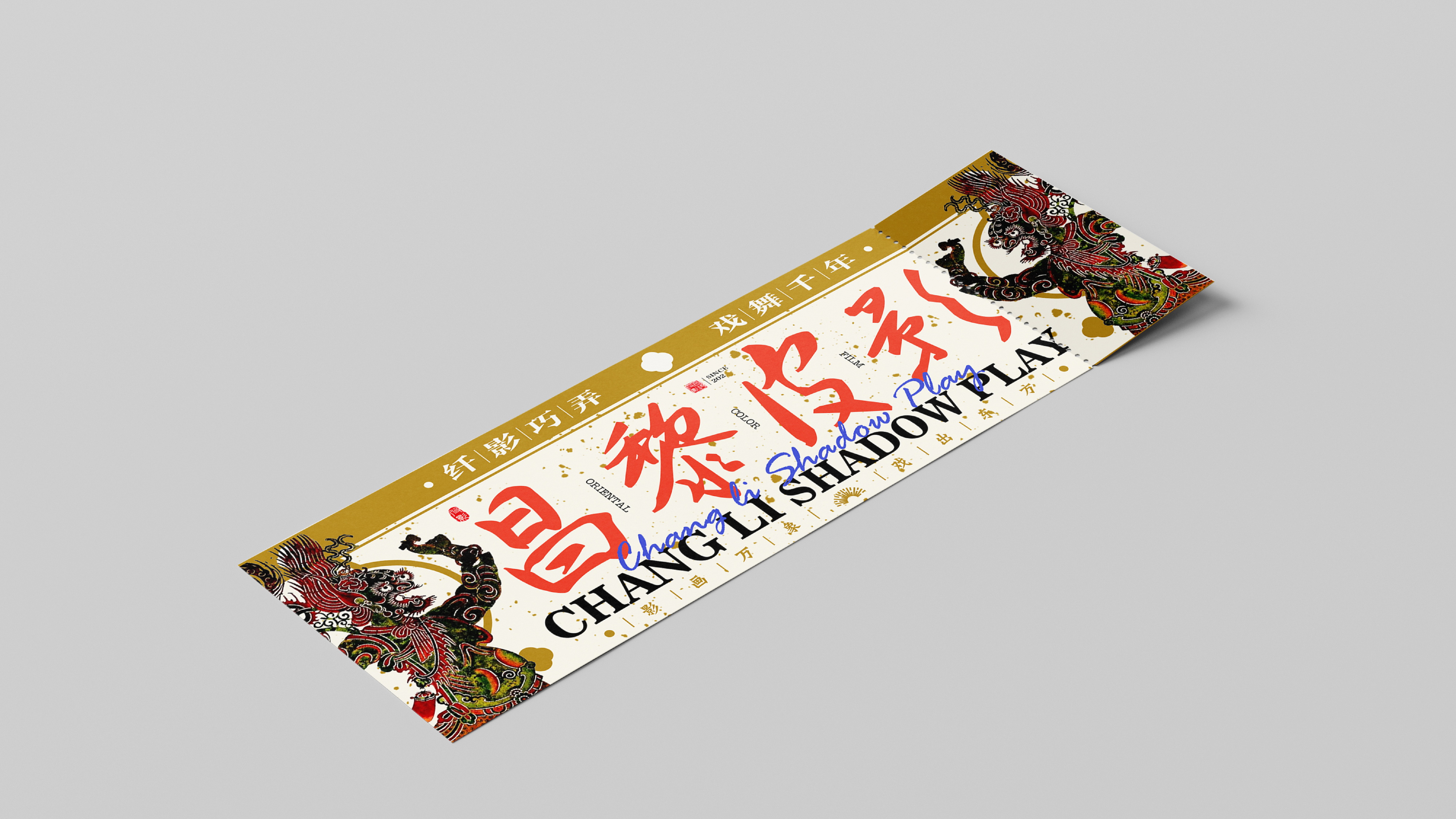
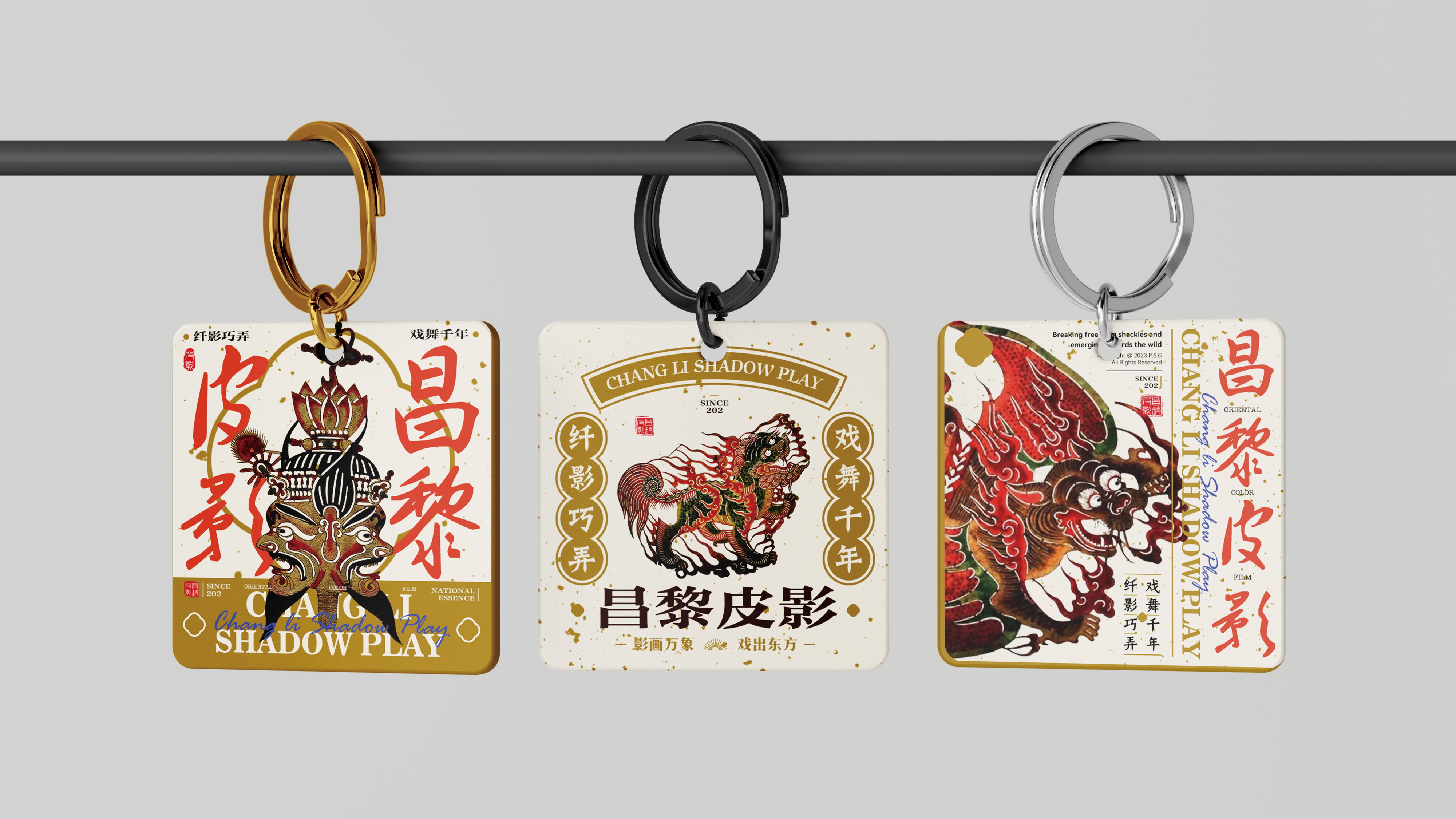
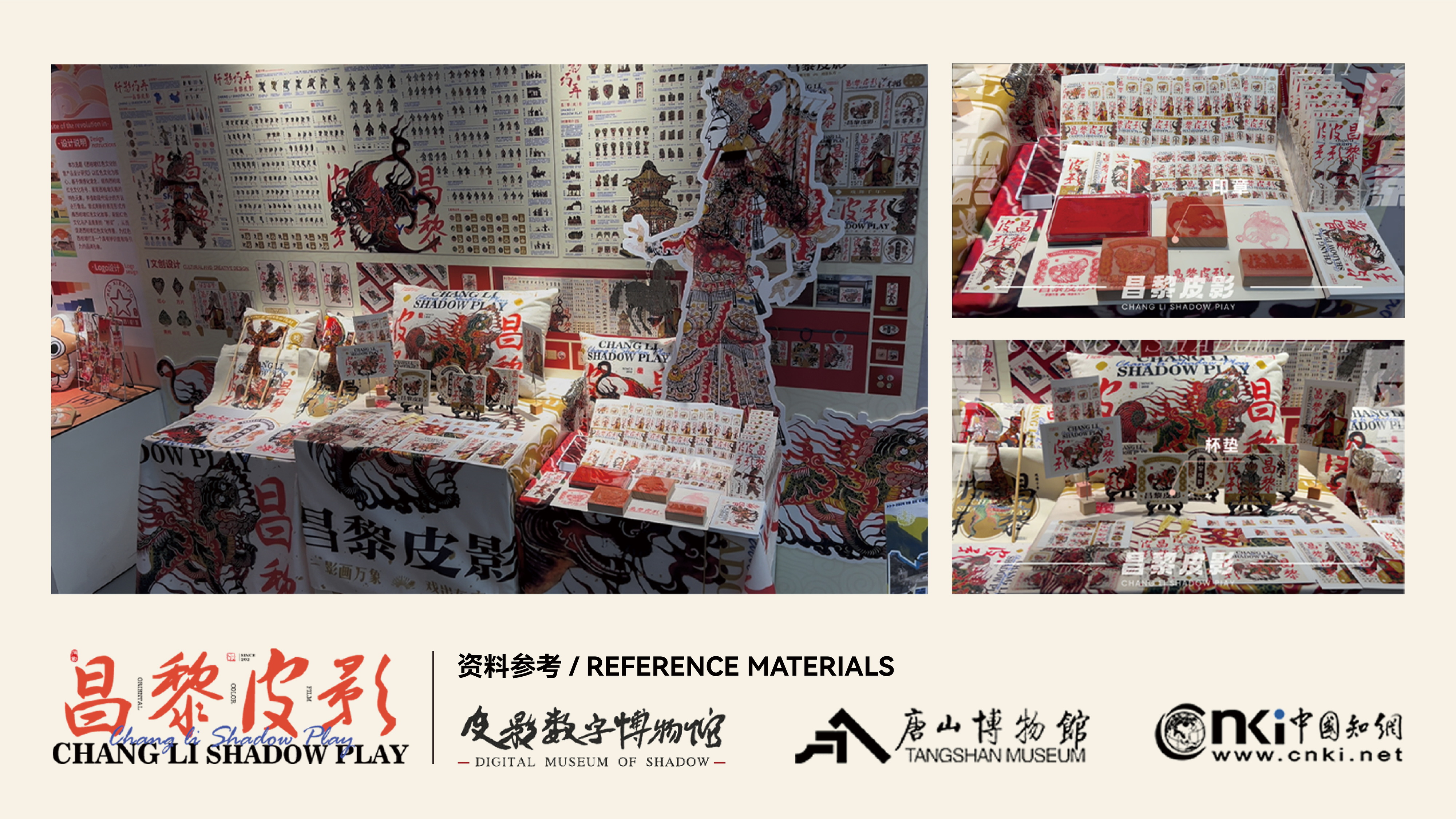
皮影戏(昌黎皮影戏),是河北省昌黎县传统戏剧,国家级非物质文化遗产之一。昌黎皮影戏主要流传于河北省秦皇岛市昌黎县及其邻近地区,是一种以灯光照射和人物剪影表演历史故事与民间传说的民间戏剧。昌黎皮影戏于清代乾隆年间进入北京,被称为“冀东皮影”,其唱腔以昌黎民歌为素材,悲时如泣如诉,乐时说而似唱,反映出昌黎人的喜怒哀乐。最终作为我毕设的选题进行再设计,希望为昌黎皮影的复兴贡献设计的力量。
Shadow puppetry (Changli Shadow Puppetry) is a traditional drama from Changli County, Hebei Province, and is one of the national-level intangible cultural heritages. Mainly spread in Changli County, Qinhuangdao City, Hebei Province, and its neighboring areas, Changli Shadow Puppetry is a folk drama that uses light projection and silhouette figures to perform historical stories and folklore. Changli Shadow Puppetry entered Beijing during the Qing Dynasty's Qianlong period and was known as "Jidong Shadow Puppetry". Its vocal music is based on Changli folk songs, which sound like sobbing when expressing sorrow and like singing when expressing joy, reflecting the emotions of the Changli people. Finally, as the topic of my graduation project, I hope to redesign it and contribute design power to the revival of Changli Shadow Puppetry.
懒人好物节 Lazy Finds Day
Brief
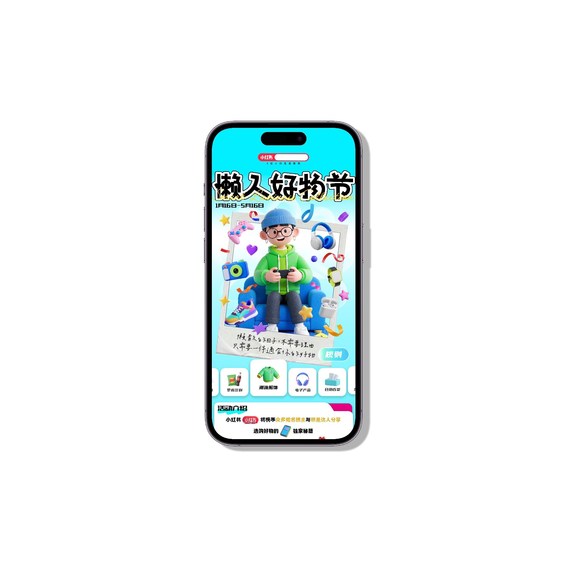
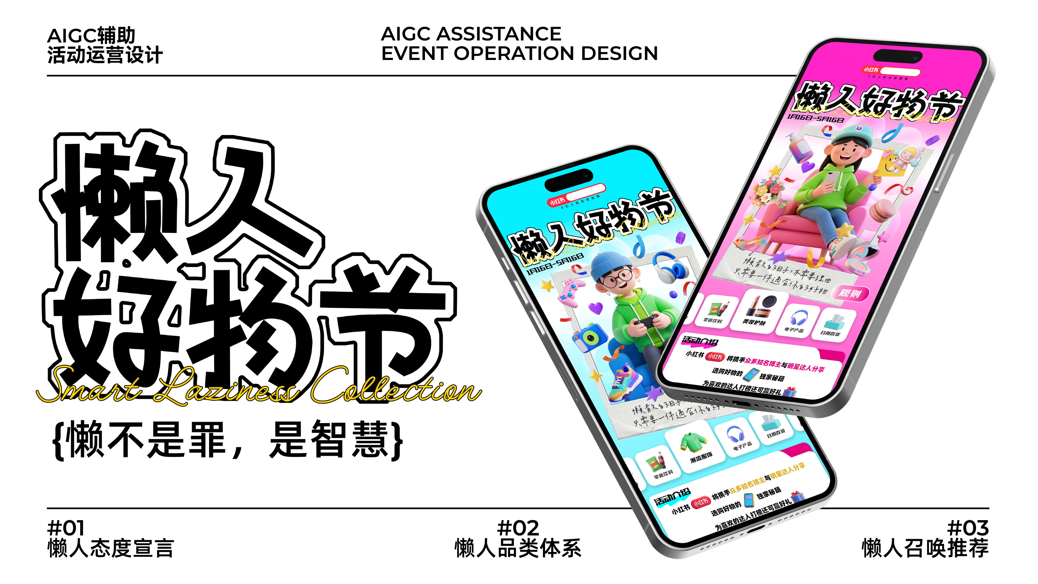
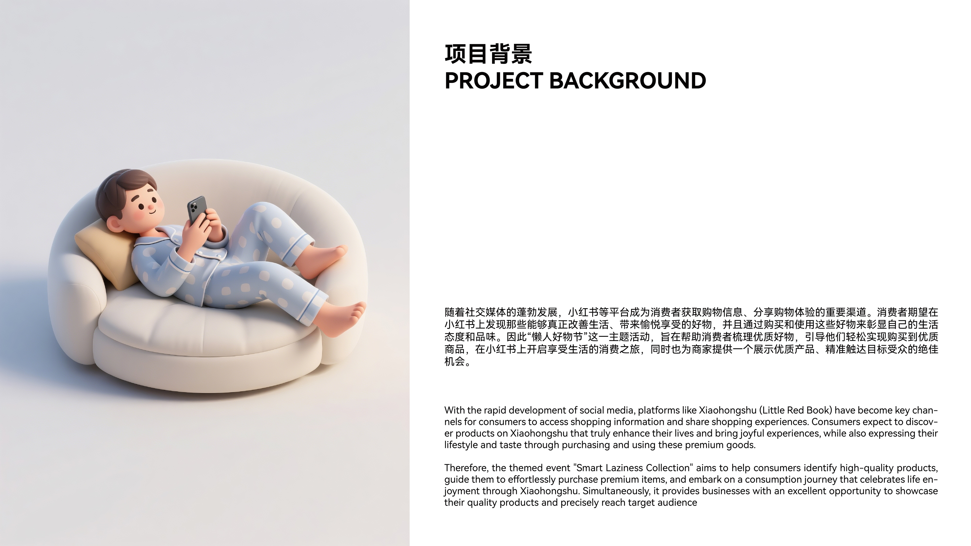
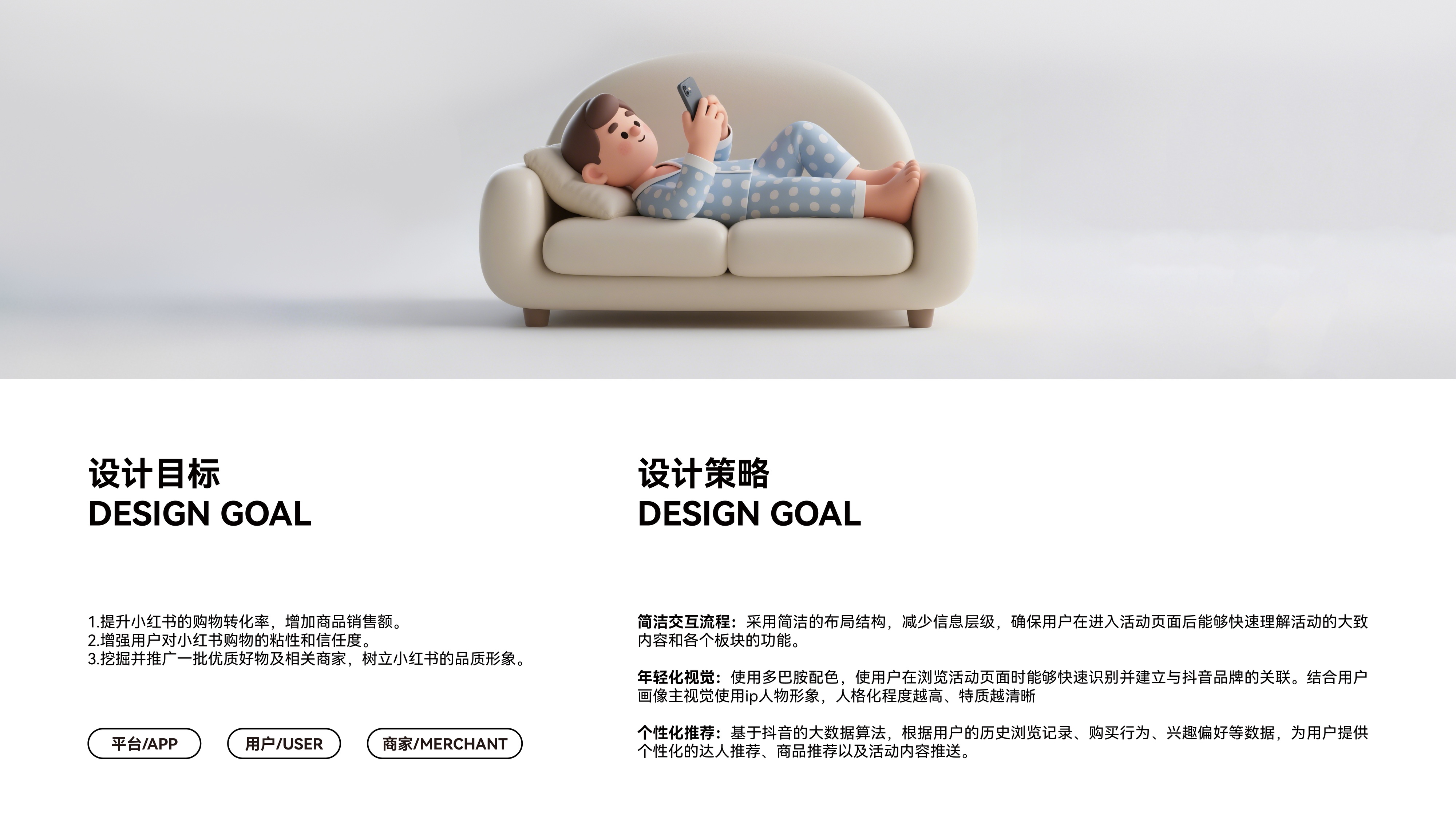
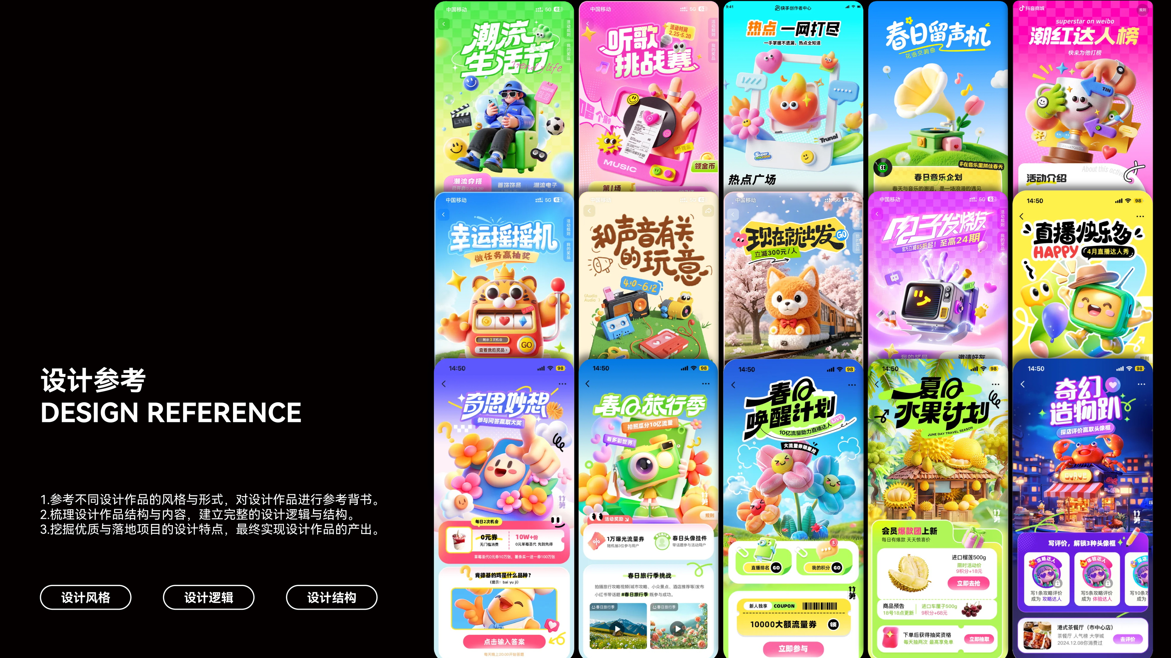
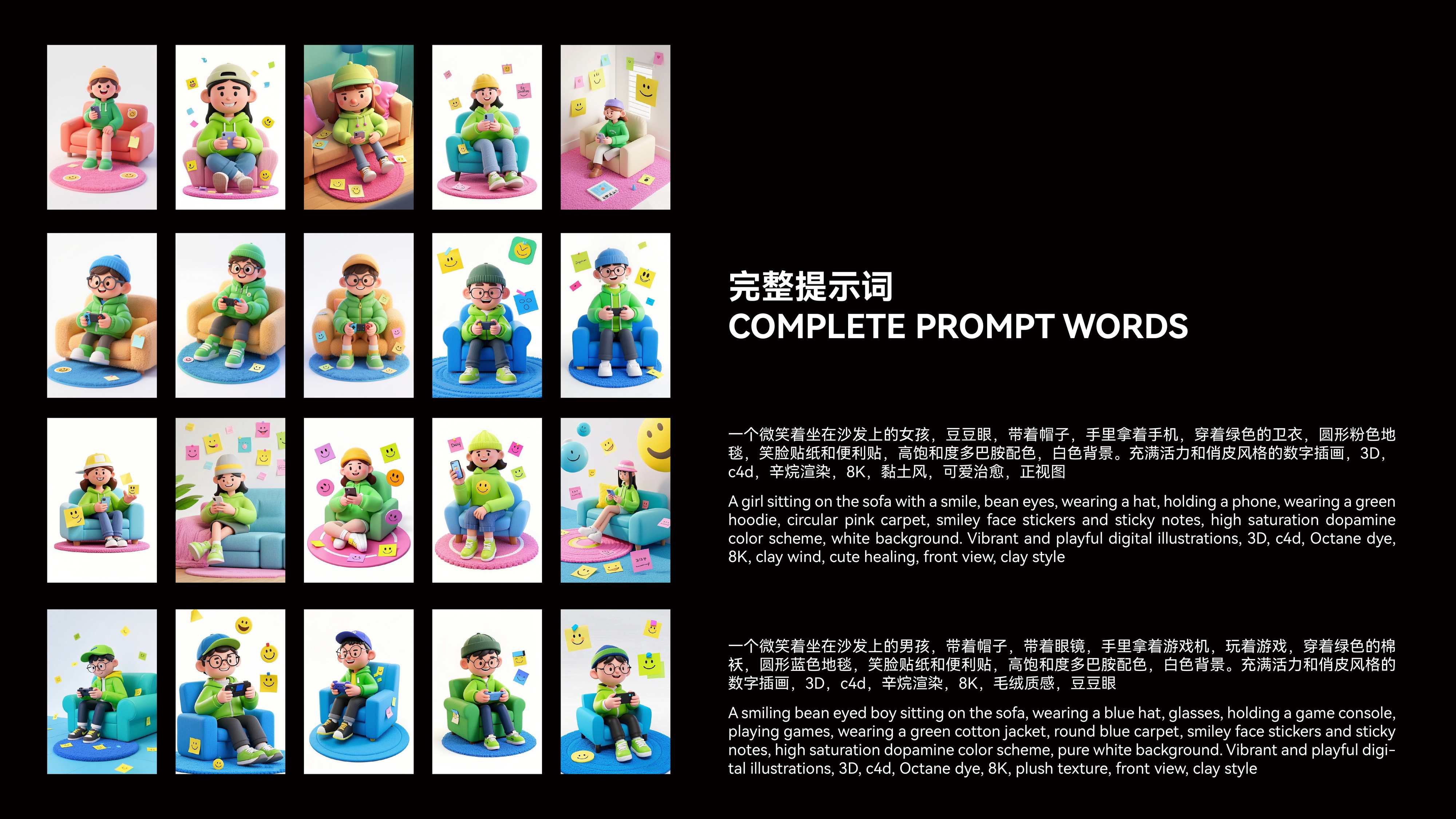
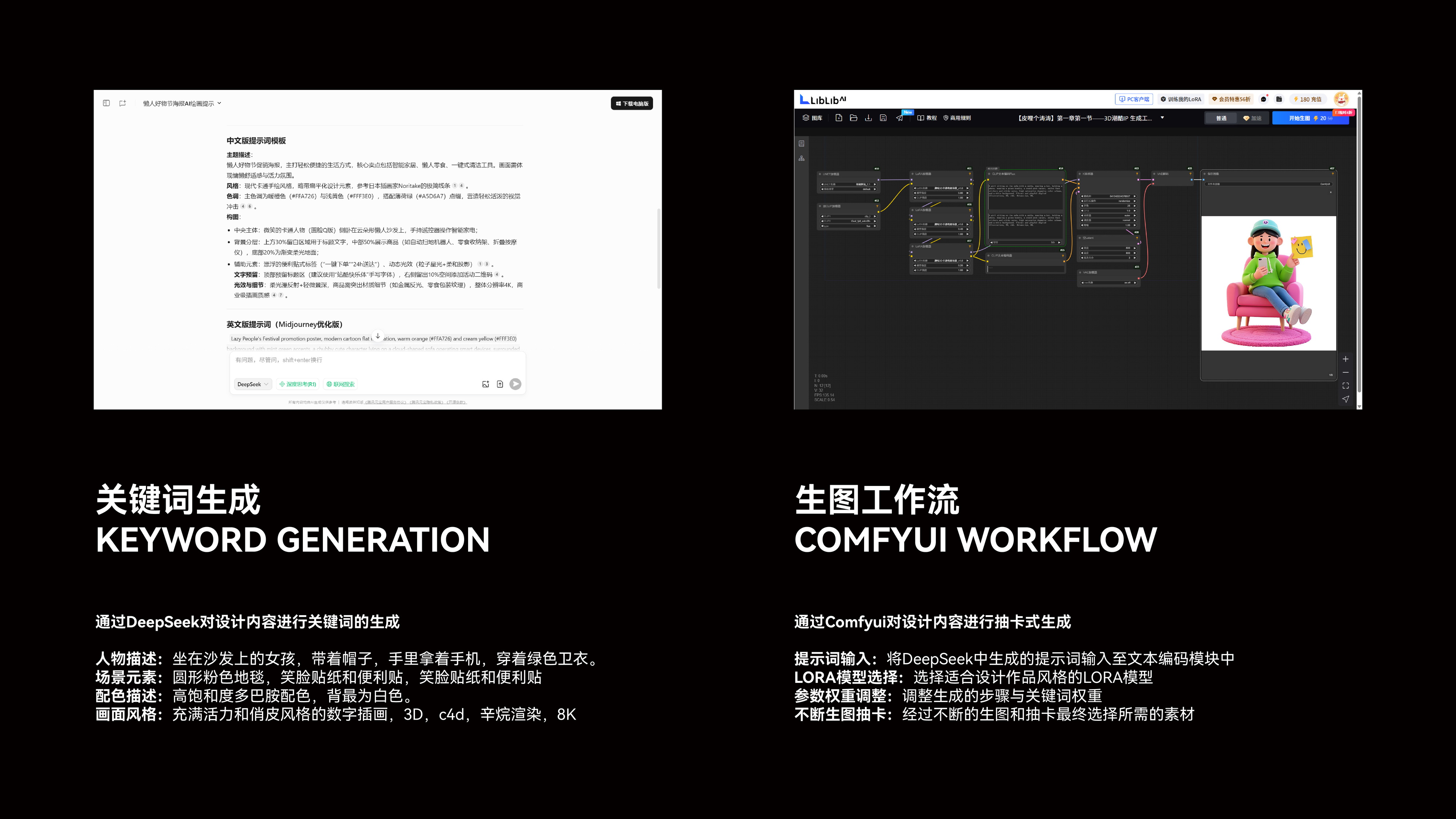
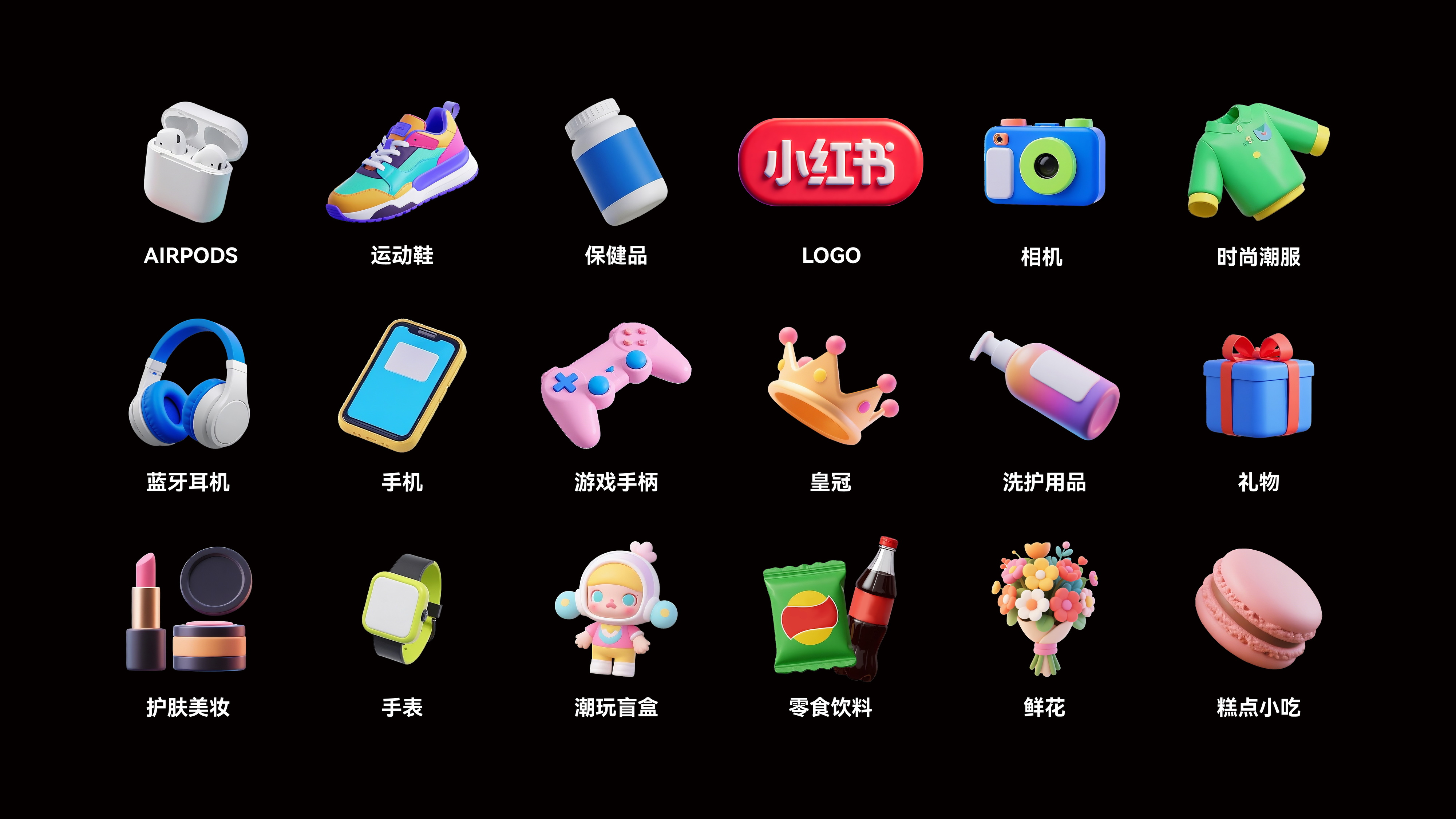
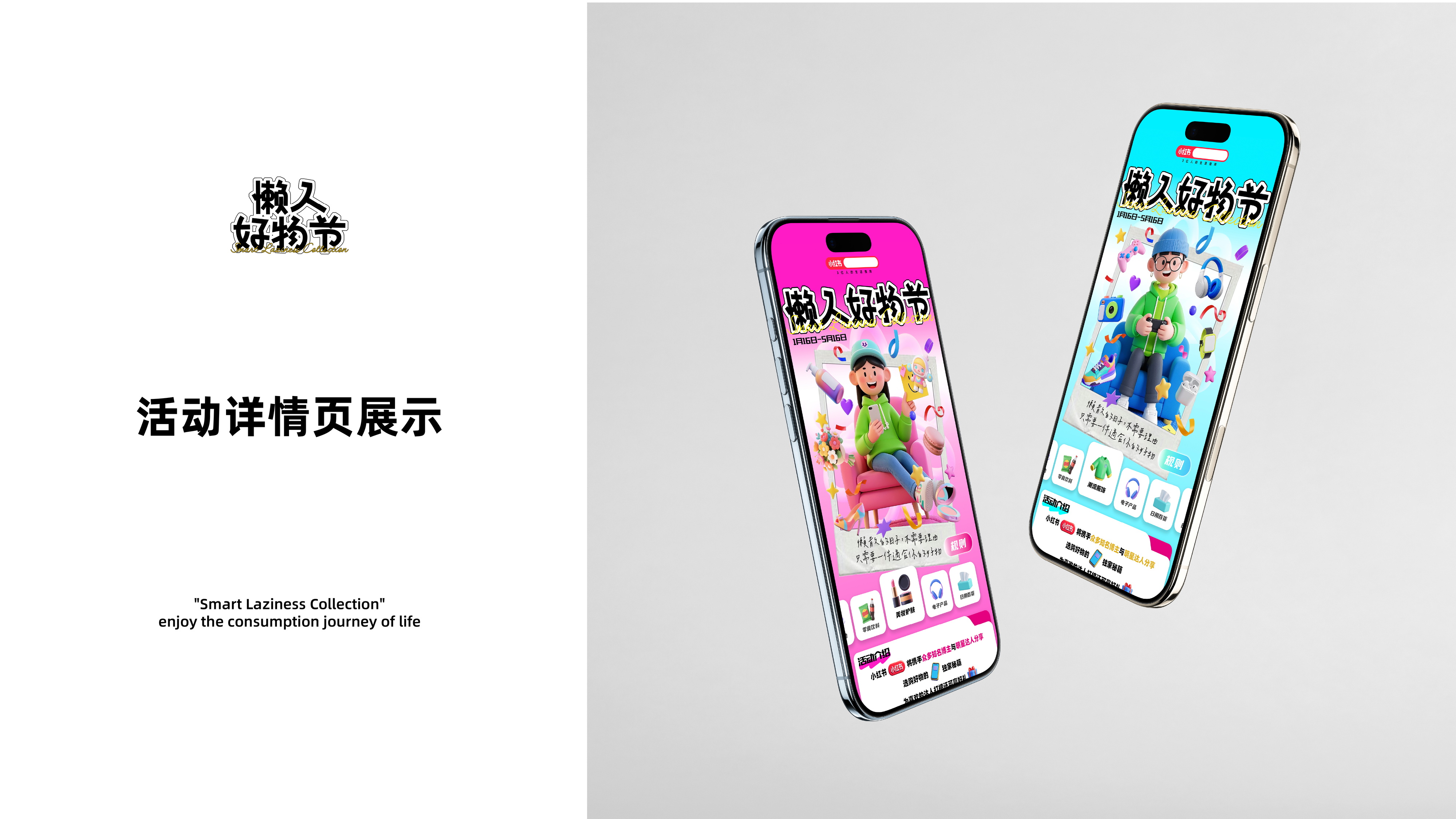
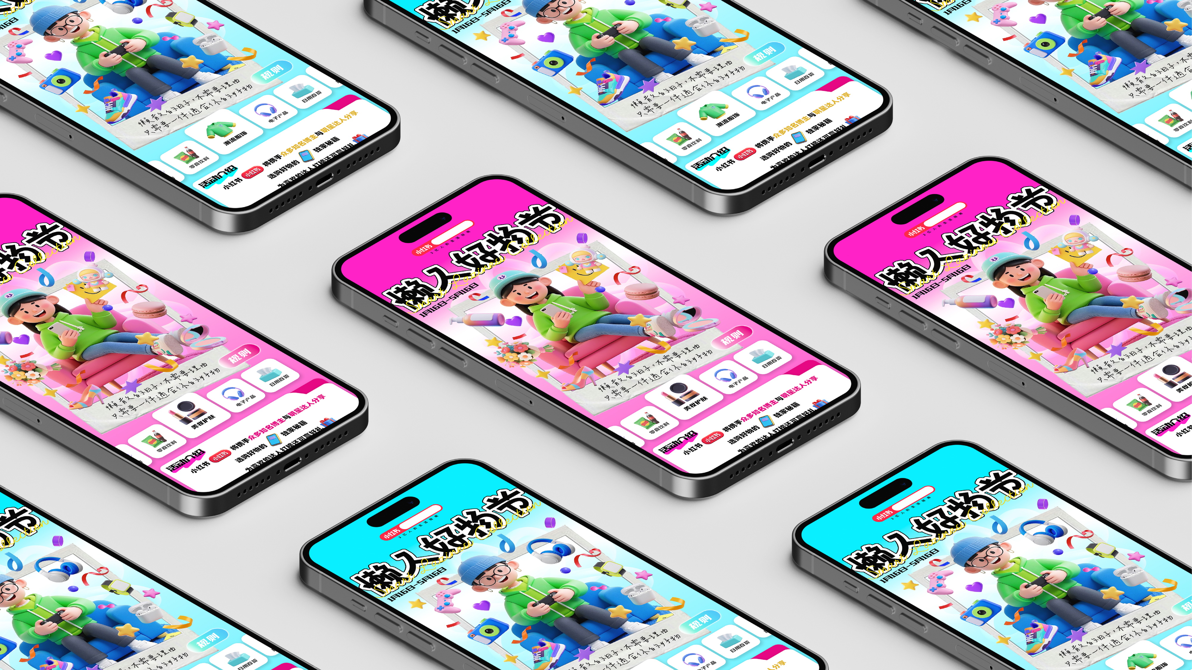
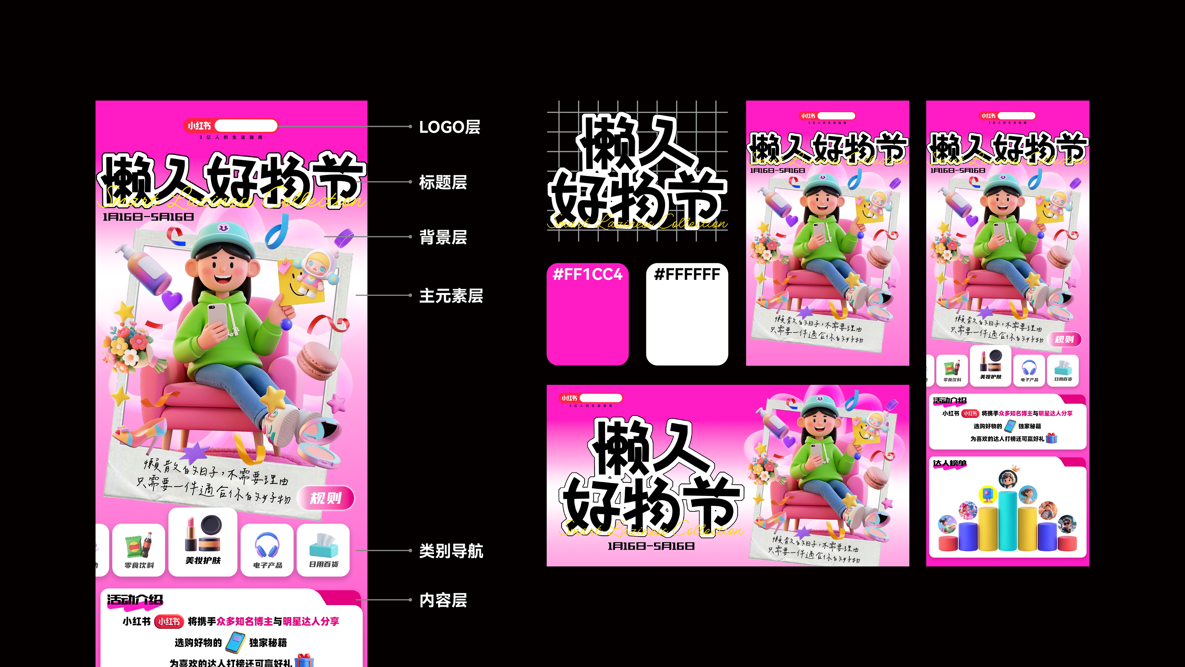
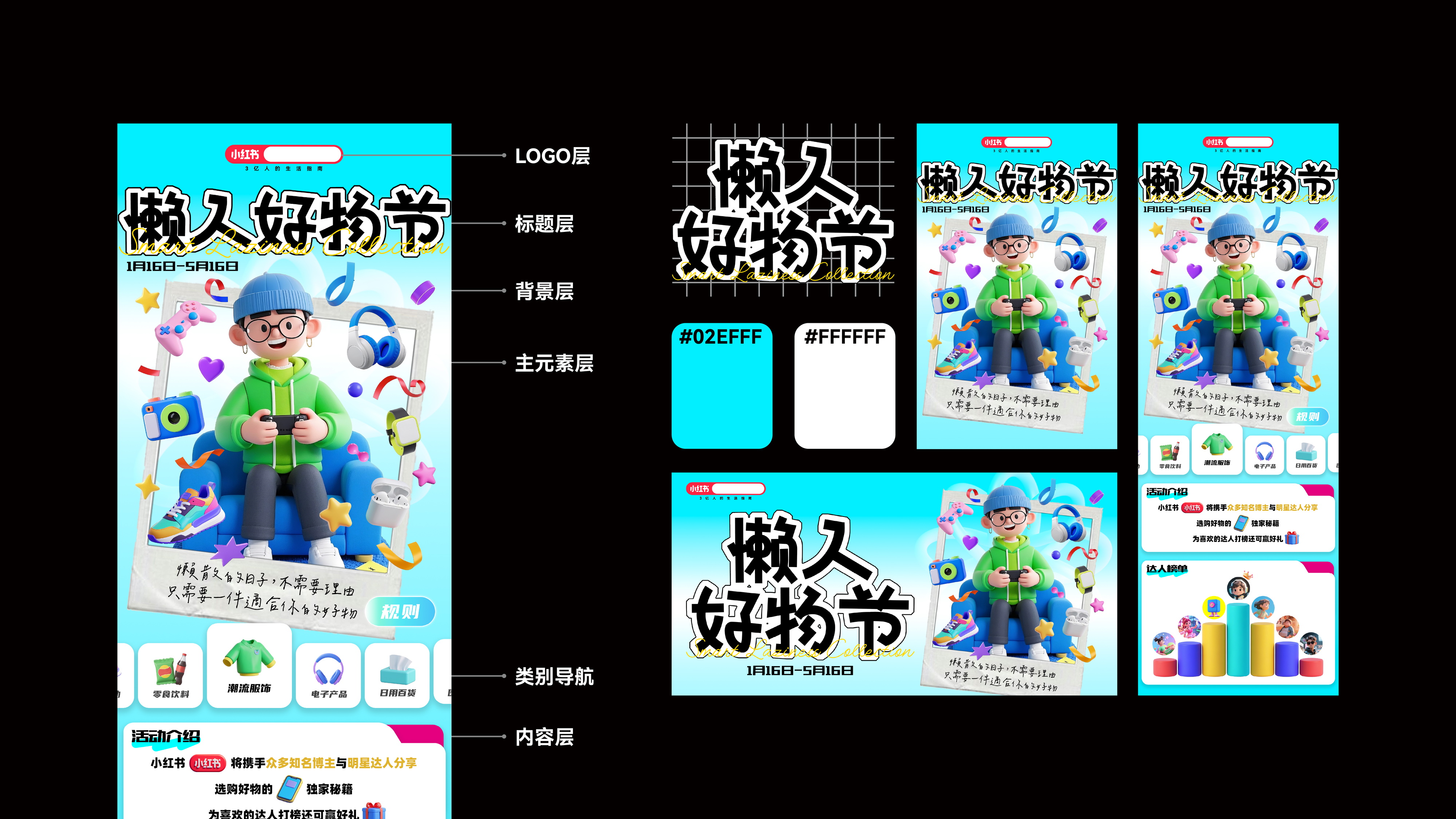
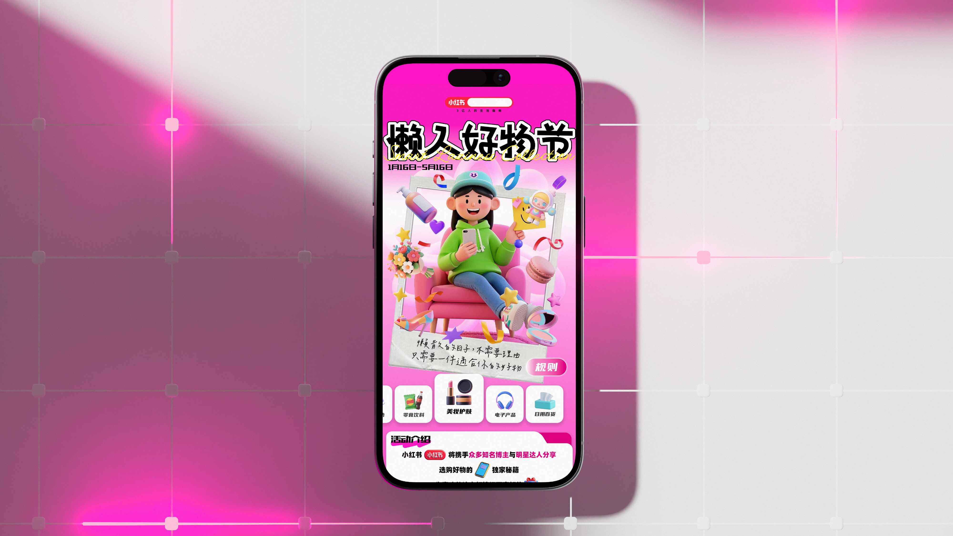
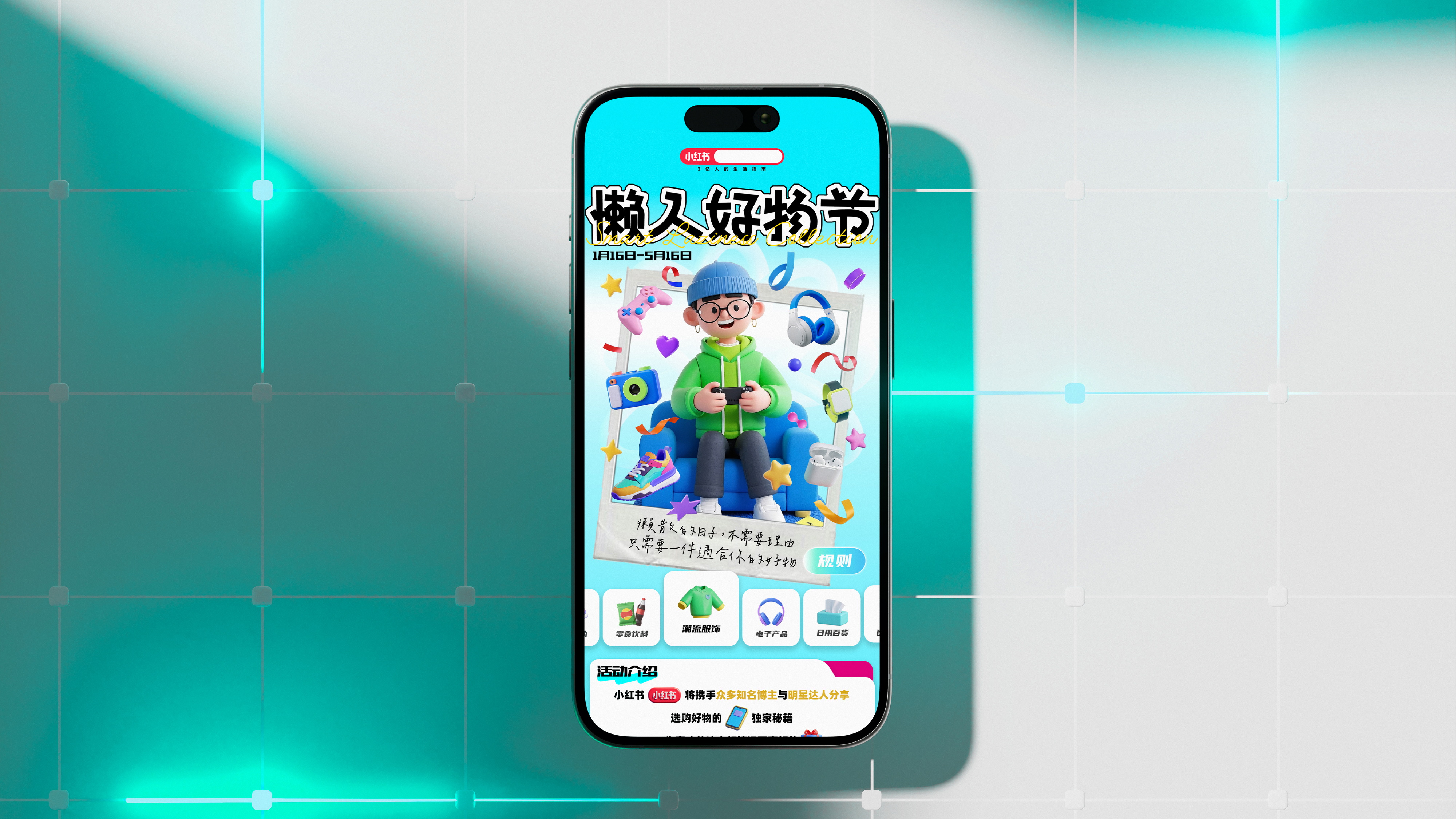
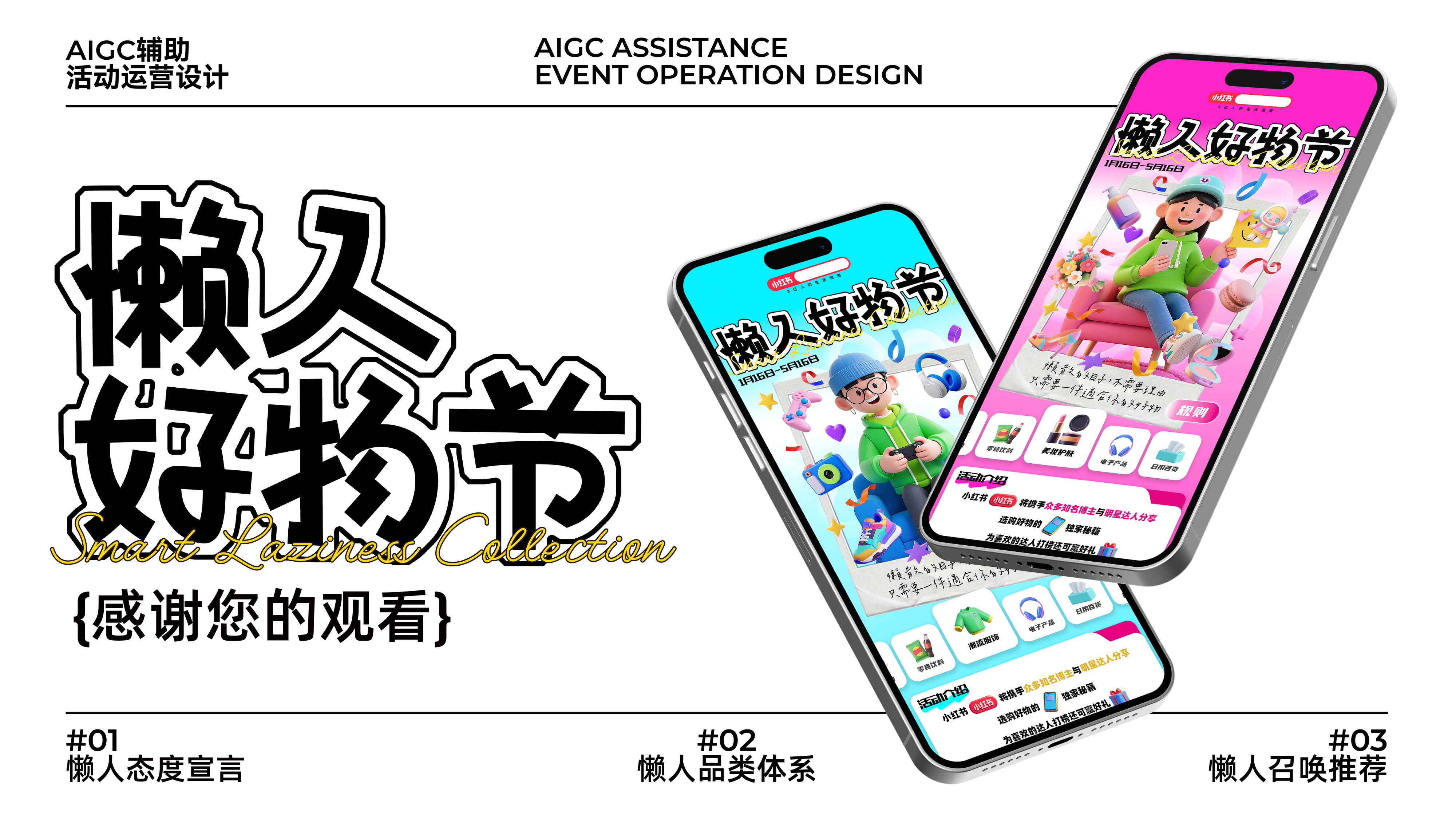
随着社交媒体的蓬勃发展,小红书等平台成为消费者获取购物信息、分享购物体验的重要渠道。消费者期望在小红书上发现那些能够真正改善生活、带来愉悦享受的好物,并且通过购买和使用这些好物来彰显自己的生活态度和品味。因此“懒人好物节”这一主题活动,旨在帮助消费者梳理优质好物,引导他们轻松实现购买到优质商品,在小红书上开启享受生活的消费之旅,同时也为商家提供一个展示优质产品、精准触达目标受众的绝佳机会。
With the vigorous development of social media, platforms such as Xiaohongshu have become important channels for consumers to obtain shopping information and share shopping experiences. Consumers expect to discover good products on Xiaohongshu that can truly improve their lives and bring joy and enjoyment, and they use the purchase and use of these good products to showcase their lifestyle and taste. Therefore, the "Lazy Finds Day" themed event aims to help consumers sort out high-quality good products, guide them to easily purchase high-quality goods, and embark on a consumption journey of enjoying life on Xiaohongshu. At the same time, it also provides an excellent opportunity for merchants to showcase high-quality products and accurately reach their target audience.
沃尔夫 WOOLF
Brief
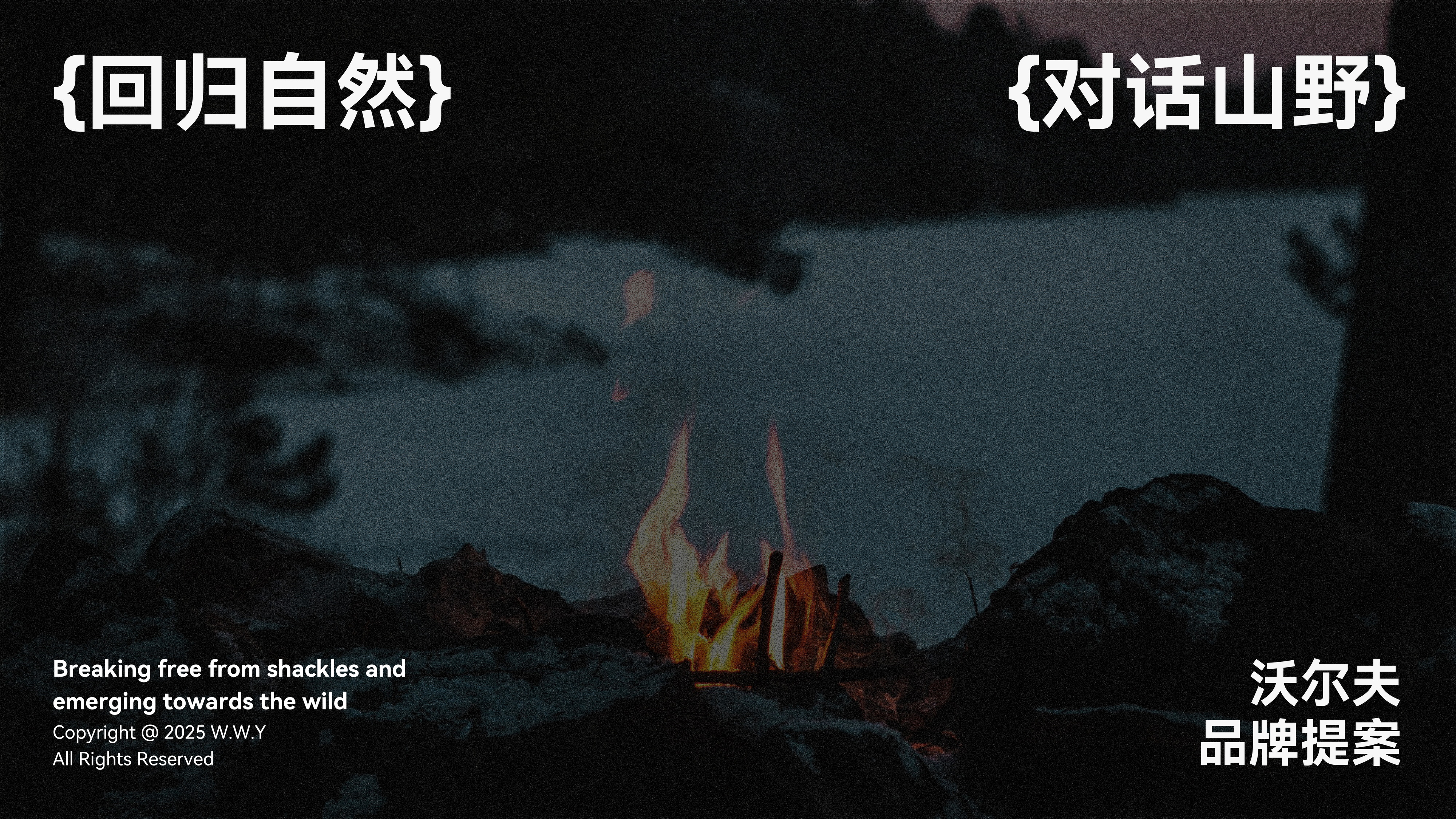
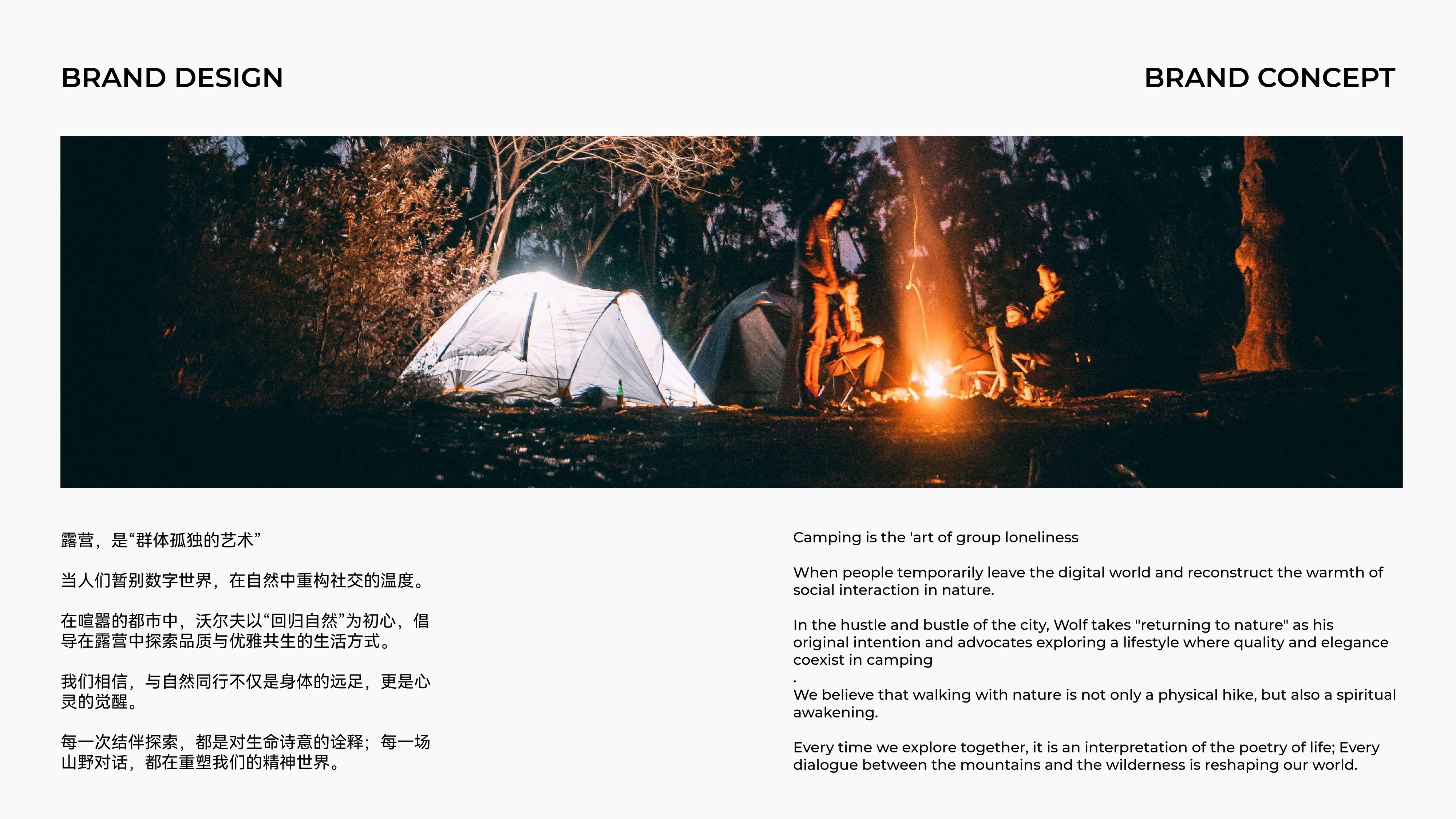
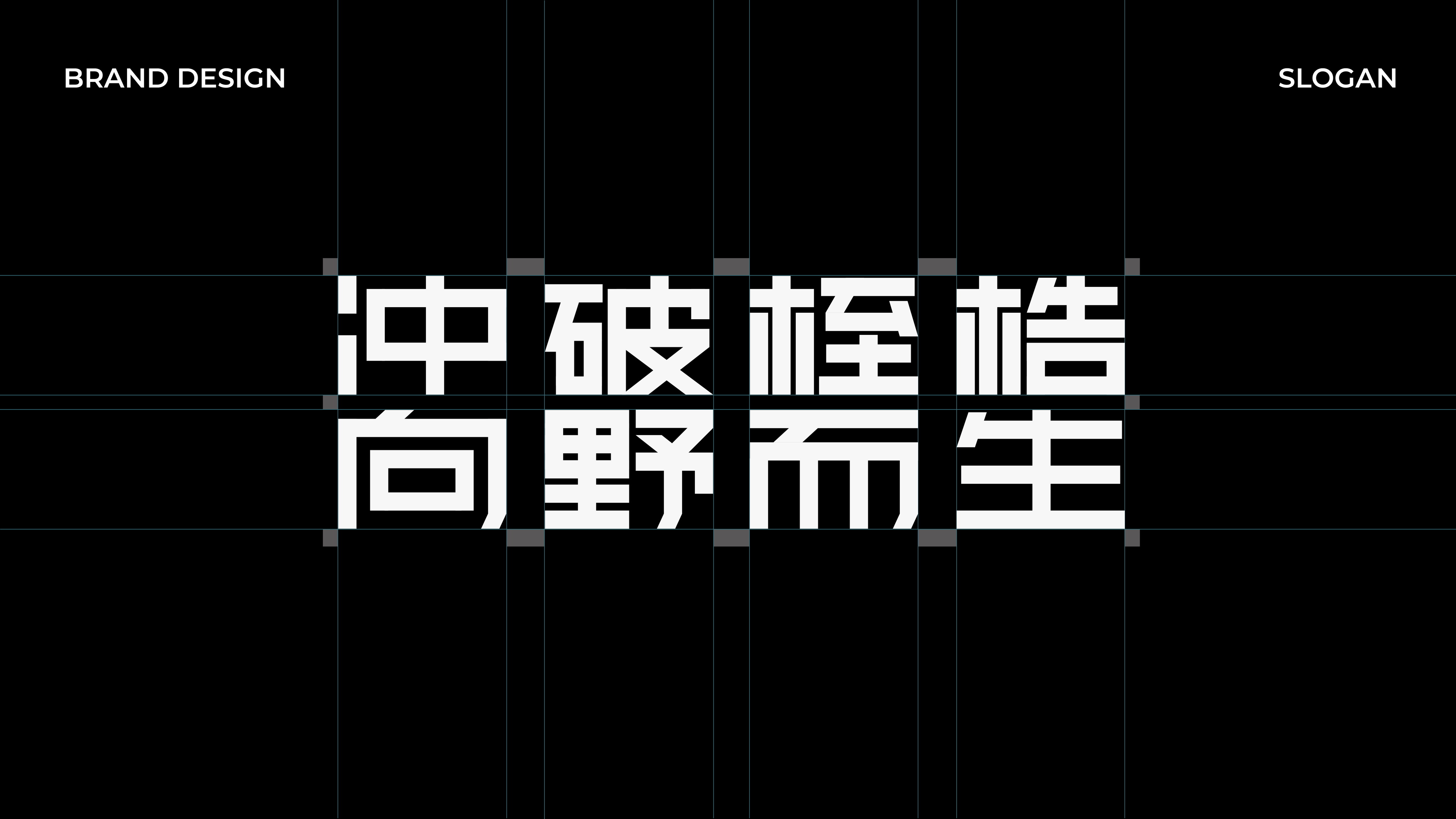
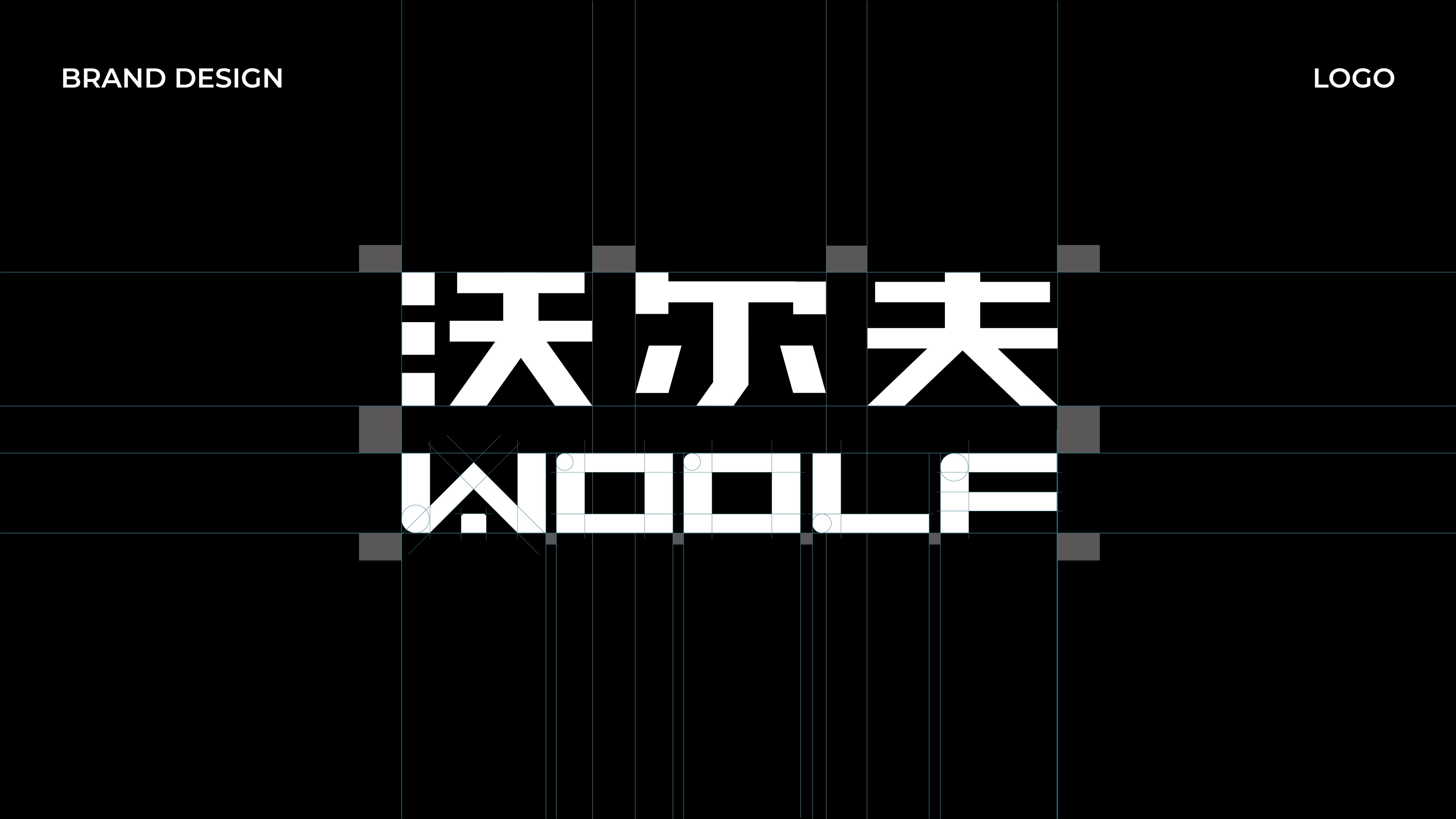
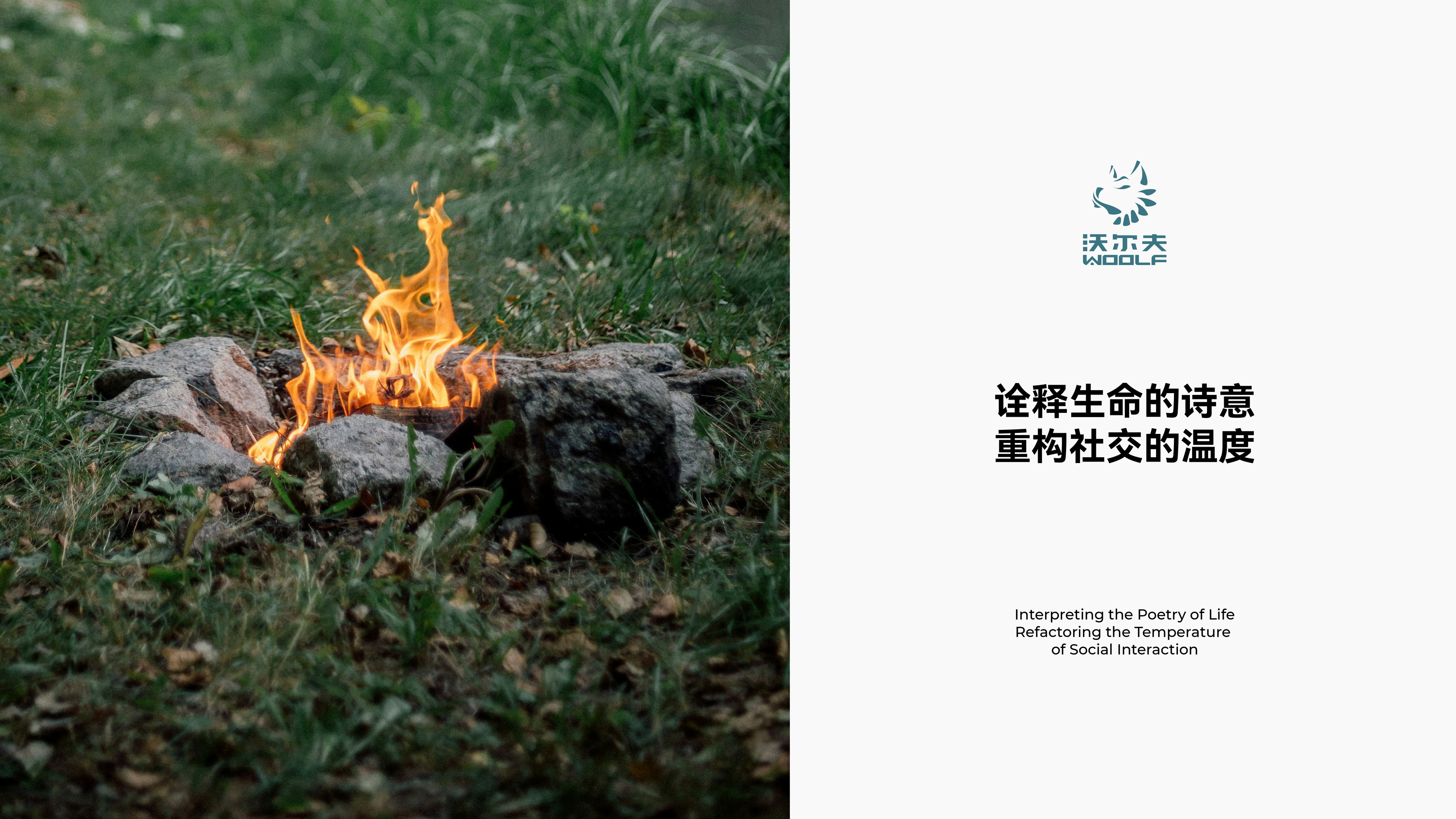
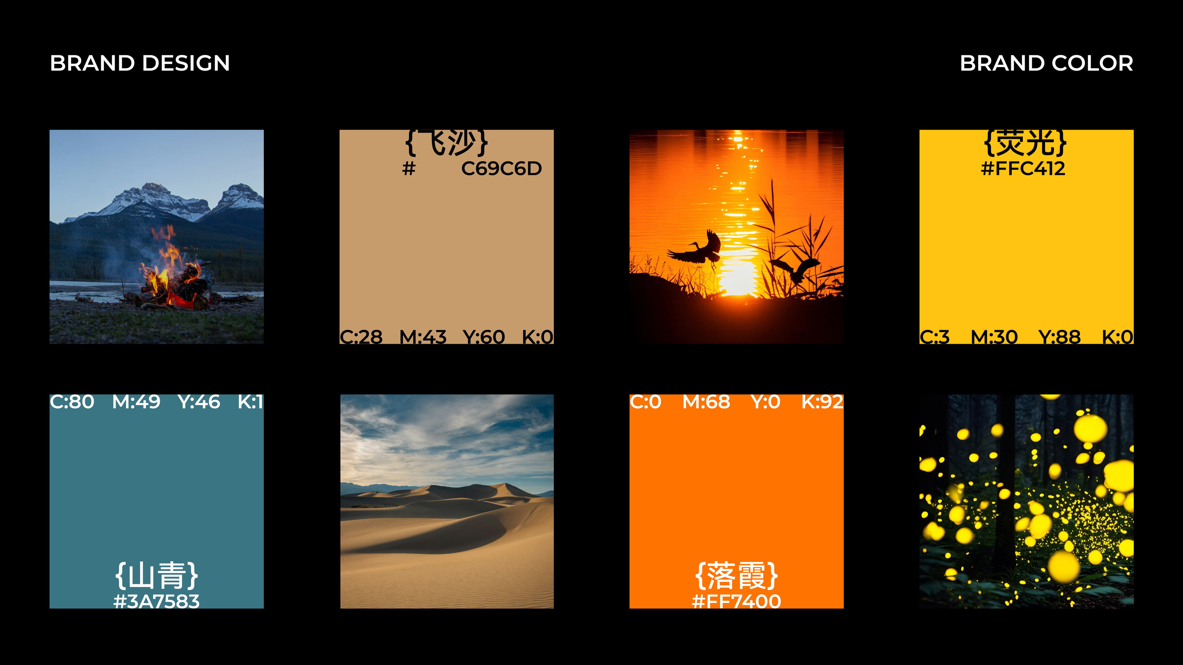
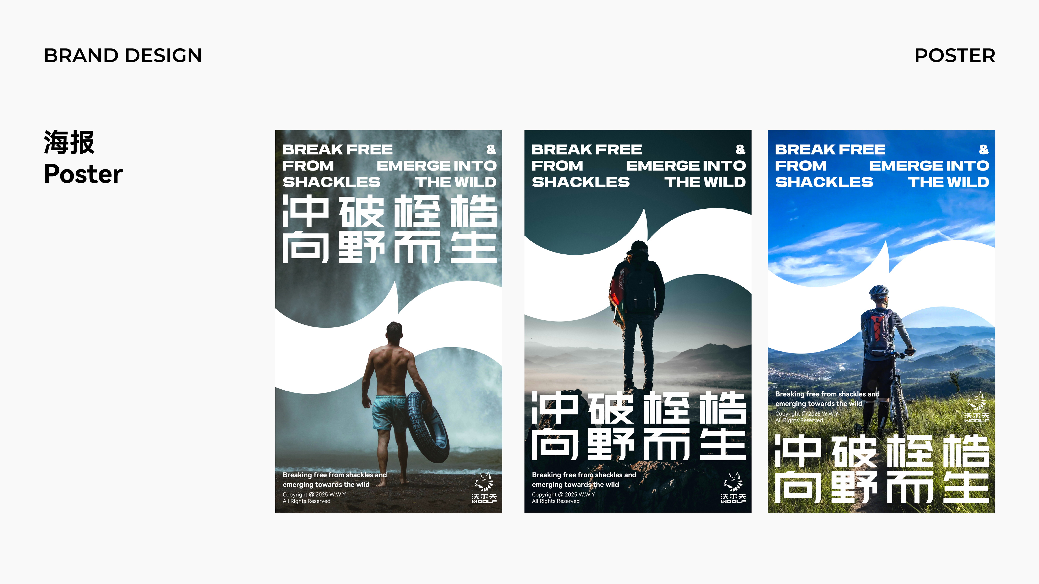
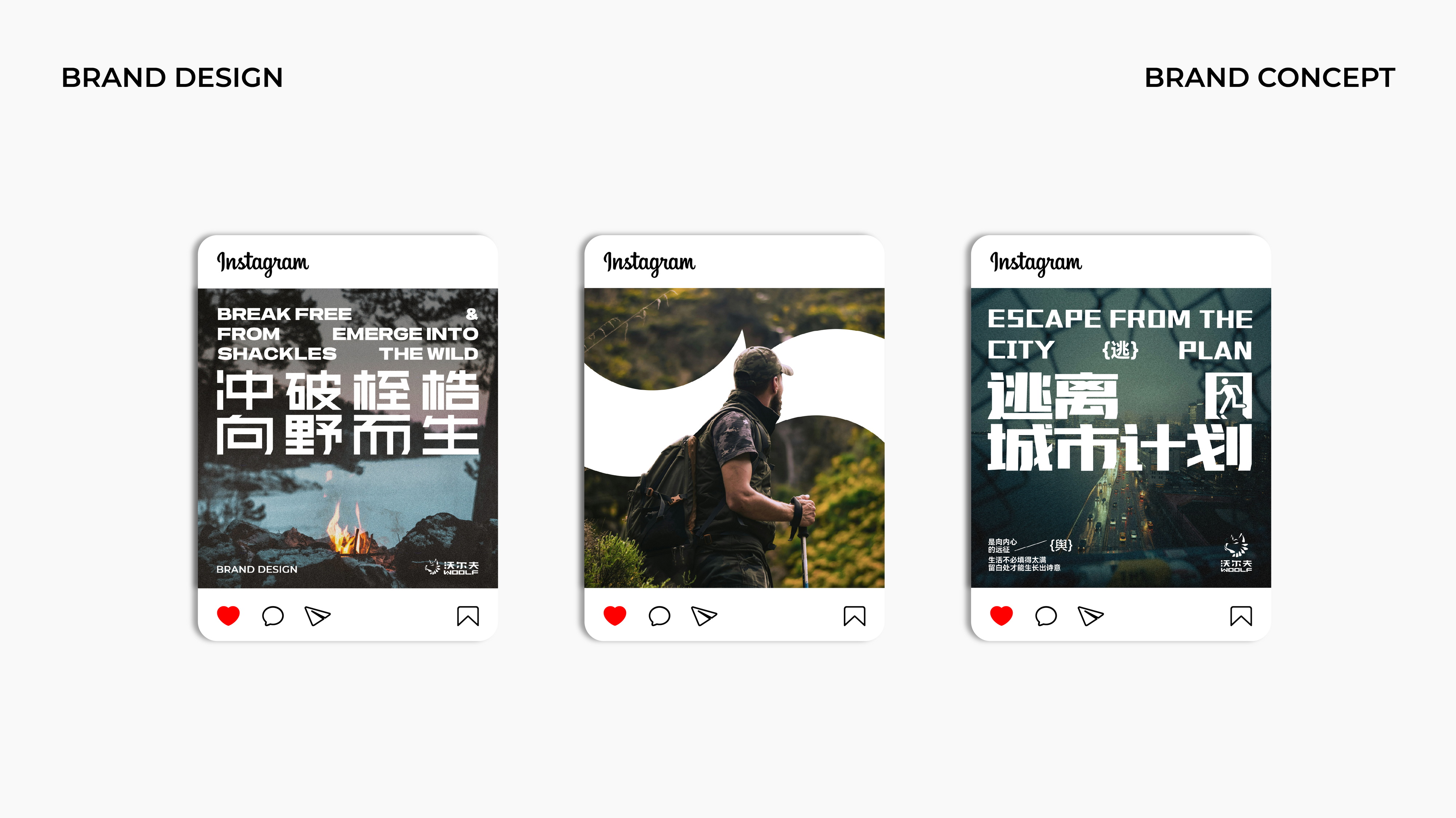
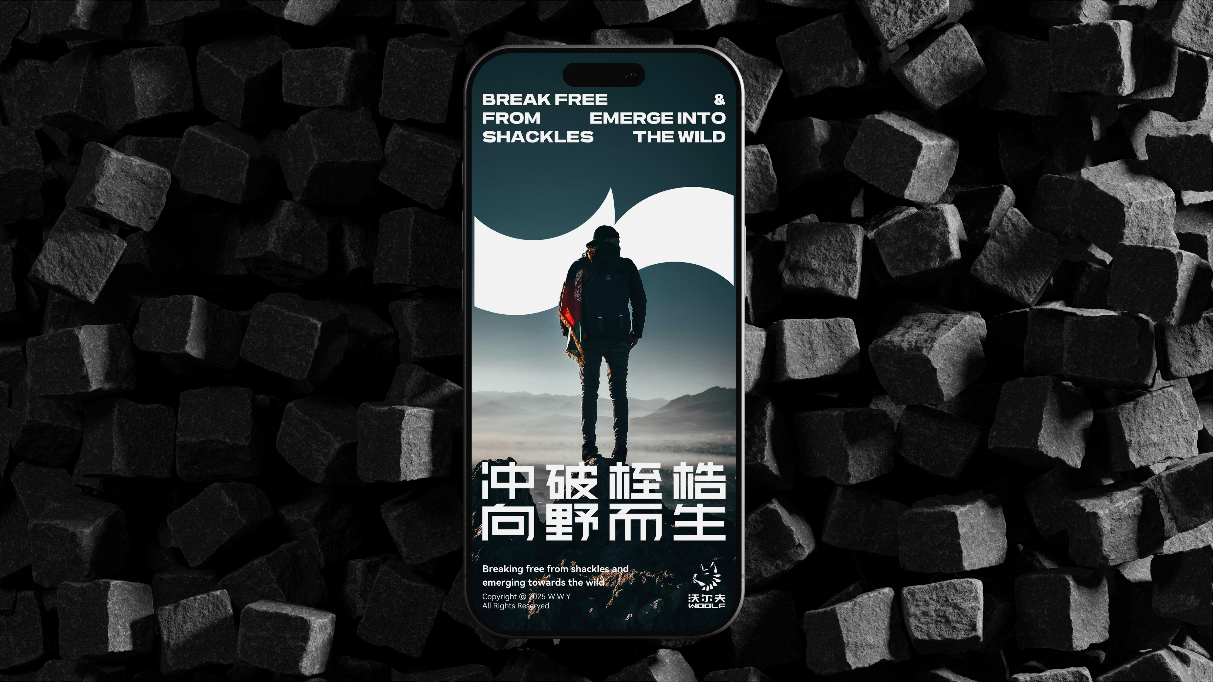
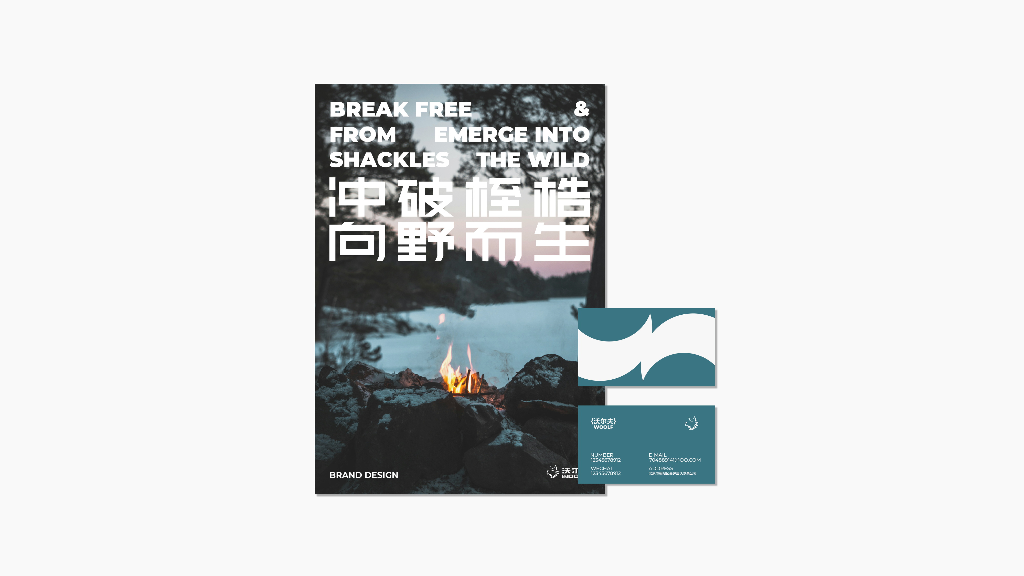
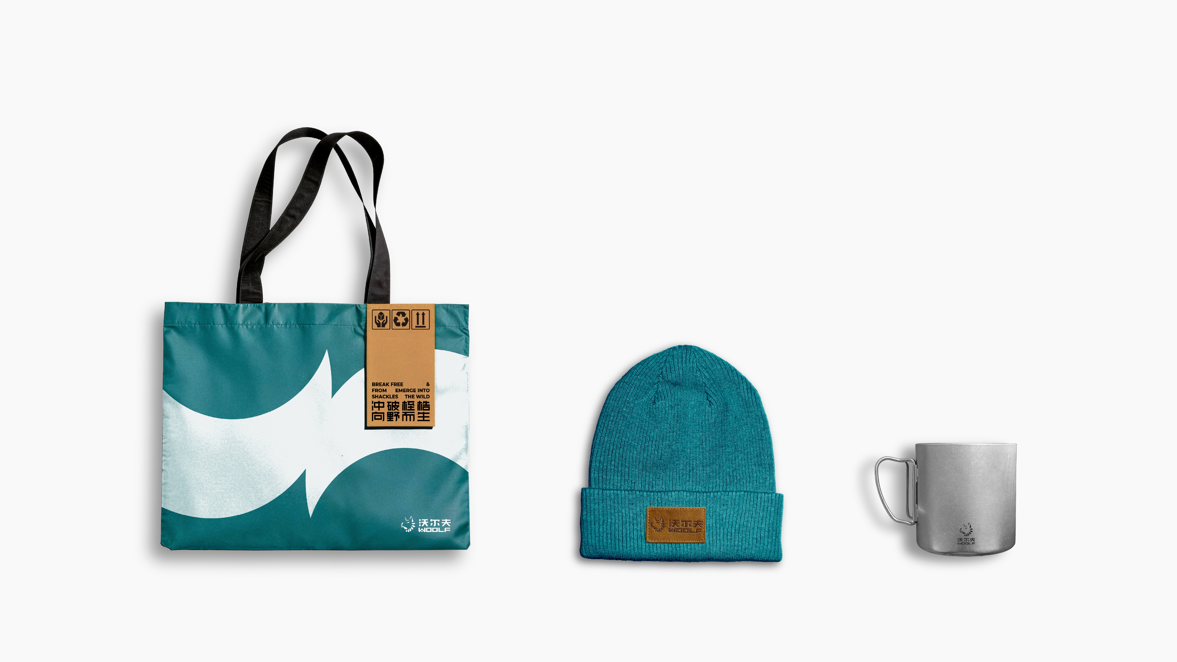
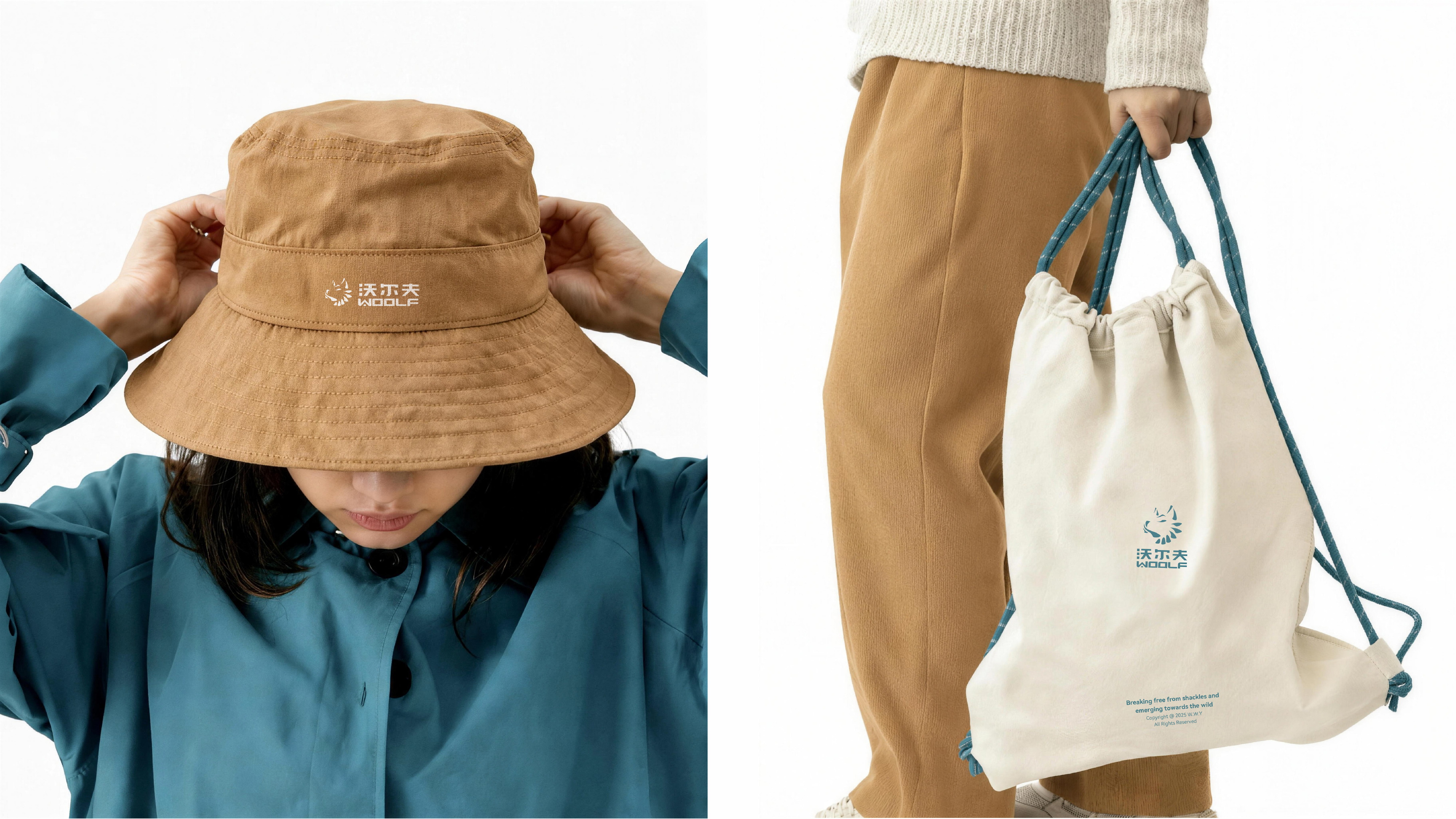
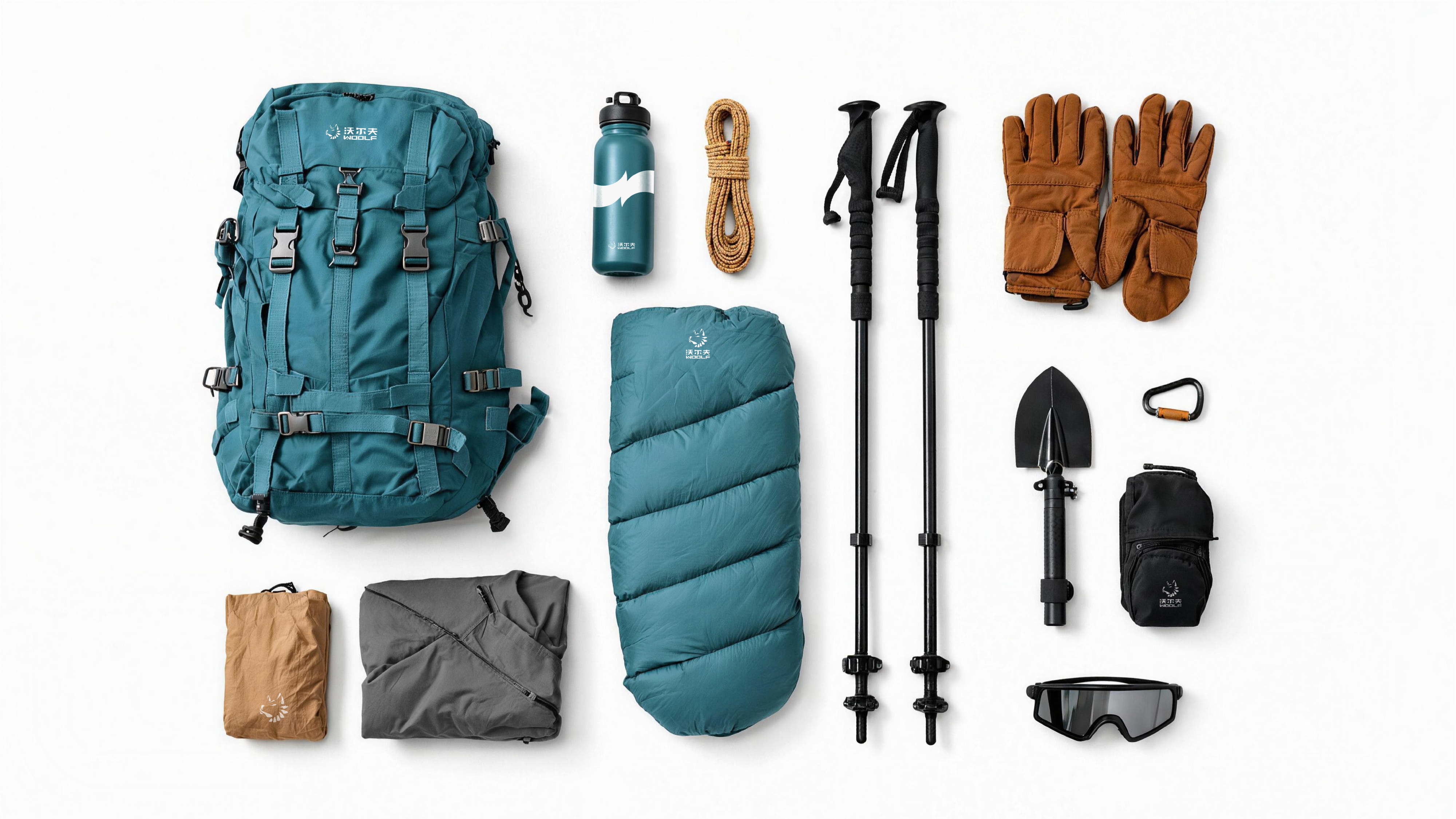
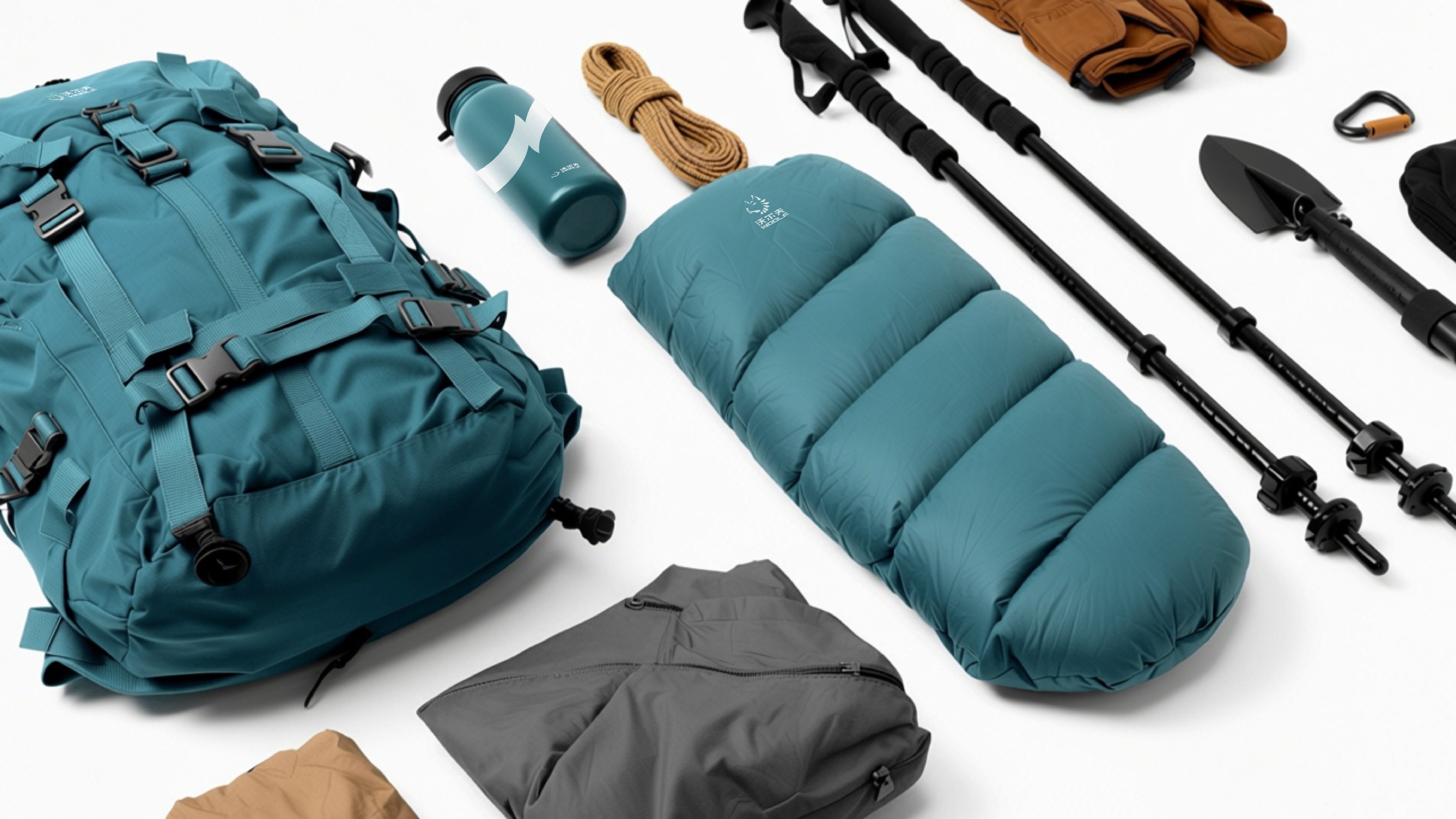
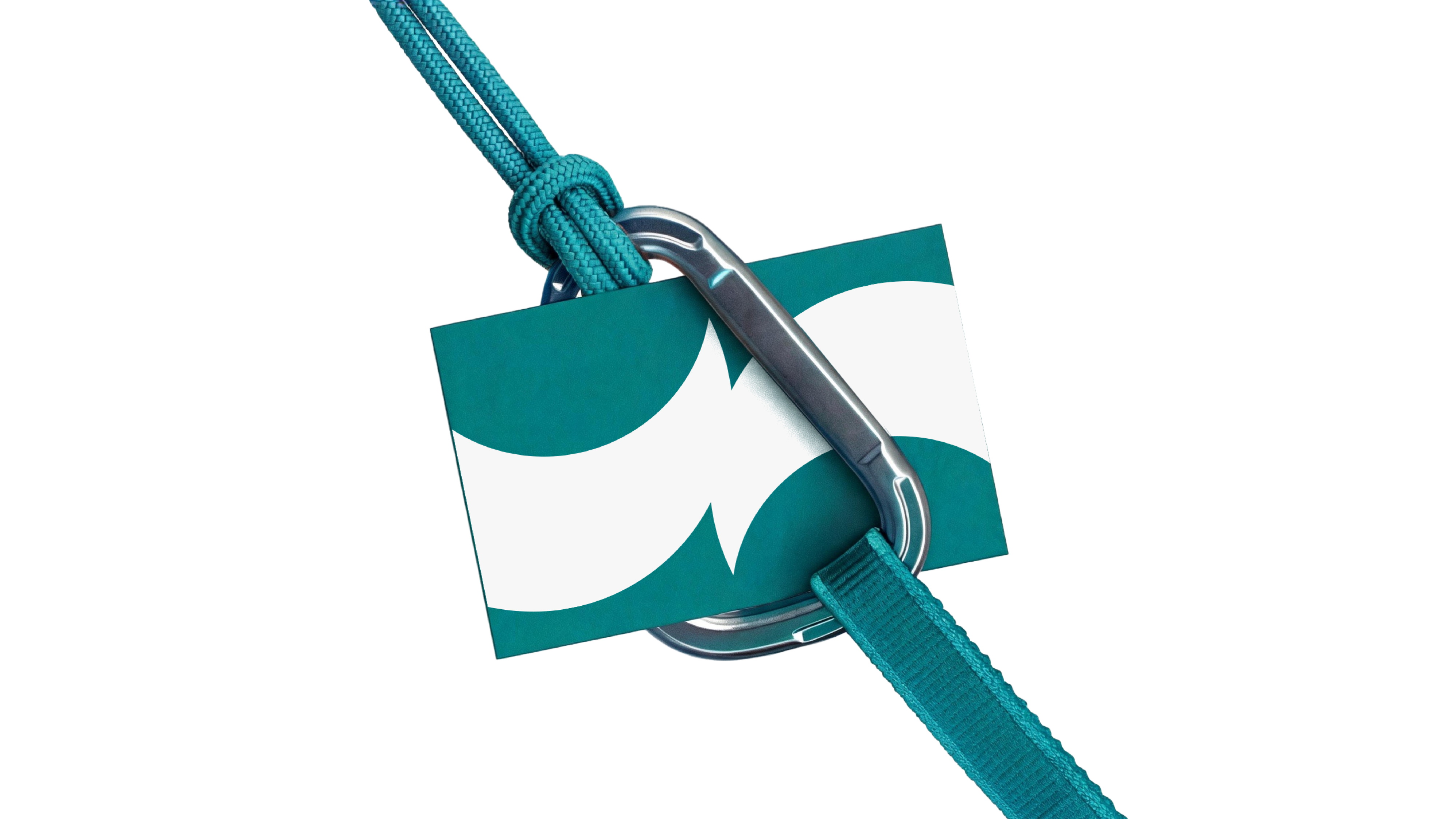
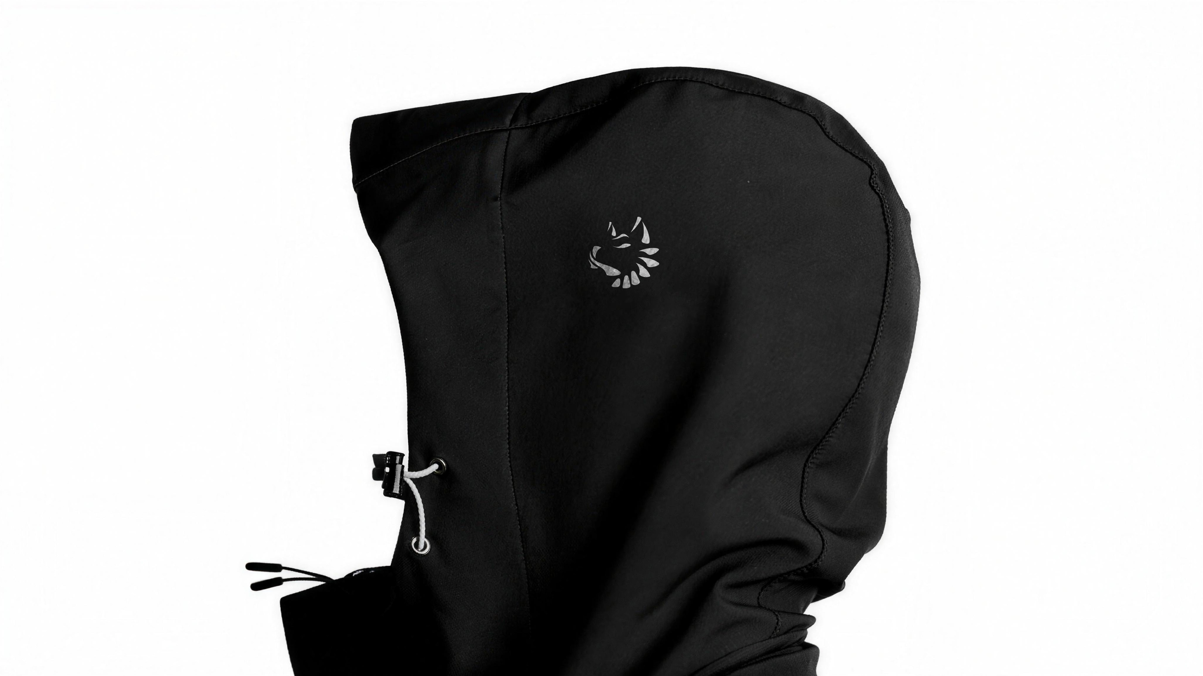
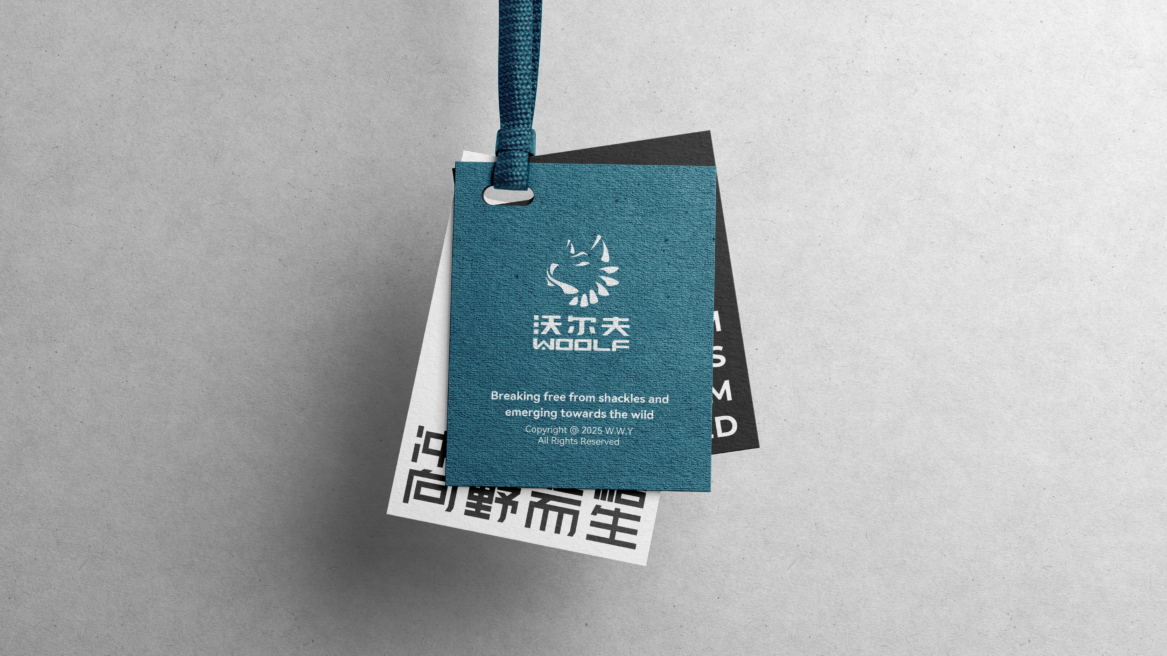
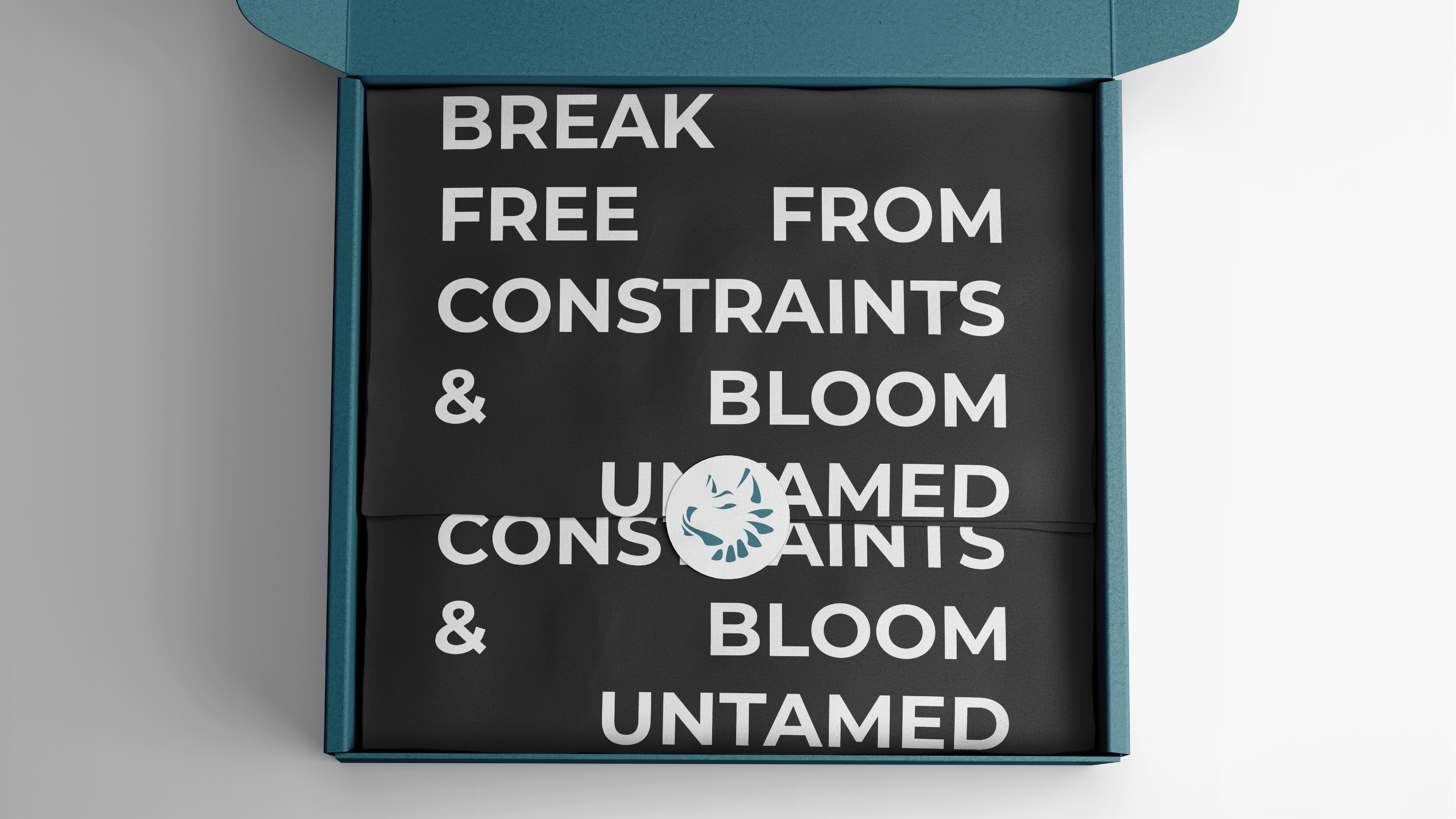
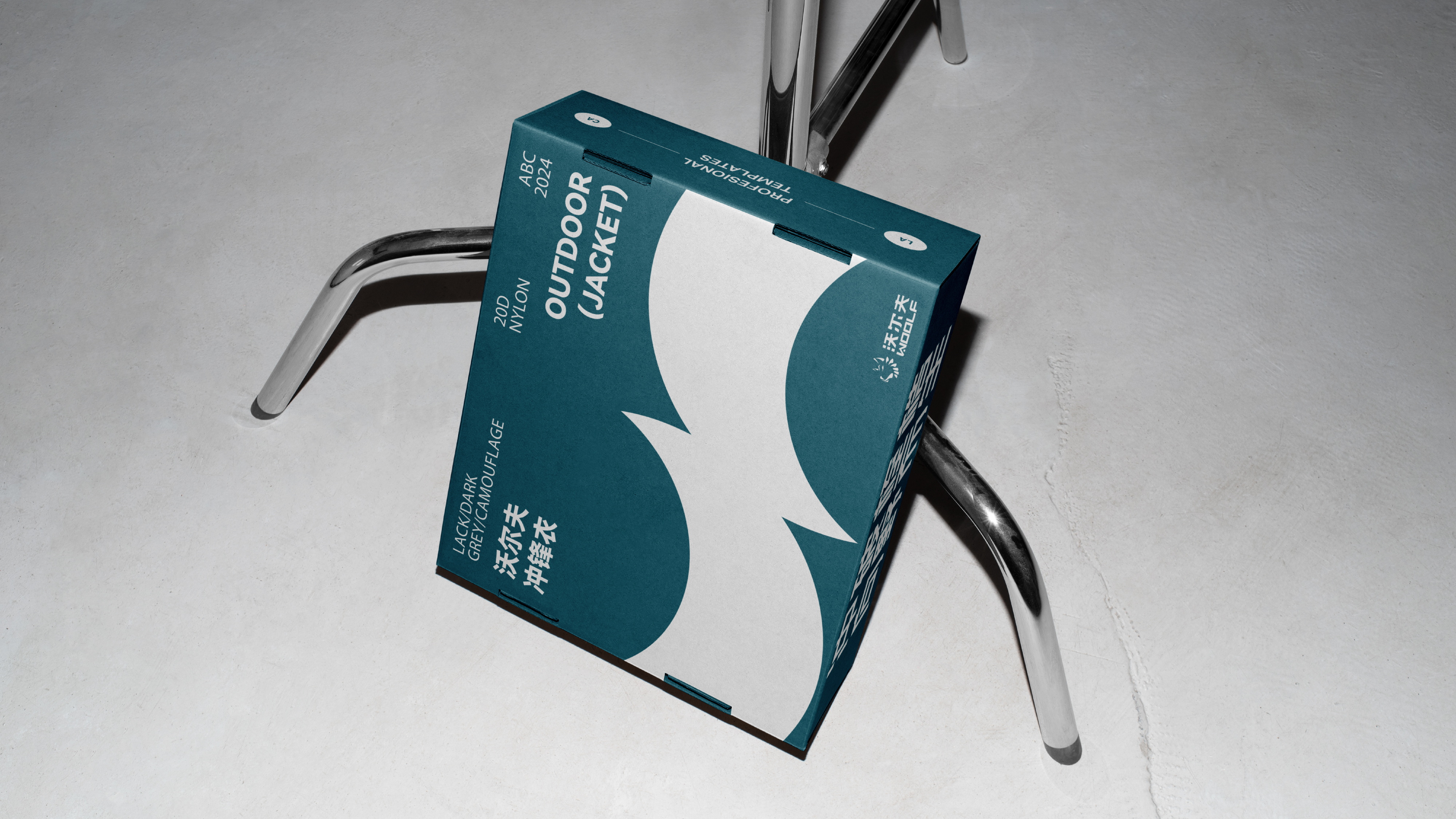
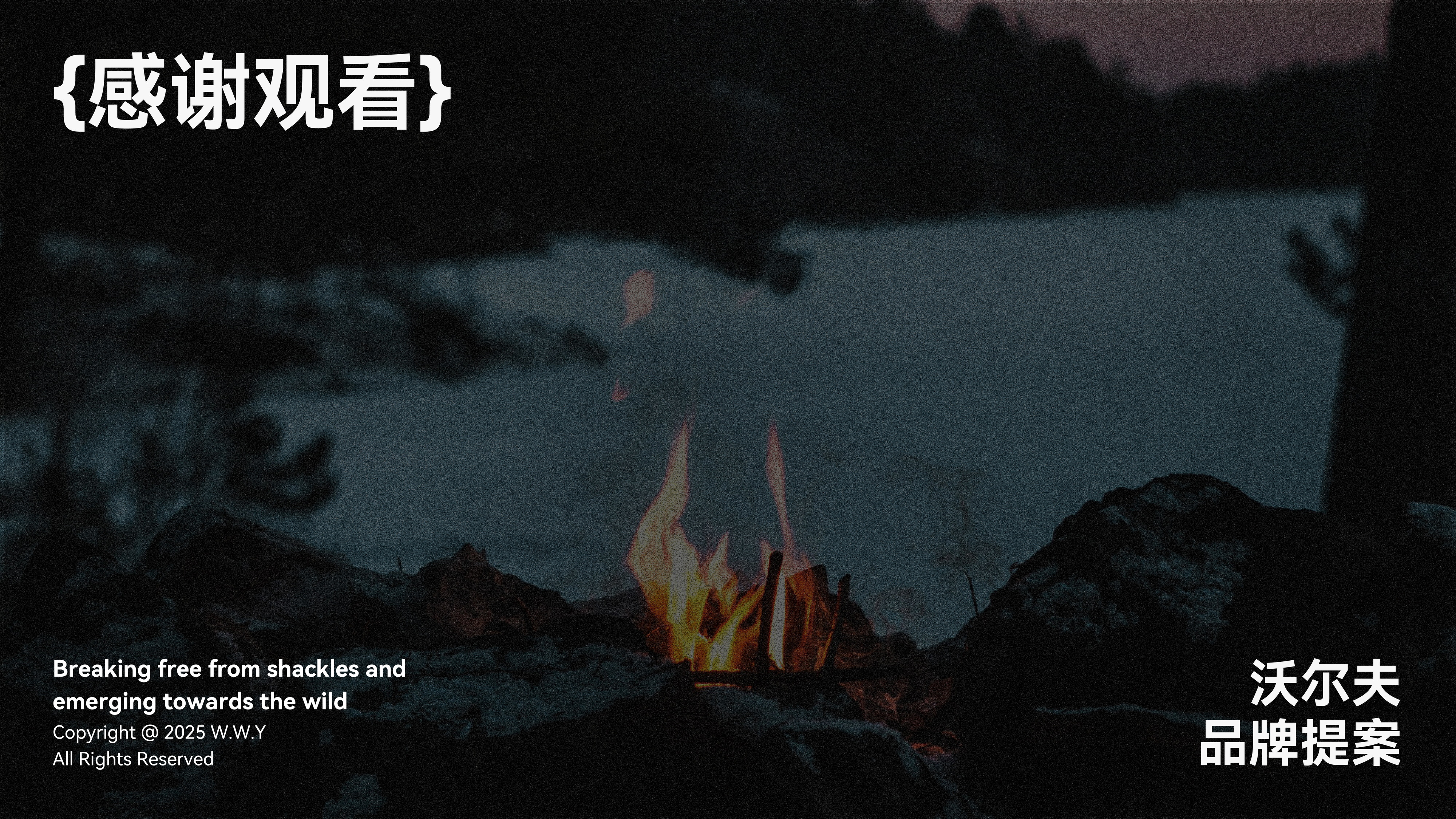
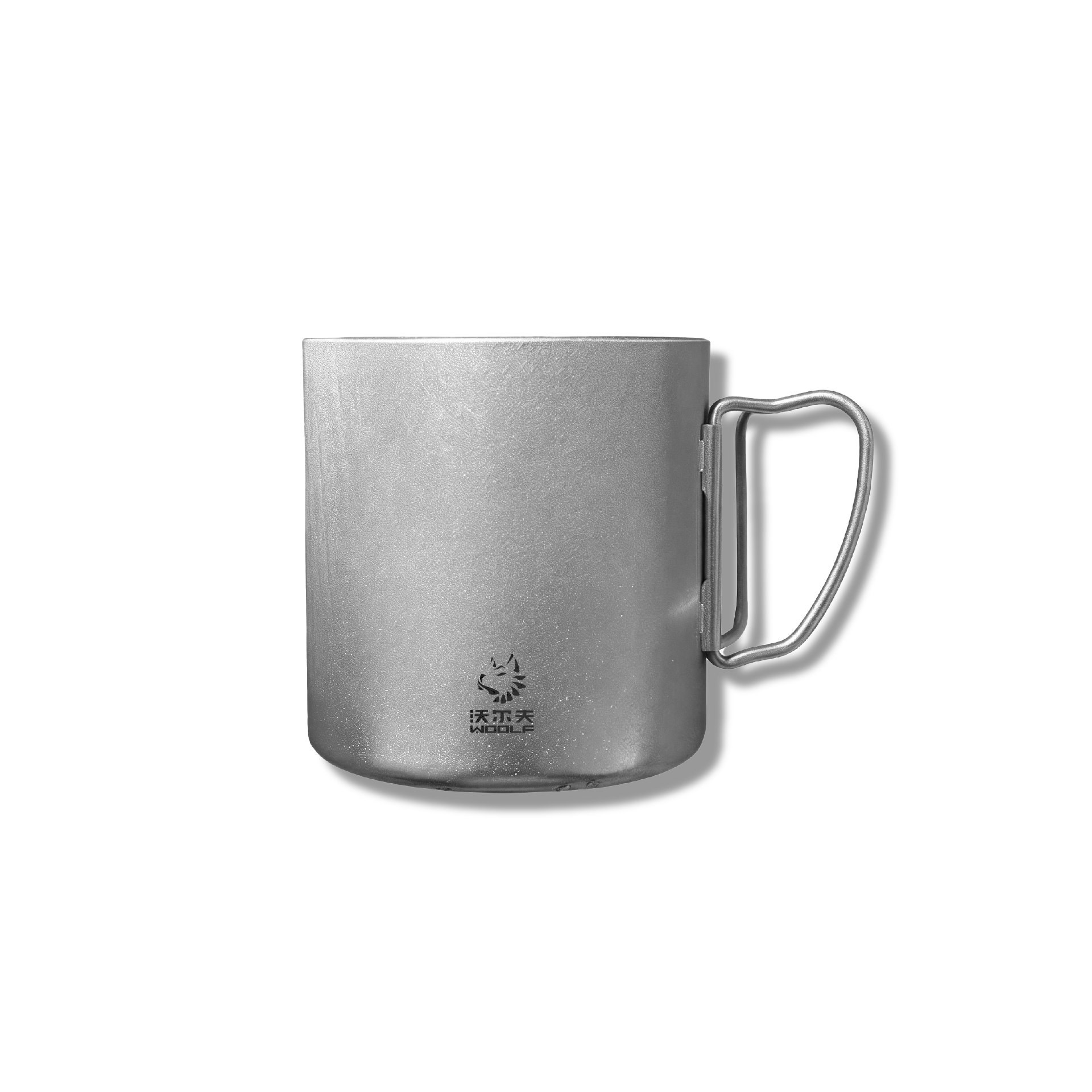
露营,是“群体孤独的艺术”当人们暂别数字世界,在自然中重构社交的温度。在喧嚣的都市中,沃尔夫以“回归自然”为初心,倡导在露营中探索品质与优雅共生的生活方式。我们相信,与自然同行不仅是身体的远足,更是心灵的觉醒。每一次结伴探索,都是对生命诗意的诠释;每一场山野对话,都在重塑我们的精神世界。
Camping is the 'art of group loneliness. When people temporarily leave the digital world and reconstruct the warmth of social interaction in nature. In the hustle and bustle of the city, Wolf takes "returning to nature" as his original intention and advocates exploring a lifestyle where quality and elegance coexist in camping. We believe that walking with nature is not only a physical hike, but also a spiritual awakening. Every time we explore together, it is an interpretation of the poetry of life; Every dialogue between the mountains and the wilderness is reshaping our world.